The network for creativity
Join 1.25M professional creatives like you
Connect with clients, get discovered, and run your business 100% commission-free
Creatives on Contra have earned over $150M and we are just getting started
Back to feedPost
Taste Test


SAME AI SKIN APP.
SAME DATA.
DIFFERENT PERCEPTION.
Which version makes the result feel more trustworthy?
🟣 A - Purple
🟢 B -Green
At first glance, this looks like a color choice.
But in a health product, color can change more than aesthetics.
It can change what users believe the product is.
🟣 One direction feels closer to premium skincare and self-care.
🟢 Another feels closer to health monitoring and measurable progress.
That matters because each category creates different expectations.
If it feels too cosmetic, AI results may feel less credible.
If it feels too clinical, it may lose emotional comfort.
The real UX question is not:
“Which color looks better?”
It is:
Which visual system makes you trust the result enough to scan again tomorrow?
👇 Vote below:

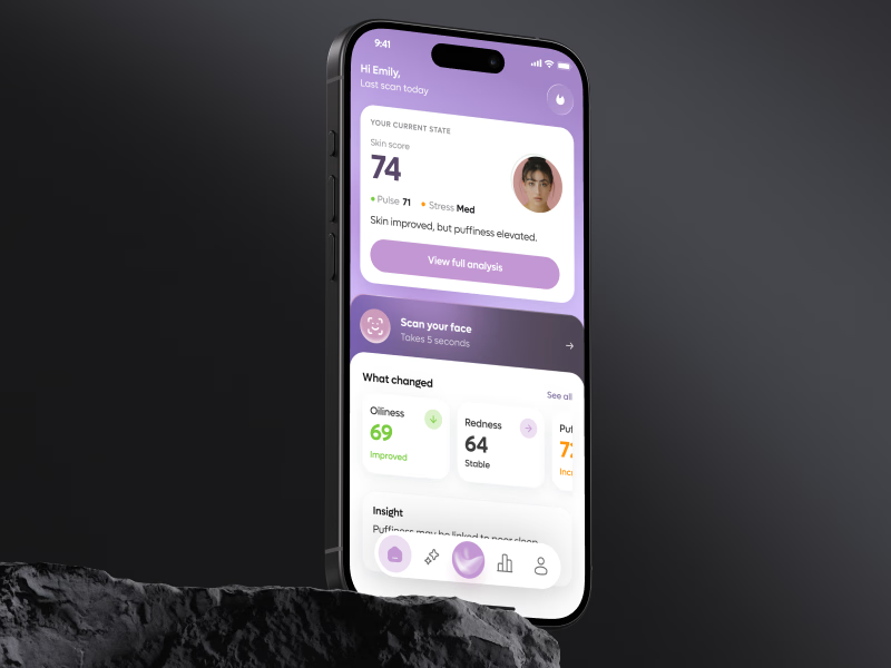
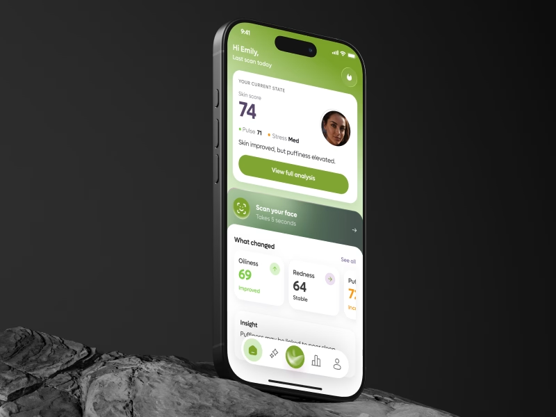
47 votes
Ends in 20h


Exactly. That’s the more interesting question here: preference can drive the first interaction, but trust determines whether the user believes the result enough to act on it. In health products, those two signals can easily pull in different directions

Interesting how quickly “health” can shift into “beauty” just through visual language.
Yes and that shift matters. The same interface can frame the product as either a clinical tool or a lifestyle/beauty product before the user even reads the content. Color is quietly setting expectations about what kind of “truth” the product is giving them

Green feels more trustworthy to me; it signals health, progress, and measurable results without feeling overly clinical.

🟣 Purple
😍

Green feels more natural for health monitoring app!

Purple for me!

Green feels like the right choice for a health app because it draws on the psychological association between nature and well-being. Research suggests that exposure to natural environments can help people feel calmer and more grounded, and using green as the primary color brings...

This will probably be path of the use research, because color can change direction of a product
The network for creativity
Join 1.25M professional creatives like you
Connect with clients, get discovered, and run your business 100% commission-free
Creatives on Contra have earned over $150M and we are just getting started
Trending
retrofuturism
Share your favorite designs from the past exploring the distant future. Or your own take on the aesthetic 🚀
halftone
Dots. Texture. Grain. Let's see your designs using the halftone technique.

Midjourney
Creatives are showing off what they're making with Midjourney.
colorgrade
Video editors sound off: How do you enhance the mood of your video in color grading?





Related posts
For an ADHD brain, which is better UX:
“Let me choose”
or
“Tell me what’s next”?
A gives users more freedom to scan, explore, choose.
B creates a clearer path, makes progress visible, and reduces decisions.
Neither is automatically better
But for users dealing with attention, overwhelm, & decision fatigue, structure can directly affect whether they continue or drop off
Which one creates less friction and a stronger reason to keep going?
🟣 A Let me choose
🟢 B Tell me what’s next
👉 BOOK A MOBILE APP STRATEGY SESSION
https://calendly.com/asol_design/book-diagnostic-call-linkedin-clone
If users aren’t activating, converting, or coming back, I’ll help identify where the UX is losing them.


6 voted
20%
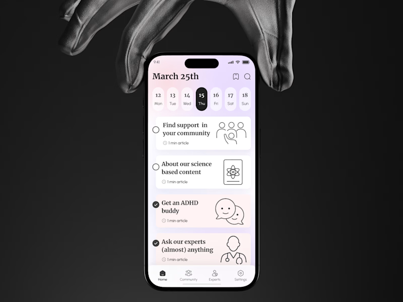
24 voted
80%
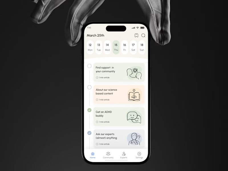
30 votes
Closed


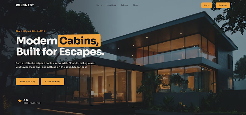
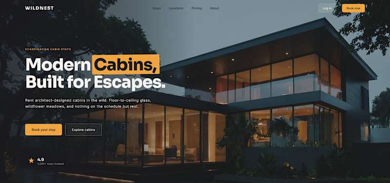
Which button do you actually want people to press?
Same hero, same two actions. The only thing I changed is their weight, and that alone decides where the eye lands.
1 – Two primaries. Both buttons solid amber. Looks confident, reads as a tie - and the visitor has to break it.
2 – One primary, one quiet. "Book your stay" stays solid; "Explore cabins" drops to a ghost. Now there's a clear first move and a calm backup.
Hierarchy isn't about adding emphasis - it's about turning one thing down so the other can lead.
Do you give the main CTA a clear winner, or keep the options equal?

6 voted
10%
57 voted
90%
63 votes
Closed


one solid one ghost, every time

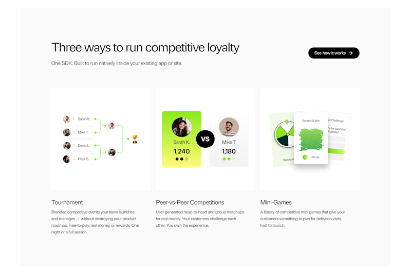
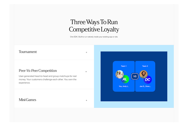
Which option will you choose and why?
Lucra: How it works Section Exploration
35 voted
76%
11 voted
24%
46 votes
Closed

A looks Good