The network for creativity
Join 1.25M professional creatives like you
Connect with clients, get discovered, and run your business 100% commission-free
Creatives on Contra have earned over $150M and we are just getting started
Back to feedPost
Taste Test


Which button do you actually want people to press?
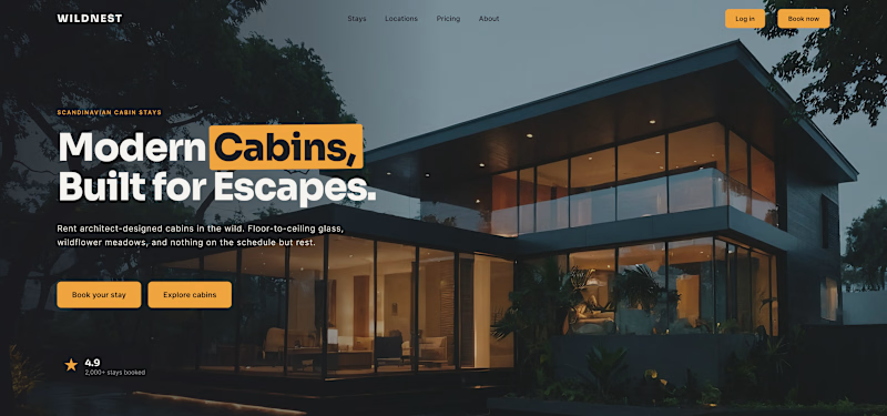
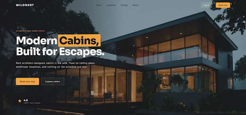
Same hero, same two actions. The only thing I changed is their weight, and that alone decides where the eye lands.
1 – Two primaries. Both buttons solid amber. Looks confident, reads as a tie - and the visitor has to break it.
2 – One primary, one quiet. "Book your stay" stays solid; "Explore cabins" drops to a ghost. Now there's a clear first move and a calm backup.
Hierarchy isn't about adding emphasis - it's about turning one thing down so the other can lead.
Do you give the main CTA a clear winner, or keep the options equal?

22 votes
Ends in 1d

Hi Serge! I prefer option 2 because the visual imbalance between a filled button and an outlined one creates the perfect contrast to guide the user. The filled button instantly grabs attention for the primary action, which naturally draws the eye to the adjacent one as well. In...


one solid one ghost, every time

Option 2 looks better that way, one solid other transparent

clear winner all the time
The network for creativity
Join 1.25M professional creatives like you
Connect with clients, get discovered, and run your business 100% commission-free
Creatives on Contra have earned over $150M and we are just getting started
Trending

Claude
Claude has entered the design space. How are you using it?

Contra University
Learn from expert creatives how to earn more using next-gen AI tools.
Brand Design
The best brand designers are on Contra. Scroll to see what's trending in brand design. What are you building?
creativeaiflow
Creative AI workflows are evolving. What tools do you use, and what are their strengths and weaknesses?
freelancerlife
Freelancer life is wins, pivots, and everything in between. What’s yours right now?





Related posts

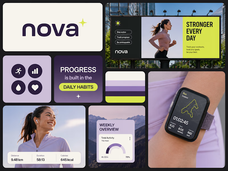
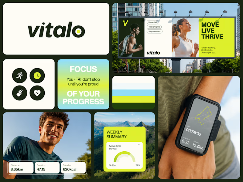
I’ve designed two branding concepts, and I’d love your feedback. Which one do you think stands out more?


22 voted
50%
22 voted
50%
44 votes
Closed

Superb execution!

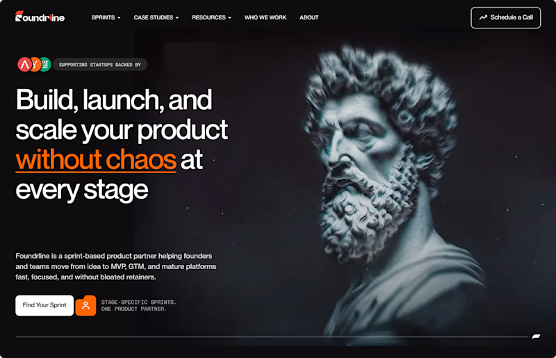
Running an A/B test on our new hero section, which one hits harder? 👀
.
.
I’m on X too, mostly thinking out loud ideas, problems, and good people to follow https://x.com/rightnextstep?s=11

10 voted
45%
12 voted
55%
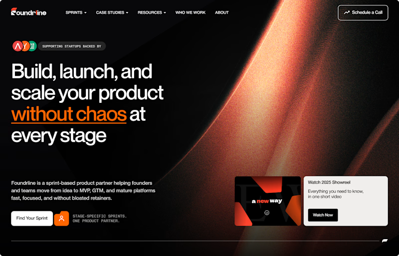
22 votes
Closed

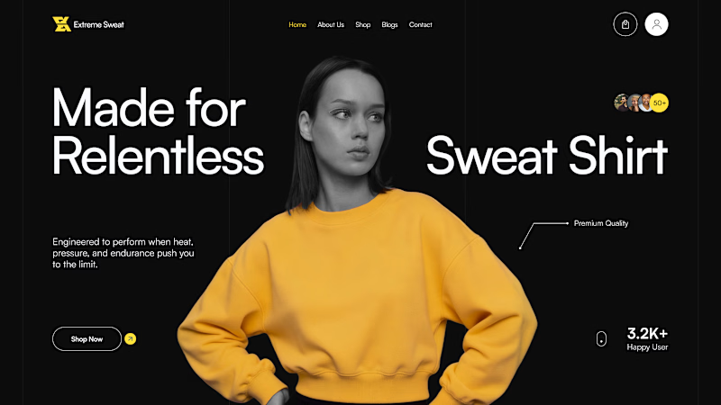
Two hero directions for Extreme Sweat, a performance sweatshirt brand built to survive what you won't. Same dark canvas, same yellow product, two different attitudes.💧
One curates the brand. The other converts the visitor.
Which hero makes you add to cart? 👇
7 voted
35%
13 voted
65%
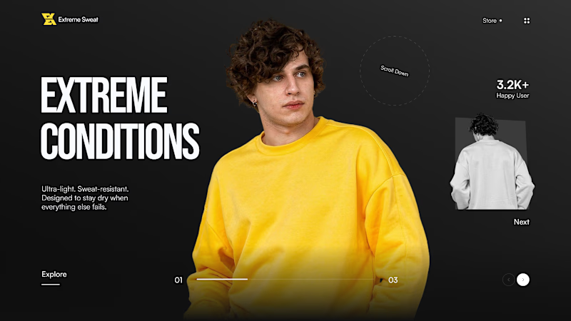
20 votes
Closed

Editorial Slider!