The network for creativity
Join 1.25M professional creatives like you
Connect with clients, get discovered, and run your business 100% commission-free
Creatives on Contra have earned over $150M and we are just getting started
Back to feedPost
Taste Test


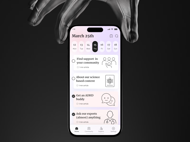
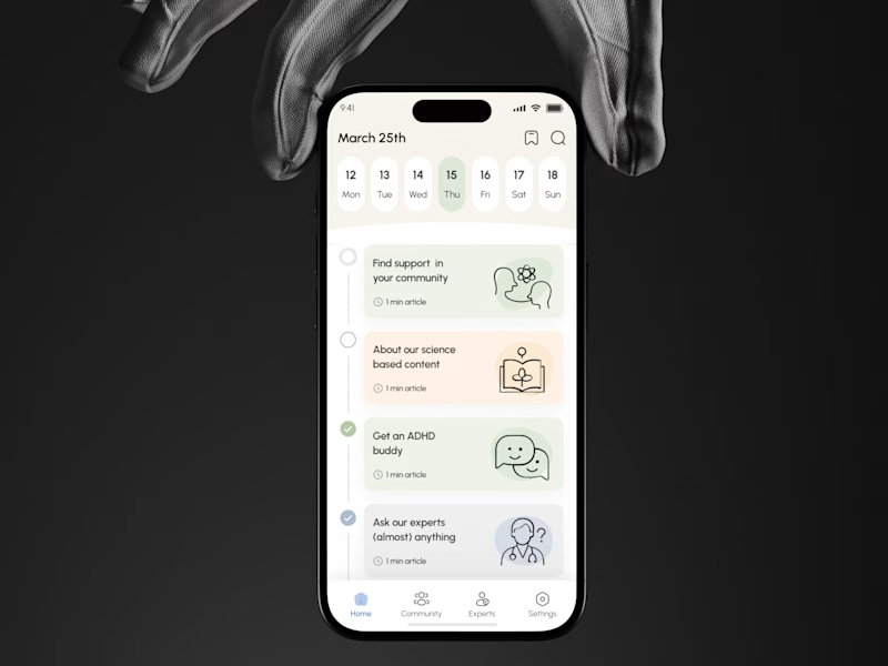
For an ADHD brain, which is better UX:
“Let me choose”
or
“Tell me what’s next”?
A gives users more freedom to scan, explore, choose.
B creates a clearer path, makes progress visible, and reduces decisions.
Neither is automatically better
But for users dealing with attention, overwhelm, & decision fatigue, structure can directly affect whether they continue or drop off
Which one creates less friction and a stronger reason to keep going?
🟣 A Let me choose
🟢 B Tell me what’s next
👉 BOOK A MOBILE APP STRATEGY SESSION
https://calendly.com/asol_design/book-diagnostic-call-linkedin-clone
If users aren’t activating, converting, or coming back, I’ll help identify where the UX is losing them.


5 votes
Ends in 1d


B. decision fatigue is the whole problem

both are lovely, but i love B! it feels more like a comforting guide than typical walk-throughs tend to be.

great work
The network for creativity
Join 1.25M professional creatives like you
Connect with clients, get discovered, and run your business 100% commission-free
Creatives on Contra have earned over $150M and we are just getting started
Trending

Claude
Claude has entered the design space. How are you using it?

Contra University
Learn from expert creatives how to earn more using next-gen AI tools.
Brand Design
The best brand designers are on Contra. Scroll to see what's trending in brand design. What are you building?
creativeaiflow
Creative AI workflows are evolving. What tools do you use, and what are their strengths and weaknesses?
freelancerlife
Freelancer life is wins, pivots, and everything in between. What’s yours right now?





Related posts

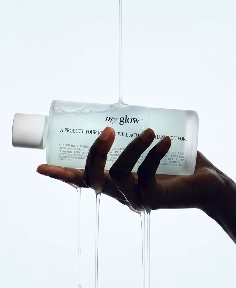
Which one to use as a cover for an insta carousel ?
89 voted
80%
22 voted
20%

111 votes
Closed

Great work





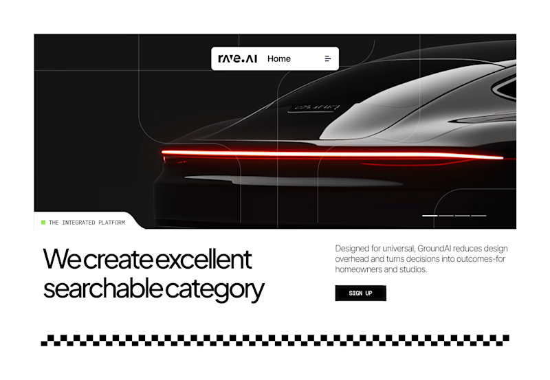
Which Hero Section works best for this use-case?
6 voted
55%

5 voted
45%
11 votes
Closed