The network for creativity
Join 1.25M professional creatives like you
Connect with clients, get discovered, and run your business 100% commission-free
Creatives on Contra have earned over $150M and we are just getting started
Back to feedPost
Taste Test

Working for one the client project, client insisting on having two seperate feature to get output.
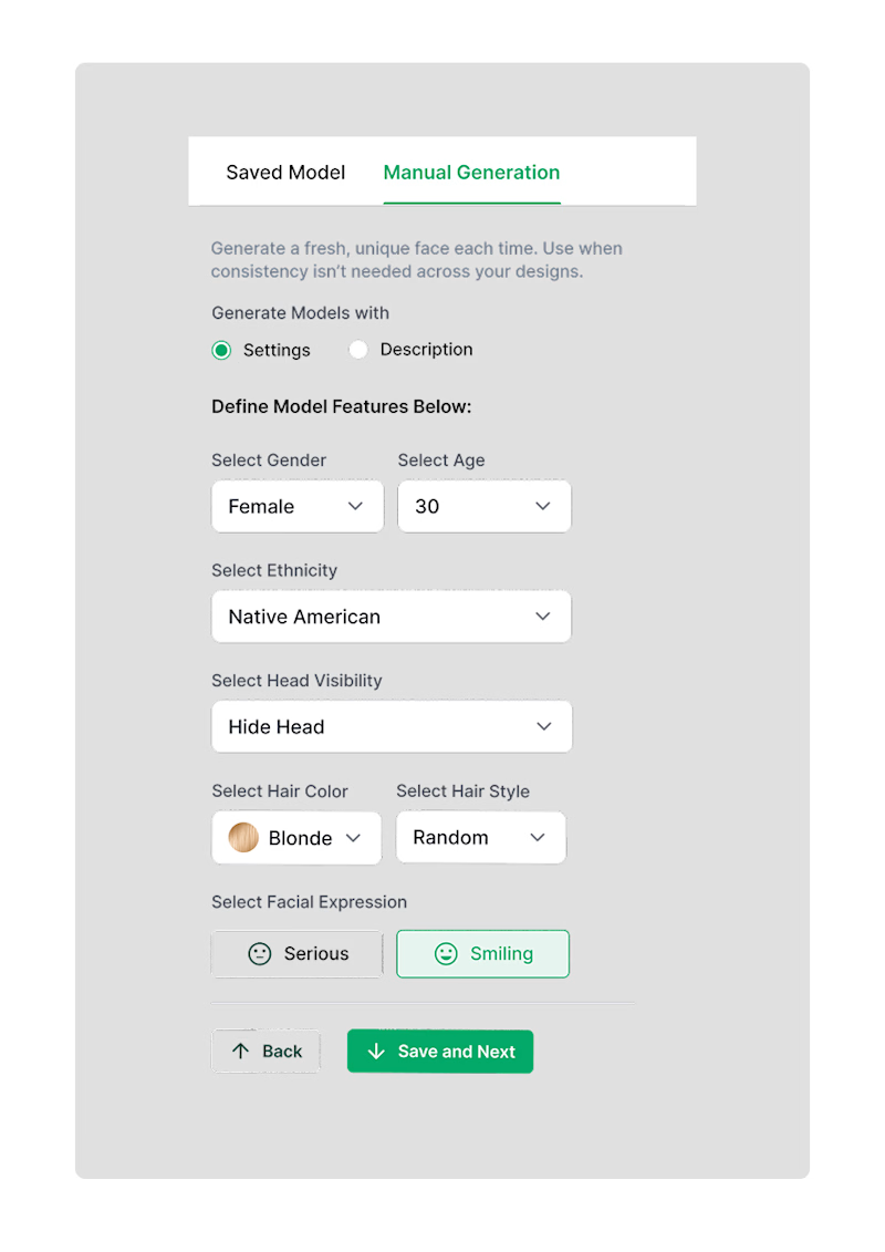
One is custom setting for users who struggle with prompt.
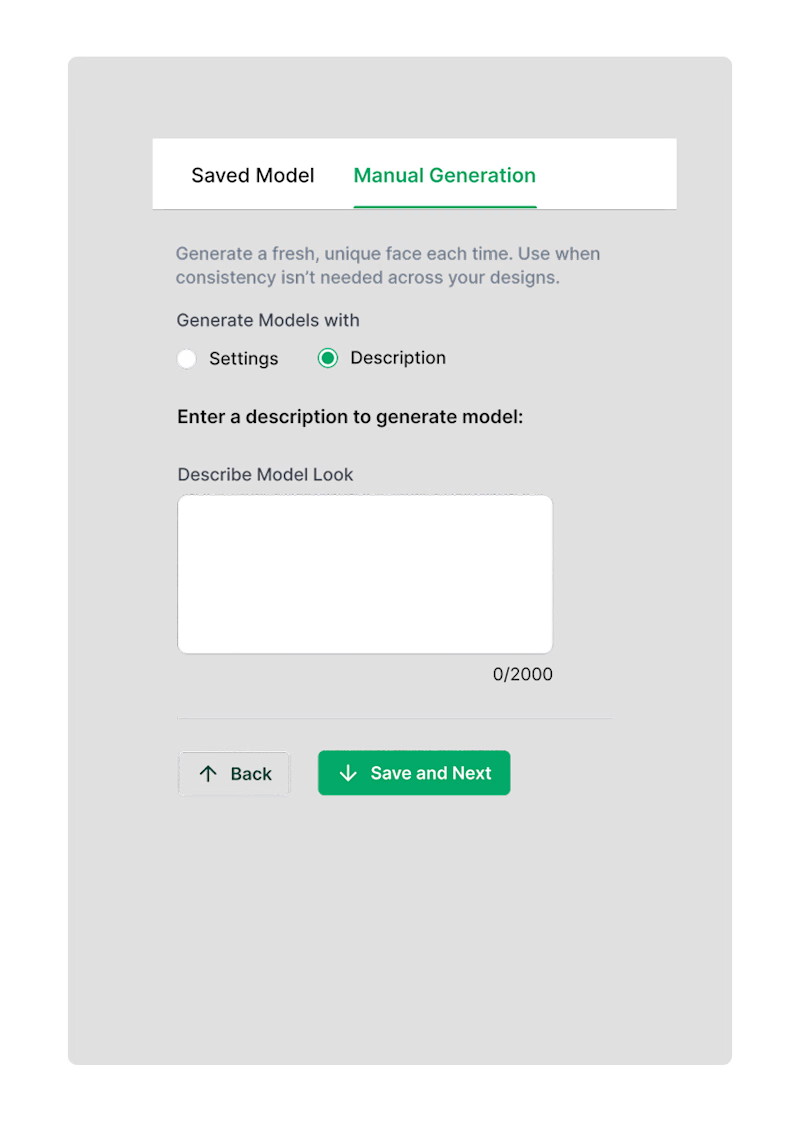
Two is purely prompt based feature which opens possibility of unlimited customisation.
What would you choose?

0 voted
0%
1 voted
100%
1 vote
Closed
The network for creativity
Join 1.25M professional creatives like you
Connect with clients, get discovered, and run your business 100% commission-free
Creatives on Contra have earned over $150M and we are just getting started







Related posts


Check it out
Just published: 0-1 design for an Energy Management System (EMS) ⚡
Designed a desktop platform monitoring wind turbines, PV parks, and battery storage across multiple sites. Keeping the interface mostly white, so green and red status indicators do the talking.
Operators managing critical infrastructure need to assess system health instantly. No visual noise, no cognitive overload. Just unmistakable state communication.


Cool work 👌



Visual identity revision for a psychology and management consulting firm


handsome works! anyway did you use any ai to generate mockups on that? or you did manual

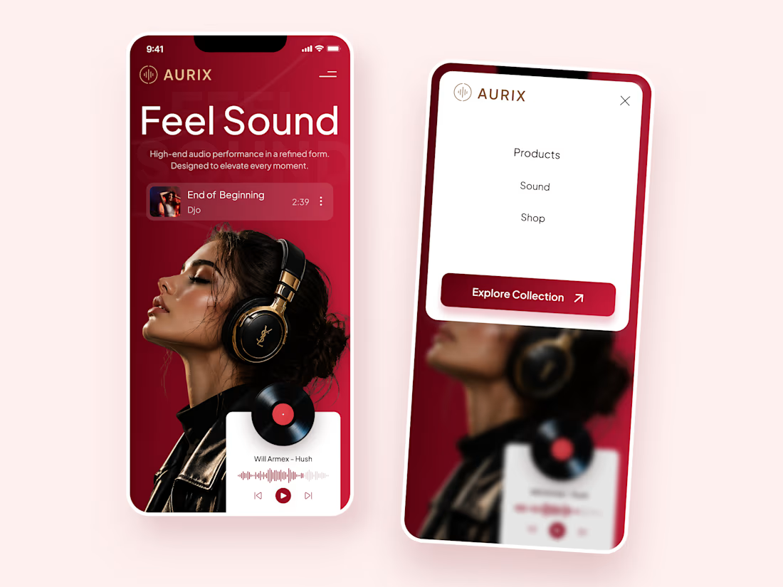
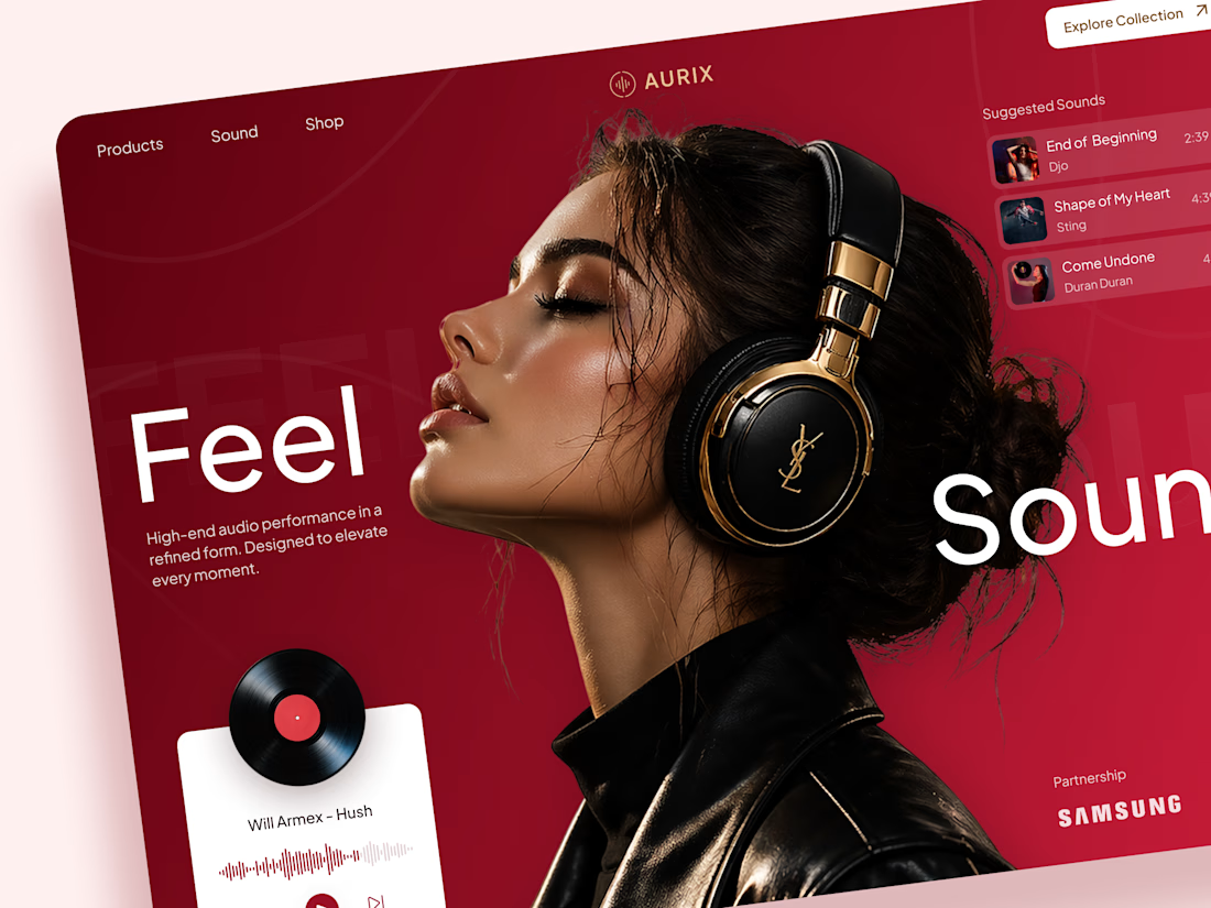
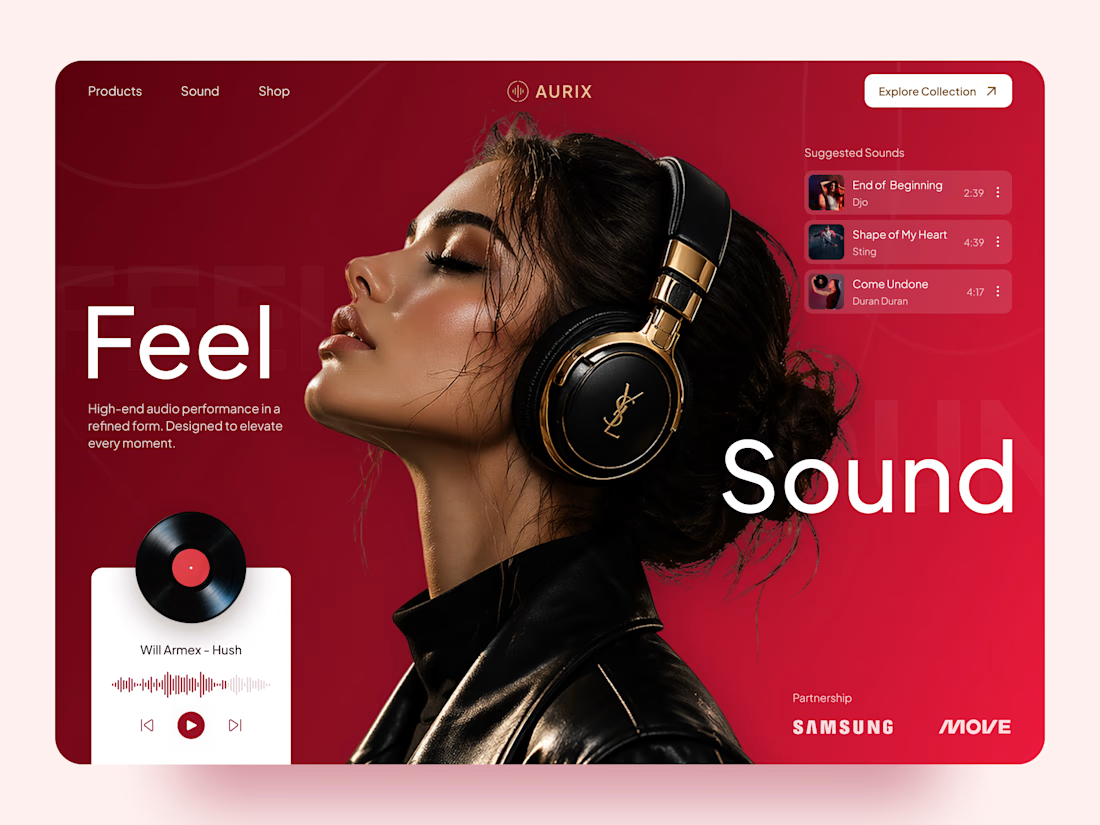
AURIX — Premium Headphones Landing Page 🎧❤️
A bold landing page concept for a premium audio brand, combining luxury headphones, music, and a strong lifestyle aesthetic
The design brings together deep red tones, elegant black and gold details, oversized typography, and immersive lifestyle imagery to create a modern, fashion-inspired experience
Special attention was given to:
• Bold lifestyle-focused hero composition
• Rich red and gold color palette
• Clean, oversized typography
• Music player and suggested tracks
• Premium product presentation
• Responsive mobile experience
• Minimal navigation and clear CTA
The result is a stylish, immersive landing page that connects premium audio with fashion, music, and everyday lifestyle ✨


Love the style!