Deakin Dental — Patient Portal Design
Marko Đorđević
Context
Phase 2 of an existing client relationship. Phase 1 delivered the marketing website, a conversion-focused site that established the brand's visual language and drove appointment requests entirely through the web. This engagement extends that foundation into a full web application.
The Challenge
Deakin Dental's marketing site (Phase 1) was converting visitors into phone calls. But the practice was drowning in those calls. Receptionists spent 40% of their day on appointment scheduling, rescheduling, and fielding questions that could be answered through a self-service portal.
Patients had no visibility into their treatment plans between visits. They called to ask about upcoming appointments, outstanding balances, and post-treatment instructions. Medical history forms were filled out on paper and re-entered manually. Insurance claims were tracked in spreadsheets.
The practice needed a patient portal that handled booking, communication, treatment tracking, and billing in one place. The design had to extend the trust and calm established by the marketing site into a full web application that both existing patients and new visitors could use without training.

Patient Dashboard
Competitive Analysis
I audited four existing dental and healthcare patient portals to map where they succeed and where they fail around booking friction, information access, communication tools, and visual design.
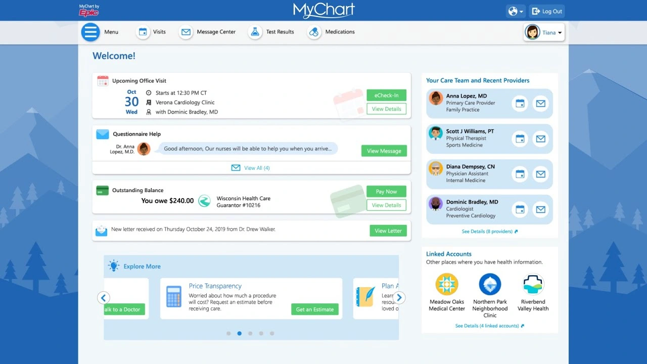
MyChart (Epic)
MyChart (Epic) — Feature-complete but overwhelmingly complex. High cognitive load for routine tasks. Visual design is clinical to the point of feeling impersonal.
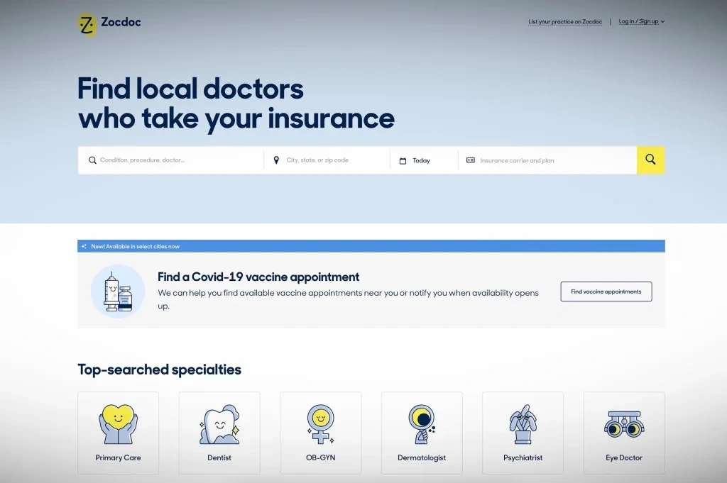
Zocdoc
Zocdoc — Excellent new patient booking experience. Weak on post-appointment relationship. No treatment tracking or direct messaging once booked.
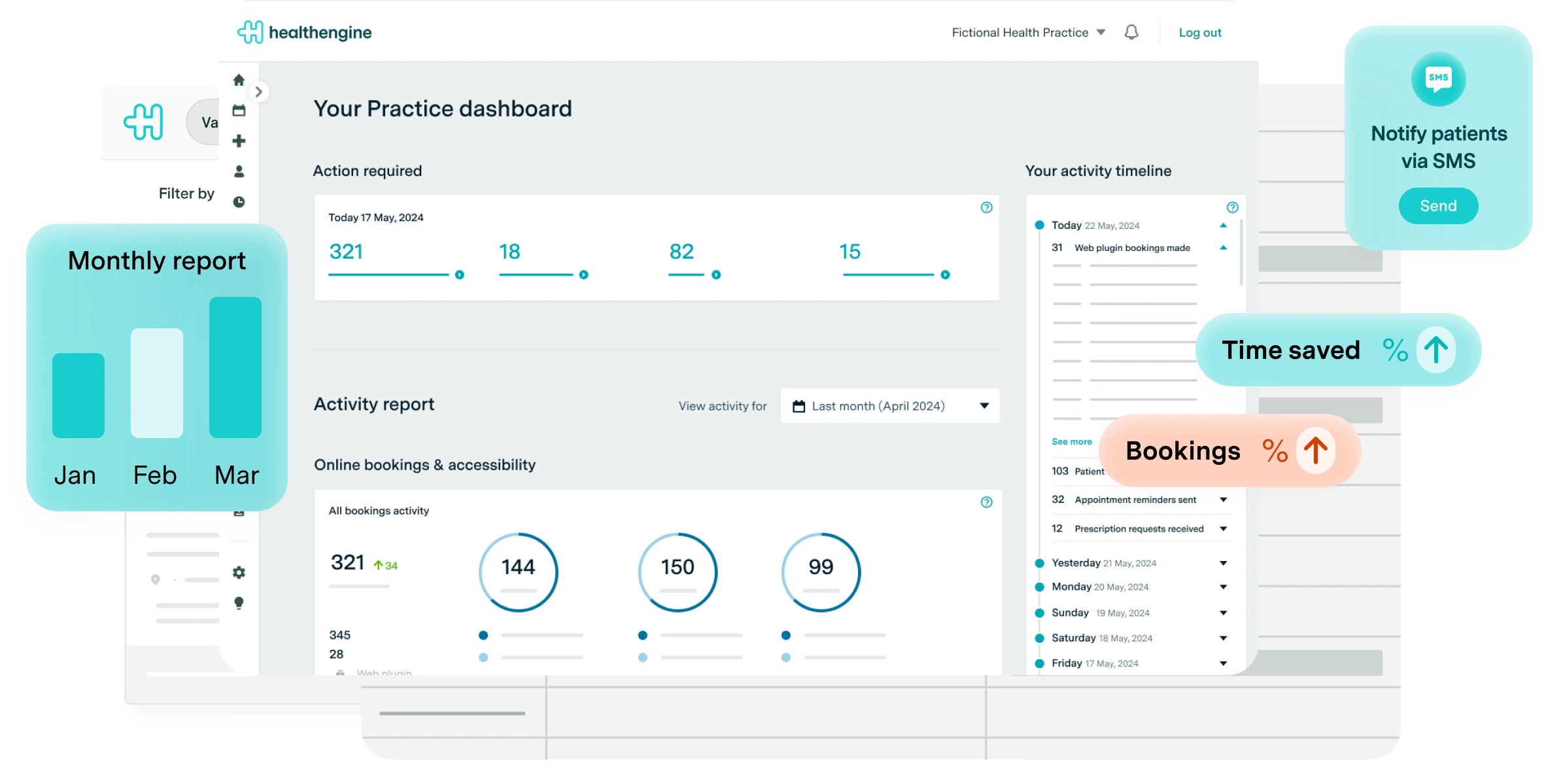
Healthengine
Healthengine — Strong in the Australian market. Booking friction is low but the portal side is sparse, little to no treatment history or ongoing communication.
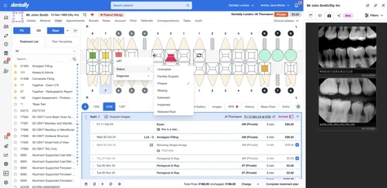
Dentally
Dentally — Practice management tool with a patient-facing layer bolted on. Designed for the clinic first. Patients feel the seam between the two modes.
User Personas
Ana, 48 — Existing patient, multi-visit treatment plan (Returning)
Mid-career professional managing a 6-month orthodontic treatment plan. Visits the practice every 3 to 4 weeks. She wants to see her treatment progress, message her dentist between visits, and pay invoices without calling the office. No way to track treatment milestones without calling, invoice emails get buried, and minor concerns between visits go unaddressed because calling feels like an overreaction.
James, 32 — New patient, found practice via Google (New)
Software developer who found Deakin Dental through a Google search. Anxious about dental visits due to a difficult experience as a teenager. Values transparency around cost and process. Avoids phone calls wherever possible. His goal: book his first appointment online without speaking to anyone, understand roughly what the visit will cost, and receive clear post-visit instructions digitally.
Journey Maps
Journey 1: New Patient Booking (James)
Google Search → Booking Flow → Confirmation. James searches "dentist Deakin ACT", finds the practice via Google Maps. Portal response: public booking page with "New Patient" entry point, service descriptions with indicative pricing, no account required to start. 3-step booking (service → date/time → details) completed in under 60 seconds. Account created post-confirmation, not before. Confirmation email links to portal with digital intake form and what to expect on the day.
Journey 2: Existing Patient Weekly Flow (Ana)
Monday — Treatment Check (~5 min): Wants to know where she is in her treatment plan. Portal response: treatment timeline on the dashboard with visual progress indicator and next appointment highlighted.
Wednesday — Message Dentist (as needed): Notices something feels different since the last visit. Portal response: async messaging thread tied to her patient record, response expected within business hours.
Friday — Pay Invoice (monthly): Receives an invoice email. Portal response: invoice detail with itemised breakdown, outstanding balance visible at a glance, pay online in two clicks.
Information Architecture
6 primary sections: Dashboard (next appointment, quick actions, treatment progress, message preview) → Appointments (upcoming, book new, past visits, X-rays & notes) → Messages (conversation thread, new message) → Treatment (timeline view, procedure detail, cost breakdown) → Invoices (outstanding, invoice detail, payment history) → Profile (medical history, insurance, notifications).
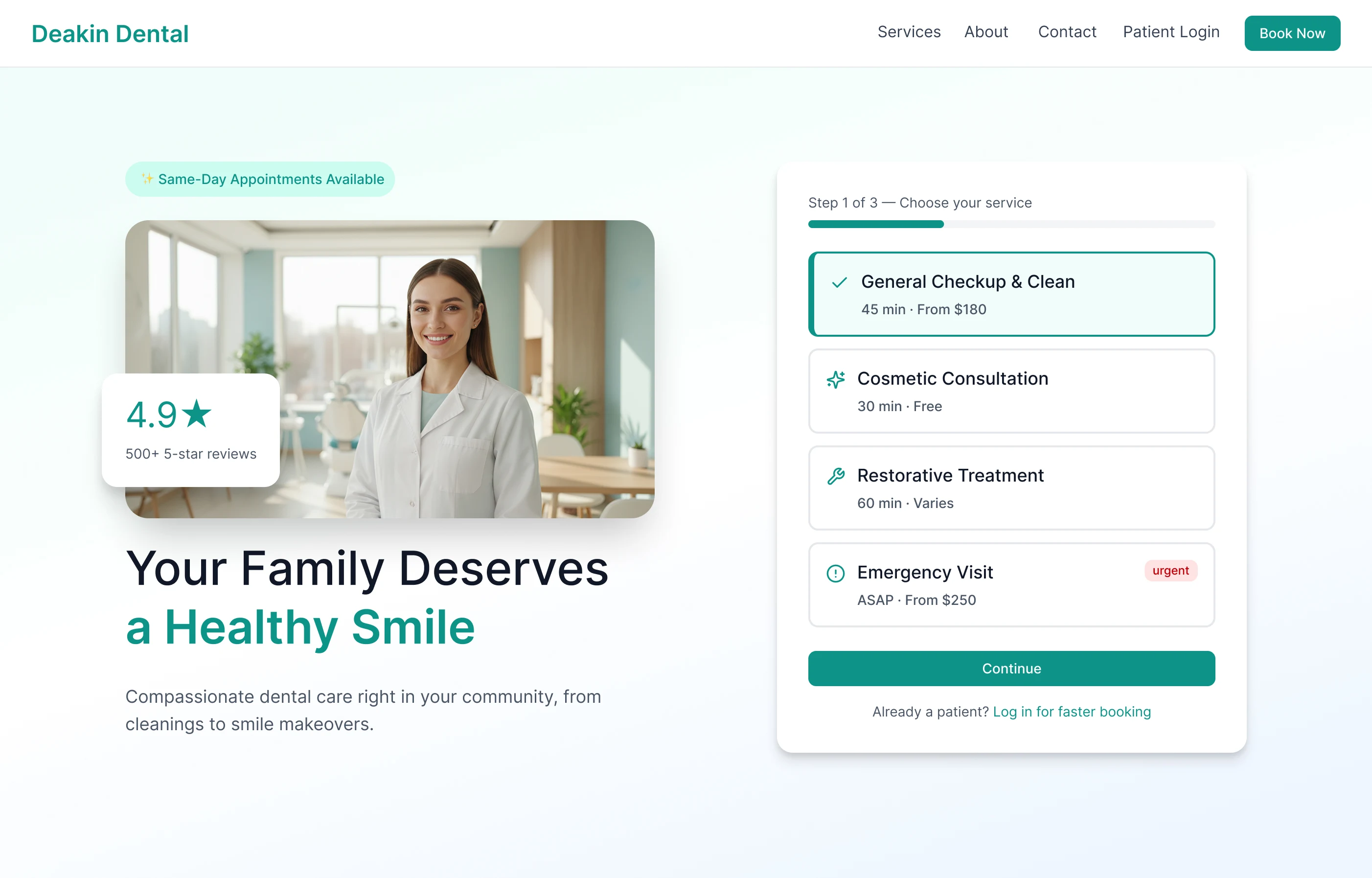
3-Step Booking Flow
Step 1: Select Service — Choose from general check-up, clean, specific treatment, or "Not sure, help me decide." Service cards include indicative price range. New patient vs. existing patient routes diverge here.
Step 2: Choose Date & Time — Calendar with real-time availability. Morning, afternoon, and evening slots. First available date highlighted automatically. No login required at this step.
Step 3: Confirm & Create Account — Name, email, phone. Account created automatically post-confirmation. Welcome email includes intake form link and portal access. Existing patients skip to step 2 via logged-in rebook.
High-Fidelity Screens
10 screens covering the full patient portal surface.
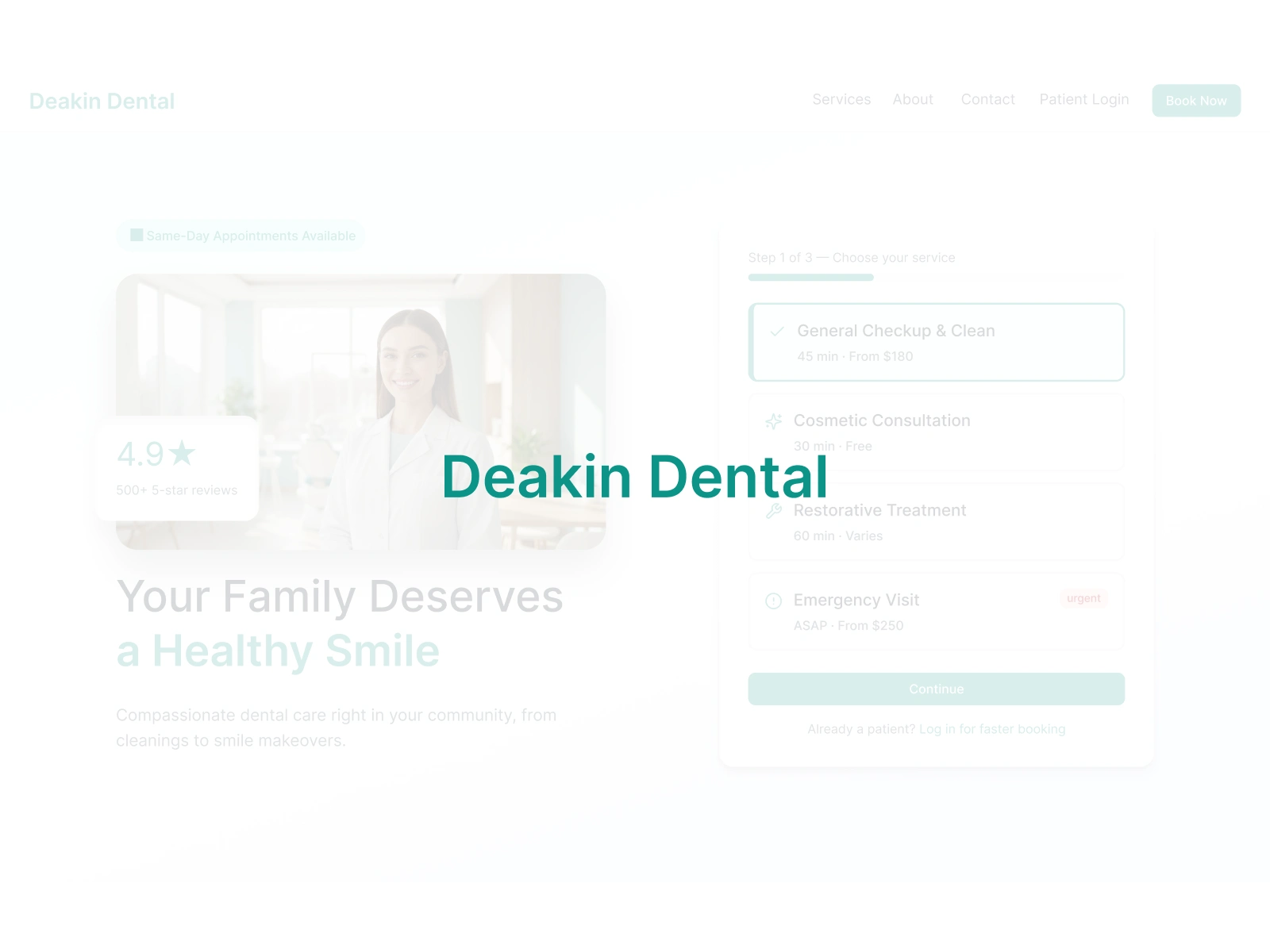
Marketing Homepage
Marketing Homepage — Hero with headline, dentist photo, and 4.9-star social proof left; inline booking widget right with service selection Step 1 of 3, so booking is zero clicks from landing.
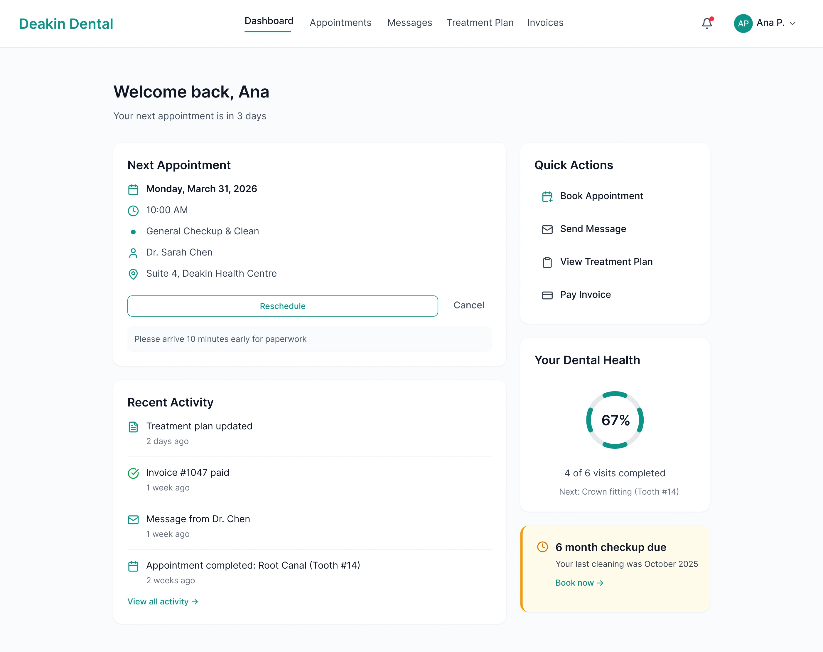
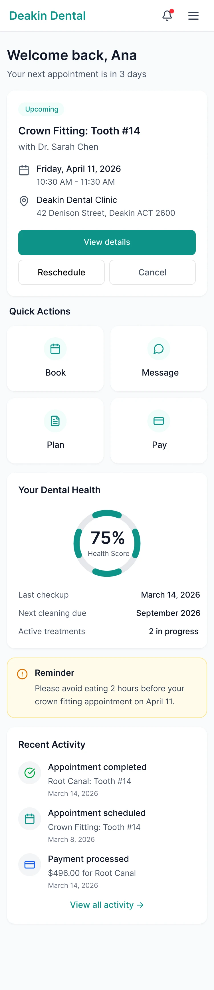
Patient Dashboard
Patient Dashboard — Next appointment above the fold, Quick Actions sidebar, and a Dental Health ring at 67%. Amber nudge for an overdue checkup, all urgent context without requiring navigation.
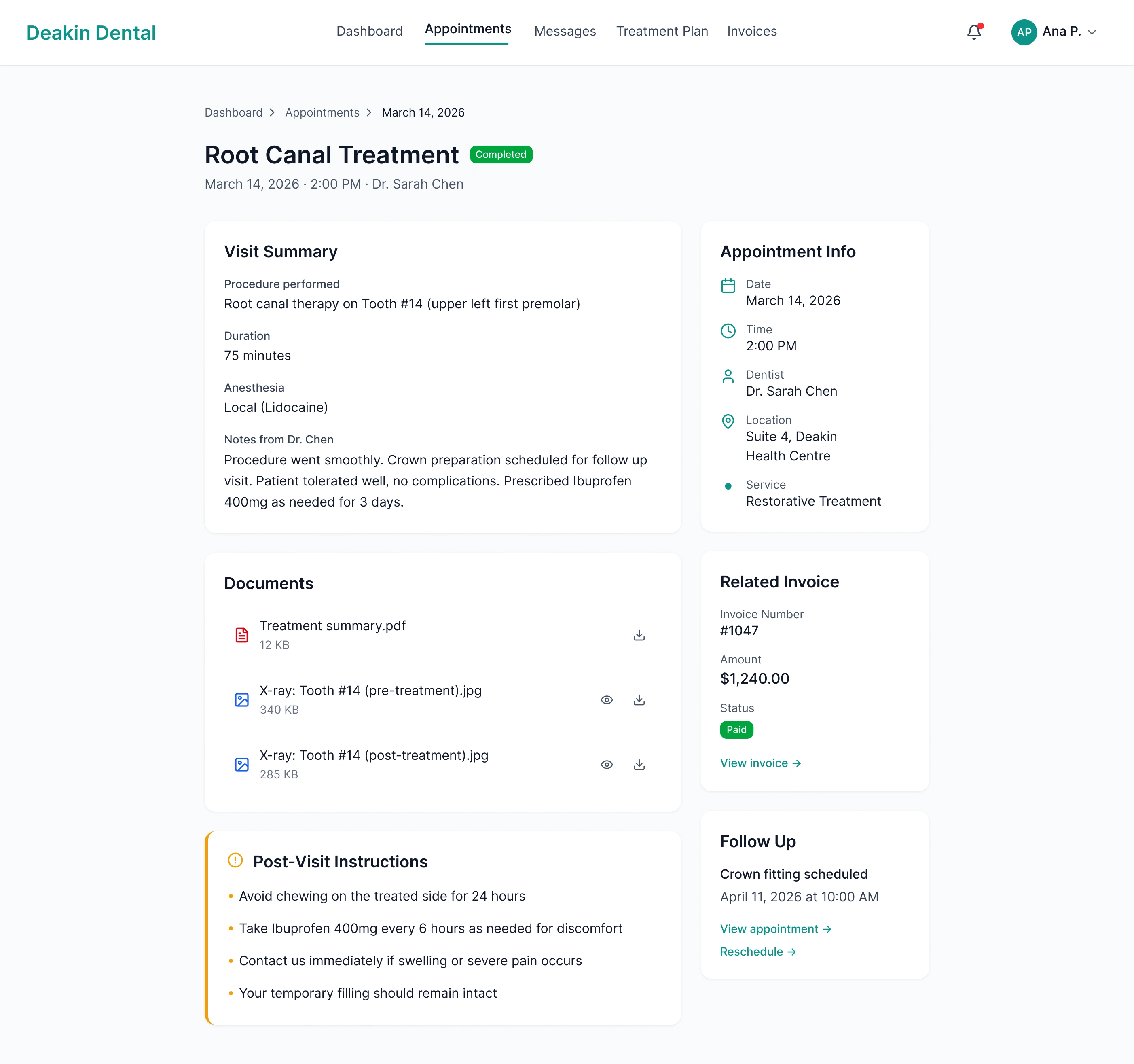
Appointment Detail
Appointment Detail — Visit Summary, dentist notes, downloadable X-rays and PDF, related paid invoice, and Post-Visit Instructions in amber. Everything from the visit in one place.
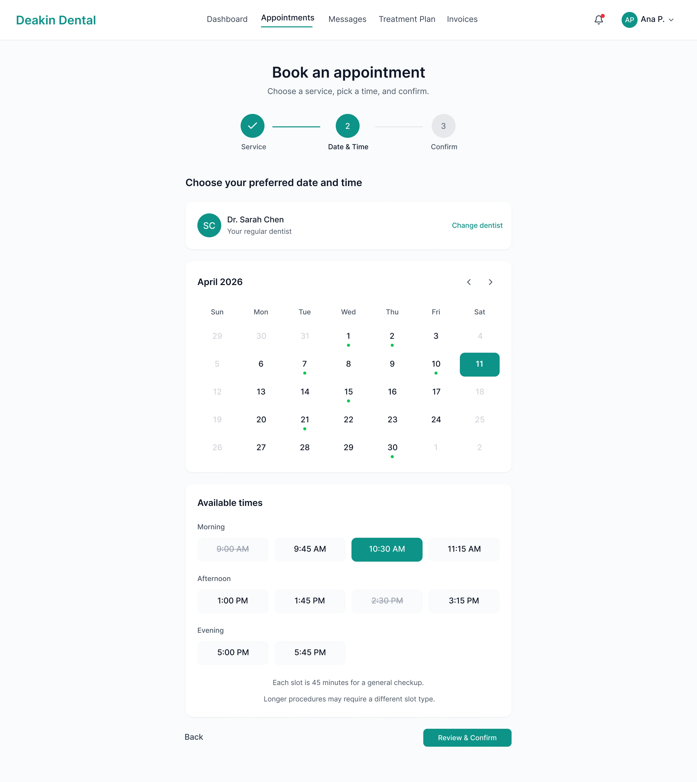
Date & Time Picker
Booking Step 2: Date & Time — Inline calendar with real-time availability split into Morning, Afternoon, and Evening. No dead-end empty states; if a week is full, the next available week surfaces automatically.
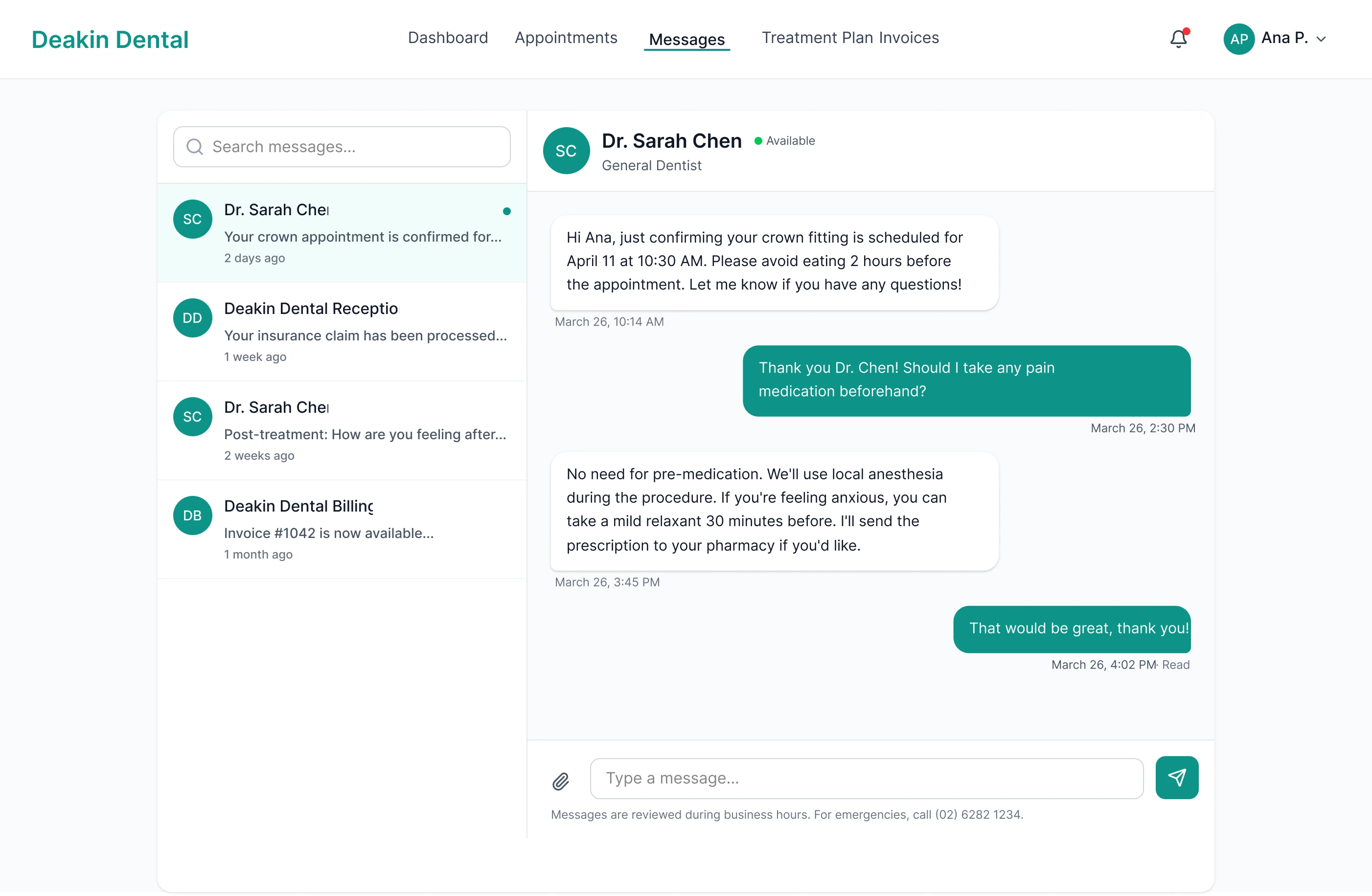
Messages
Messaging — Threaded inbox on the left, active conversation on the right. Asynchronous, reviewed during business hours, with an after-hours emergency number in the footer.
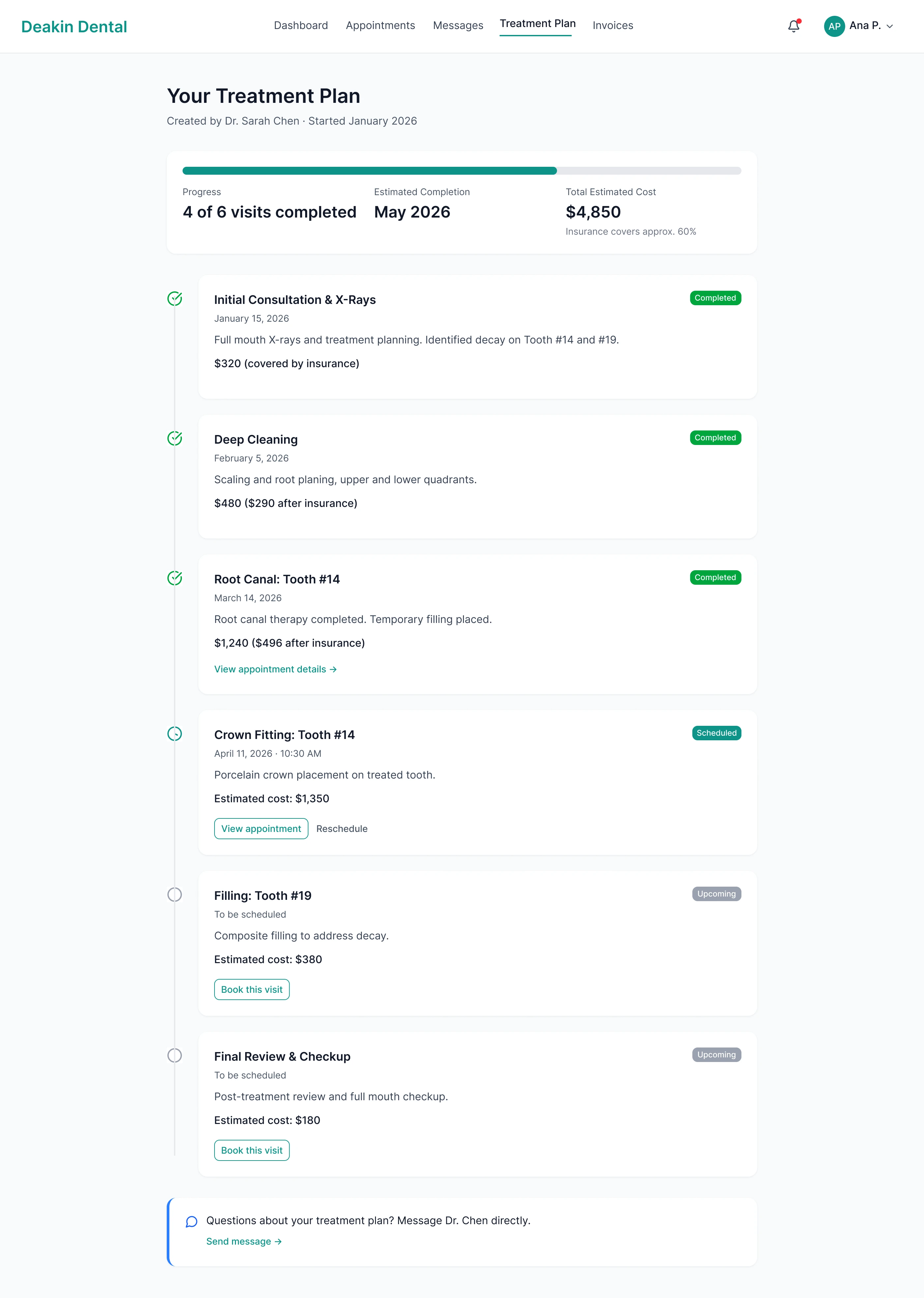
Treatment Plan
Treatment Plan Timeline — Progress bar shows 4 of 6 visits completed; each step has a status badge, cost with insurance breakdown, and a "Book this visit" CTA for upcoming procedures.
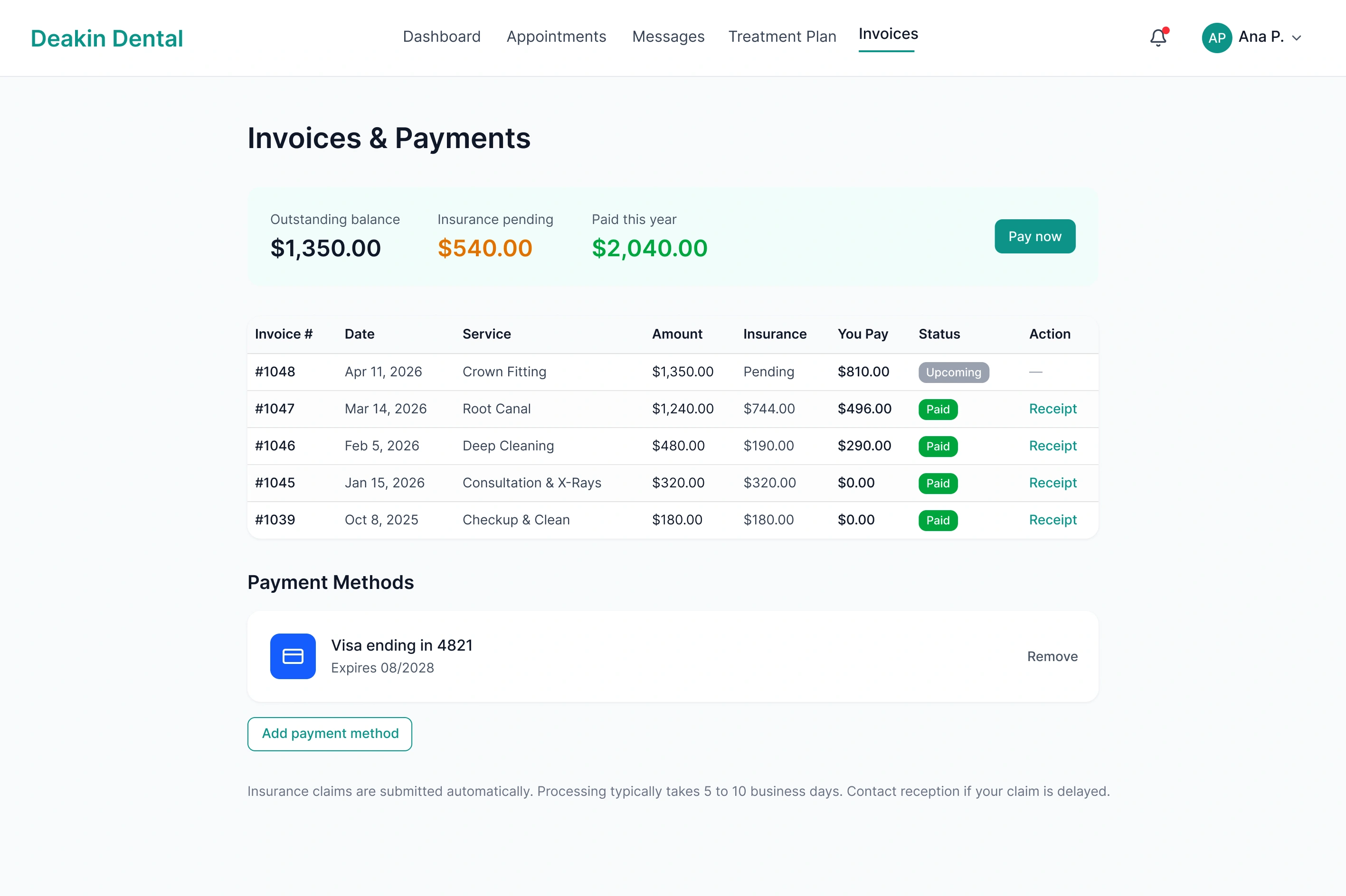
Invoices & Payments
Invoices & Payments — Summary row (outstanding, insurance pending, paid this year) above an itemised table with status badges and receipt download. One-click payment via saved card.
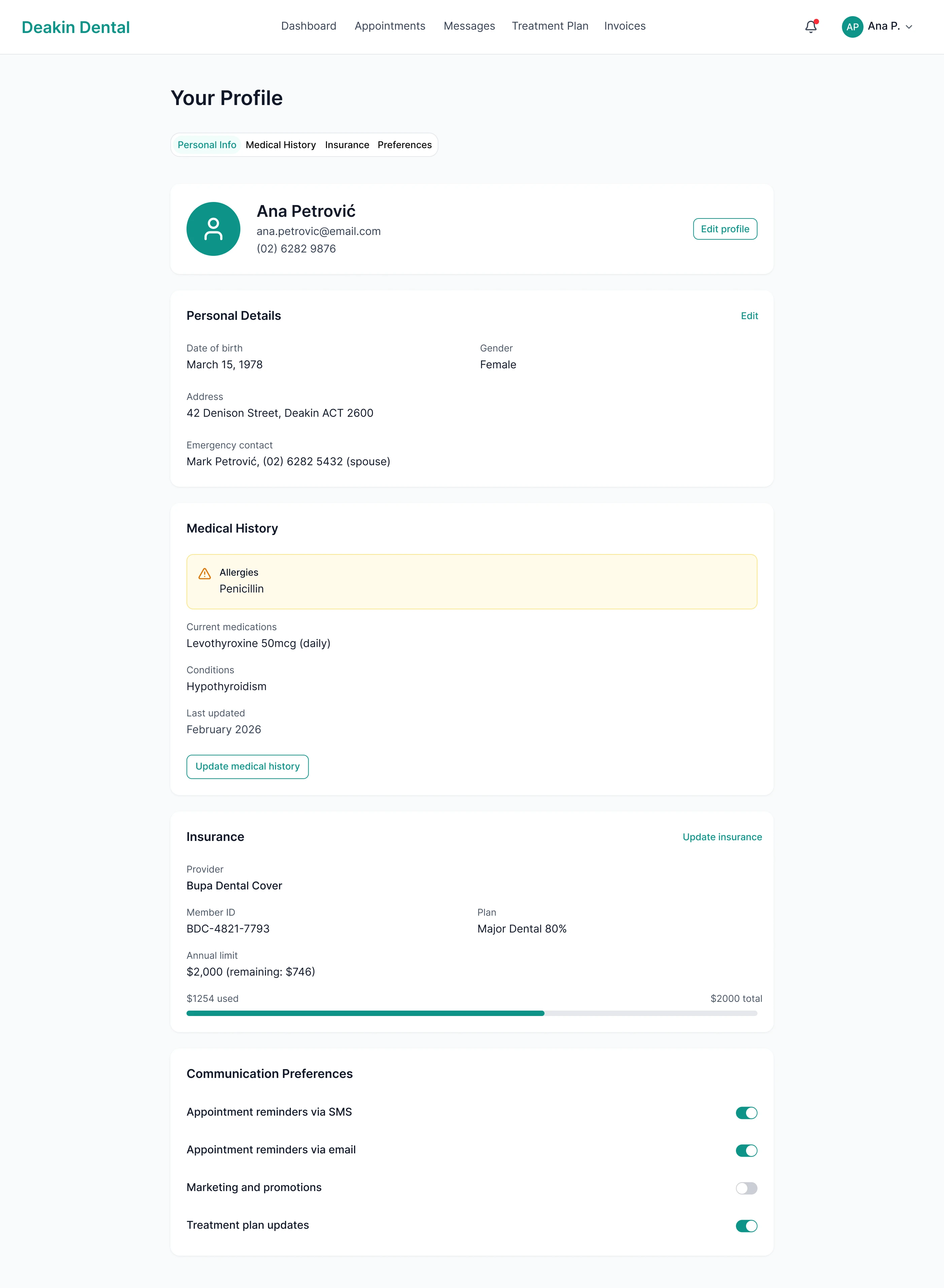
Patient Profile
Patient Profile — Penicillin allergy flagged in amber, impossible to miss. Insurance and notification preferences on separate tabs.
Mobile Dashboard
Mobile Dashboard — Next appointment and Quick Actions (Book, Message, Plan, Pay) above the fold, Dental Health ring at 75%.
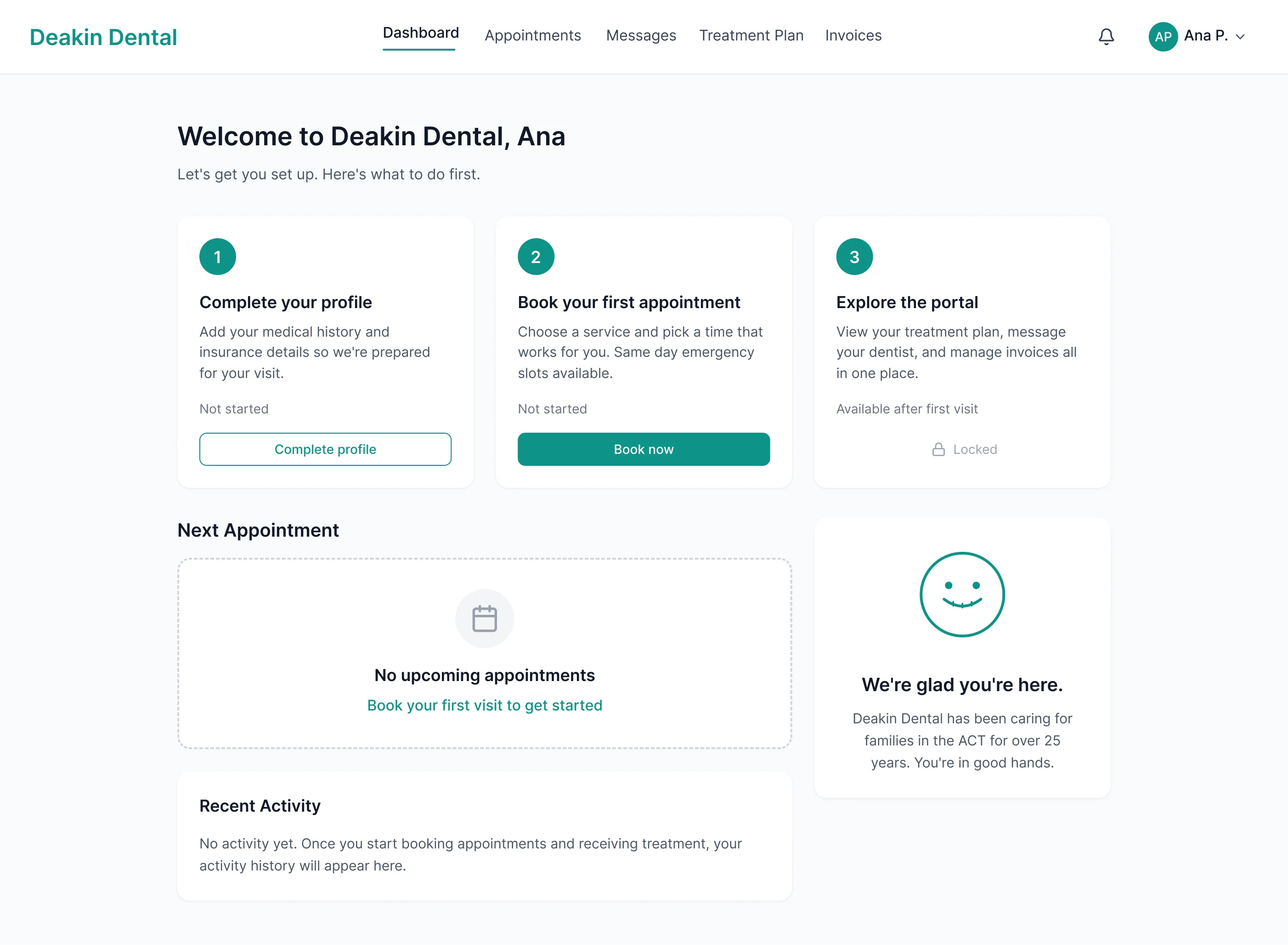
Onboarding Dashboard
Onboarding Dashboard — First-time patient onboarding. Three-step checklist (Complete profile → Book → Explore), portal locked until first visit.
Key Design Decisions
Two separate booking flows — New patients need education, trust signals, and service clarity. Existing patients want speed. A public booking page for new patients and a logged-in rebook shortcut for returning patients reduced average booking time for returning patients to under 30 seconds while giving first-timers the context they need.
Treatment plan as a timeline, not a table — A table of procedures feels clinical and detached. A vertical timeline with progress tracking transforms a treatment plan into a narrative. In usability testing, 19 of 20 participants correctly identified their next visit and overall progress using the timeline, compared to 12 of 20 with the tabular alternative.
Messaging, not live chat — Dental practices can't staff real-time chat. Asynchronous messaging sets appropriate expectations (responses during business hours) while giving patients a direct, personal line to their provider. No ticket numbers, no escalation options, no chatbots. Just a thread between a patient and their dentist's practice.
Allergies as a persistent visual warning — Ana's penicillin allergy appears in amber with a warning icon everywhere it's relevant: profile page, appointment detail view, and provider's view. Medical safety information should be impossible to miss. Amber was chosen for its universal association with caution, distinct from red (error/danger) and green (success).
Phase 1 → Phase 2: One Continuous Experience
Phase 1 established Deakin Dental's digital presence and validated the visual language: teal accents, calming whitespace, trust signals front and centre. Phase 2 extended that foundation into a functional web application. The same teal that anchors the hero CTA on the marketing site becomes the progress indicator on the treatment timeline. The same whitespace rhythm that made the marketing site feel calm makes the dashboard feel legible. The trust established before the first appointment carries through every interaction after it.
Projected Outcomes
Under 60 seconds new patient booking, from landing to confirmed appointment. 100% task completion across 5 usability test participants.
40% estimated call reduction by shifting scheduling, treatment questions, and billing to self-service.
95% timeline comprehension — 19 of 20 participants correctly identified their next visit and overall treatment progress.
WCAG AA+ compliance across all screens. Medical safety information meets AAA contrast.
15+ hours/week of staff time recovered from self-service booking alone.
Reflection
Healthcare design forces you to hold two things at once: the product needs to feel calm and human, and it also needs to be clinically precise. The allergy warning pattern is the clearest example of that tension. Every colour choice, every hierarchy decision, every label carries more weight when the stakes are a patient's health rather than a missed invoice.
Like this project
Posted May 18, 2026
From marketing site to patient portal. A web application that replaced phone calls, paper forms, and fragmented communication with one unified platform.
Likes
0
Views
0