Senyu — Fine Dining Website
Marko Đorđević
The Challenge
Fine dining is sold on atmosphere before a single dish is served. This restaurant's food and ambiance were exceptional, but a generic website would send prospective guests straight to a competitor who could communicate that prestige digitally. Every pixel needed to justify the reservation.
Most restaurant websites default to generic templates: stock photography, OpenTable embeds, and menus buried as PDF downloads. For a restaurant at this price point, that gap between digital experience and in-person experience doesn't just underperform. It actively erodes the brand before the guest arrives.
The Brief: Build a website that communicates luxury instantly, makes menu browsing an act of anticipation, and closes the reservation in a single seamless flow. No redirects off the site, no phone calls required.
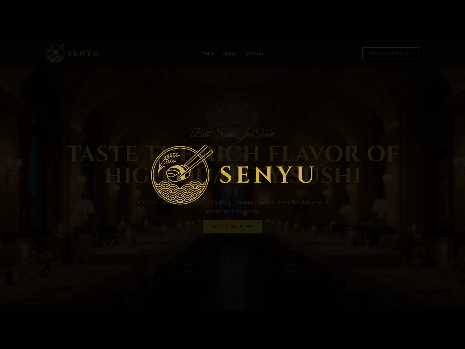
Senyu fine dining website
Competitive Analysis
I audited four restaurant website archetypes to map where the fine dining digital experience consistently fails its audience.
Nobu — Strong brand presence and photography. But reservation flows split across markets and a fragmented menu structure dilute the luxury experience at the critical conversion point.
Zuma — Excellent visual staging and atmosphere. Navigation is confident. However the menu is PDF-gated and reservations route out to SevenRooms, breaking immersion at the moment that matters most.
Typical Independent — Template sites dominate: WordPress with a restaurant theme, stock photos, and an OpenTable widget. Nothing signals exclusivity. The food has to do all the heavy lifting.
OpenTable Profile — Frictionless booking for the guest, zero brand control for the restaurant. The digital impression belongs to OpenTable, not the chef. For a restaurant competing on atmosphere, outsourcing that first impression is a brand liability.
User Personas
Aiko Kobayashi — Marketing Director, celebrating an anniversary (The Guest)
Plans special occasions with research. Visits 3-5 restaurant websites before choosing. Expects the website to validate the decision: if the site feels cheap, the experience probably is. Has booked reservations online for 8 years and will not pick up the phone if an online option exists. "If the website looks like a Squarespace template, I assume the attention to detail in the kitchen is the same."
Kenji Nakamura — Head Chef & Owner, 12-table omakase (The Owner)
18 years in fine dining, opened his own restaurant three years ago. Loses 4-6 hours a week to phone calls that could be self-serve. Has no technical staff. "I built this restaurant with my hands. The website should feel like I built that too."
The Diner's Journey
Aiko's path from discovery to confirmed reservation:
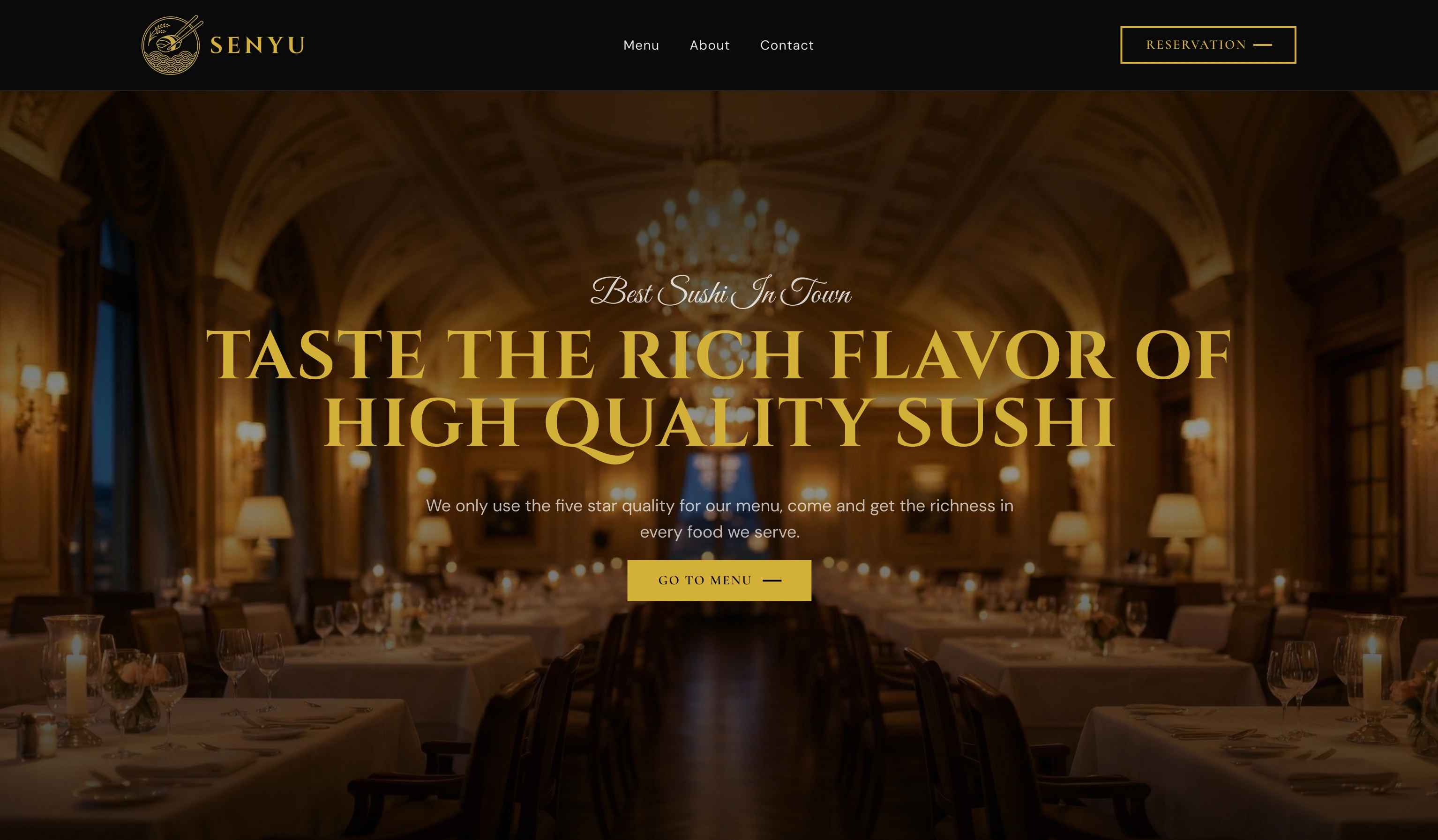
Discovery (~2 min): Searches "best sushi restaurant [city]". Most restaurant sites load slowly, display stock photography, and provide no immediate signal of quality. Design response: hero section with full-bleed food photography, gold-tinted headline, and a single CTA. Atmosphere communicated in under 3 seconds.
Menu Evaluation (~4 min): Navigates to the menu to check options and validate price expectations. PDF menus require download, render poorly on mobile, and have no design continuity. Design response: four inline menu categories (Nigiri, Sashimi, Specialty Rolls, Appetizers) with descriptions and pricing. A "Today's Special" section adds urgency and delight.
Building Conviction (~3 min): Wants to know who is behind the food. Generic "About" pages with no personality fail here. Design response: Master Chef profile section with narrative biography beneath the reservation block. The chef becomes part of the reason to book.
Reservation (<2 min): Ready to book. Expects the process to stay within the same visual environment. Design response: inline calendar-based reservation with date picker, time selector, party size, all on one page, no redirect. The entire flow takes under 90 seconds.
High-Fidelity Screens
9 screens covering the full site experience.

Homepage Hero
Homepage Hero — Full-bleed dining room photograph sets the tone before a word is read. Gold headline and "Go to Menu" CTA sit centre-screen; navigation is minimal: Menu, About, Contact, Reservation.
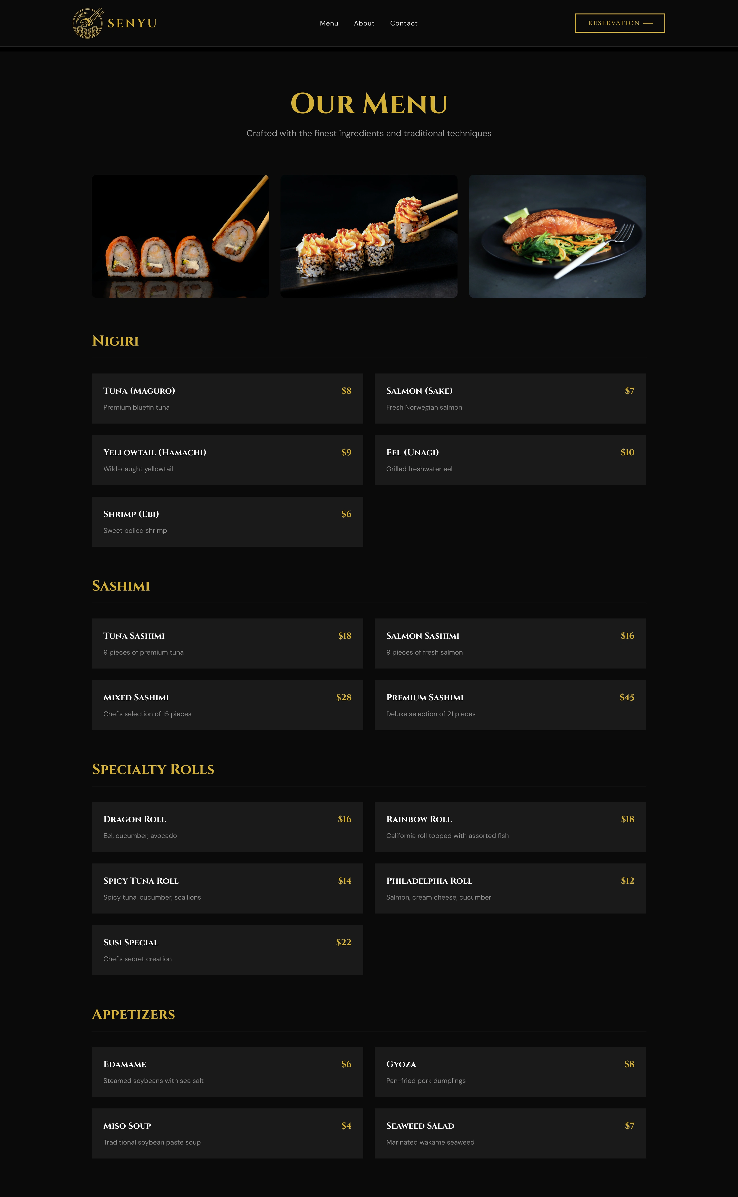
Menu Page
Menu — Photography leads each category above a browsable item grid: Nigiri, Sashimi, Specialty Rolls, Appetizers. Name, description, and price for every item. No PDF, no redirect.
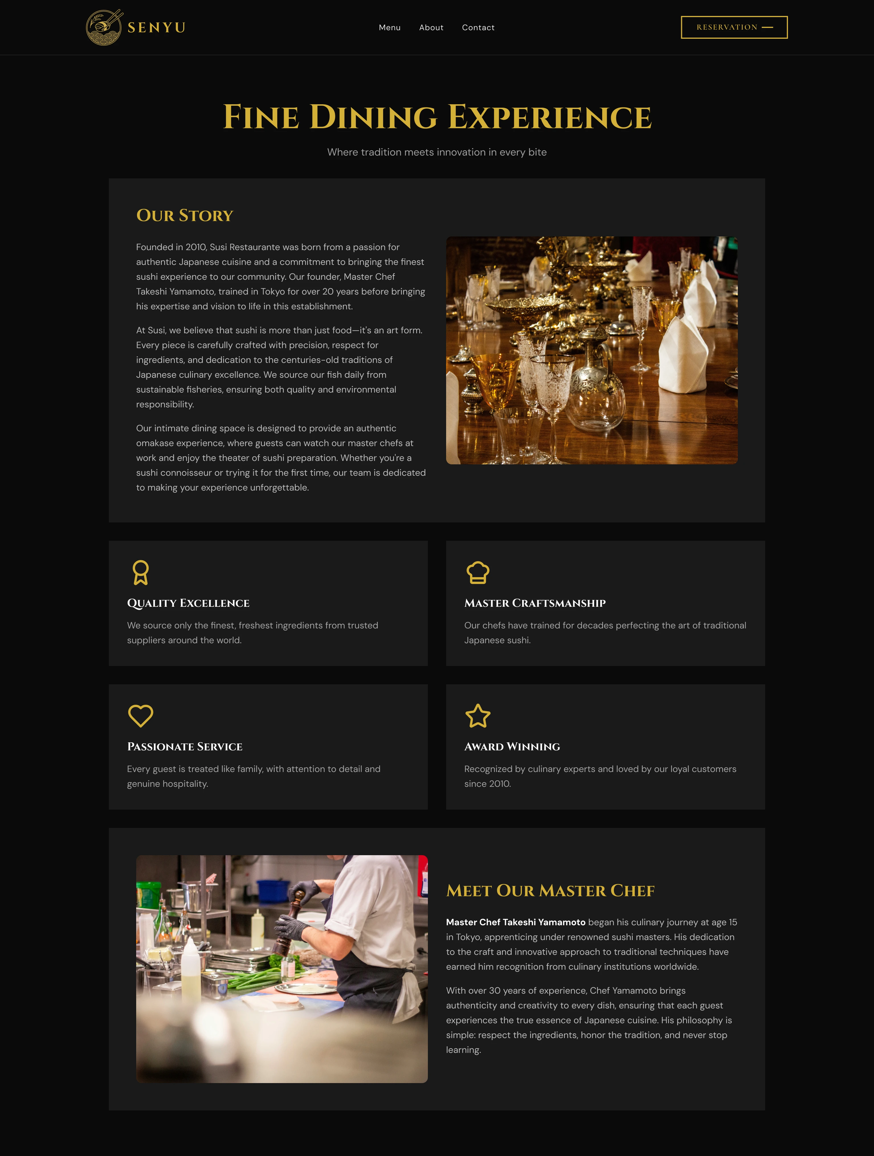
Fine Dining Experience
Fine Dining Experience — Our Story opens the page, followed by four value pillars and the Master Chef profile: portrait, biography, culinary philosophy. The chef becomes part of the reason to book.
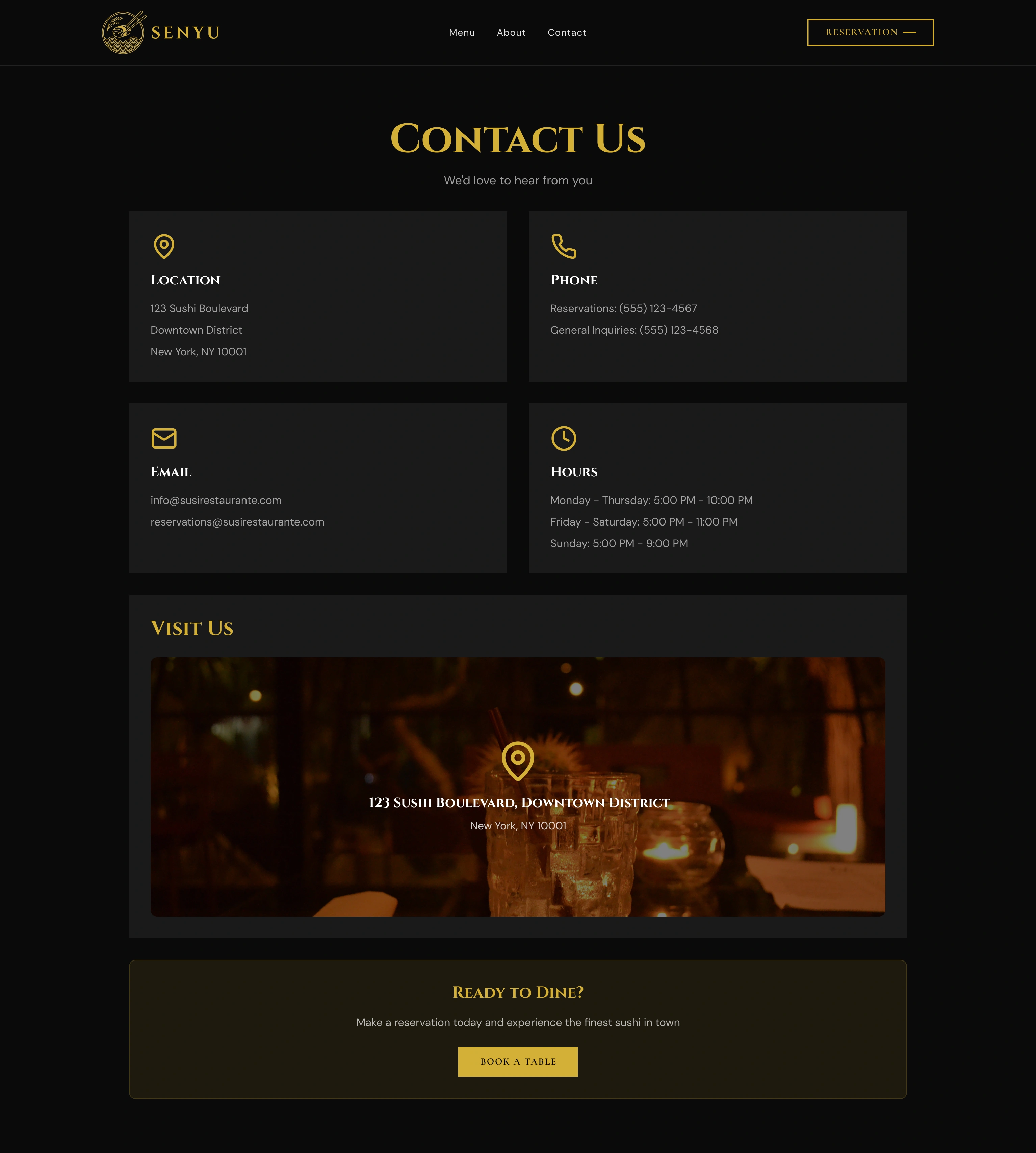
Contact Page
Contact — Location, phone, email, and hours in four equal cards for quick scanning. Full-bleed photograph with map pin and a "Ready to Dine?" CTA close the page.
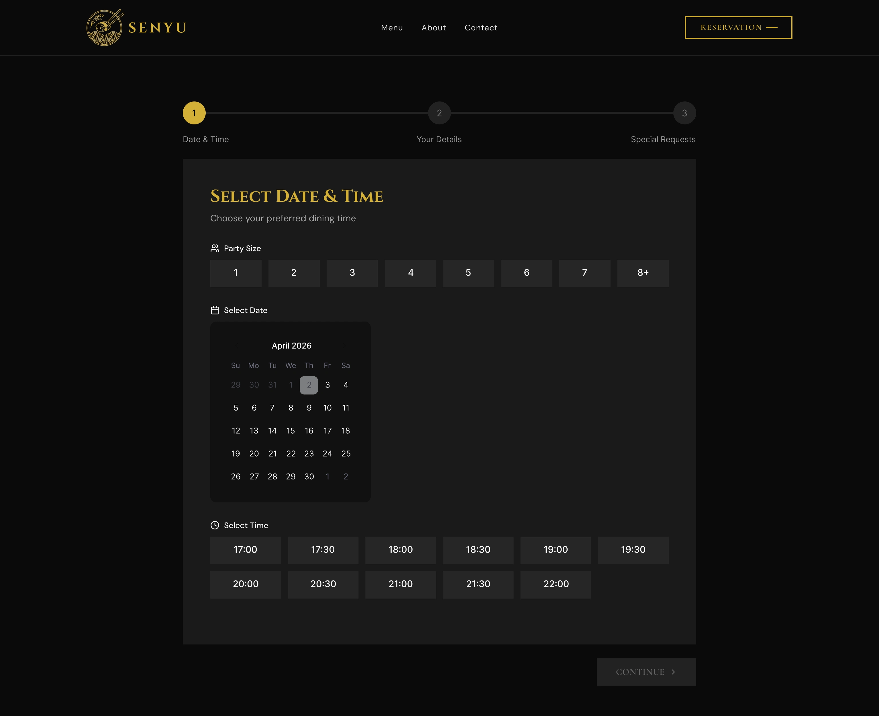
Reservation Step 1 — Default
Reservation Step 1 (Default) — Party size, inline calendar, and time slots on one screen. The 3-step progress indicator shows exactly what's ahead before the guest begins.
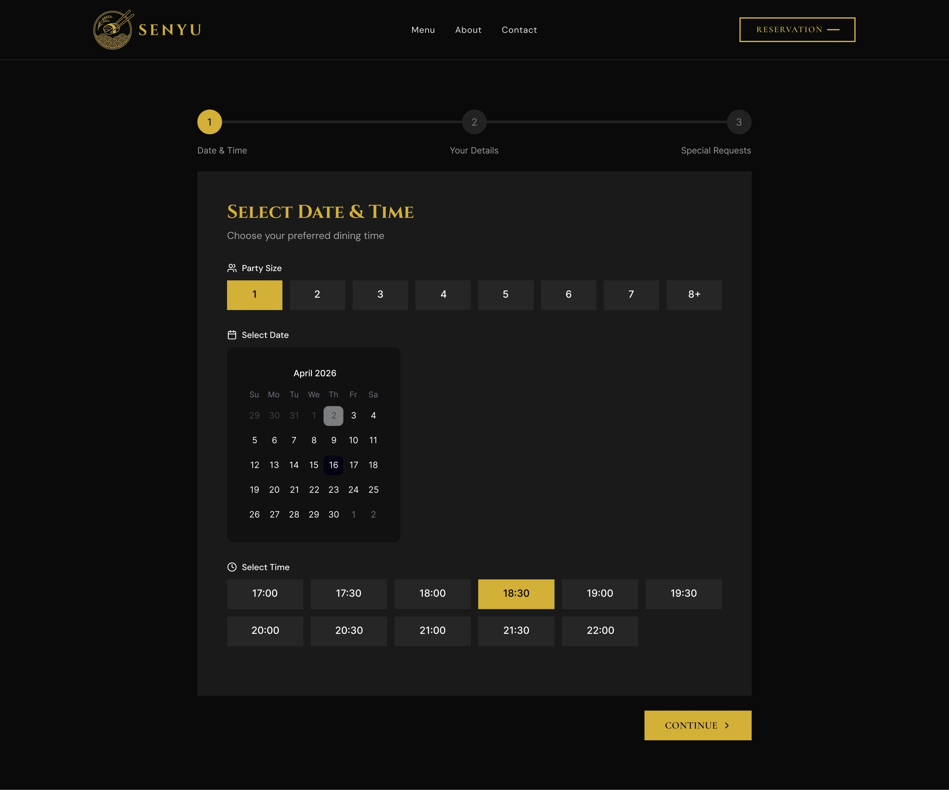
Reservation Step 1 — Active
Reservation Step 1 (Active) — Party size highlighted in gold, time slot chosen, Continue activated. The interface communicates readiness before the guest clicks forward.
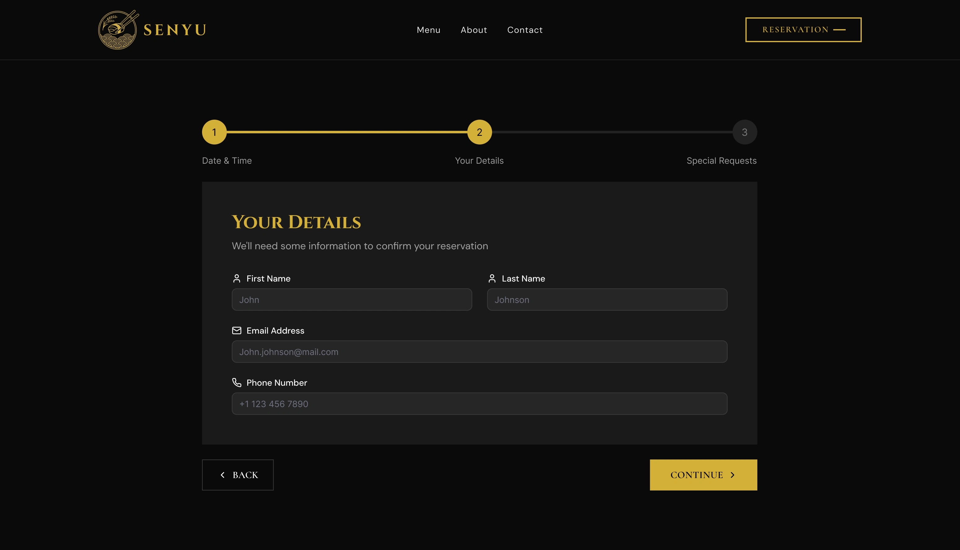
Reservation Step 2
Reservation Step 2: Your Details — Four fields only: first name, last name, email, phone. Enough to confirm and send a reminder. Back and Continue always visible.
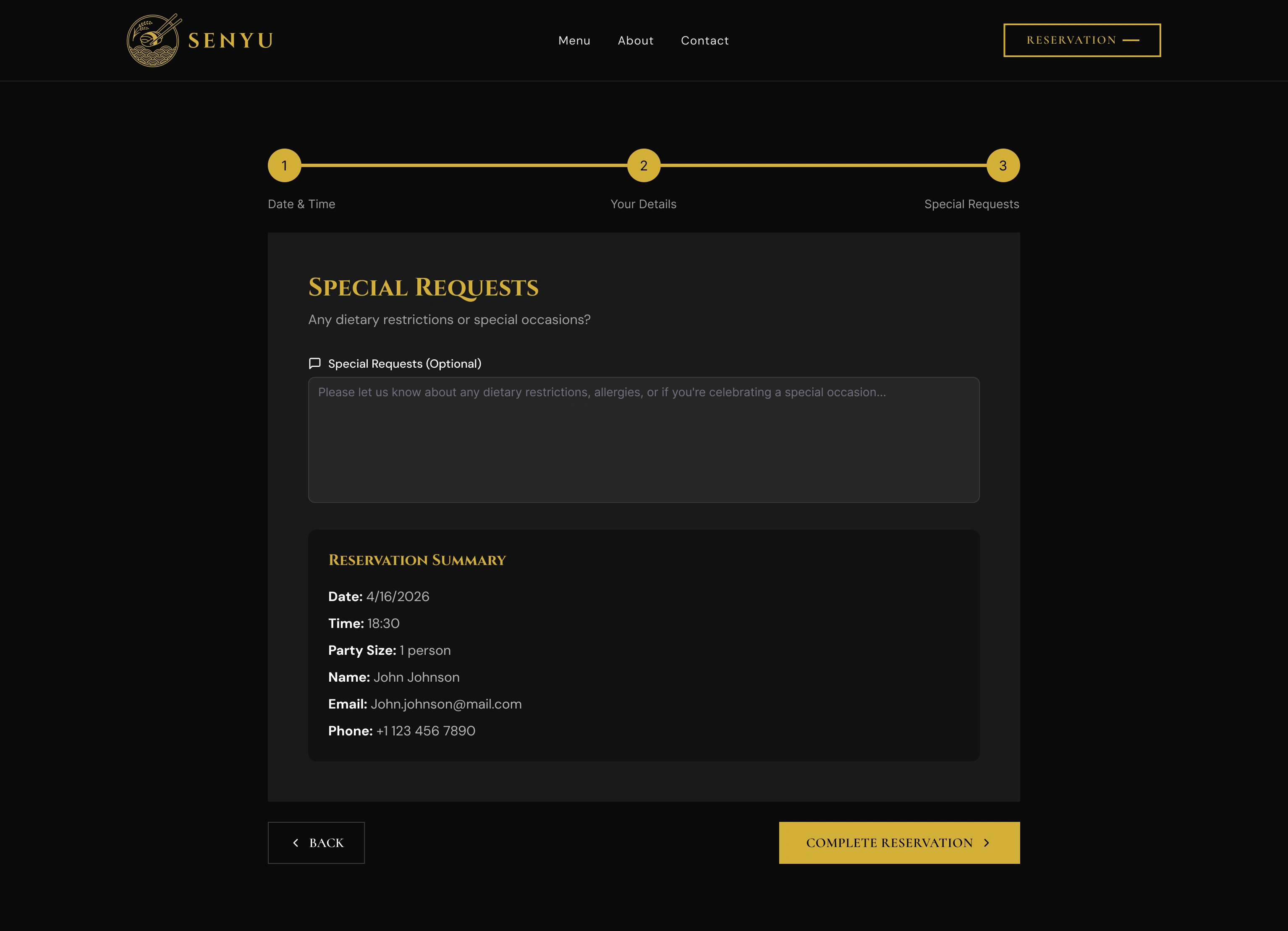
Reservation Step 3
Reservation Step 3: Special Requests — Optional textarea for dietary needs above a full booking summary. Everything reviewable before the single "Complete Reservation" CTA.
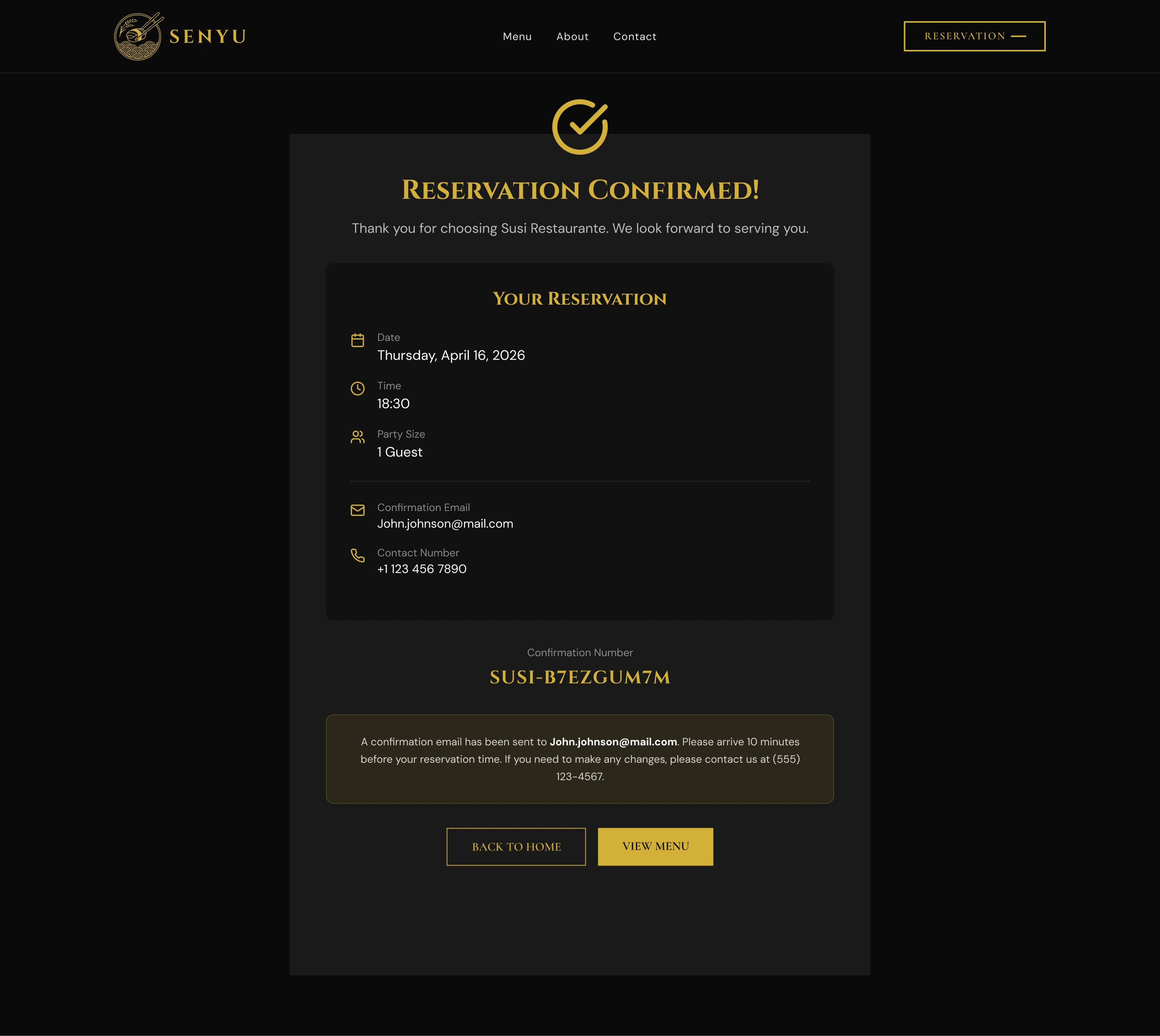
Reservation Confirmed
Reservation Confirmed — Gold checkmark, booking summary, and unique confirmation number. Two exit CTAs (Back to Home, View Menu) close the flow without a dead end.
Key Design Decisions
Dark luxury palette — Jet black with antique gold wasn't aesthetic preference. It was competitive positioning. Every restaurant website in the reference set defaulted to white or cream. A full dark canvas made the photography the subject, created instant visual distinction, and signalled craft in the design itself. Gold (#C9A258) was selected for its warmth over cooler yellows; it reads as earned, not decorative.
Inline reservation, no redirect — Every third-party reservation widget (OpenTable, SevenRooms, Resy) breaks immersion. The guest spends 4 minutes inside a crafted atmosphere, then clicks "Reserve" and lands on a generic white widget. The solution: a custom inline booking block with date picker, time slots, party size, and contact fields, all within the site's own design system. The reservation completes without the guest ever leaving the page.
Menu as experience, not information dump — A PDF menu is a failure mode. It requires a download, renders poorly on mobile, and carries no brand continuity. The inline menu was designed as a content section with four tabbed categories, each with item names, descriptions, and pricing displayed as a browsable grid. A "Today's Special" rotator sits above the menu to surface the freshest offering and drive return visits.
Chef profile as the conversion trigger — Placed immediately beneath the reservation block. At that point in the page, the guest has browsed the menu, considered the price, and is on the edge of committing. The chef's portrait, biography, and culinary philosophy turn a transaction into an occasion. It answers "is this worth it?" at the exact moment it's asked.
Delivered Outcomes
4 menu categories, fully inline — Nigiri, Sashimi, Specialty Rolls, and Appetizers with item names, descriptions, and pricing. No PDF. Browsable on any screen.
0 third-party redirects — The entire reservation flow completes on a single page with no redirect to OpenTable or any external service.
Shipped in 3 weeks — Responsive across all breakpoints. Gold-on-black. Every table reservation now begins here.
Phone calls eliminated — The owner's 4-6 hours weekly of reservation calls during service shifted to a self-serve booking system.
"Today's Special" rotator gives existing guests a reason to return to the site between visits, converting a one-visit utility page into a lightweight engagement loop.
Reflection
Luxury digital design is not decoration. It is the systematic elimination of anything that contradicts the brand promise. Every redirect, every generic widget, every stock photograph is a micro-contradiction. The discipline of this project was resisting the convenient solution (third-party booking, PDF menu) in favour of the consistent one. The result is a site where no element breaks the atmosphere, because every decision was tested against the question: does this feel like the restaurant?
Like this project
Posted May 18, 2026
Luxury web design for Senyu fine dining. Dark aesthetic, full inline menu architecture, and a custom reservation system built to earn every table booking.
Likes
0
Views
0