Numera — FinTech Dashboard Design
Marko Đorđević
The Challenge
Mid-market finance teams (50 to 500 employees) are stuck between tools built for accountants and tools built for startups. Cash flow, forecasting, and expenses live in separate platforms. The result is a fragmented workflow that consumes hours every week just to answer "where do we stand?"
The dominant solutions (QuickBooks, Xero, Sage) were built for accountants. They surface ledger detail at the expense of strategic visibility. A CFO reviewing burn rate before a board call can't afford to reconstruct that answer from raw data. The gap is not features. It is perspective.
The Brief: Design a dashboard that answers "Are we healthy?" the moment the page loads, without training or navigation, while preserving the operational depth finance managers need day to day. One product, two distinct users.

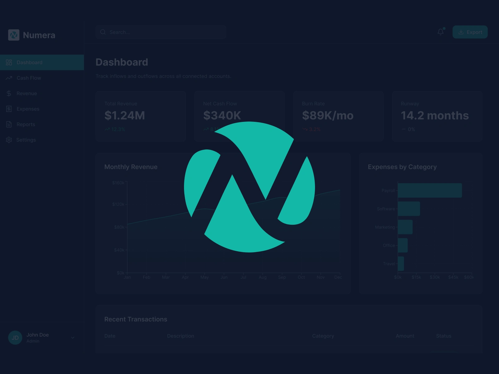
Numera dashboard overview
Competitive Analysis
I audited Stripe Dashboard, Mercury, Brex, and QuickBooks to map what each does well and where they fall short for finance leaders who need strategic, not transactional, visibility.
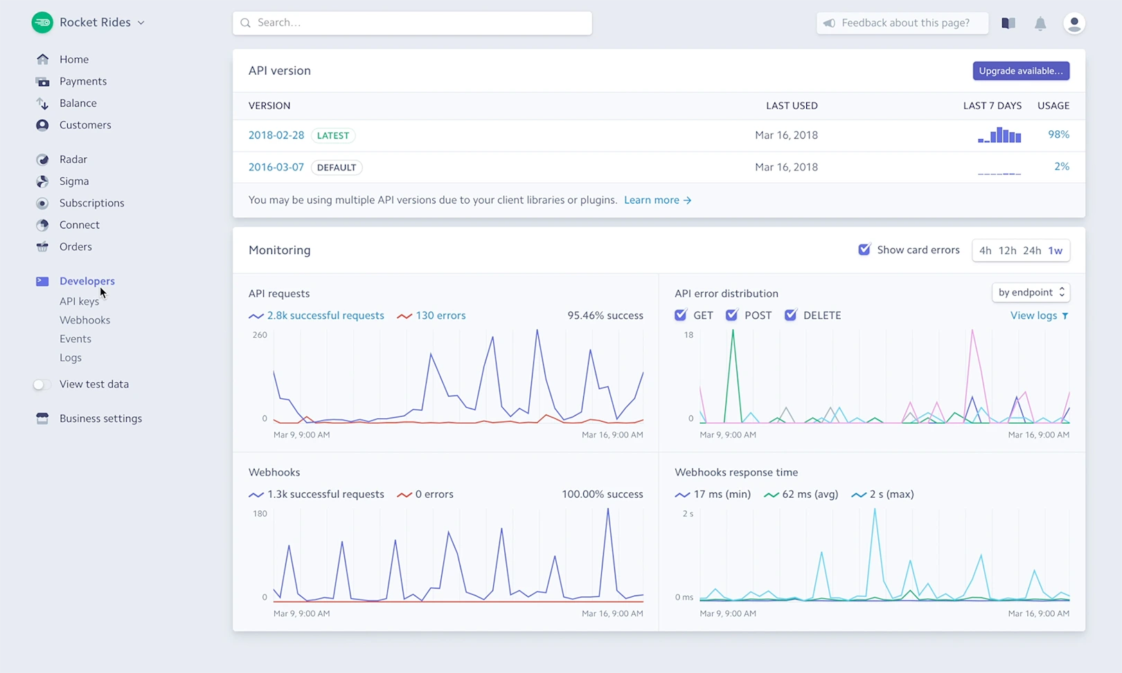
Stripe Dashboard
Stripe Dashboard — Developer-first. Clean visual language and real-time data, but built for payment ops, not finance strategy.
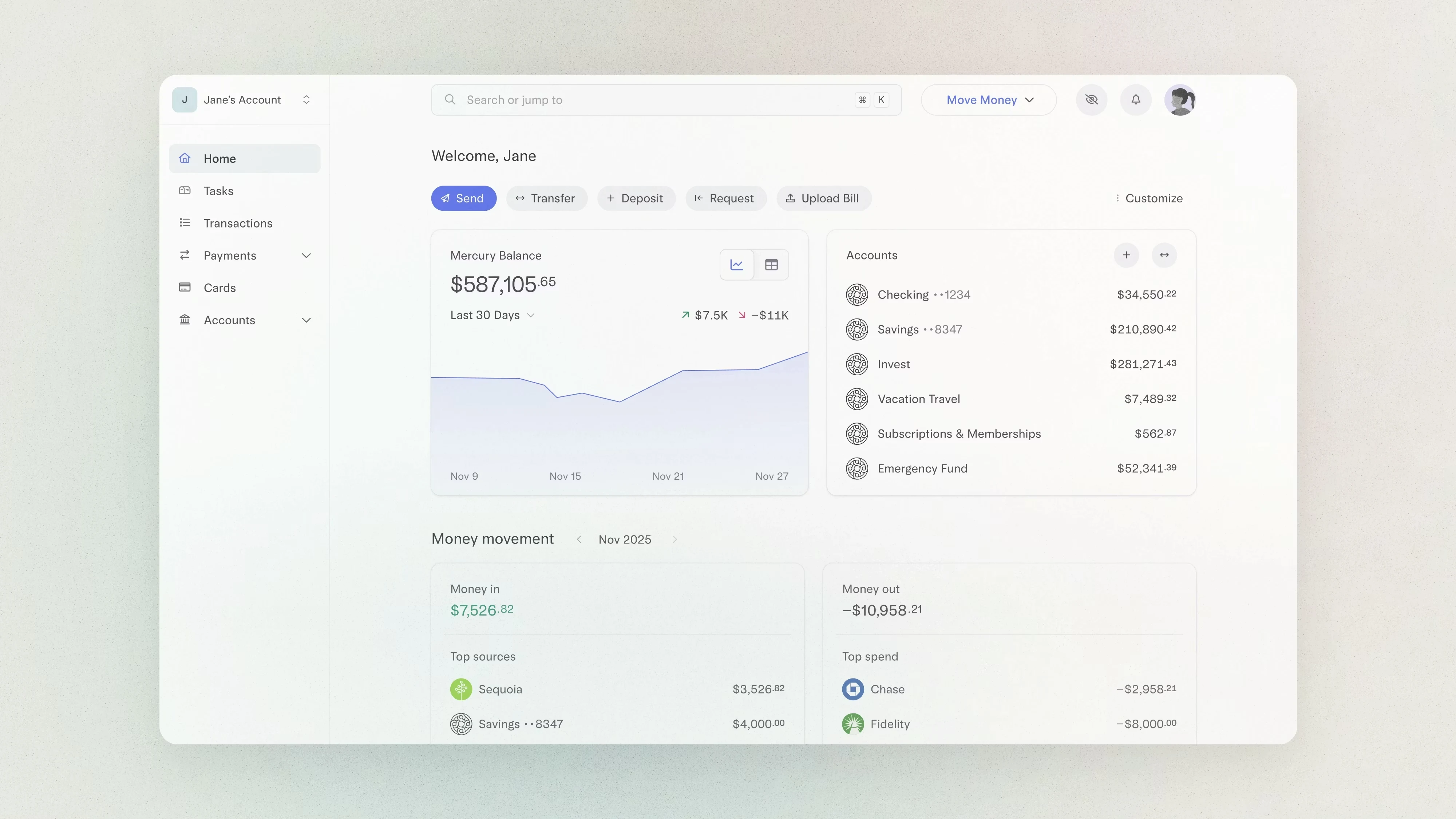
Mercury dashboard
Mercury — Best-in-class visual clarity and balance visibility. Strong for early-stage, but limited forecasting and reporting depth.
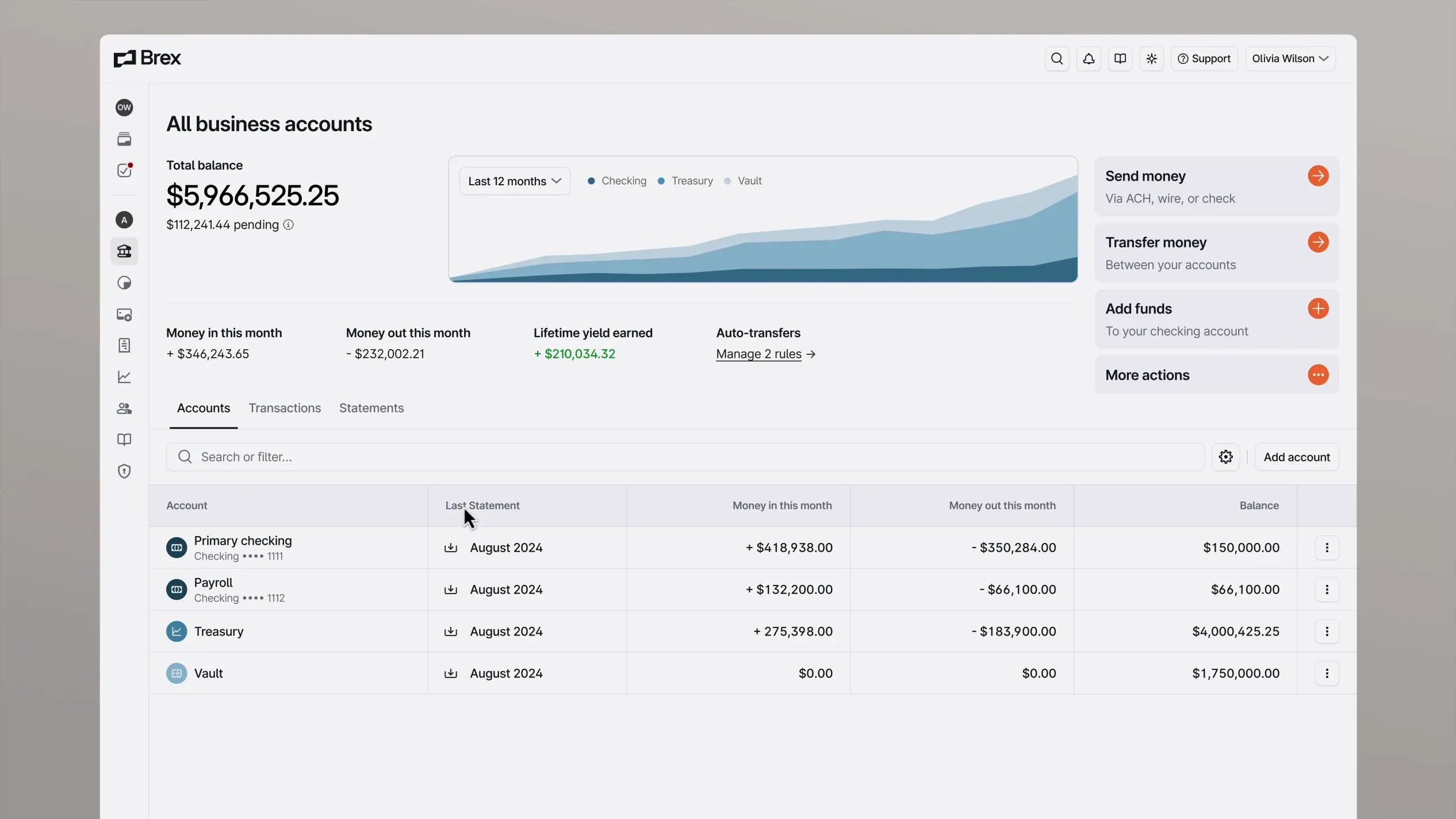
Brex dashboard
Brex — Good spend visibility and policy controls. Dense navigation structure creates orientation challenges for new users.
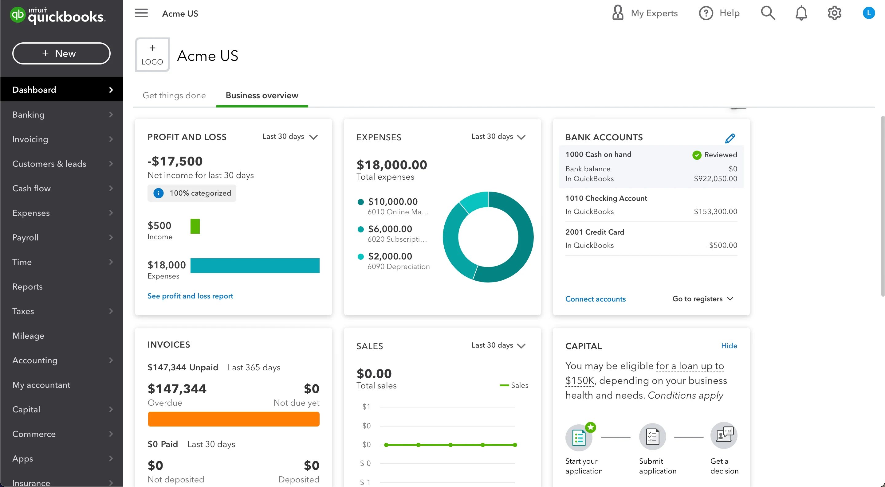
QuickBooks dashboard
QuickBooks — Feature-rich and accountant-optimized. High cognitive load for non-accounting users. Weak on executive-level summary.
User Personas
Two distinct users share the same product, but with fundamentally different jobs to be done.
Sarah Chen — CFO, 120-person SaaS company (Strategic)
10 years in finance, previously VP of Finance at two Series B companies. Her primary goal: board-ready data in 2 clicks. Runway and burn rate above all else. She spends 45+ min per week manually pulling numbers into board decks and has no single view of cash position, forecast, and actuals in one place.
Marcus Reid — Finance Manager, 60-person e-commerce company (Operational)
5 years in operations finance. Processes an average of 247 transactions per month. His primary goal: speed and accuracy of transaction processing. Recategorising a single expense takes 3 modal interactions in current tools, and Friday report generation takes 2 to 3 hours of manual data assembly.
User Journey Map
Marcus's weekly workflow mapped against friction points that Numera was designed to eliminate:
Monday — Cash Flow Check (~35 min): Log in to bank portal, export CSV, paste into master spreadsheet, rebuild weekly cash position manually. 3 different logins, 20 minutes before any real analysis begins. Numera response: cash position, runway, and weekly delta visible on load. Zero CSV exports.
Wednesday — Expense Review (~90 min): Open each transaction, determine correct cost centre, navigate to category modal, select, save. Repeat 50 to 80 times. 3 clicks per transaction, modal closes after each save. Numera response: inline category dropdown, 1 click per transaction, bulk editing for recurring vendors.
Friday — Report Generation (~2-3 hrs): Pull data from bank, accounting tool, and payroll. Merge into slide deck. Data from 3 sources with different refresh times. Numera response: one-click report export, all data live and pre-reconciled.
Information Architecture
The navigation structure prioritizes the executive-first hierarchy: Dashboard > Expenses > Reports > Forecast > Integrations > Settings. Each section maps to a distinct job-to-be-done rather than a data category.
High-Fidelity Screens
12 screens covering the full product surface, from executive overview to onboarding flow.
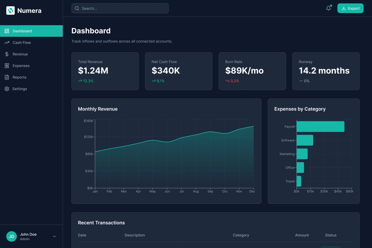
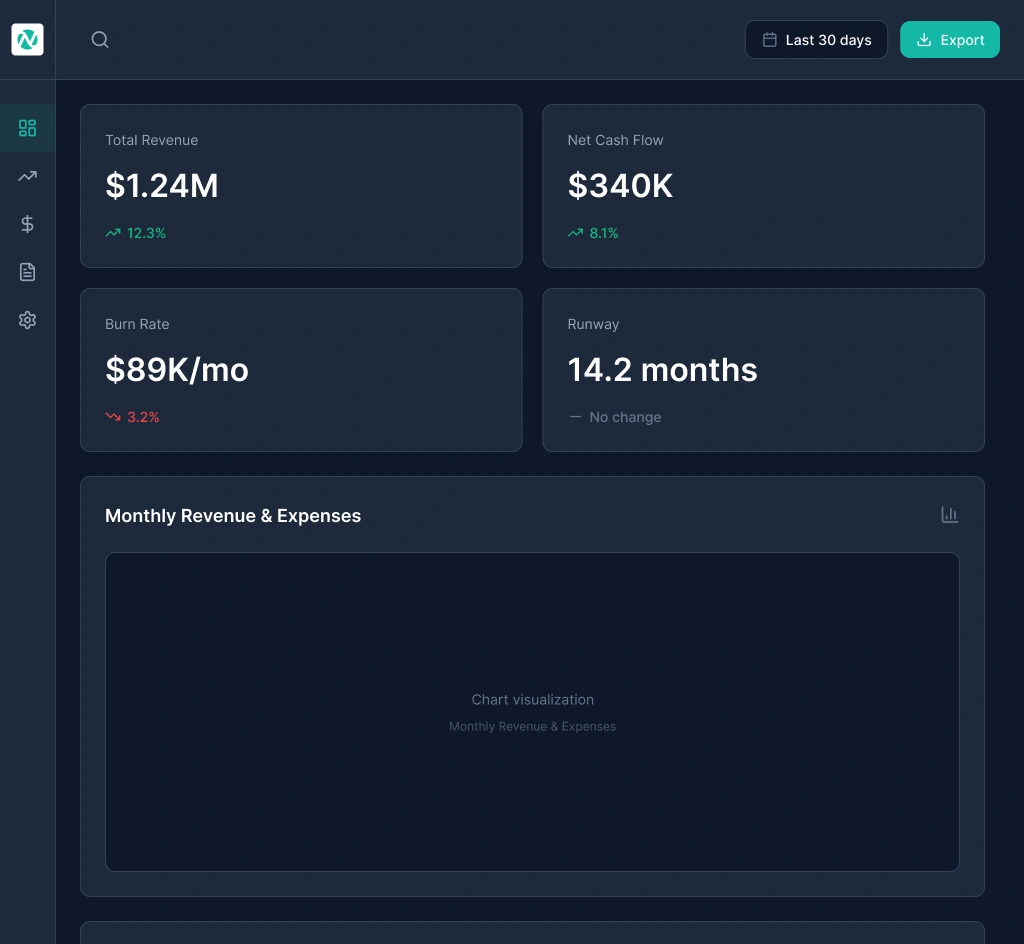
Dashboard Overview
Dashboard Overview — KPI cards above the fold, revenue and cash flow charts in the middle zone, recent transactions at the bottom. The three-row hierarchy matches the two user types: executives read top to bottom and stop when satisfied; managers continue to the table.
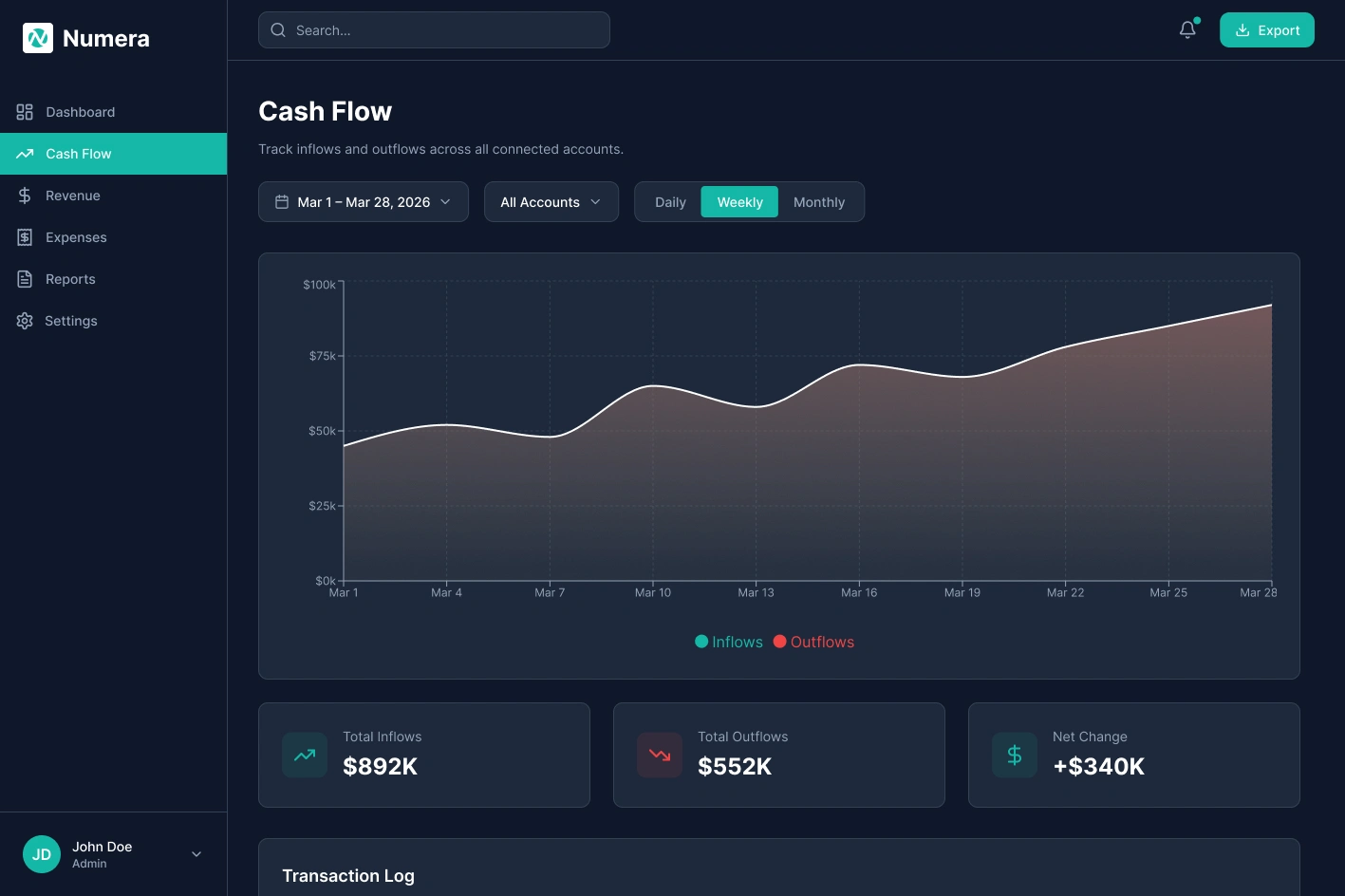
Cash Flow
Cash Flow — Inflows and outflows tracked week by week with Daily, Weekly, and Monthly toggles. Summary cards show Total Inflows, Total Outflows, and Net Change.
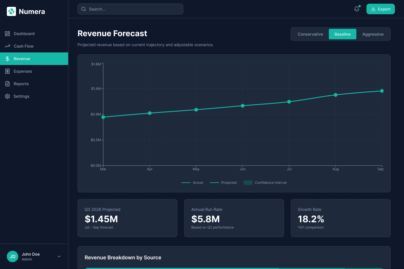
Revenue Forecast
Revenue Forecast — Projected vs. actual overlaid with a confidence interval band. Conservative, Baseline, and Aggressive scenario toggles let teams stress-test assumptions without touching a spreadsheet.
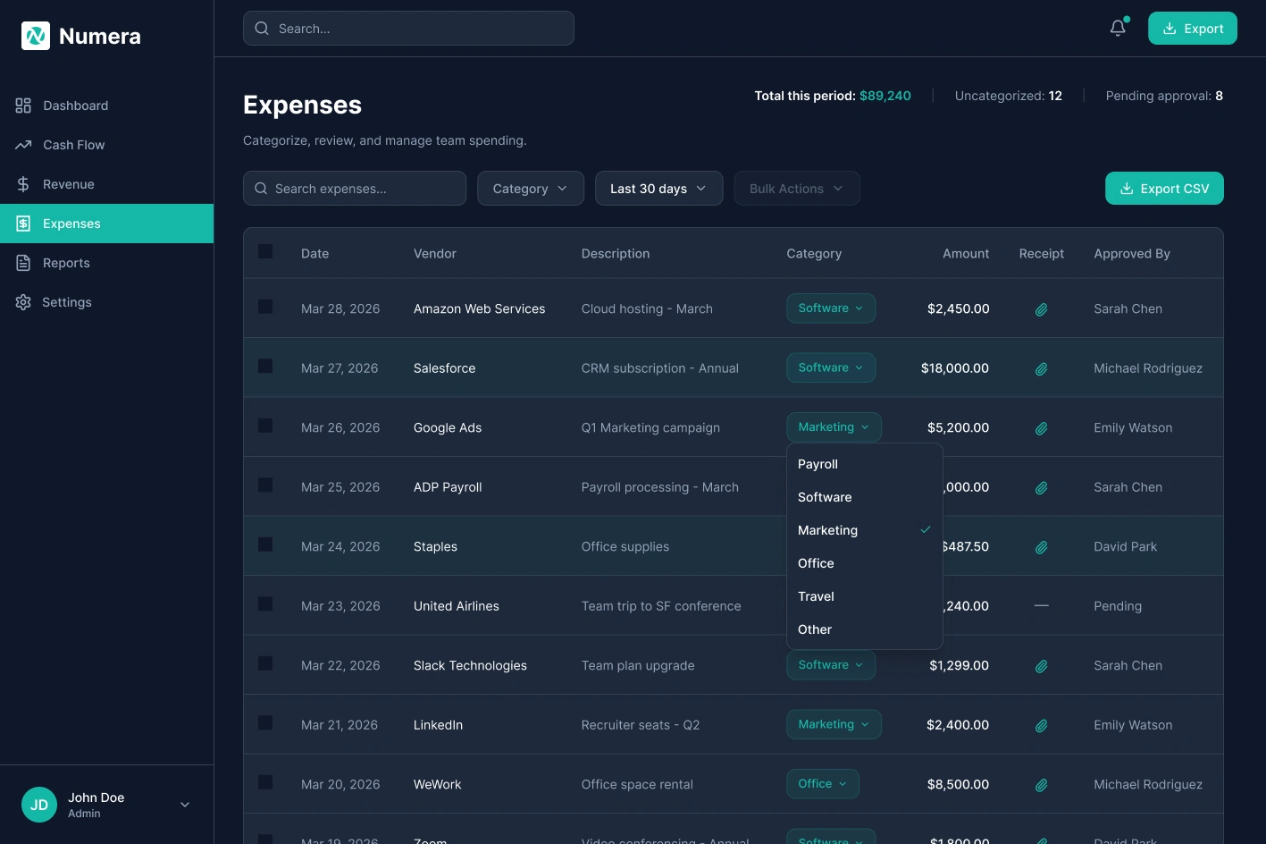
Expenses
Expenses — Full expense table with inline category assignment via single-click dropdown. Uncategorized count and pending approvals surfaced in the header.
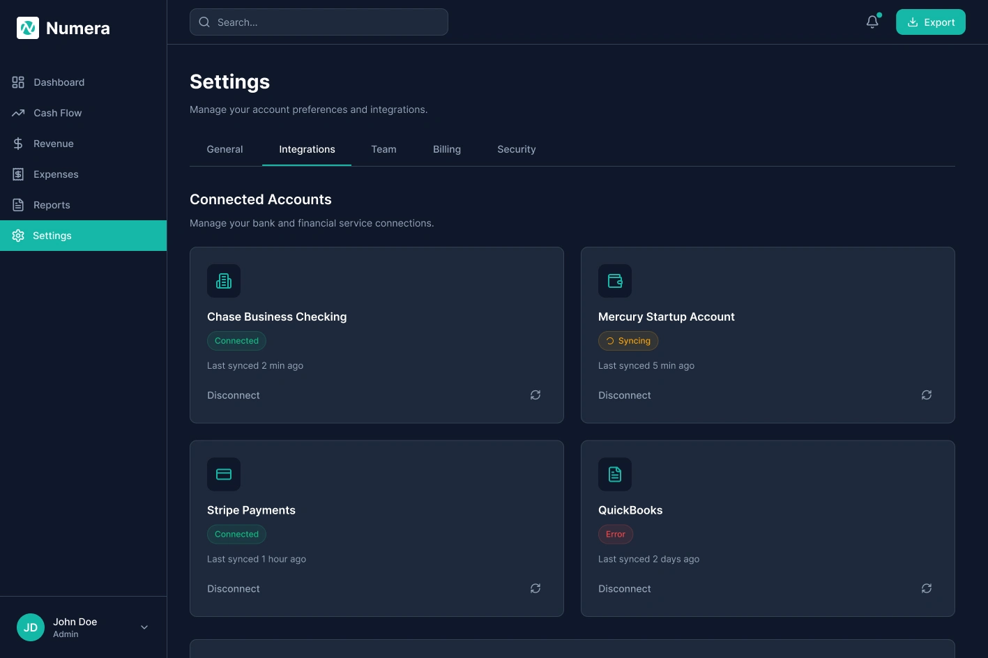
Settings / Integrations
Settings / Integrations — Connected accounts panel showing live sync statuses for each bank and payment service.
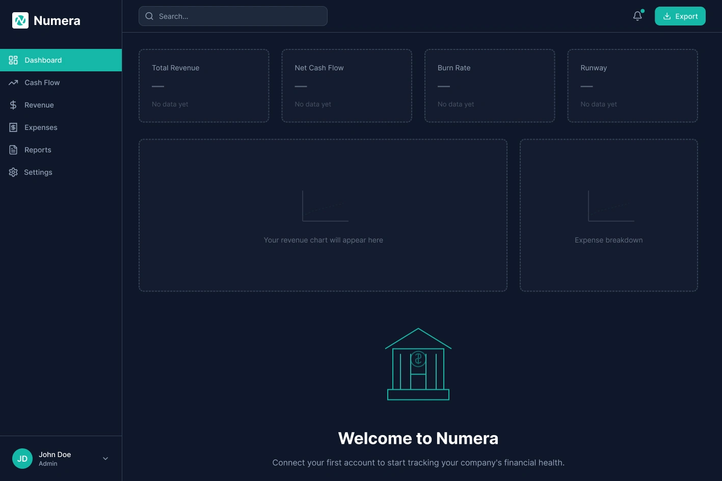
Empty State
Empty State — New account, no connected bank. Single CTA, skeleton KPI cards so layout feels familiar before data exists.
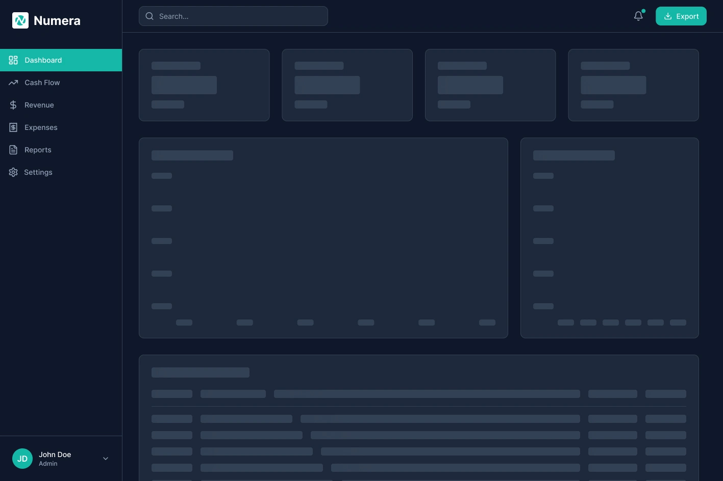
Loading State
Loading State — Skeleton shimmer placeholders match exact positions so layout stays stable.
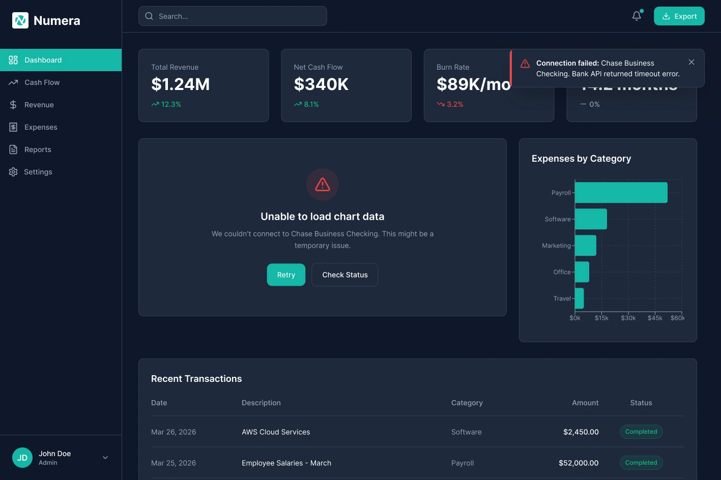
Error State
Error State — Non-blocking banner specifies which account failed and why. Last-known data stays visible so work continues.
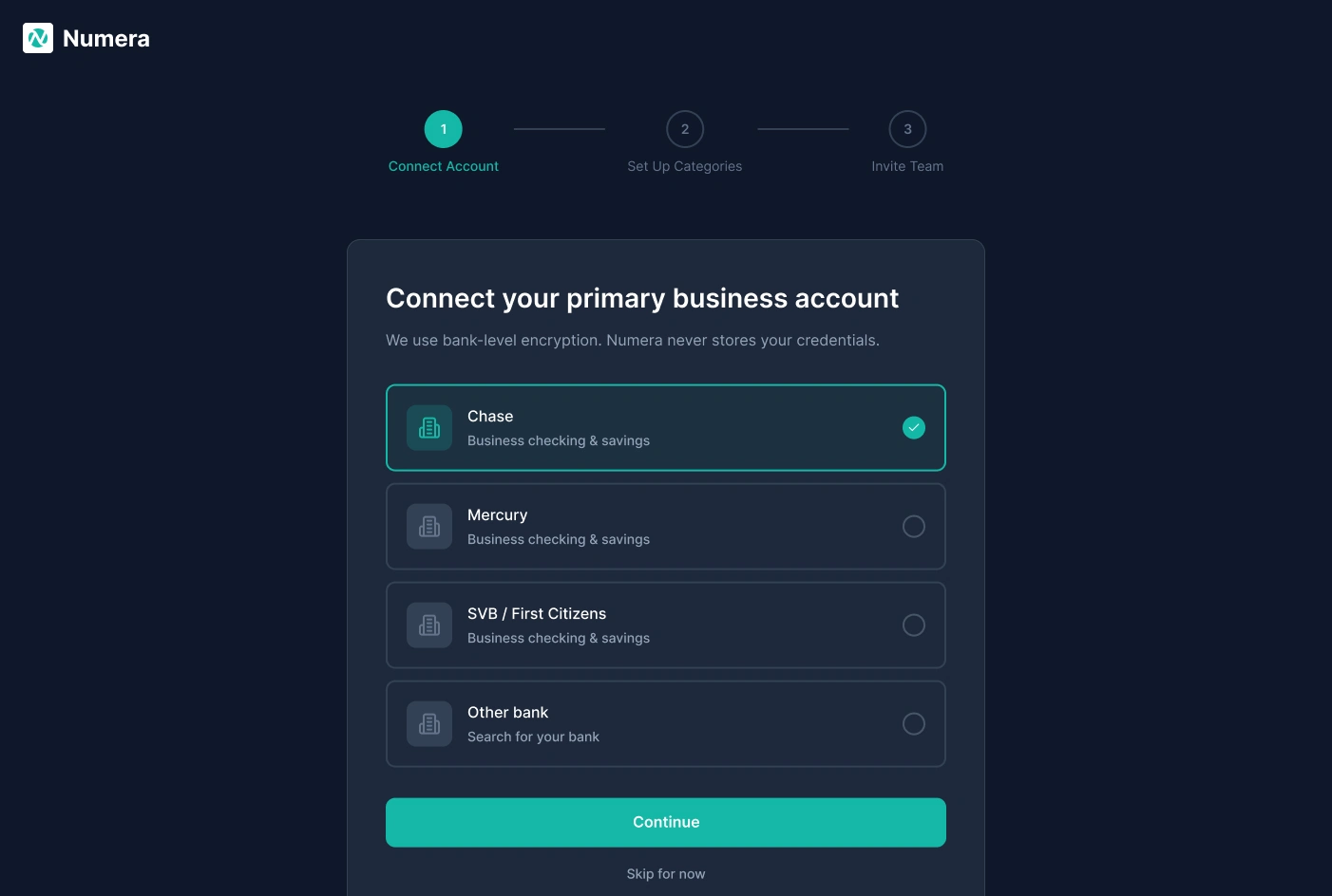
Onboarding: Connect Account
Onboarding Step 1: Connect Account — Bank selection list with encryption reassurance. A Skip option lets teams explore the product before committing credentials.
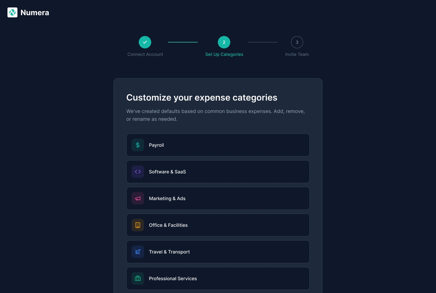
Onboarding: Set Up Categories
Onboarding Step 2: Set Up Categories — Pre-built expense defaults drawn from common business spending. Users can add, remove, or rename categories before any transactions are imported.
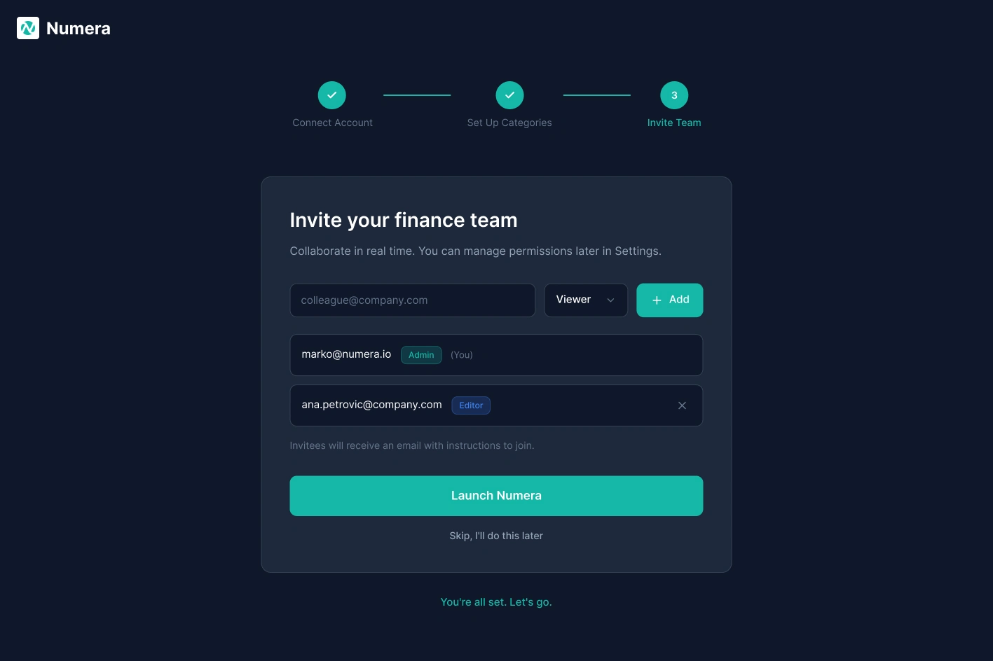
Onboarding: Invite Team
Onboarding Step 3: Invite Team — Role assignment at invite time. The Launch Numera CTA only appears once all three setup steps are complete.
Tablet View
Tablet Layout — Sidebar collapses to an icon-only rail, KPI cards reflow to a 2x2 grid, and charts stack vertically. Full informational parity with desktop in a touch-first layout.
Key Design Decisions
Dark theme — Finance dashboards are used in long sessions. A dark surface reduces eye strain and lets data visualisations stand out with high contrast. Teal (#2DD4BF) was chosen for its visibility against dark backgrounds and its association with trust and precision.
KPI cards above the fold — CFO interviews surfaced the same request: Cash Balance, Monthly Burn, Runway, and MRR should be visible without scrolling or clicking. Each card shows a delta vs. prior period using directional arrows and colour.
Inline expense editing — The old flow required 3 to 5 actions to recategorise a single transaction. An inline dropdown in the table row cuts that to 1 click. At ~250 transactions per month, that compounds into real time savings.
Progressive onboarding — Three steps, one action each: connect your bank, configure categories, invite your team. Every step can be skipped. Users who commit get full setup; users who aren't ready still land in a usable product.
Projected Outcomes
0 clicks to key metric — Designed to reduce time-to-key-metric from the industry average of 4 clicks to 0. Visible on load.
85%+ estimated onboarding completion — 3-step progressive onboarding structured to match benchmark completion rates for similar B2B SaaS sequences.
35+ component variants — 7 core components enabling consistent design at scale.
~30 min/week saved on expense editing (1 interaction vs. 5) for a Finance Manager processing 247 transactions monthly.
Report generation reduced from 2-3 hours to under 10 minutes by eliminating manual data assembly.
Reflection
Designing for two user types in one product is not a layout problem. It is a hierarchy problem. The temptation is two separate views. The real challenge is one layout where both users feel it was built for them. The answer is information layering: what is visible immediately, what requires a click, what requires navigation. That hierarchy question is the core design problem of Numera.
Like this project
Posted May 18, 2026
End-to-end product design for a B2B FinTech dashboard that transforms complex financial data into actionable insights for mid-market finance teams.
Likes
0
Views
1