BINC Brand Redesign
Flávia Jackeline
1 collaborator
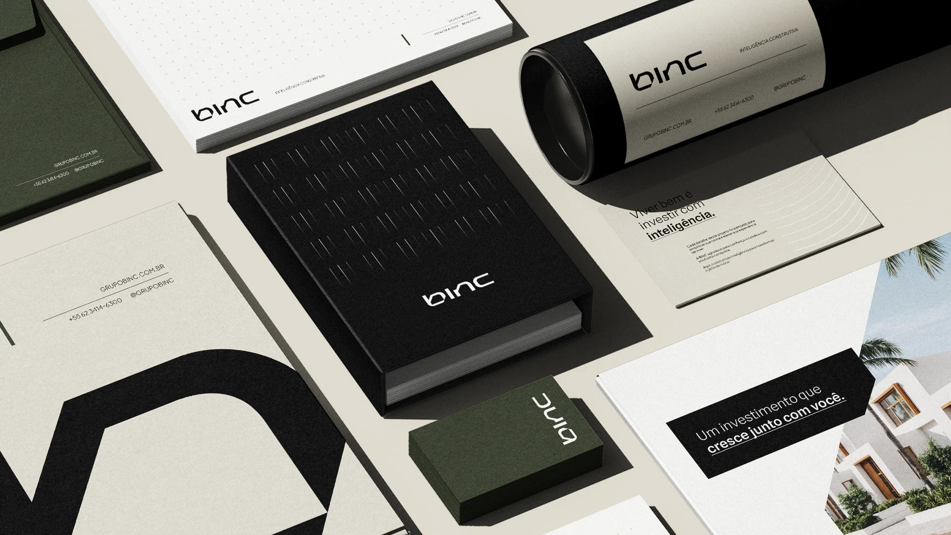
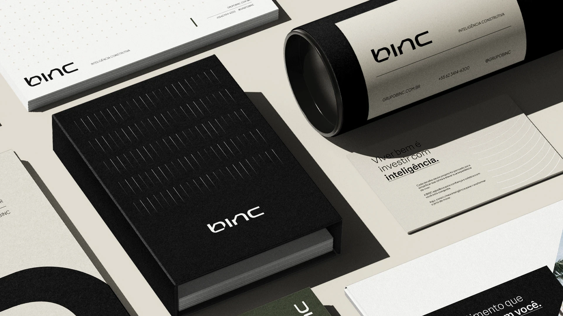
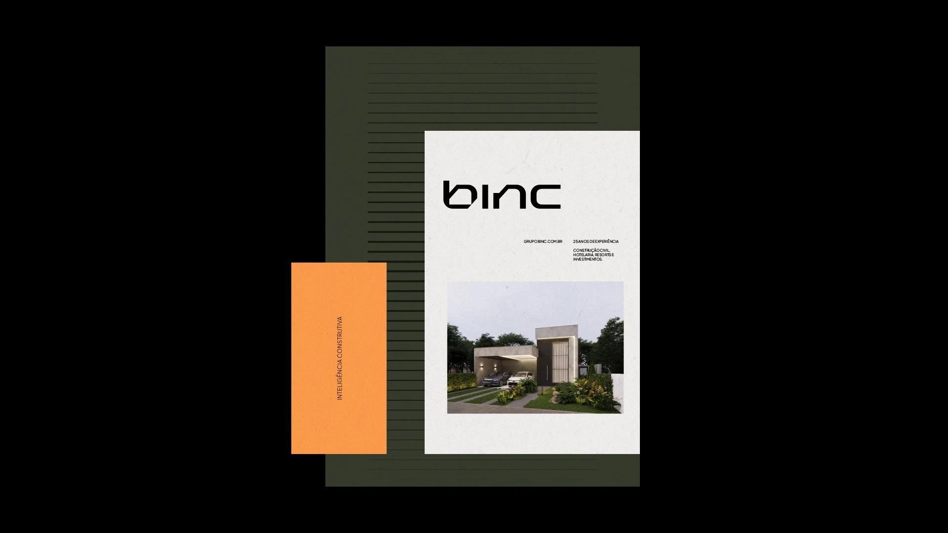
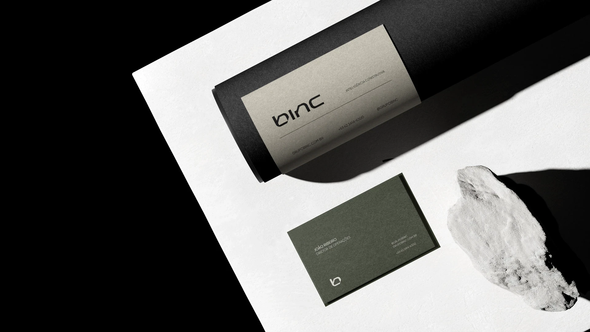
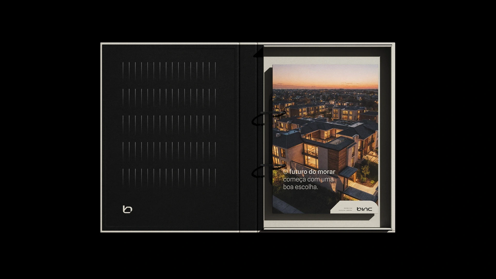
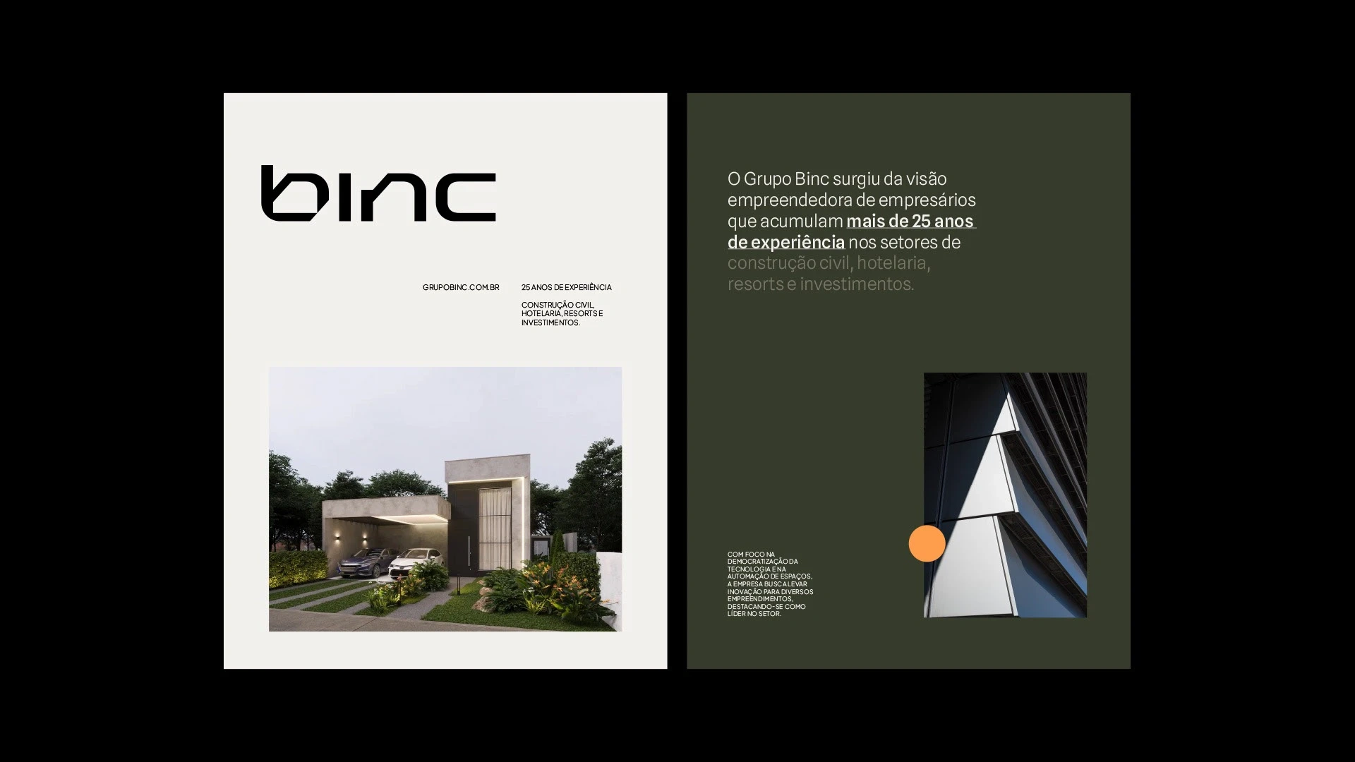
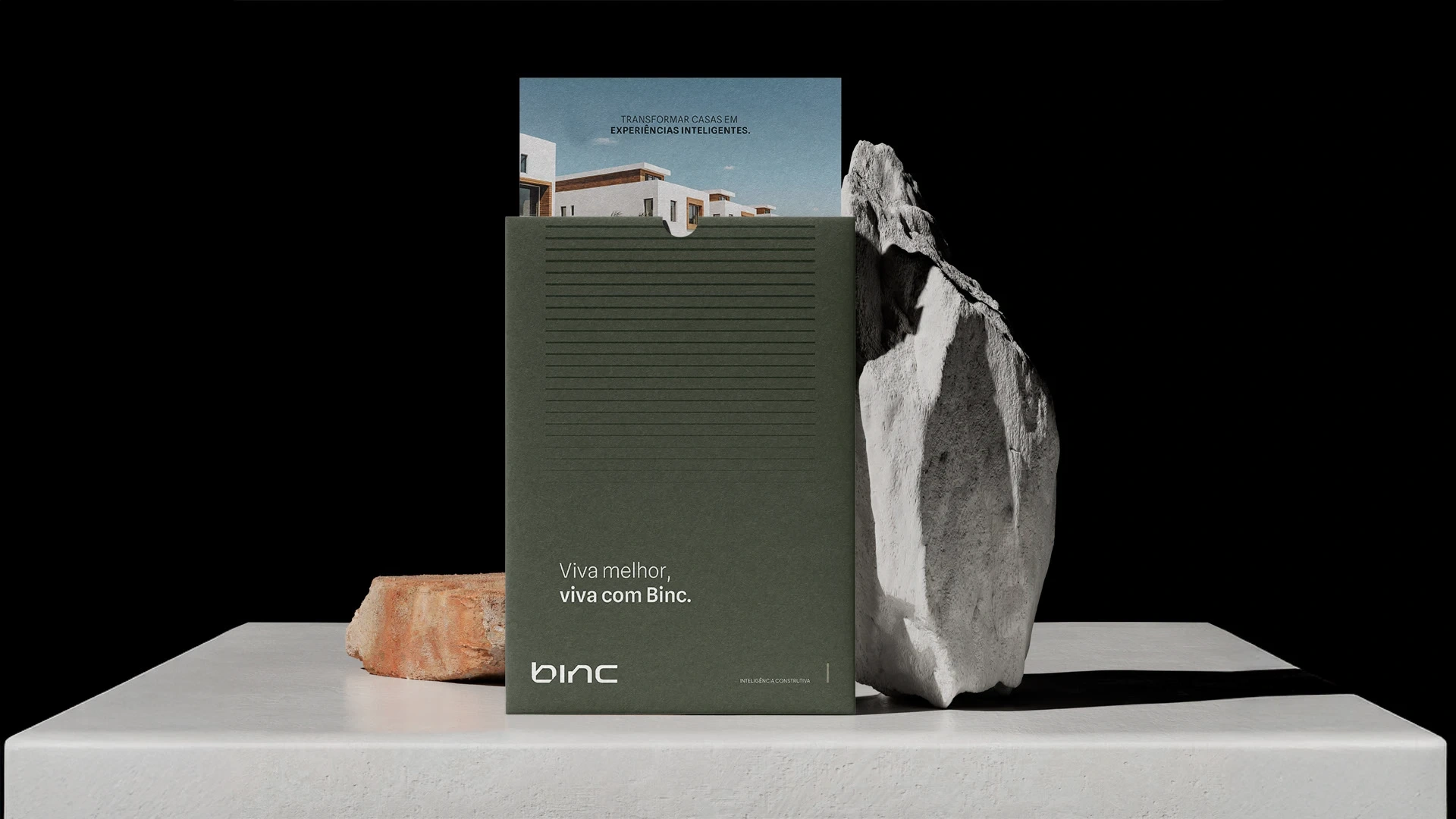
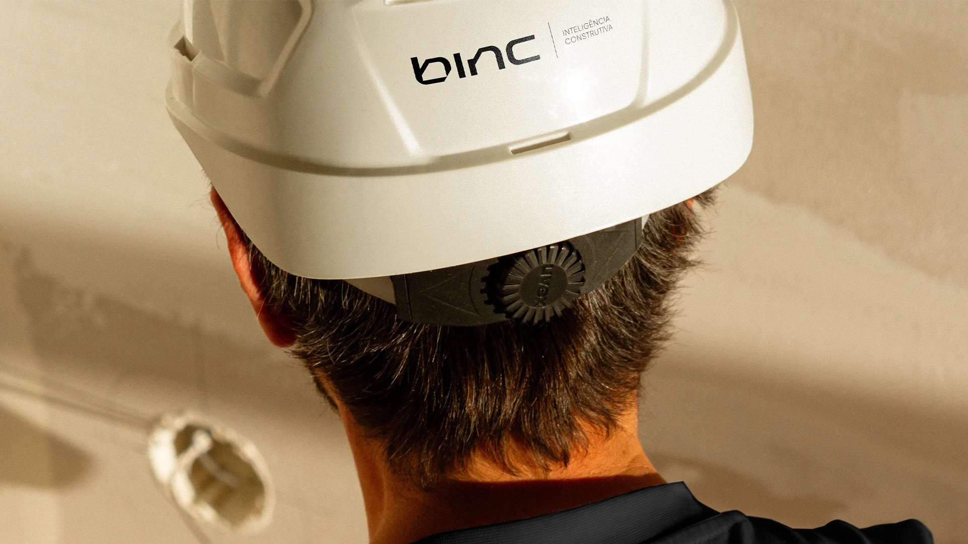
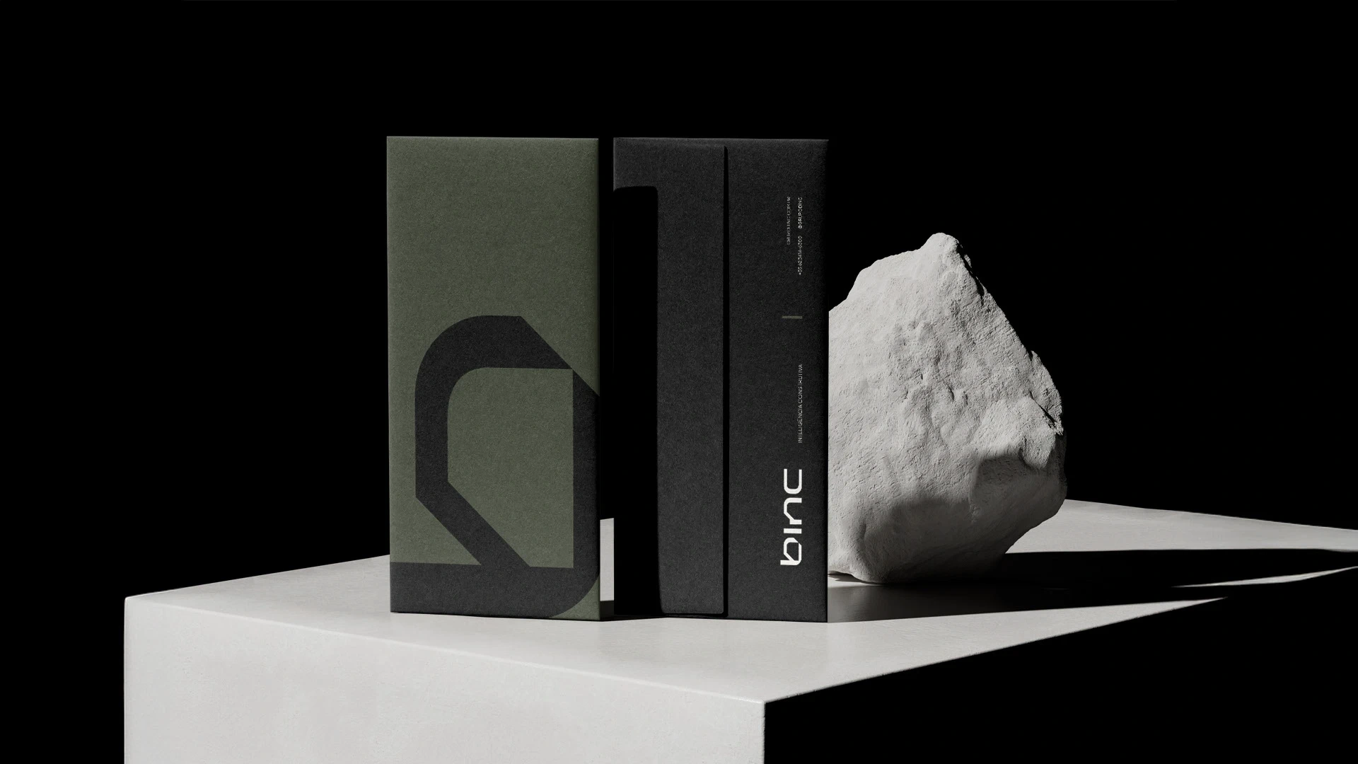
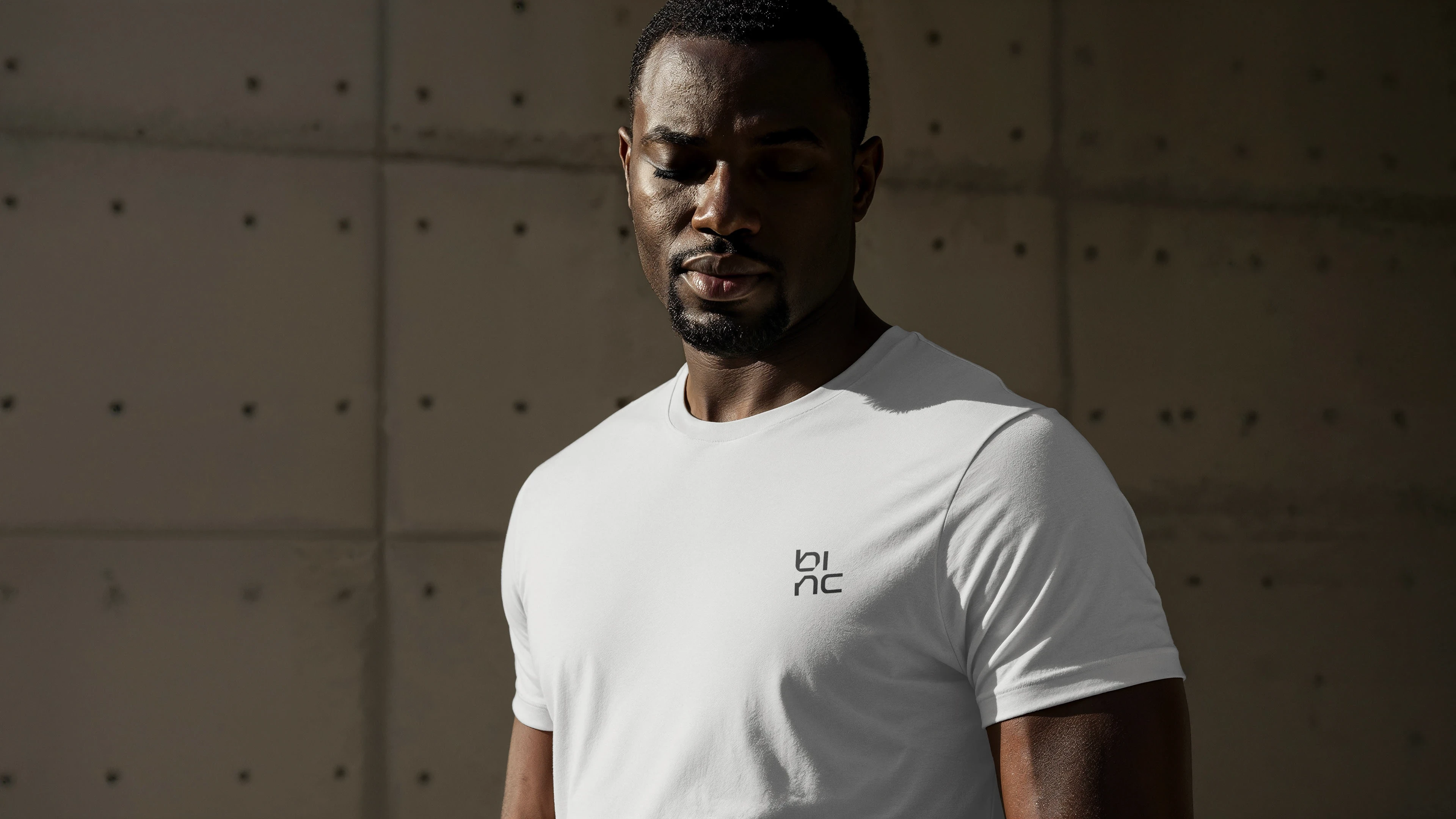
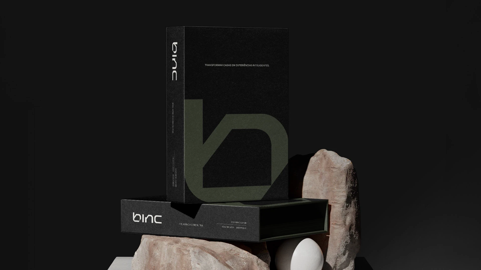
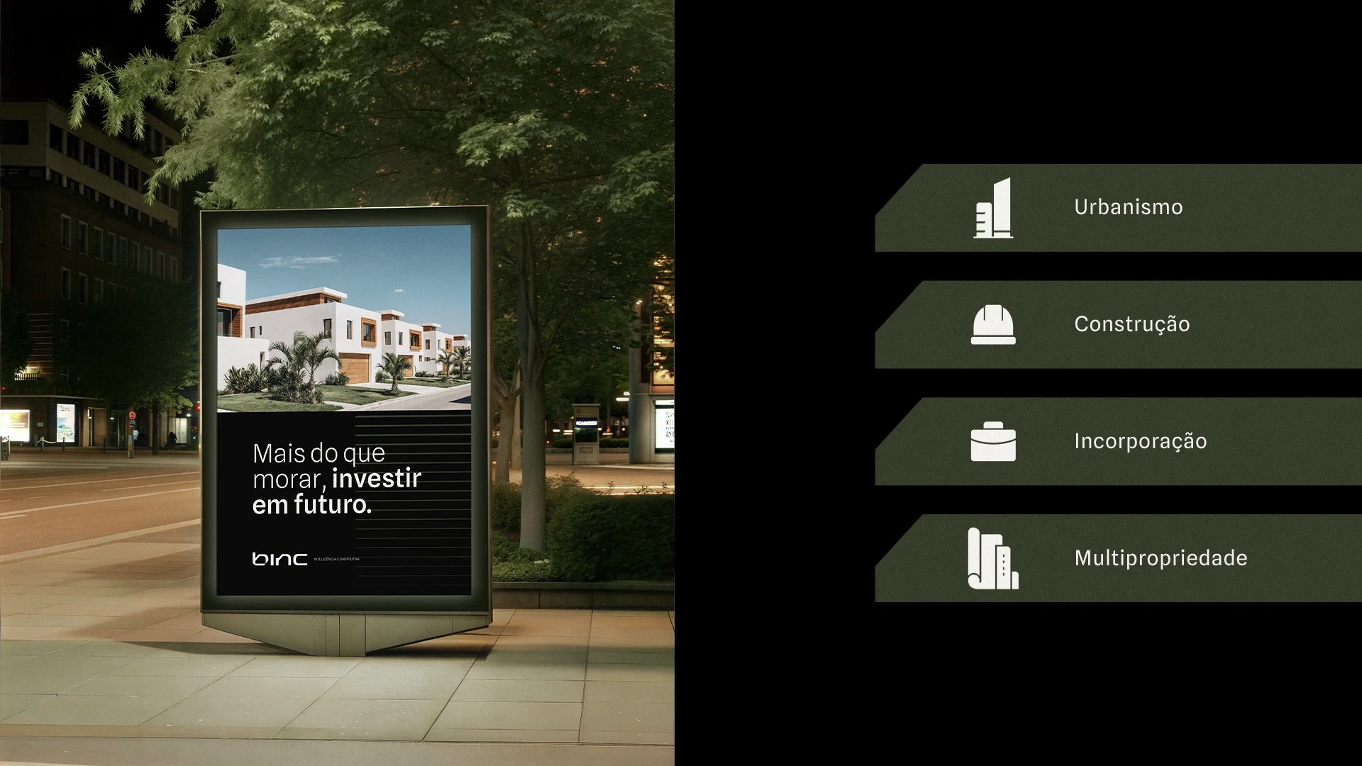
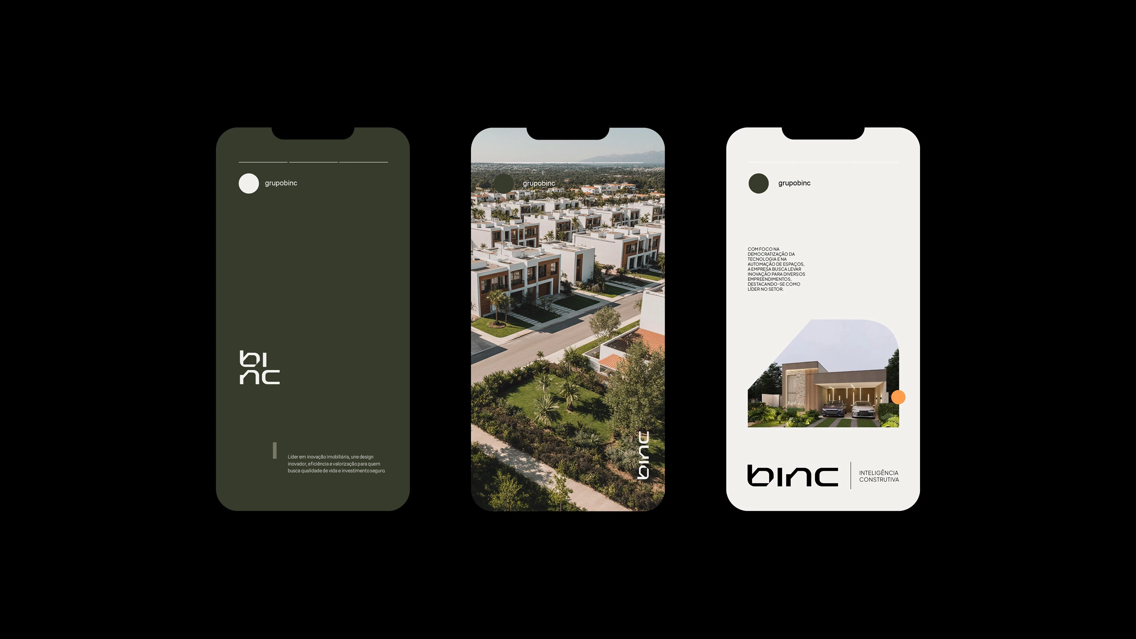
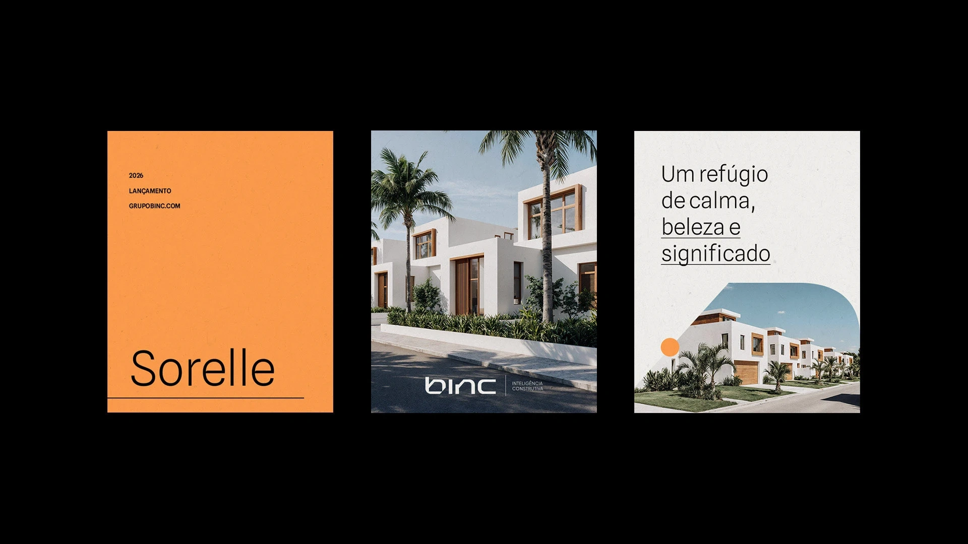
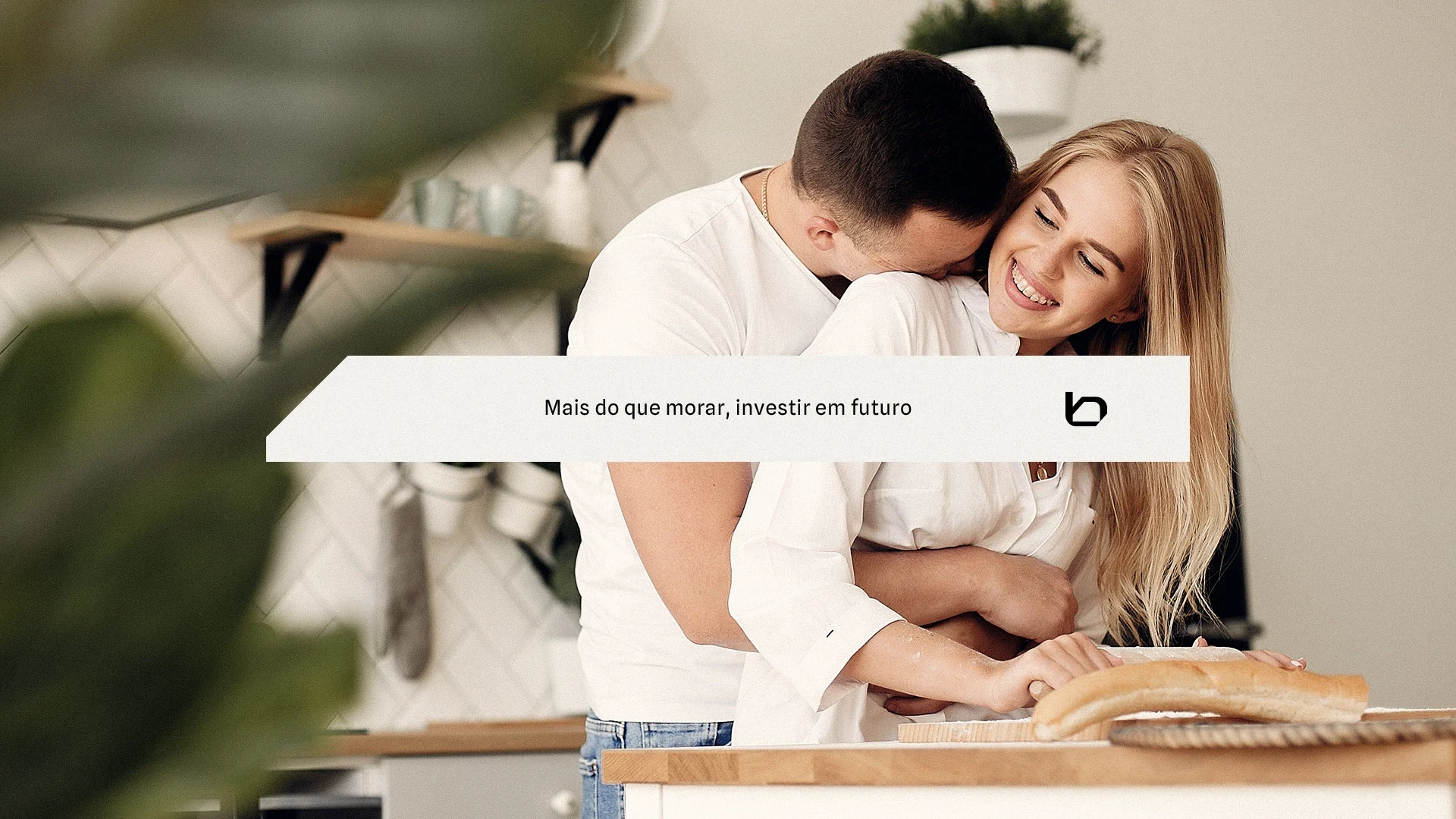
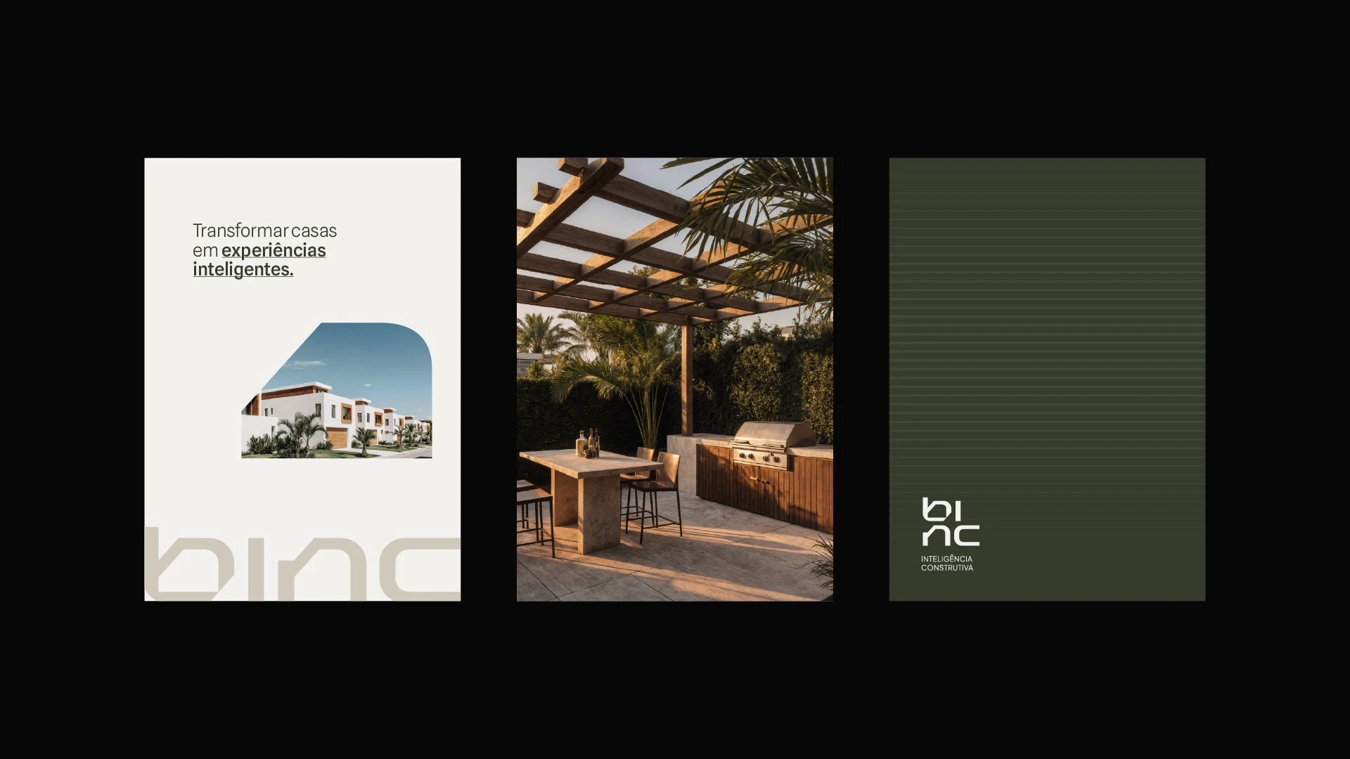
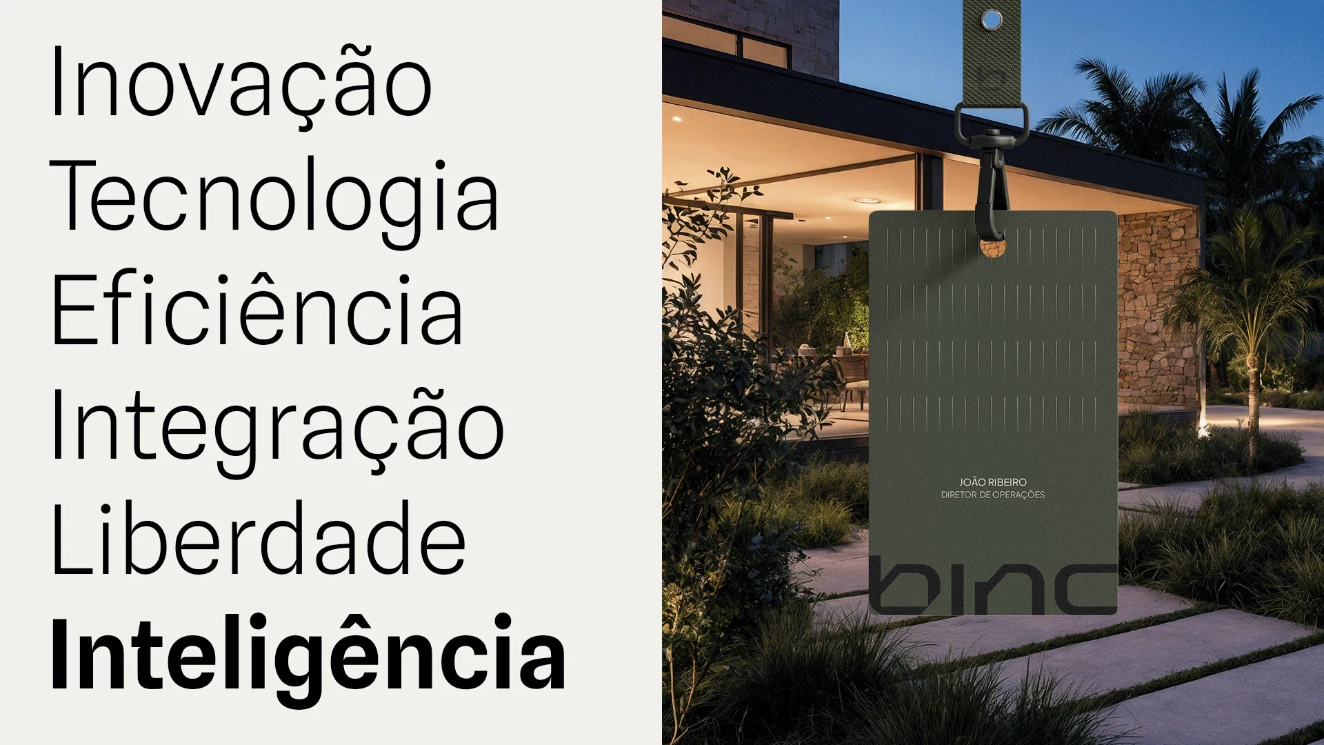
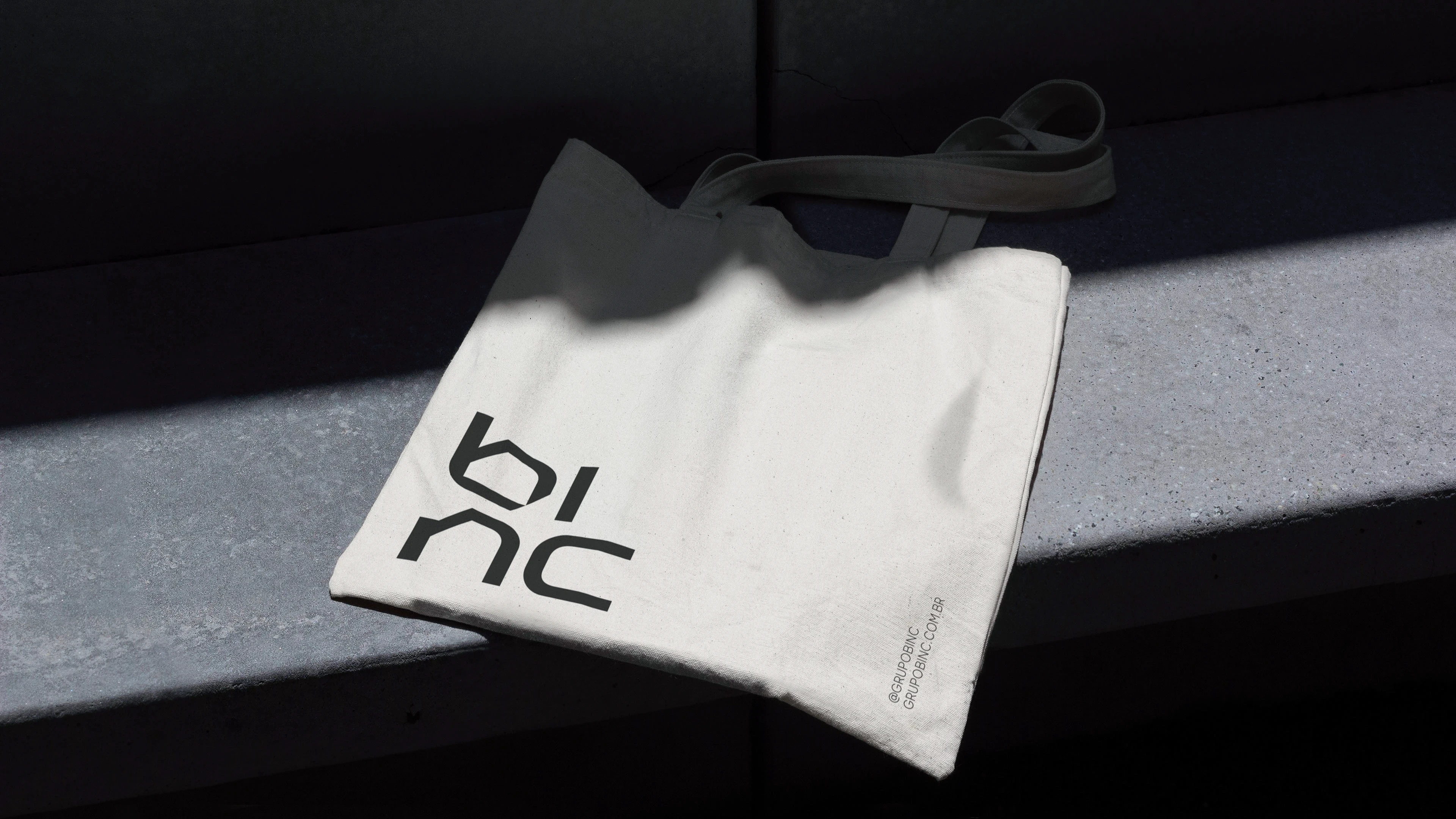
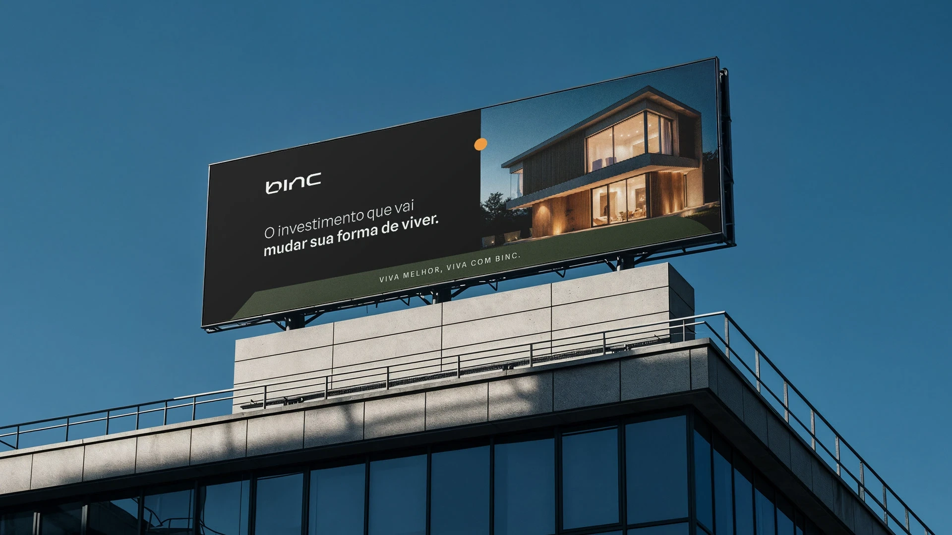
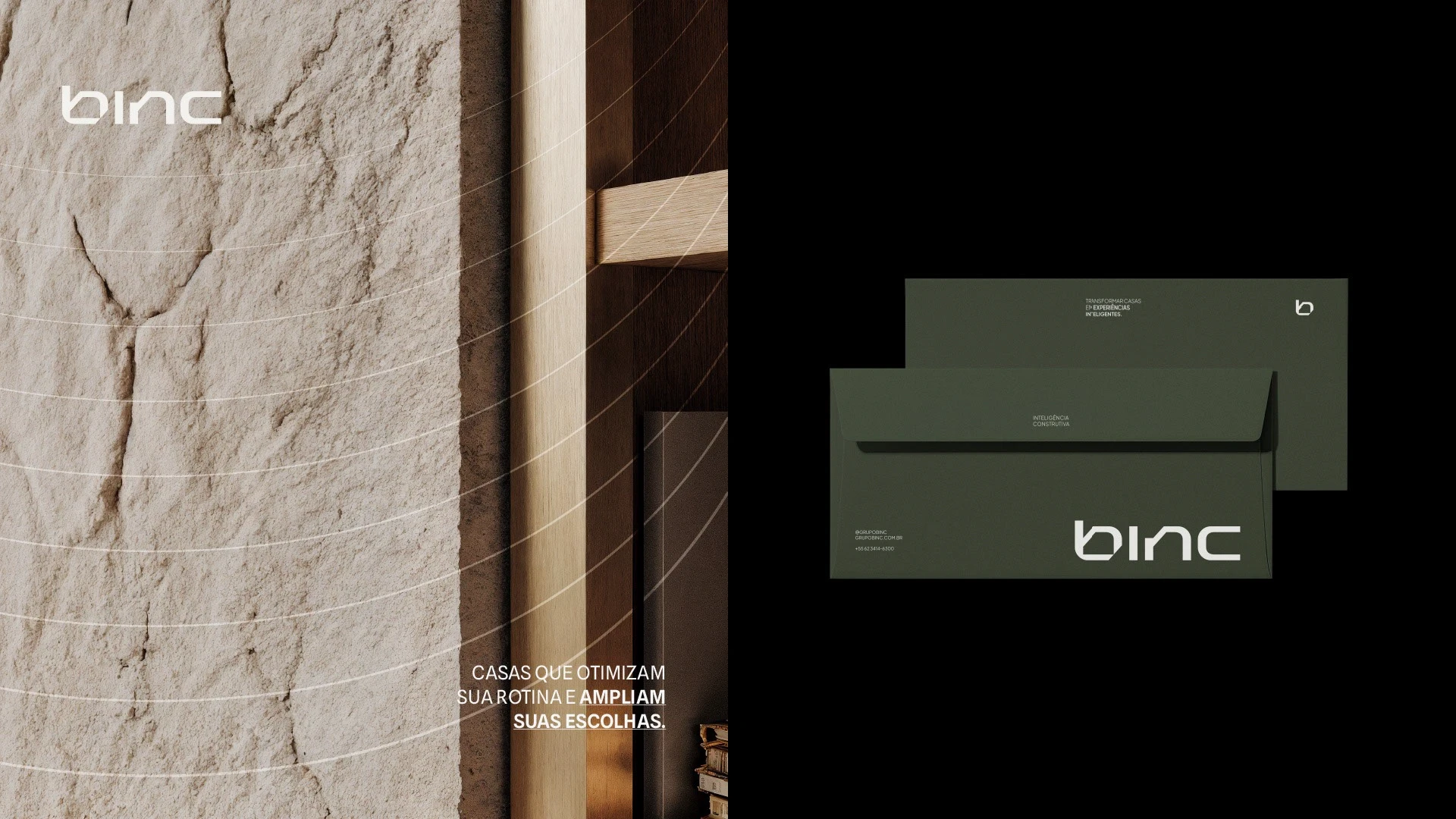
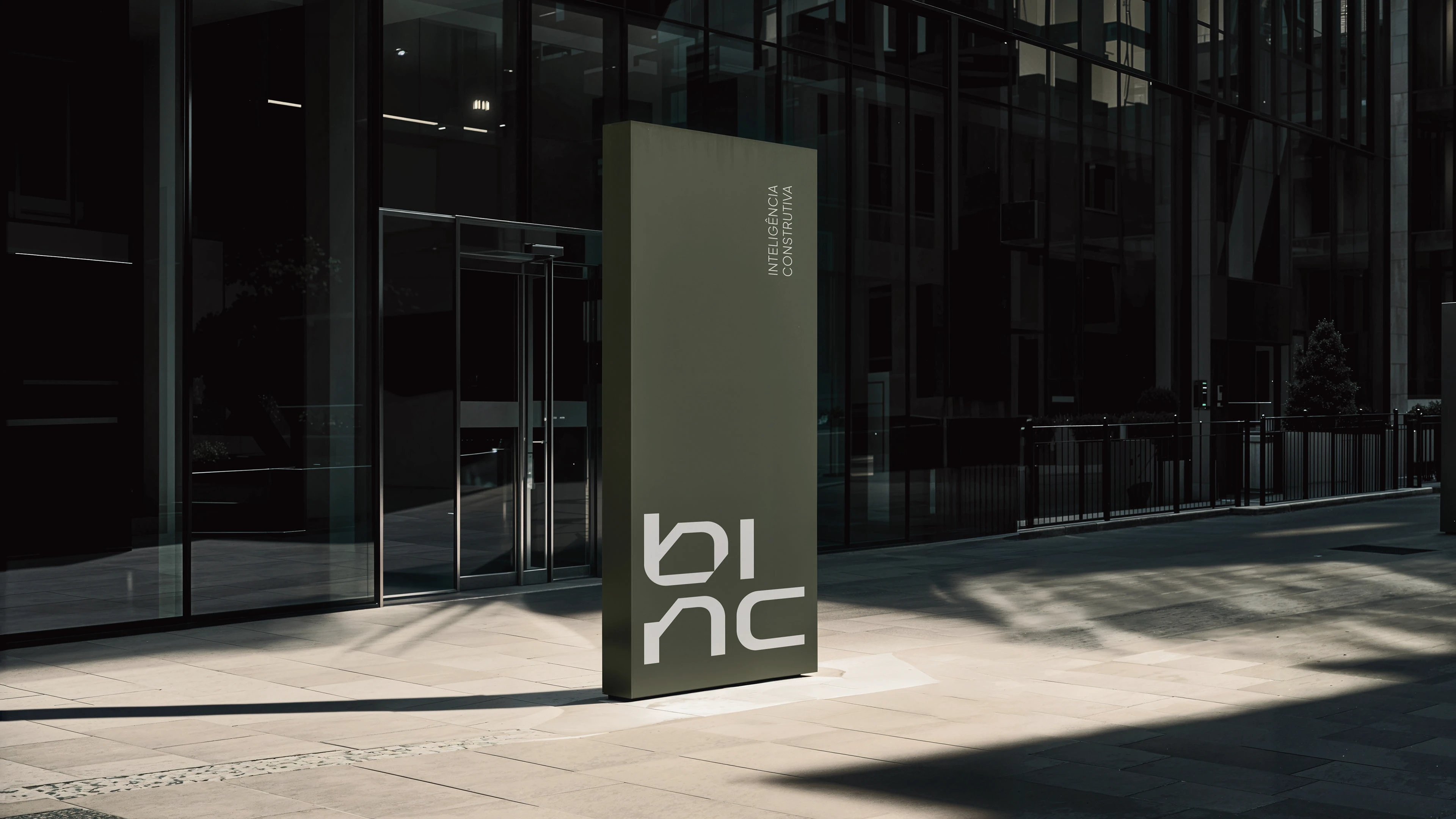
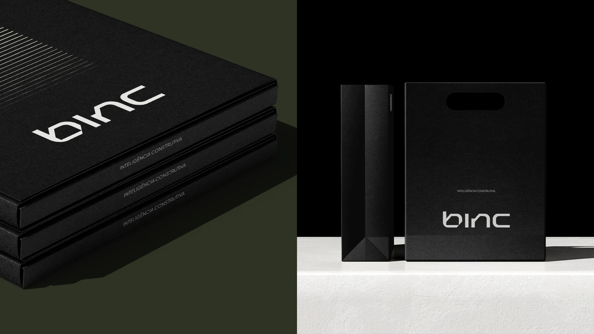
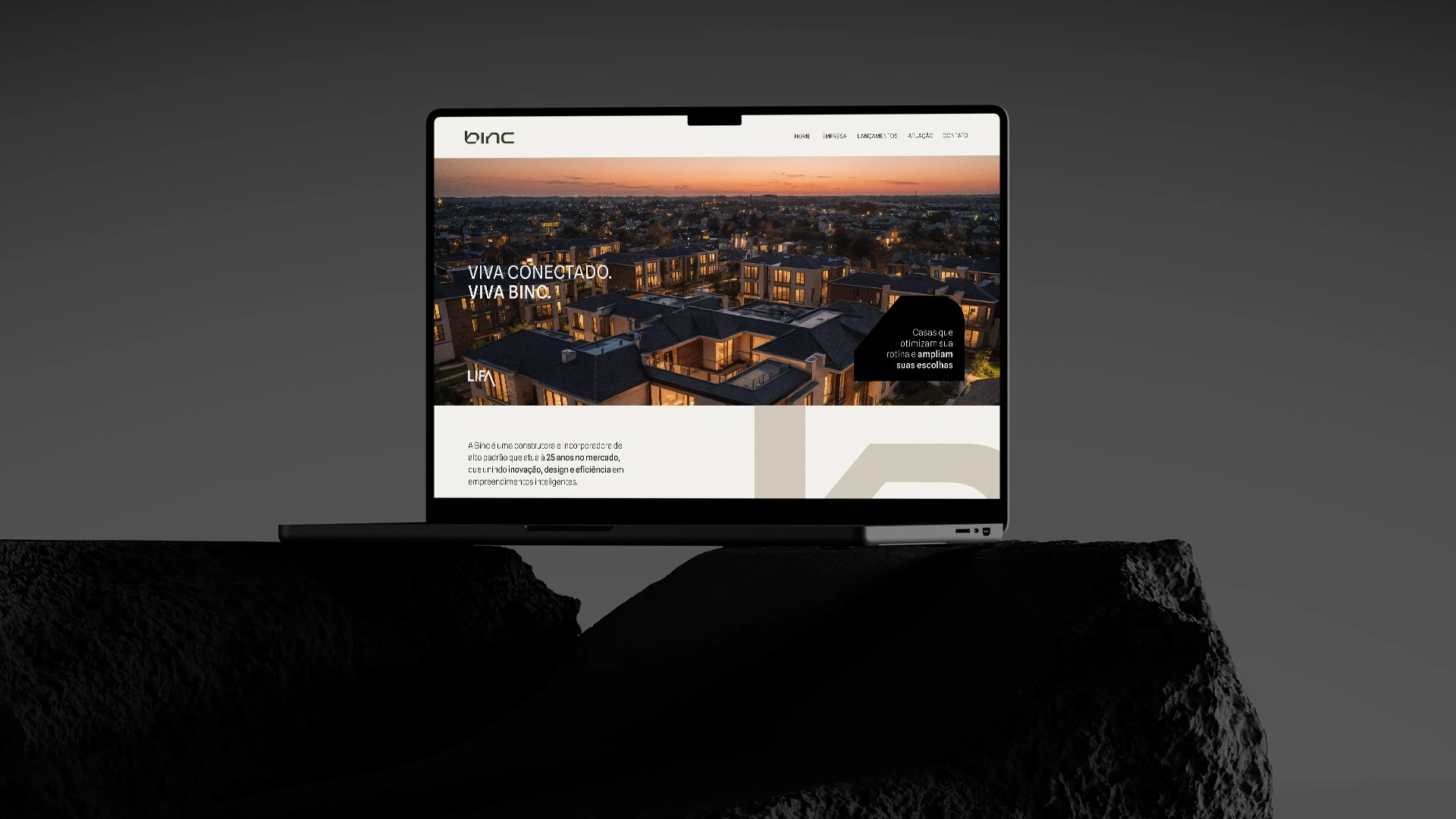
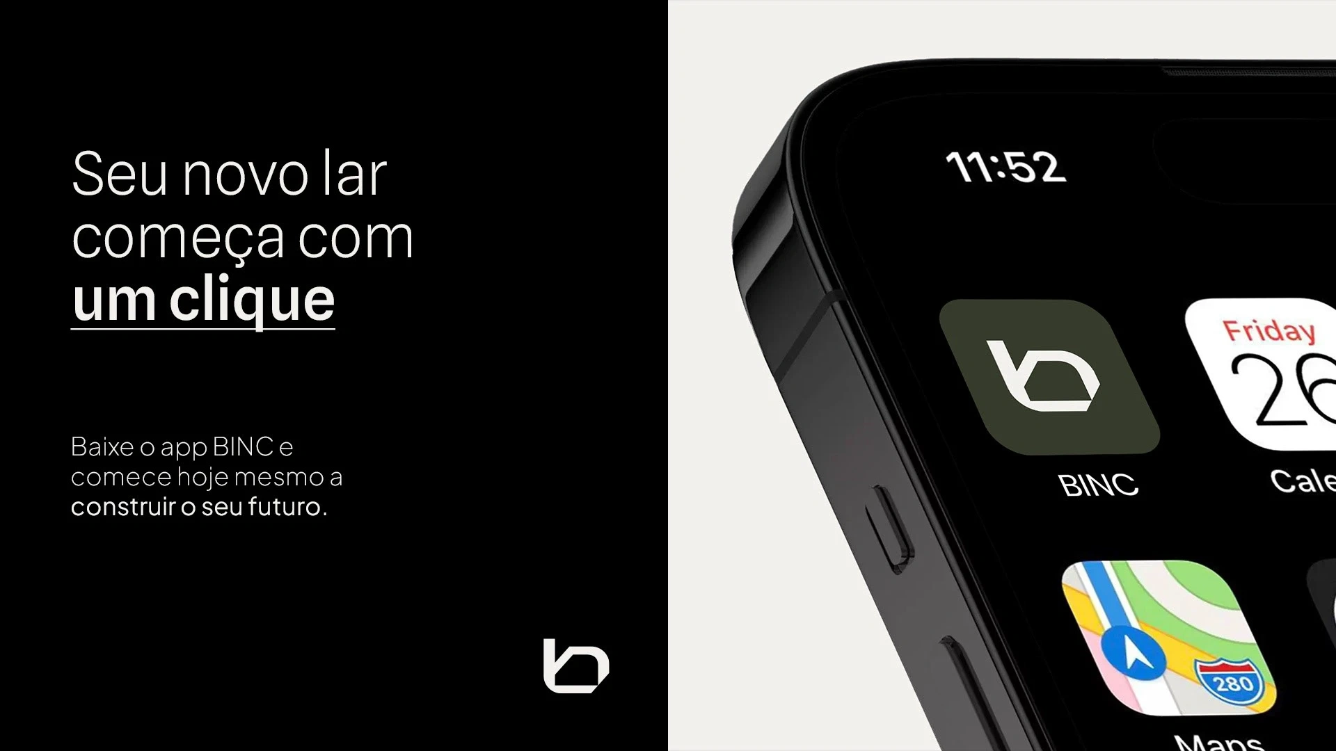
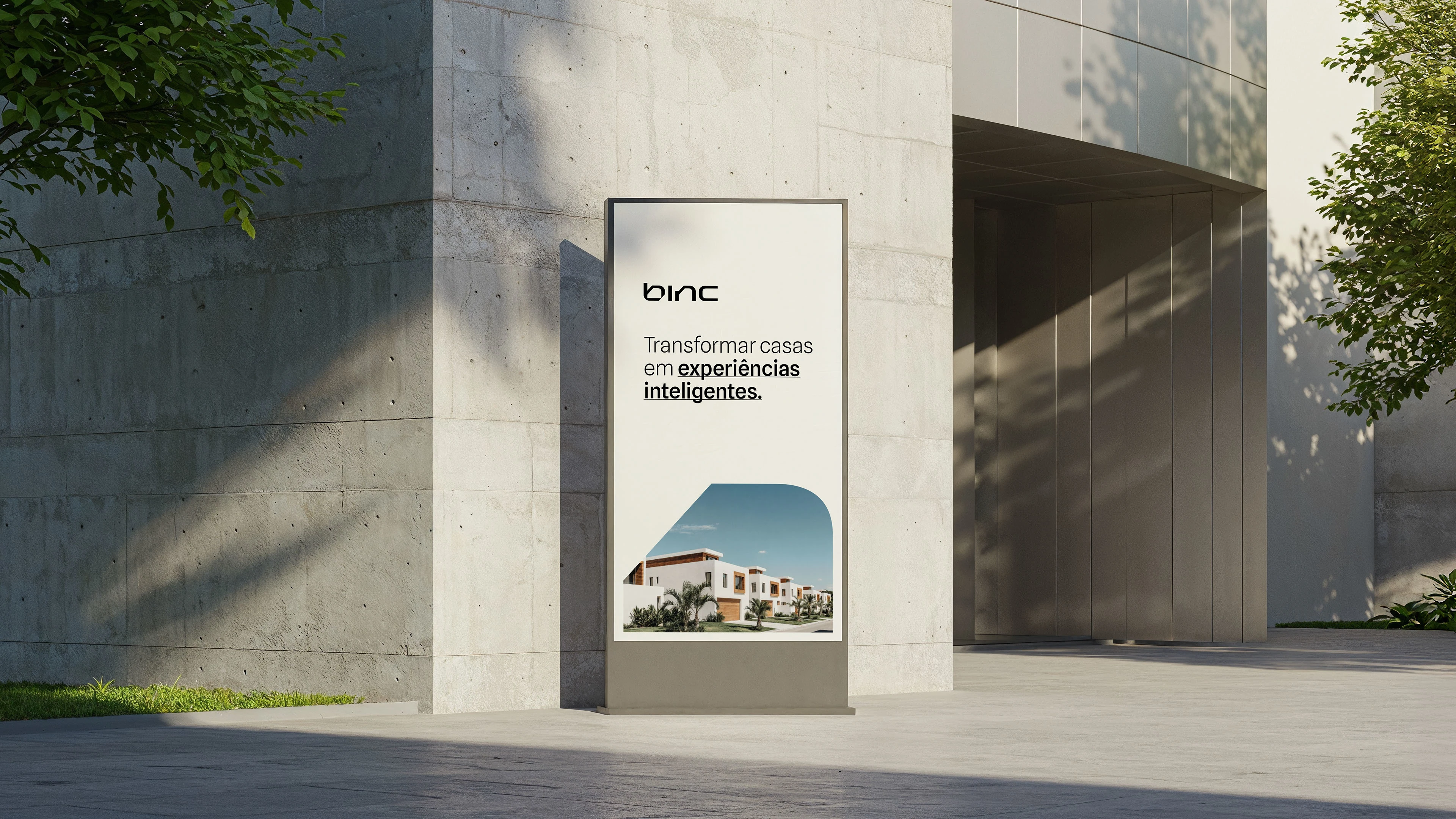
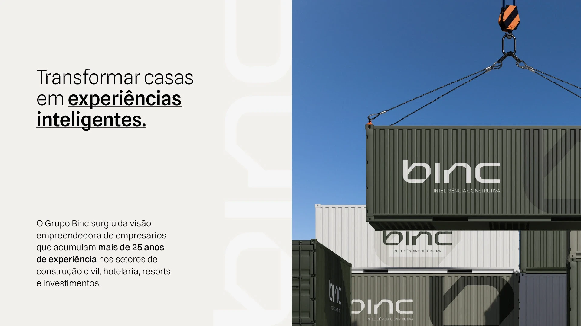
The BINC redesign was born from a strategic transition, a moment to update an established brand and reflect the group’s new chapter, more premium, more intelligent, and in tune with the future of construction. The process began with subtle refinements to the original logo, enhancing proportions and visual balance. From there, new variations were developed to ensure greater flexibility and applicability across different contexts, digital, corporate, and architectural. The new identity was designed to express efficiency, technology, and functional sophistication while preserving the solid and trustworthy essence that has always defined BINC. More than a simple redesign, this project marked a complete brand repositioning. The new strategy presents BINC as a reference in intelligent, automated, and high-standard construction. Every visual detail reflects these values: the contemporary typography, the neutral and elegant color palette, and the graphic elements inspired by constructive precision create a balance between engineering and design, an identity that unites technique, purpose, and aesthetics in a single vision.
Like this project
Posted Oct 31, 2025
Reimagined BINC’s brand to express innovation, precision, and premium excellence in modern construction.
Likes
1
Views
13
Collaborators