Madha Brand Identity Design
Flávia Jackeline
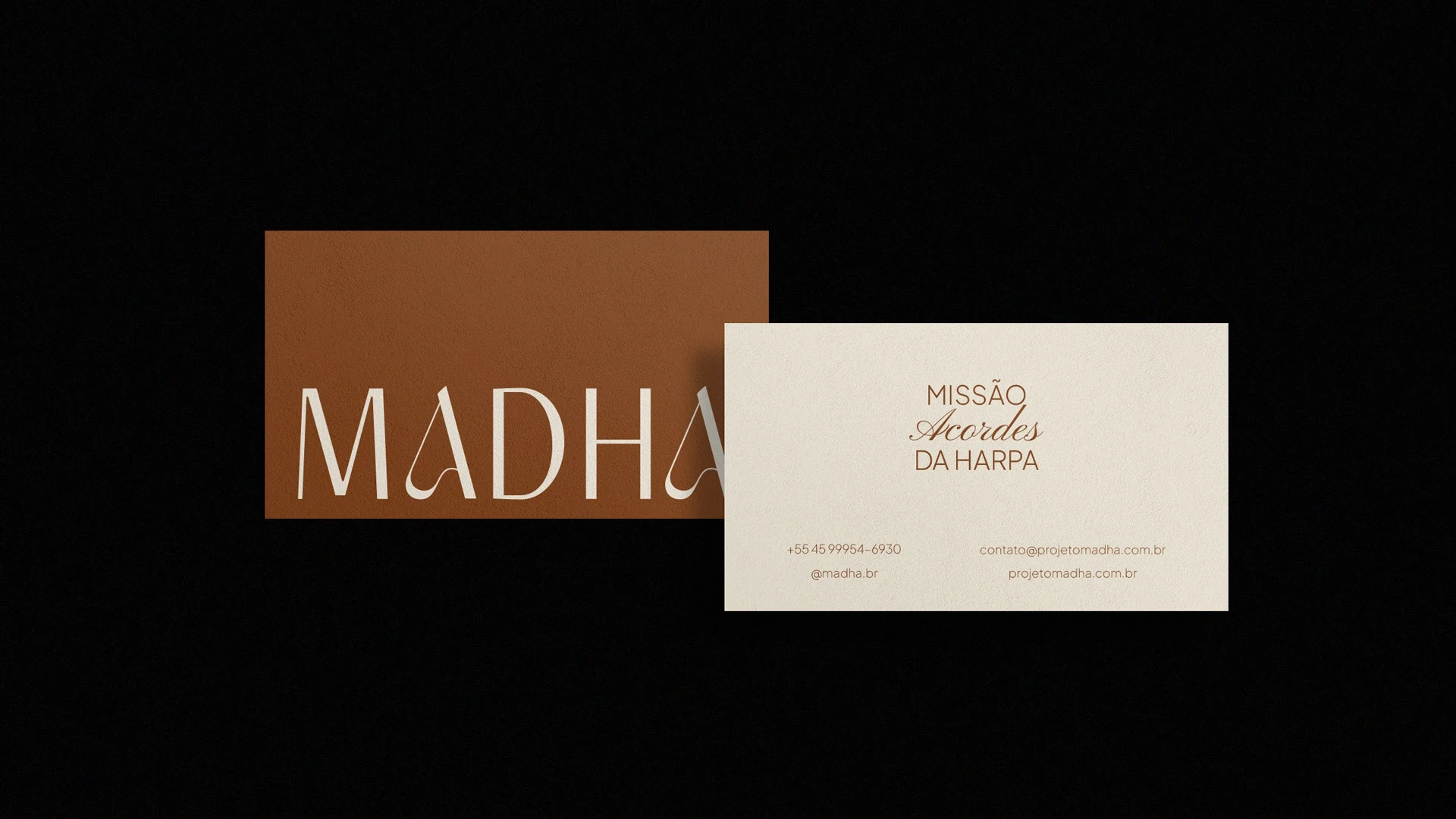
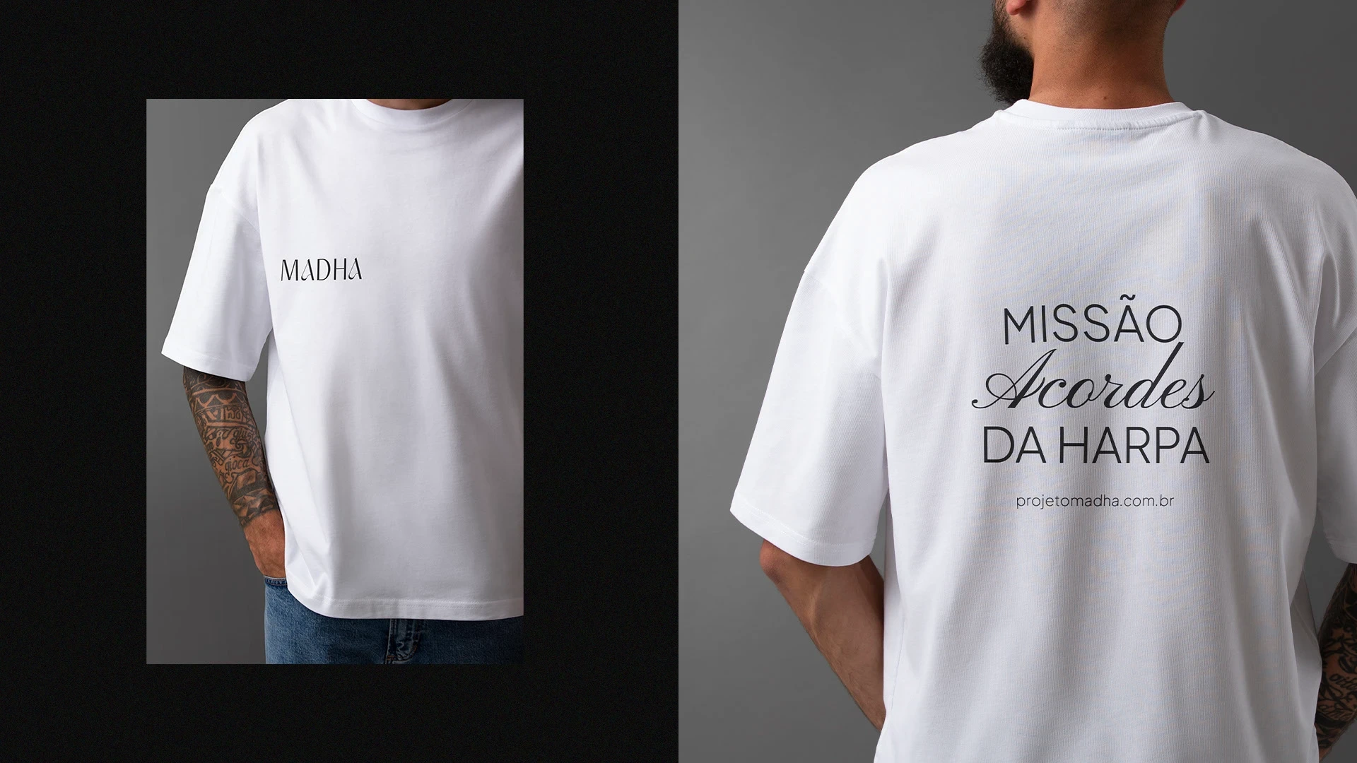
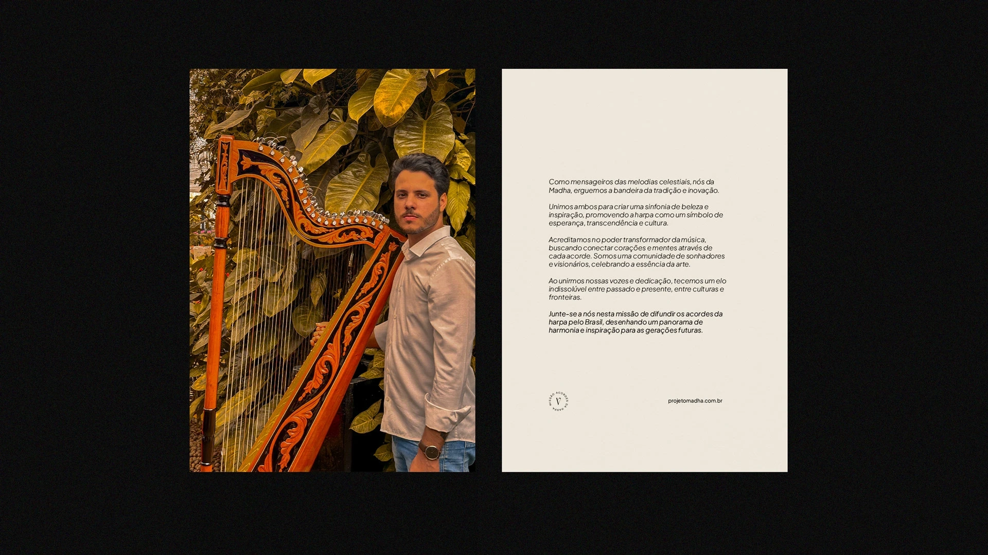
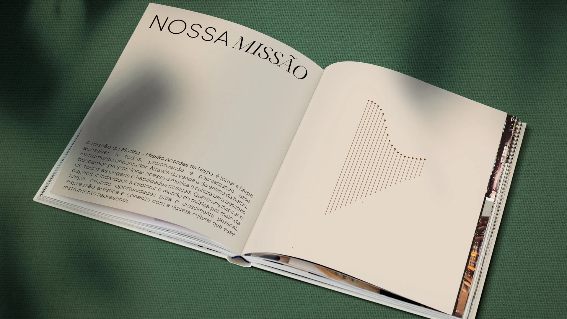
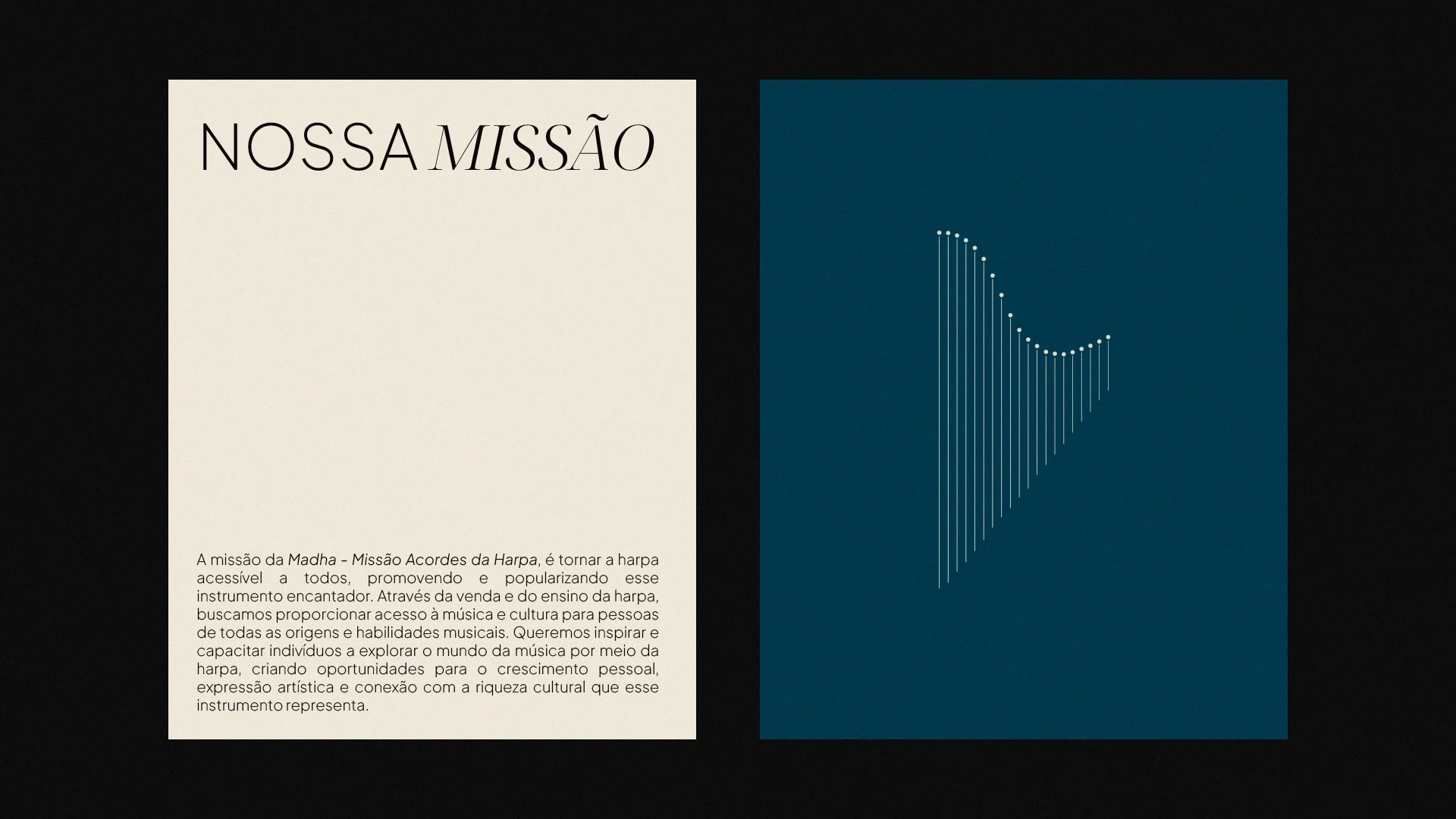
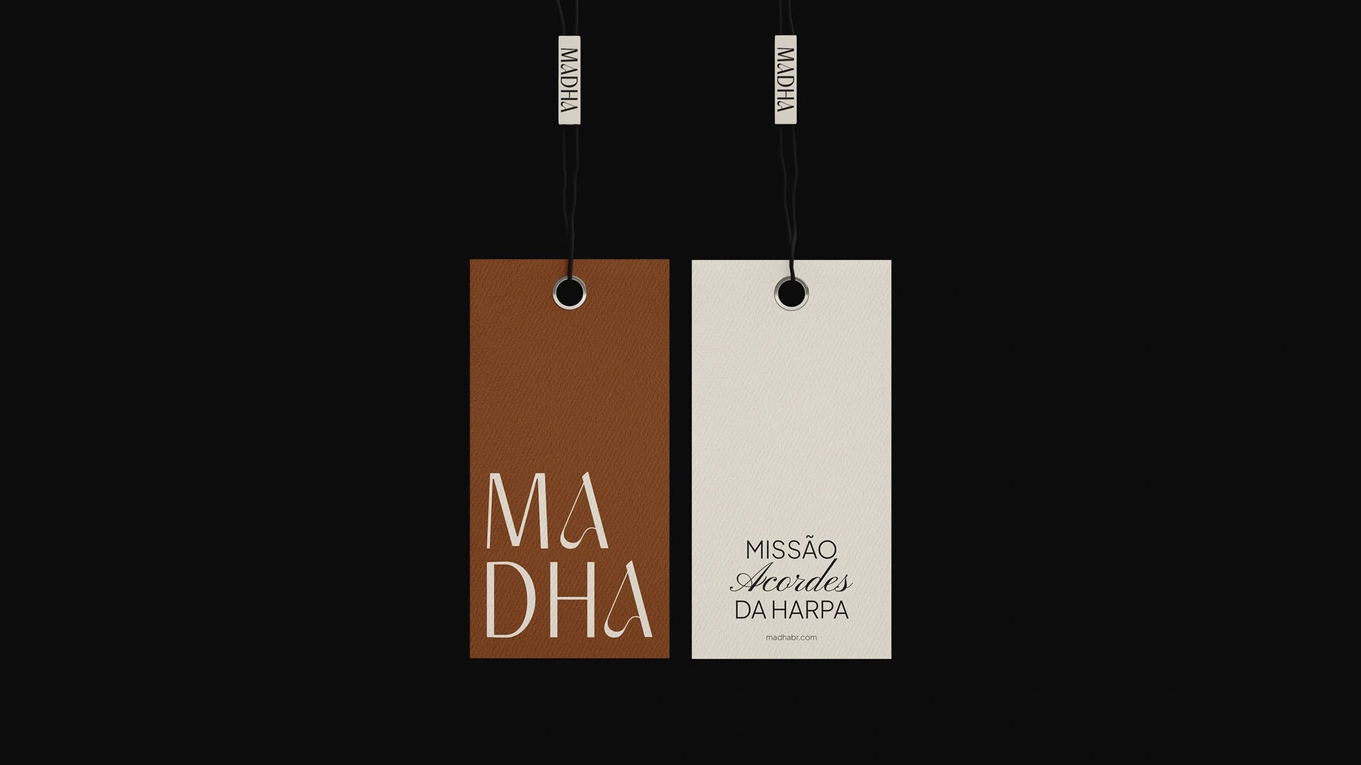
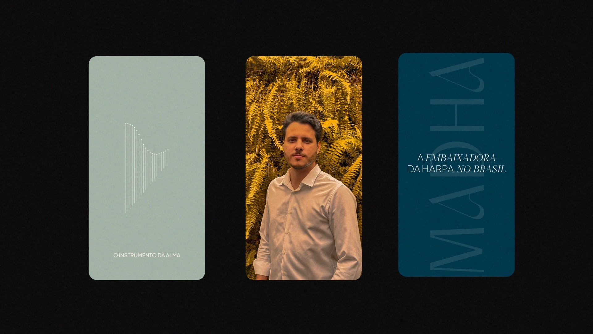
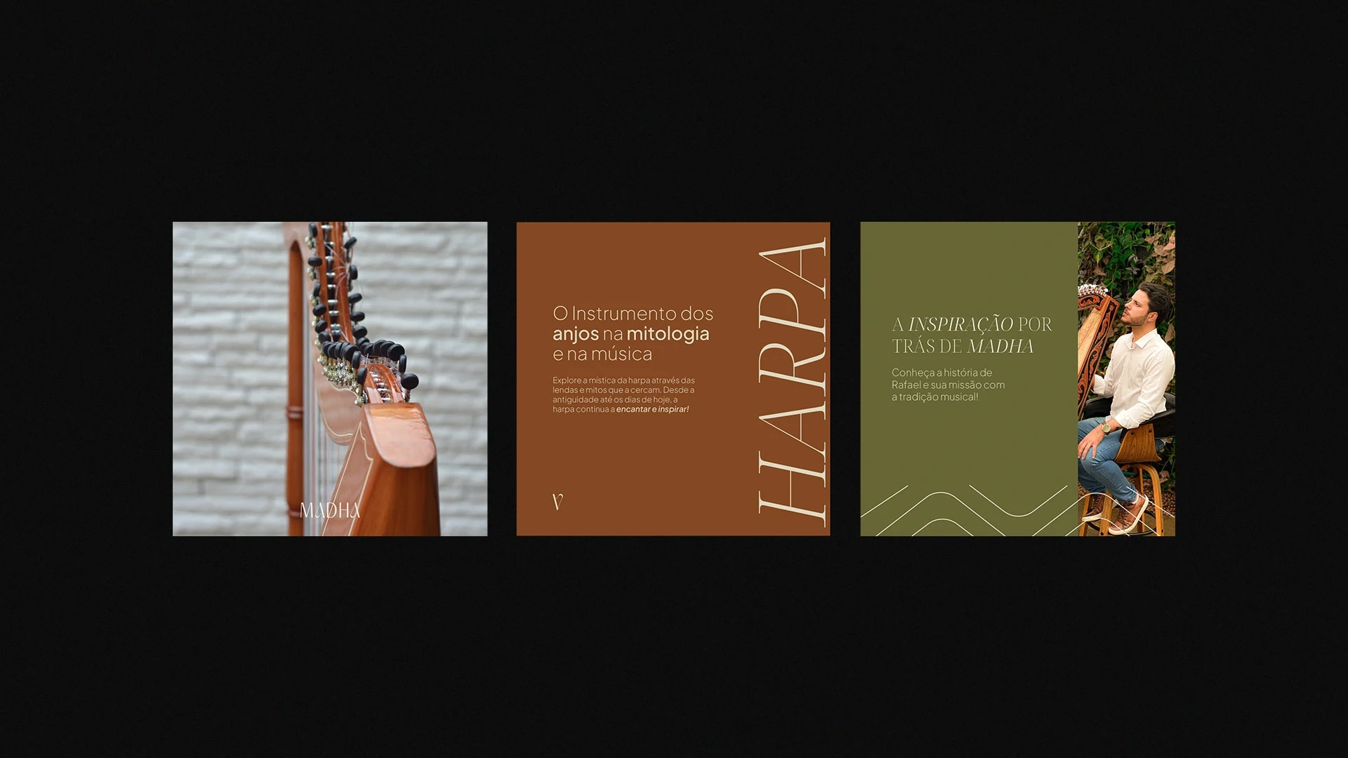
Madha - Missão Acordes da Harpa is a project created by Rafael Deboleto with the aim of promoting and popularizing the harp through the sale and teaching of this unique instrument.
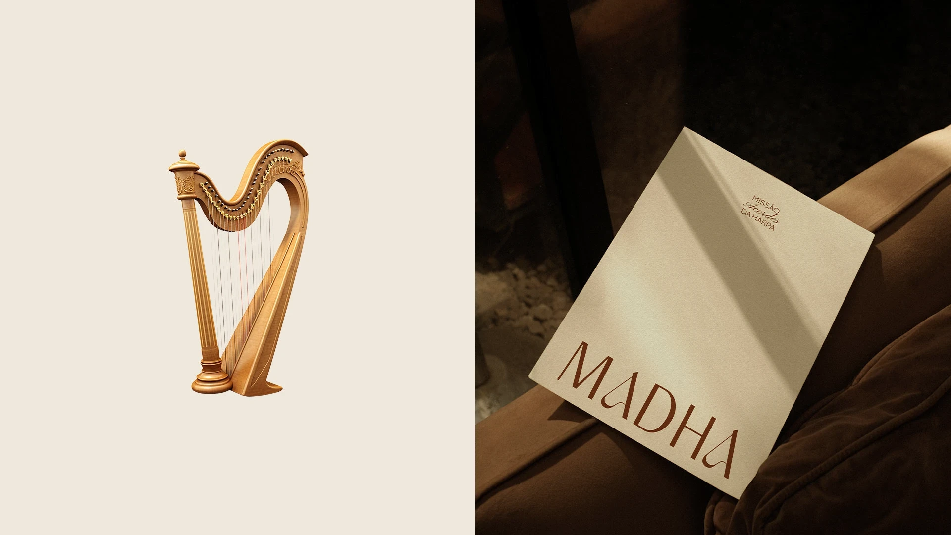
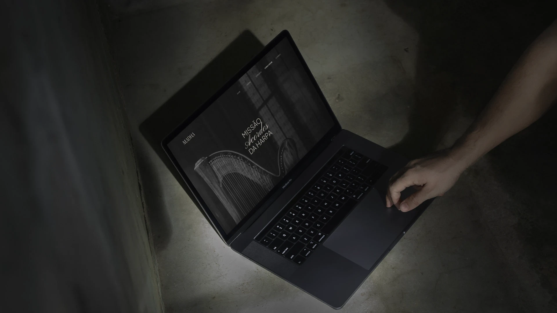
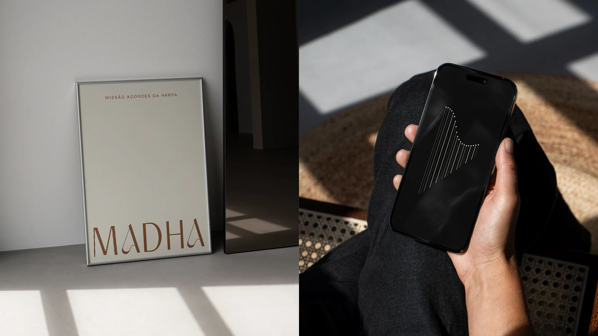
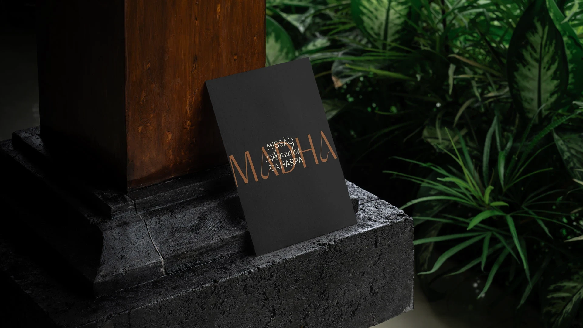
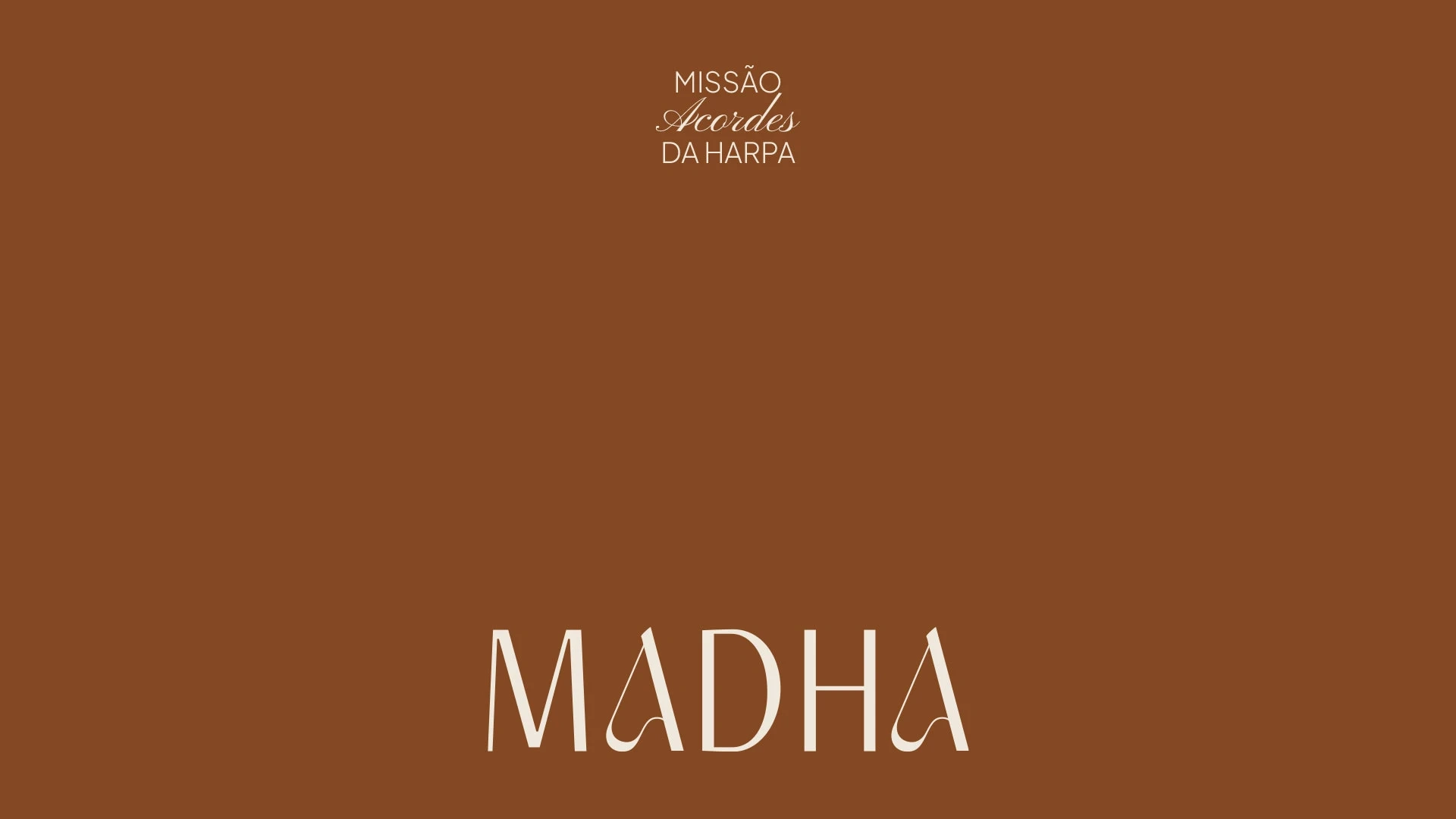
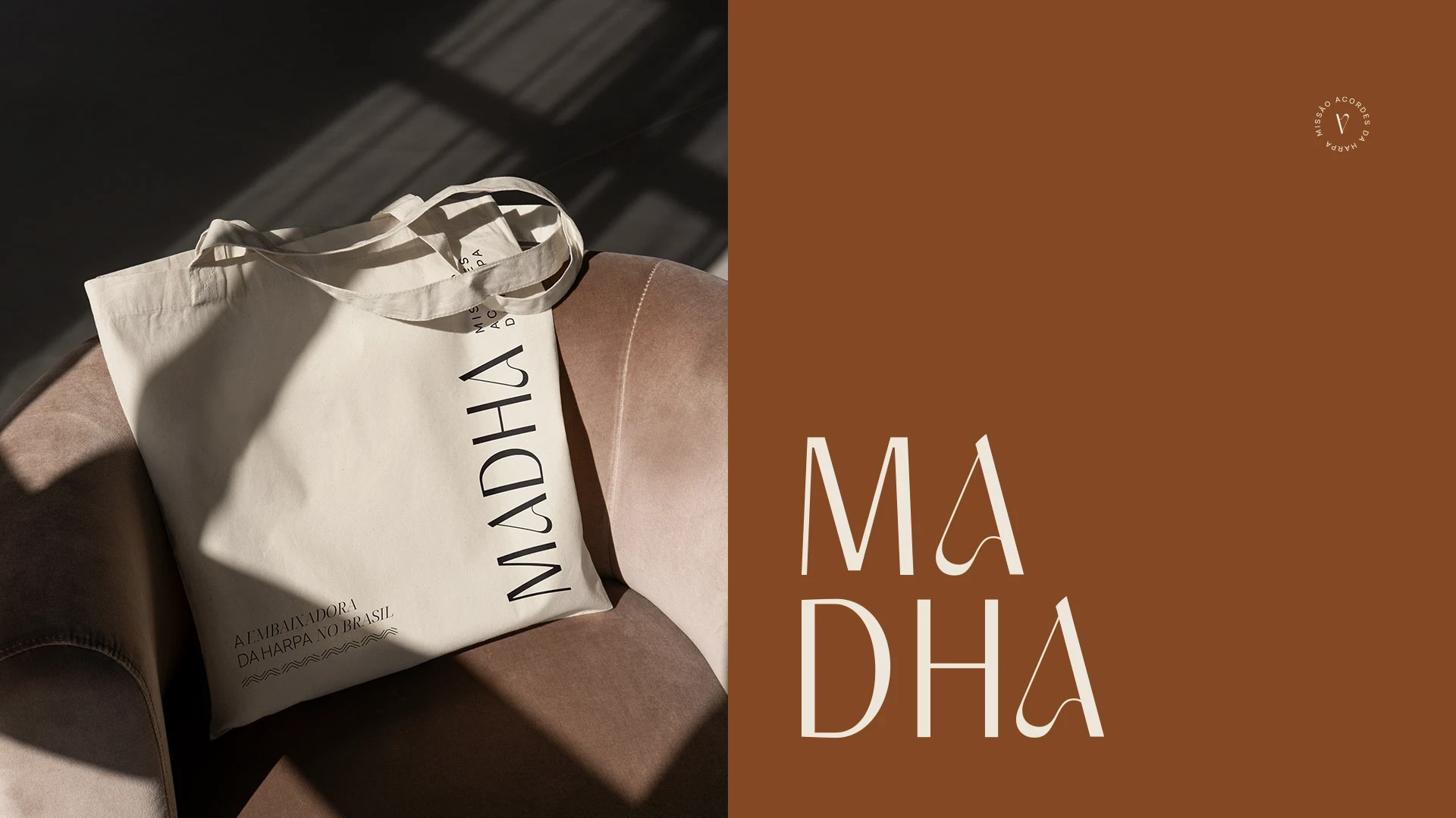
Madha combines the modern and the classical with sophistication and elegance, conveying a sense of nobility and refinement. Every detail is designed to reflect excellence, providing a timeless and contemporary visual experience.
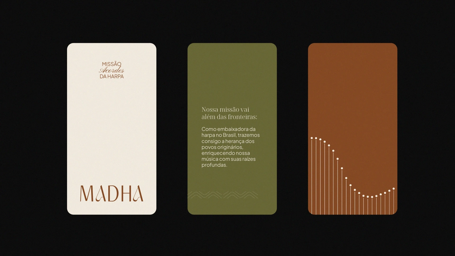
The color palette is a vivid expression of its essence, inspired by the beauty and authenticity of harps and nature. Earthy tones of brown, beige, and black reflect the elegance and serenity found in harp wood, while secondary colors such as green, gold, dark and light blue pay homage to the natural elements surrounding us.
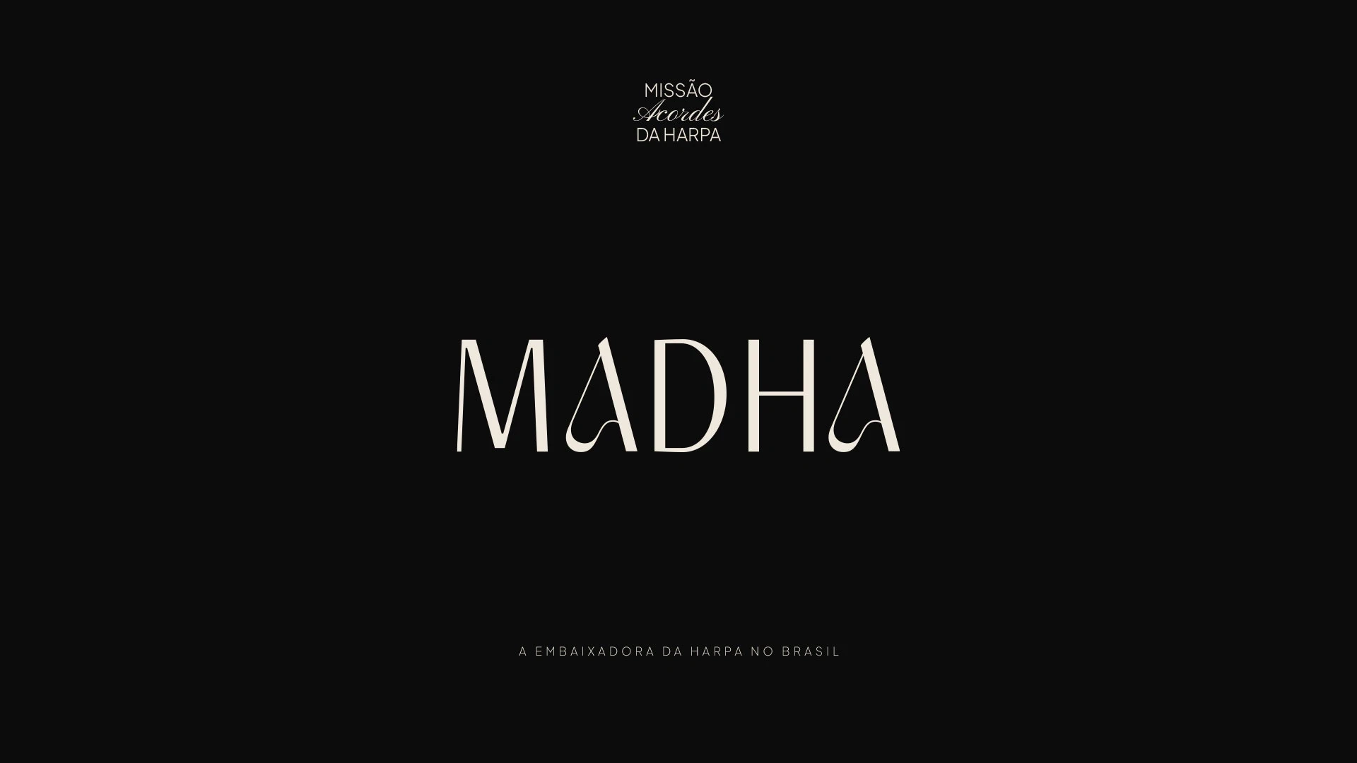
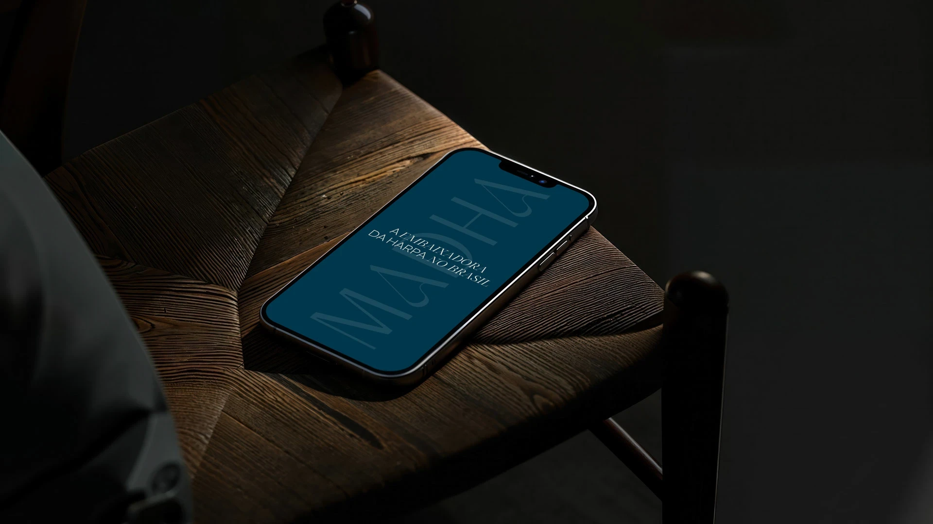
It's in this visual harmony that our brand comes to life. With a logo that exudes elegance and innovation, the clean typographic combination invites you to embark on a musical journey, where each letter tells a story. And at the center of this narrative, the letter A, inspired by the essence of the harp itself, where contrasts and curves come together in a perfect chord, conveying the duality of tradition and modernity. Thus, we present our logo: an expression of warmth, modernity, and passion for music

Like this project
Posted Oct 27, 2025
Created a sophisticated brand identity for Madha, uniting tradition and modernity to honor the harp’s artistry.