Cardify CRM

Due to an NDA, I can't post anything from the original project, this is a version of a real one made for a Red Ventures' client.
The context 🔎
Back in 2020, I was assigned to a really big project for the largest private bank in brazil. From the beginning, the team knew this would be a huge project due to the client's needs.
This bank has a giant product portfólio. Credit cards, financing, leasing, insurances, investments, POS machines... Something around 30 products. Every single one is managed by different teams, with their business requirements and client base. Every sales team used different systems (or sometimes, just Excell to control it all). So we started planning, interviewing, asking the sales team about their routines, and what would make their lives easier.
We discovered that:
☝️ Every product is unique.
☝️ It has to be as responsive as possible.
☝️ Built to scale without limits.
☝️ Should be a PWA.
☝️ Integrate client's information between products is a need, and so analytics
Where to start? 🧐
We knew that it has to be modular, with a huge components library, but first, we need to build a solid foundation to hold it all. A scalable navigation system was the first thing to be done. The user profile information holds what each one can access.
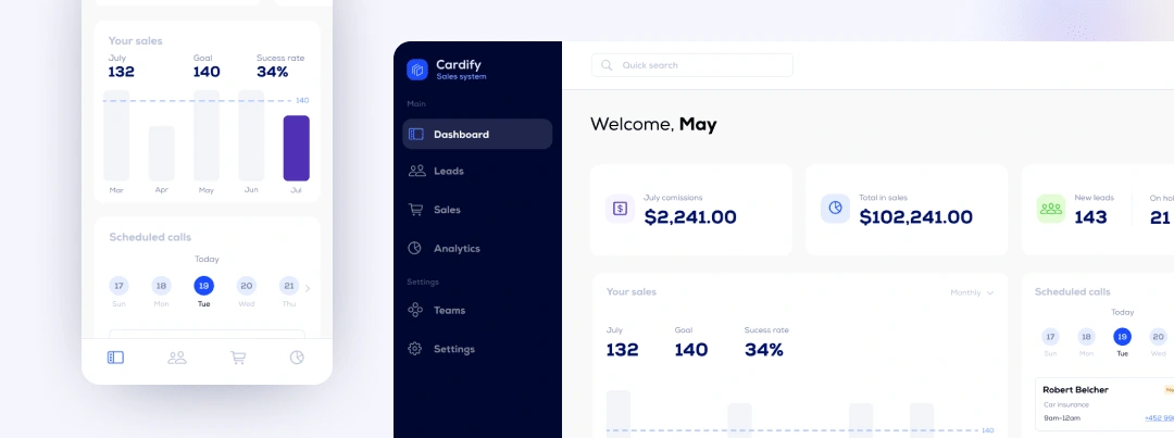
Once I figured out with de dev team how profiles, teams, and users would be managed, the navigation for mobile and desktop was designed to be flexible.
One fits all 🪢
Even though each product has its particularities, we need to build everything to be as reusable and responsive as possible to optimize development efforts.
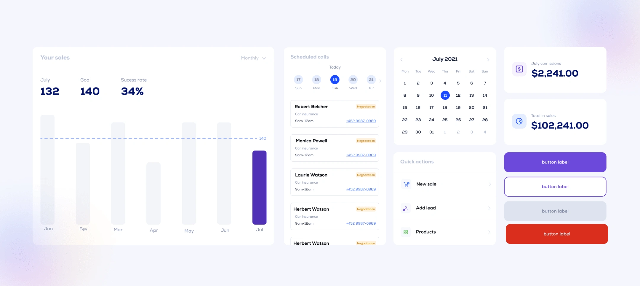
No more Excel, no more tables 🙅🏻
In the research phase, we discovered that most controls were made with spreadsheets. It was a mess. While thinking about how to make it better, I just tried to imagine how would I do this workflow and Jira came to my mind. I use it for years and can't imagine working without it. Kanban is a simple way to see the bigger picture, I love it but I was not sure about how the actual user could feel about it. To validate we created wireframes and show them to users to collect feedback. It was a success. Most people didn't know about it, and never had contact with it. At the first glance, people were amazed. It is so intuitive that every single person I spoke to understood without any explanation
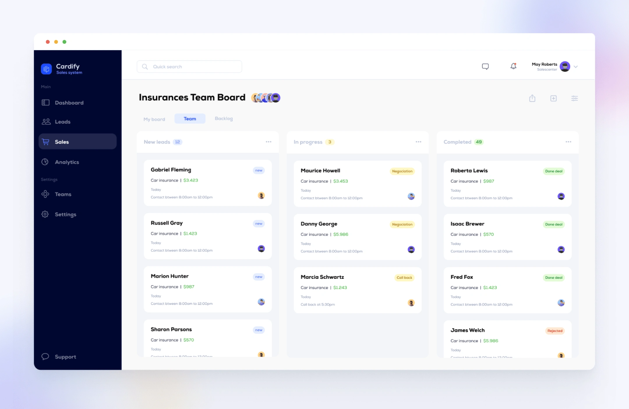
Team board example
A Sneak peek
Unfortunatelly, I can't show as much as I'd like to, so I selected some features which are "generic" but shows the essence of the product
Help center 🙋♀️
After the first release test, the plan was to make it available for 500 workers. That's a lot, so we invest time creating a help center and FAQ to optimize support
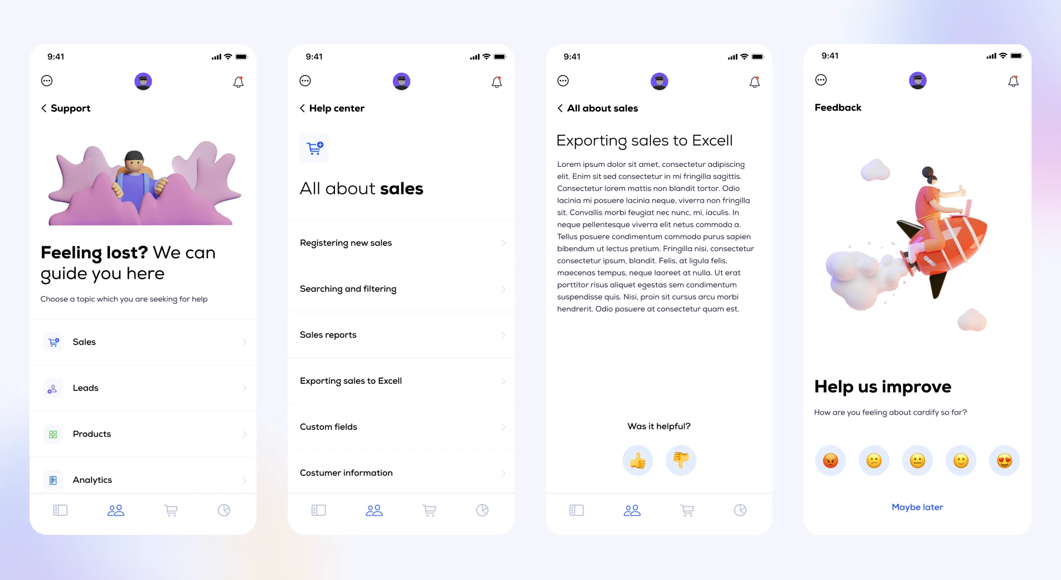
Mobile help center
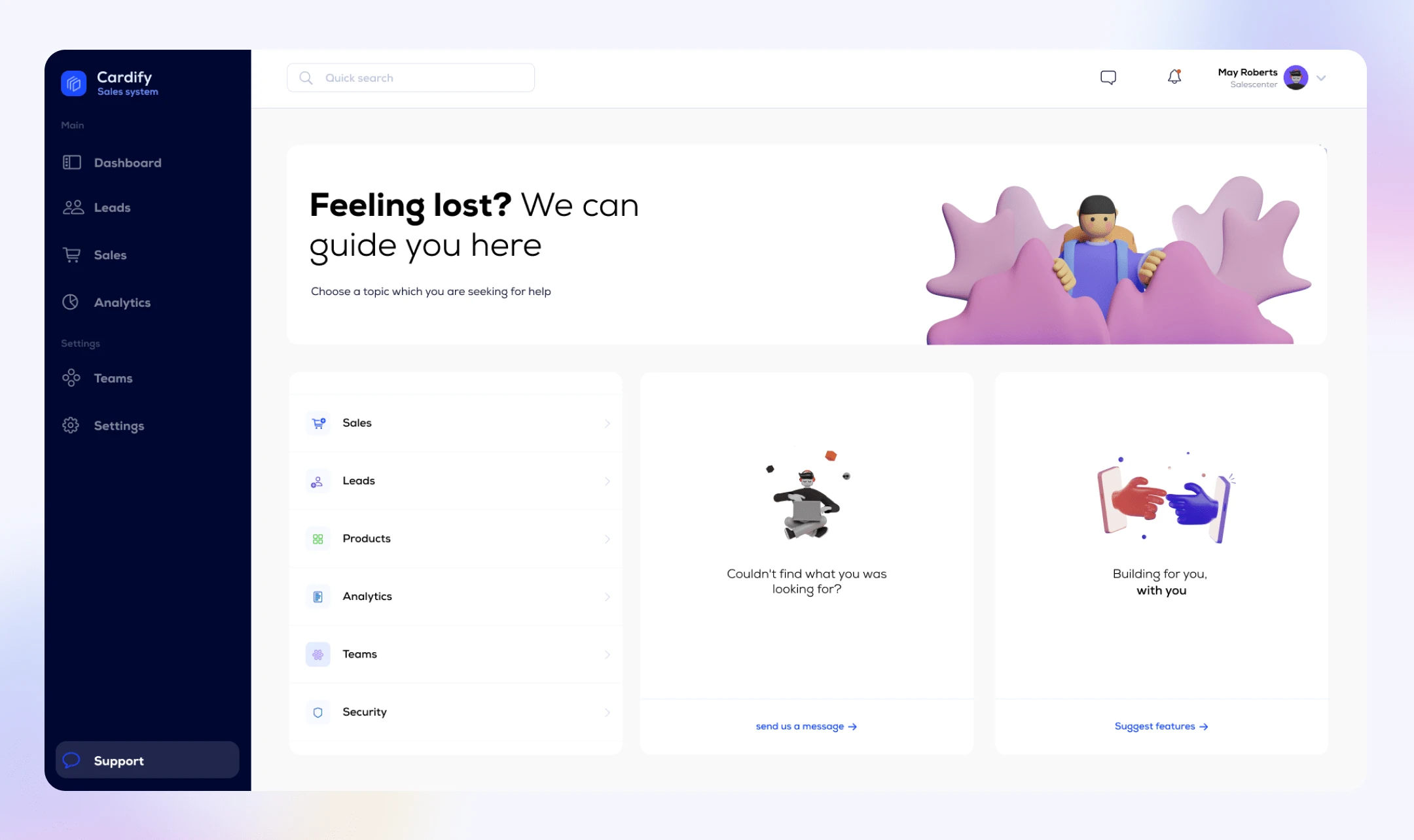
Desktop help center
Calendar 📅
Users had no system to manage scheduled calls and events. Some users used google calendar or outlook, some used post-its, and some used nothing. We planned a calendar where they can check all scheduled calls for the day, week, or month.
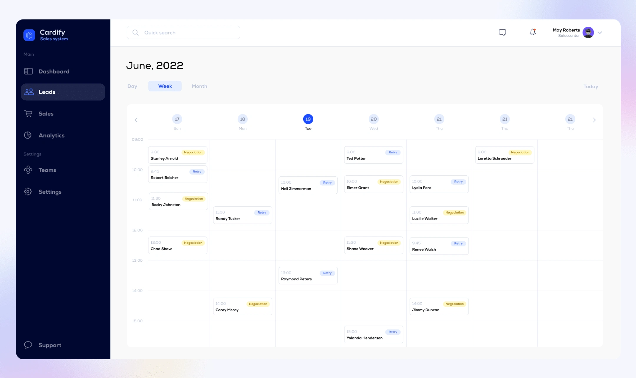
Calendar - weekly view
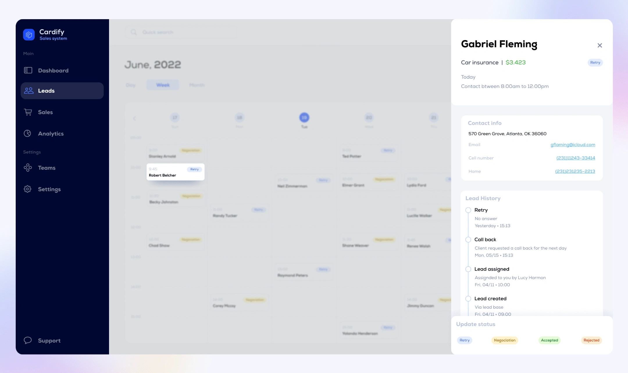
Calendar - event details
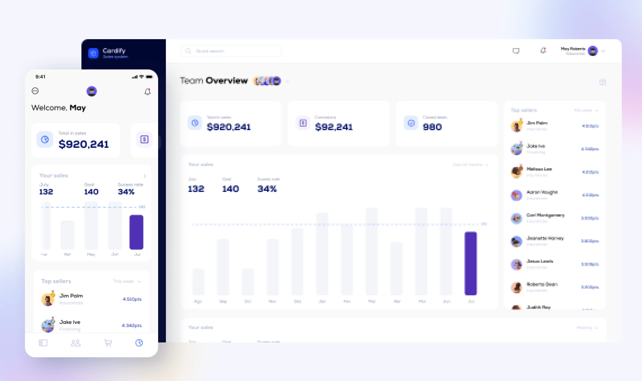
Analytics 📊
Analytics was both a need and a wish in our interviews. Sellers wanted to be able to keep up with their sales and managers to get insights into their team performance.
That's all. Hope you enjoy it ✌️

Like this project
Posted Apr 15, 2022
A modular sales CRM made the largest private bank in brazil
Likes
0
Views
38

