TechCre8 Brand Identity & Visual System

Kenny Dunn

The Brief
TechCre8 (Technically Creative LLC) needed a brand identity that could hold two worlds together: the precision of project management, Lean Six Sigma, and automation on one side, and the raw creativity of music production, sound design, and fine art on the other. The brand had to feel professional enough for consulting engagements while staying true to the creative spirit behind the work.
But the identity couldn't just be about what the brand does. It had to reflect what it stands for. TechCre8 is built on a strict ethical foundation: technology and efficiency in service of real value, never greed. Every product, every service, every piece of content exists to serve a purpose. Nothing ships that doesn't contribute to execution. And the brand stands firmly in support of marginalized communities and individuals. That's not a footnote. It's core to the identity.
I was the client and the designer. I knew the brand had to communicate that structured thinking and creative output aren't opposites, and that both can be rooted in values that put people first.
The Logo: Two Heads, One Mind
The TechCre8 logo is two profile faces looking in opposite directions. One represents the highly analytical, logical mind. The other represents the creative, organic, natural side. They overlap, because it's the intersection of those two modes of thinking that is the backbone of everything I build and everything my future team will create.
Human but machine. That duality isn't a contradiction. It's the gift.
The logo pulls two audiences into one cohesive brand experience: the people who need structured, efficient execution and the people who need creative vision. TechCre8 serves both because it is both.
The Approach
Every design decision was filtered through the same efficiency principles I apply to my consulting and production work. No wasted elements, no decoration for decoration's sake. Each piece needed to earn its place. Lean thinking applied to visual design: if it doesn't serve the message, it doesn't make the cut.
The logo system was built for flexibility. Multiple variations ensure the brand works across contexts: streetwear, social media, website headers, product covers, and client-facing materials. The visual language stays consistent whether it's on a Facebook business page cover or an Ableton Live training product.
The brand also extends into my daily workflow. I designed a set of 3840x1080 desktop wallpapers for an ultrawide monitor setup, built for Windows desktop switching using PowerToys FancyZones and virtual workspace layouts. Each wallpaper provides a visual representation of what function and category I'm currently working in, turning the OS itself into a branded productivity tool. The ultrawide wallpaper system is designed to scale: if I ever bring on employees (paid well), the ultrawide setup and wallpaper system would be standard issue for efficiency purposes.
What I Created
Streetwear logo for brand merchandise and casual brand presence
3840x1080 home screen wallpaper for branded ultrawide desktop
Facebook business page cover photo
Ableton Live training product cover photo
3840x1080 ultrawide work wallpapers for task bucketing via Windows desktop switching, PowerToys layouts, and workspace functions, providing visual cues for current work category
Cohesive visual system tying together the full TechCre8 brand
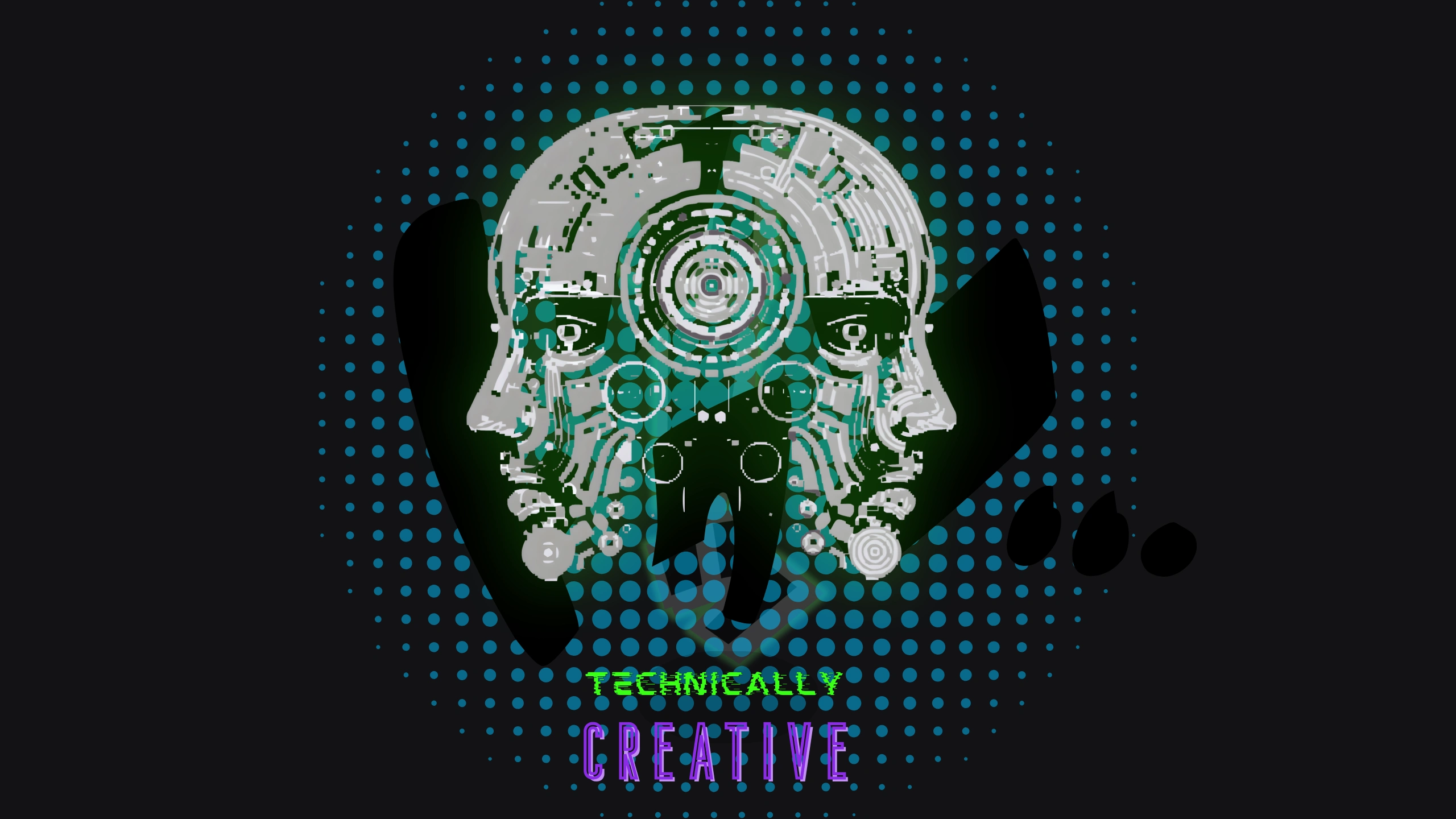
Streetwear logo

Brand 3840x1080 home screen wallpaper
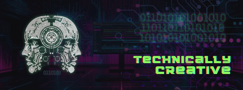
Facebook business page cover photo
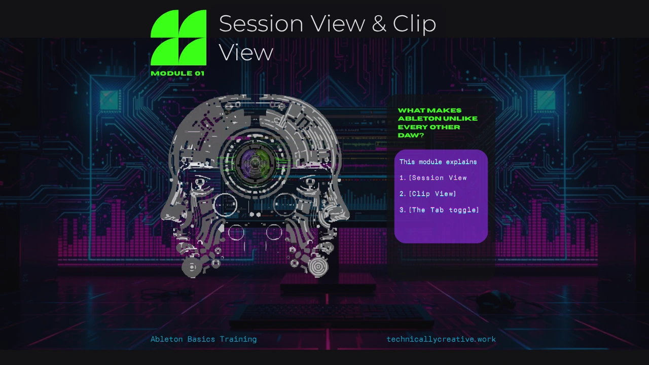
Ableton Live training product cover photo
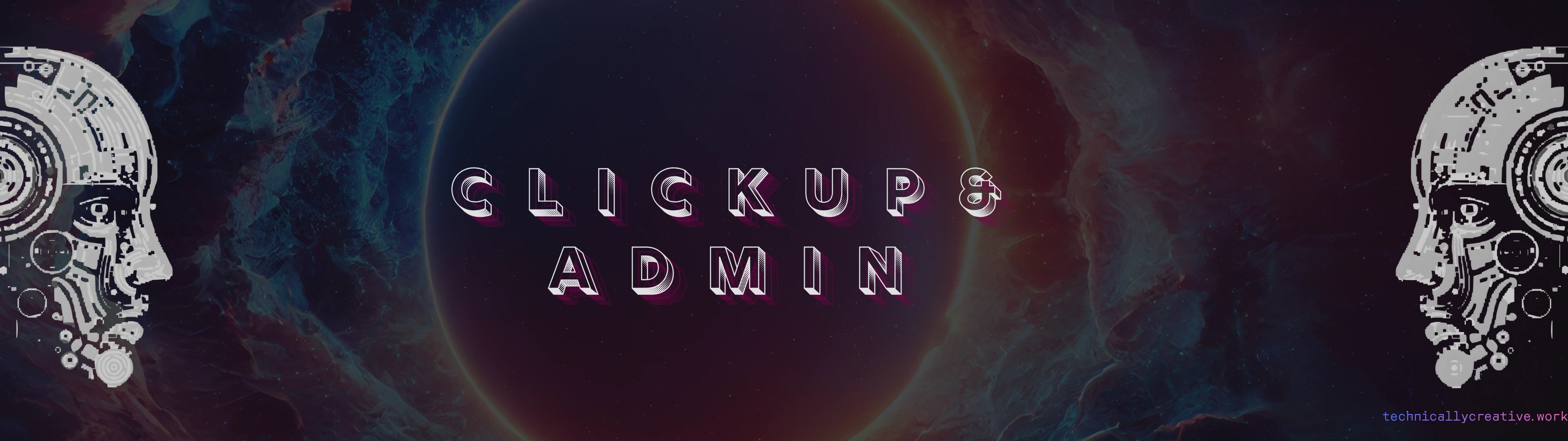
3840x1080 ultrawide wallpaper for task bucketing via Windows desktop switching and PowerToys workspace layouts
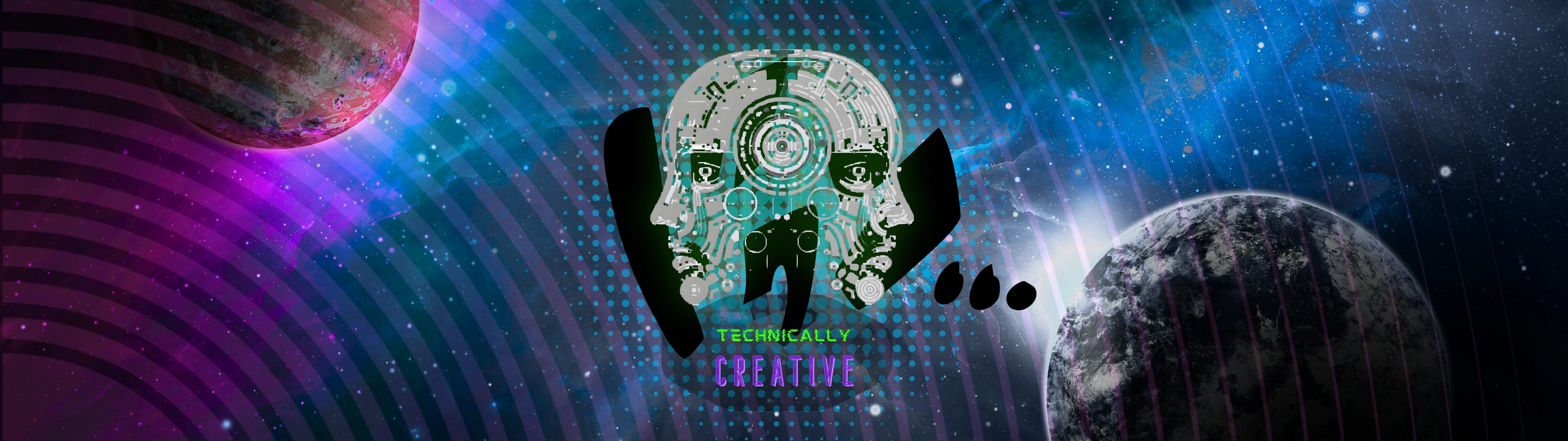
3840x1080 ultrawide wallpaper for task bucketing via Windows desktop switching and PowerToys workspace layouts
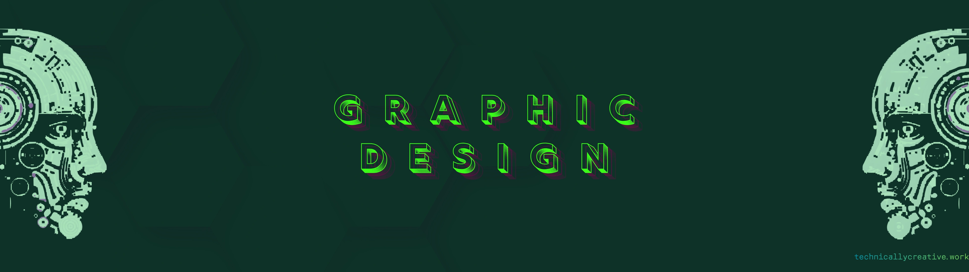
3840x1080 ultrawide wallpaper for task bucketing via Windows desktop switching and PowerToys workspace layouts
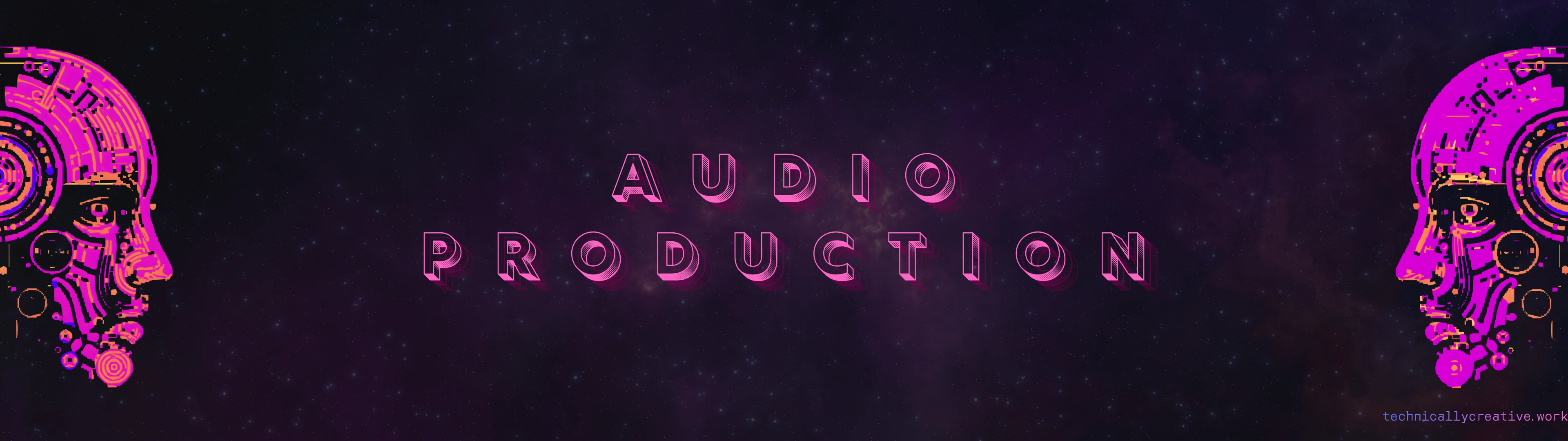
3840x1080 ultrawide wallpaper for task bucketing via Windows desktop switching and PowerToys workspace layouts
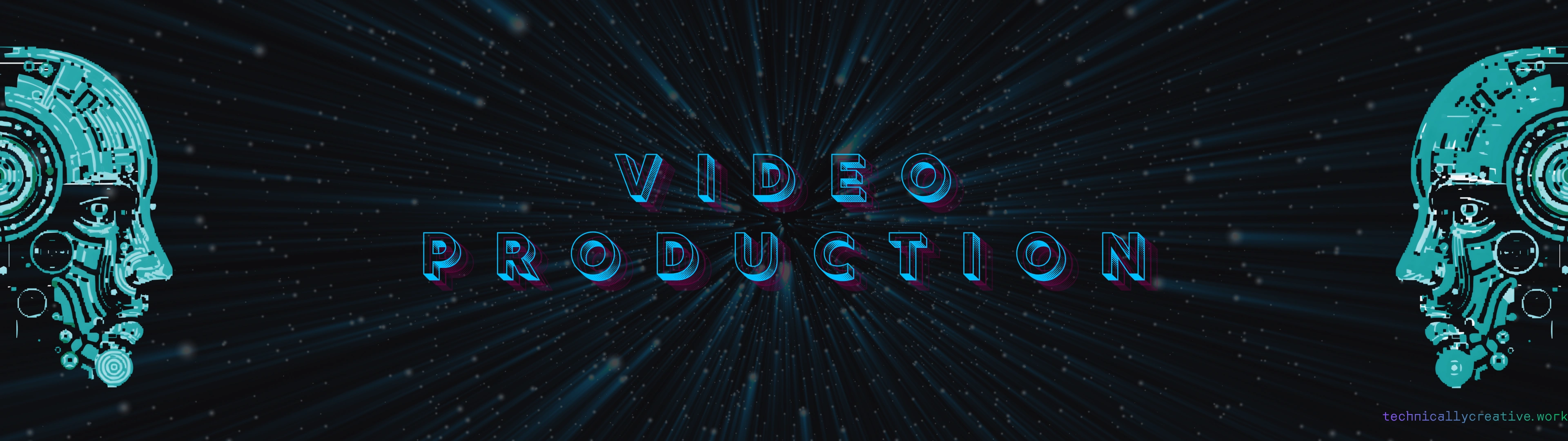
3840x1080 ultrawide wallpaper for task bucketing via Windows desktop switching and PowerToys workspace layouts
The Outcome
A cohesive brand experience that pulls two audiences into one. The analytical and the creative. The structured and the organic. Human but machine. The two-headed logo isn't just a mark; it's a statement that the overlap between these two sides is where the real work happens. Every asset in this system, from the streetwear logo to the ultrawide wallpapers, reinforces that identity across every touchpoint.
Like this project
Posted Jul 25, 2026
Full brand identity system for Technically Creative LLC: logo design, streetwear assets, social media covers, product artwork, and a branded ultrawide desktop wallpaper system built for productivity.