SeaCatBoats Digital Platform Design and Development

Sumit Joshi


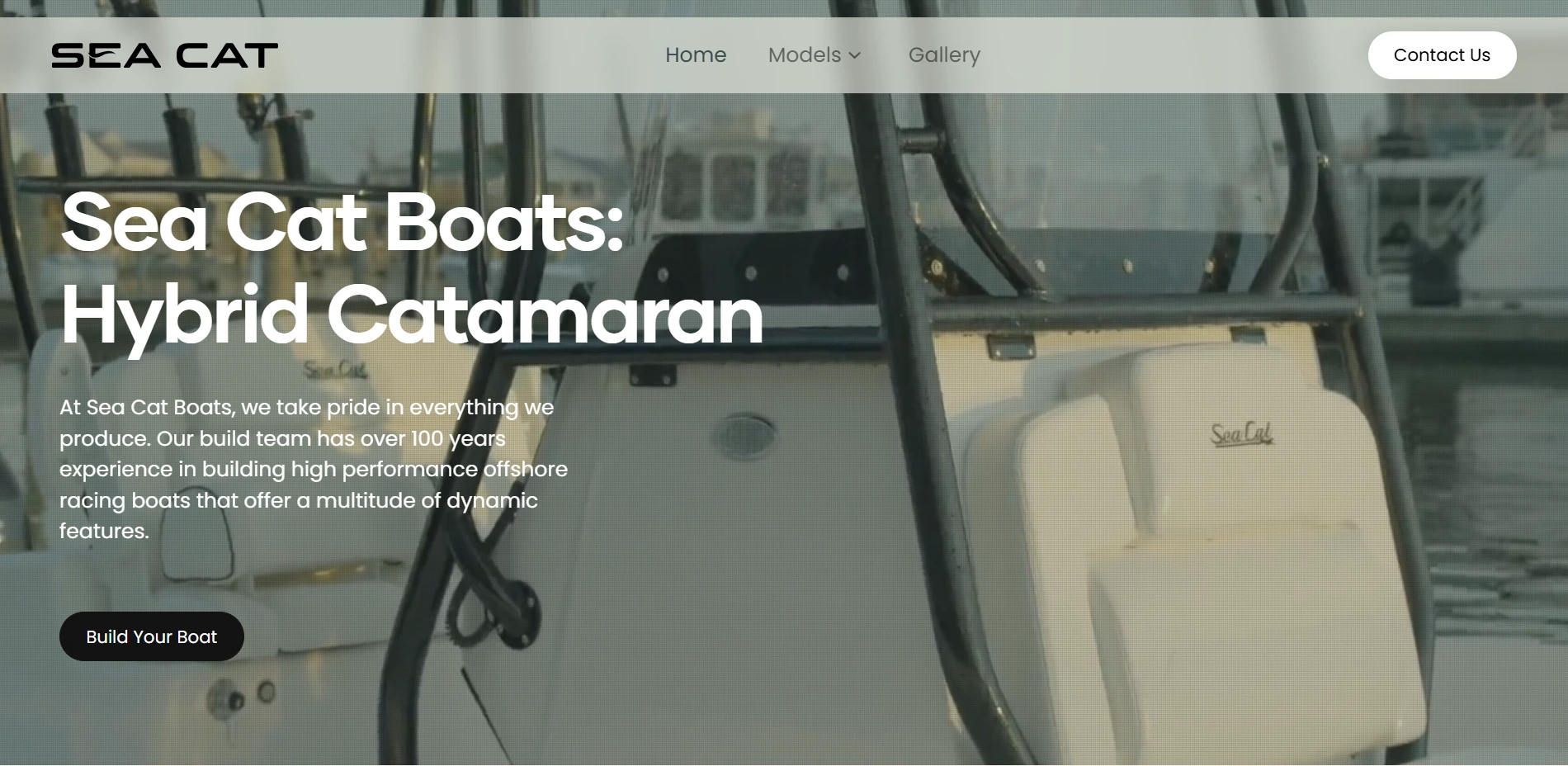
The homepage sets the tone: cinematic, restrained, product-first — no stock-photo boat clichés.
SeaCatBoats — The Feature That Could Have Sunk the Whole Site
A boat you can't picture is a boat you don't buy.
That was the problem sitting underneath everything else on this project. Sea Cat had a genuinely different product — a hybrid catamaran with proprietary AFTEC™ airflow technology — but online, "different" is invisible unless someone can see it. Static photos of a few color options weren't going to cut it. Buyers needed to build the thing in their head before they'd ever call a dealer.
So early on, one feature got promoted from "nice to have" to "the reason this site exists": Build Your Boat, a live 3D configurator.
It was also, by a wide margin, the riskiest thing on the roadmap.
Why it was the hard part
Most of a marketing site is forgiving. A slightly slow hero image, a layout that's a little off on tablet — nobody notices. A 3D configurator has no such grace period. It either feels real, or it feels like a toy. There's no middle setting.
And the constraints worked against each other in almost every direction:
Real-time 3D rendering is expensive. Marine buyers are often on slower connections — some on a boat, some abroad, some just on average home wifi.
The rest of the site was built to be cinematic — full-width video, high-res imagery. All of that competes with the configurator for the same bandwidth and rendering budget.
Get the physics or proportions even slightly wrong on a $100K+ product, and the brand's credibility takes the hit, not just the feature's.
Bolt on a heavy 3D tool the way most sites do it, and you get one of two failure modes: a beautiful site with a configurator that chugs, or a snappy configurator wrapped in a site that feels cheap everywhere else.
We didn't want either.
The approach
Instead of treating the configurator as a widget dropped into a page, we treated it as a first-class citizen of the site's performance budget from day one.
That meant making trade-offs deliberately instead of by accident — deciding upfront what "high-resolution" actually needed to mean on each page, so the configurator wasn't fighting oversized hero assets for the same rendering headroom. It meant tuning asset loading so the heavy 3D payload could load progressively — the boat appears and becomes interactive quickly, with detail refining as it goes, rather than the user staring at a spinner.
It also meant the configurator's UI had to earn its place next to the rest of the brand. A gorgeous site with a clunky, engineer-built configurator interface would have undercut the "premium" positioning the whole project was built on. So the controls — color, power, options — were designed with the same restraint as the model pages: clear, minimal, no visual noise competing with the boat itself.
The test we kept coming back to: would someone actually finish building their boat, or give up halfway and bounce?
What it made possible
The configurator isn't a gimmick sitting off to the side of the site. It's the point where browsing turns into intent — a buyer who's spent ten minutes picking a color and a power option has, without realizing it, started making a decision. That's a fundamentally different kind of visitor than one who's just scrolled a spec sheet.
Getting it fast and smooth mattered because a laggy configurator doesn't just annoy people — it undoes the exact trust the rest of the site worked to build. A brand that feels premium everywhere except the one interactive moment doesn't feel premium at all.
The takeaway
The hardest feature on a site isn't the one that looks the most impressive in a screenshot. It's the one where "almost right" and "right" produce completely different outcomes.
For SeaCatBoats, that was Build Your Boat — and getting it right is the difference between a visitor who admires the boats, and one who starts building theirs.
Like this project
Posted Dec 16, 2025
Developed a digital platform for SeaCatBoats highlighting premium features and customization along with a 3D Builder of a SeaCat.
Likes
2
Views
10