From Frankenstein UI to Conversational Flow—A UX Case Study
Wanderson Jackson
Minicule Case Study: From Frankenstein to Flow—Redesigning for Real Researchers

Intro: The Monster Under the Hood
Minicule started as a classic founder story, vibecoding their way to an MVP. Fast forward, and what we had was a Frankenstein product: stitched together, unpredictable, and a pain to use. Users (actual scientists!) were getting lost in the app, unable to tell an agent from a project, or figure out what the hell happens next after asking a research question. The result? Drop-off rates that would make any SaaS founder sweat.
The Problem: A Maze of Unclear Concepts
From the landing page to the first research attempt, users were stuck. They’d ask the AI a question, get three follow-ups, and then stare at the screen wondering what’s happening. Reports? Knowledge graphs? Agents? Projects? All a blur. Founders wanted to hook users with a free research flow, then get them to sign up for the final report. But the flow was broken from the start.
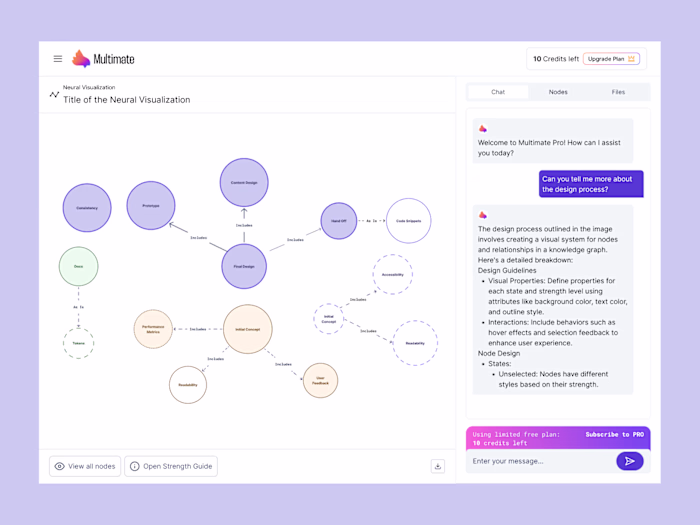
UIs that would make any designer cry, so don't click on it you might cry too...
My Approach: Don’t Just Ask the Founders, Ask Everyone
I could’ve just asked the founders what they wanted and jumped straight into Figma. But that’s not my style. I talk to customers, users, developers, marketing, PMs, and even support. Why? Because every perspective brings insights, opportunities, and exposes technical landmines.
The concept of “AI agent” is still pretty alien to most people. Their first interaction with AI is ChatGPT. So, making Minicule’s value clear was half the battle.
This is what my co-creation session can look like, pure chaos but the insights are generally great
Workflow: Empathy(tell me what's up, users/humans), Co-Creation, and Gorilla Testing
User Pain Audit: I started by figuring out what frustrates users in their current workflow.
Open-Ended Interviews: Asked users about their first thoughts and friction points when using Minicule.
Team Goals: Sat down with the team to clarify if we’re chasing acquisition, retention, or just trying to save/make money for customers.
Co-Creation Sessions: Got everyone in a room (or Zoom), presented the pain points, and sketched solutions together. No right answers, just ideas, sketches, and post-its.
Consolidation: Gathered feedback, voted on solutions, consolidated into a wireframe, and shared for final feedback.
Design & Usability Testing: Designed the new flow, then hit up 3-5 power users for guerrilla usability tests. Customer success folks joined in—they’re on the front lines and know what’s broken.
Handoff: Once the design was greenlit, handoff to devs was smooth. No surprises, no “what the hell is this?” moments.
The Fix: Conversational, Unified, and Transparent
We ditched the scattered, Frankenstein UIs. Instead, we went all-in on conversational patterns users are familiar with. Everything became a research flow, just with different modes and depths. Quick research? Reliable sources, the agent delivers a doc/report. Deep research? Build a project, see transparent progress, get artifacts like knowledge graphs, dendrograms, mindmaps, and reports.
Projects, research, and agents they’re all just different flavors of the same thing(artifacts). Agents run in the background, projects are built via conversation, and users always know what’s happening.
Bam! there you go, a bit more polished and using already existing patterns to make user life easier
Why It Works: Less Cognitive Load, More Research
By simplifying flows and consolidating code, components, and logic, we made the app easier to maintain and faster to ship. The new conversational agent lets users focus on meaningful discoveries, not figuring out the UI. For the team, it’s a single source of truth, easier handoffs and less chaos.
The Outcome (So Far): Solid Foundation, Real Feedback
We’ve built a solid design system and a new app experience that leverages users’ existing habits, not forcing weird new patterns down their throats. The rebuild is still in progress, so I can’t share hard results yet. But soon, all customers will get the new experience, and we’ll track metrics, get feedback, and keep iterating. Result: Founders are happy with the new design, developers are happy because no surprises, and hopefully more customers.
Mobile experience
TL;DR: From Frankenstein to Flow
Minicule went from a stitched-together mess to a streamlined, conversational platform for researchers to actually get sh*t done.
Still a lot to work on and improve, but this is at least a starting point, didn't reinvented the wheel, just used Shadcn UI/Tailwindcss as a solid foundation so the devs won't hate me and they can focus on what really matter, shipping fast and having more customers using the cool thing they built.
That’s the story so far: turning chaos into clarity, and giving researchers the tools they actually need to get meaningful work done. The new Minicule isn’t perfect (yet), but it’s got a solid foundation, a design system that actually makes sense, and a conversational flow that puts users first.
Still plenty to improve, but at least now the team can focus on shipping fast and making users happy, instead of fighting the UI monster. If you want to geek out about the process, see more behind-the-scenes, or chat about design and product, hit me up.
Here’s to less confusion, more discoveries, and building apps people actually want to use.
Curious about my work or want to dig deeper into my process? Let’s chat. I’m always up for sharing insights, walking through my workflow, or swapping stories about design, product, and the chaos of building great apps. Reach out if you want to learn more or just geek out about UX.
Like this project
Posted Sep 15, 2025
How I led the redesign of Minicule’s research platform, transforming a chaotic, stitched-together app into a conversational experience for scientists.
Likes
1
Views
28
Timeline
Sep 2, 2025 - Sep 13, 2025