Redesigning Multimate.io's Knowledge Graph
Wanderson Jackson
Case Study: Multimate.io – Redesigning Knowledge Graphs for Clarity, Collaboration, and Mobile
Quick note: This is a condensed case study—due to NDA restrictions, I can’t share all the product details here. However, I’m happy to walk you through my workflow and design breakdown in the Figma file if you’d like a deeper dive. I know your schedule is packed, so I kept things concise rather than crafting a full-blown case study.
Overview
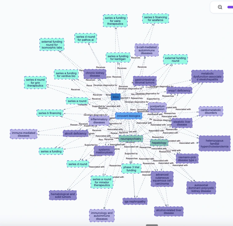
Multimate.io is an AI-driven platform that turns messy, unstructured content—like PDFs, academic papers, or internal docs—into interactive knowledge graphs. Users can explore these graphs visually, ask natural language questions, and extract insights in real time. Think of it as a research copilot, powered by GPT-4, Claude, and Gemini, with traceable, verifiable outputs.
My role: Product Designer
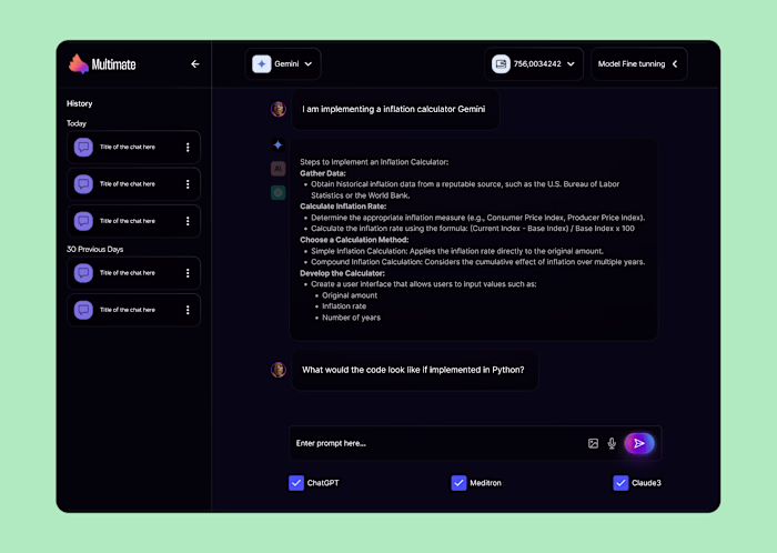
Scope: Interface redesign, mobile-first experience, and a scalable design system to help developers avoid the frustration of repeatedly implementing yet another node. Don't believe me? I have proof in the screenshot below
Problem
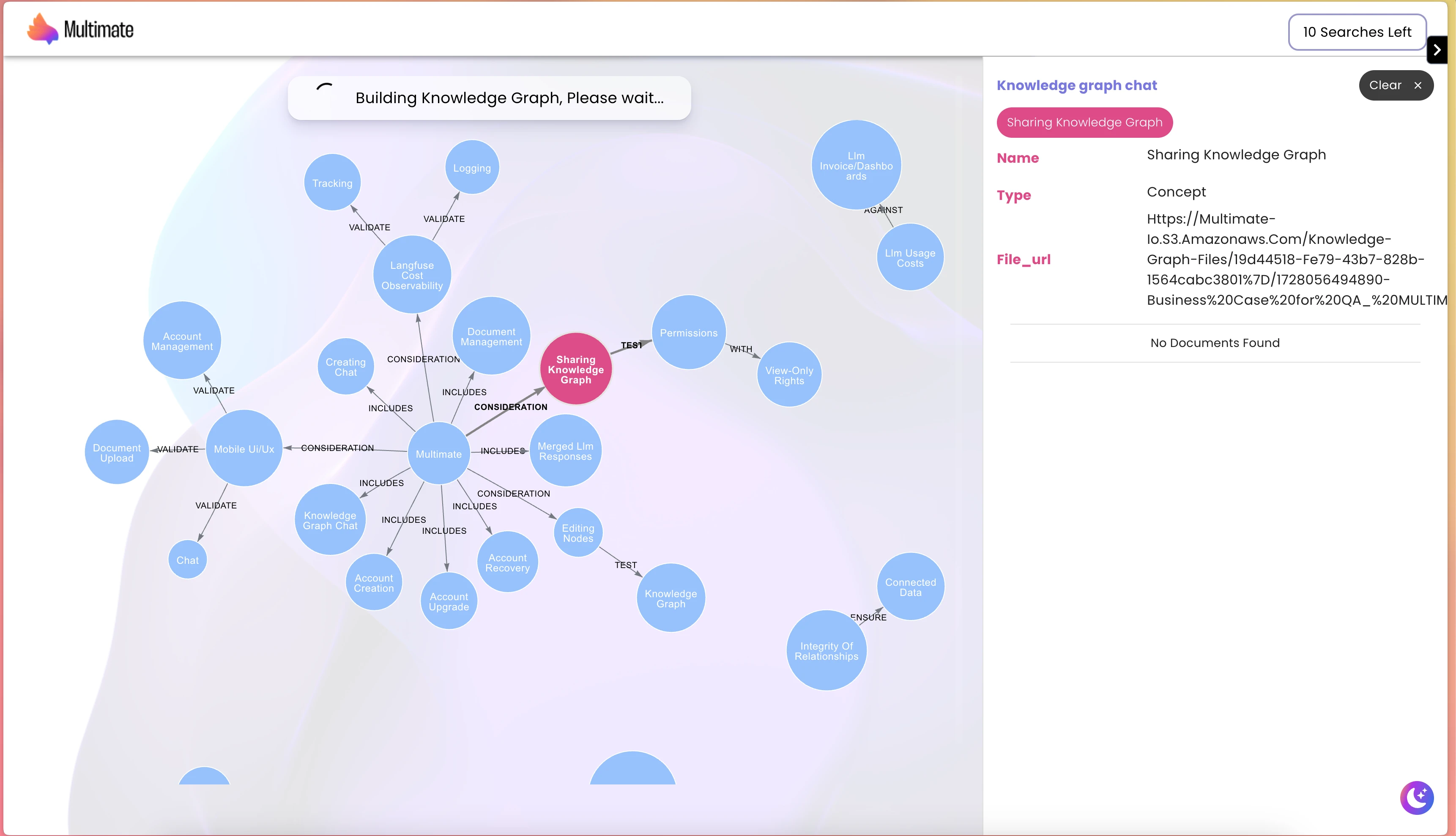
Despite its powerful engine, the early version of Multimate struggled with usability. After speaking with users, I found that while they saw the platform’s potential, they struggled to make sense of the information structure, source details, and overall progress. There was also confusion regarding the strength of sources (weak, medium, or strong), as well as how nodes, their relationships, and attributes interrelate. Users faced four key friction points:
Information overload: Graphs became chaotic fast—no visual hierarchy, no clear starting point.
Navigation pain: Large graphs were hard to explore. Panning and zooming felt clunky.
Mobile black hole: The product was barely usable on phones or tablets.
Fragmented collaboration: Side panels (chat, notes, and roles) were disjointed, breaking the flow.
This was the previous design state: bit of a cluster funk
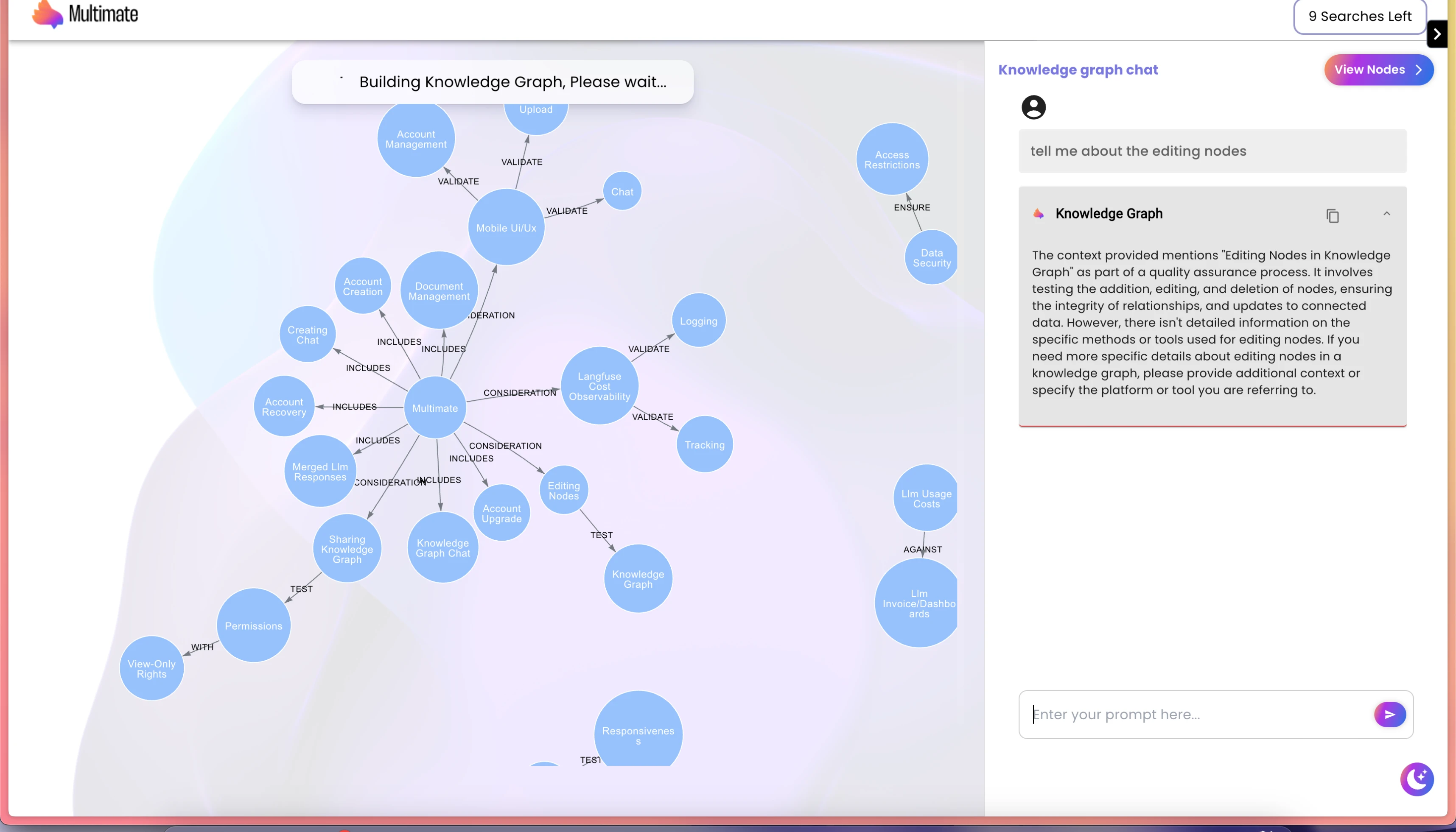
Made by tech bros
For tech bros lol
Yeah, accibility left the chat
Design Goals
We focused on three primary challenges:
1. Make Complexity Legible
Reworked the graph visual language to guide the eye and reduce noise.
Introduced entry points and contextual breadcrumbs for orientation.
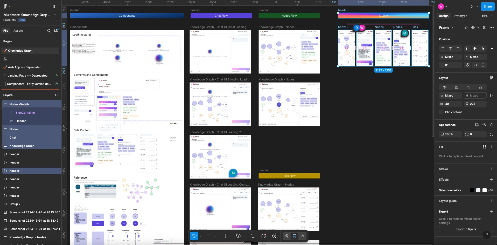
2. Build a Modular Design System
Created reusable Figma components for everything: node types, states, tooltips, panels, layouts.
Ensured consistency across different flows—chat, notes, roles, citations.
3. Bring Graphs to Mobile (Finally)
Designed responsive layouts for phones and tablets.
Enabled touch-friendly gestures for graph navigation and interaction.
Process
UX Audit: Mapped friction across the entire interface—graph interactions, sidebar behaviors, mobile views.
Componentization: Built a scalable system in Figma with atomic design principles.
Flow Mapping: Reimagined user journeys for tasks like querying data, adding notes, and assigning roles.
Mobile First: Created adaptive layouts to keep node clarity intact across breakpoints.
Cross-functional Work: Collaborated with engineers and PMs to prioritize design debt vs. shipping timelines.
Source, trust me bro - Jokes I can't really show more here, I'll be able to
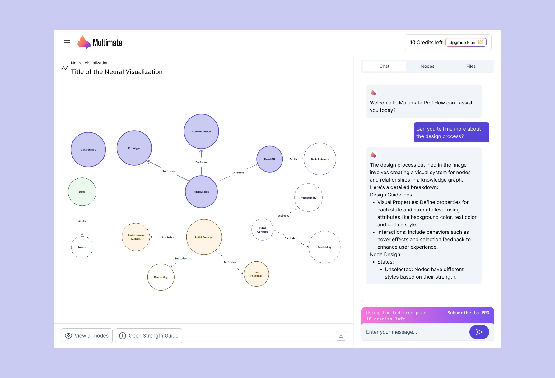
Noise. Clear, Structured and less chaotic
Results
Cleaner graphs: Better visual hierarchy, with interactions that feel natural.
Unified sidebar experience: Notes, chats, and context now live in one intuitive place.
Mobile unlocked: Users can now explore and interact with graphs on mobile—no more desktop-only limitation.
Design velocity: The new system made future features easier and faster to design and build.
No developers were harmed in the process: With the new design system and UX improvement, developers could be able to implement and ship things faster without having a meltdown.
Money being made: Now 50 paying customers in the pharma industry, big pharma is a bit trickier to share their data, so now the app is just a gateway to making them understand how the application works, to later be installed locally under their own ownership. That's all I can say for now.
Impact
New users got up to speed faster—onboarding friction dropped significantly.
Teams started using Multimate in mobile settings (meetings, field work, etc.).
The product team now ships with a unified system—less duplication, faster iteration.
The app is now in production, and has changed to a different niche and focused on Pharma as one part of the work coming up with the ICP, tracking user behaviour, and was beyond UI design, had a lot of Product involved, but for the sake of NDA, I will not explain it in the case study, next season(our call I can maybe share that).
That's all, folks.
Hopefully, we can chat soon
Don't be shy, we can schedule a call - https://cal.com/wanderson-jackson/catch-up
Wanderson Jackson
I Design AI apps
Like this project
Posted Aug 26, 2025
Redesigned Multimate.io's interface for better usability and mobile access.
Likes
0
Views
22