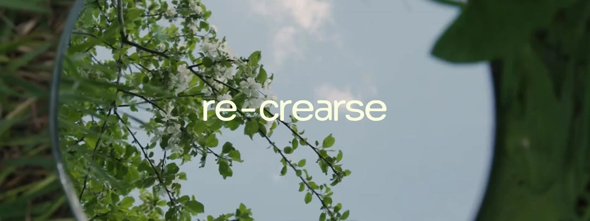
re-crearse
Diana Garcia
Challenge: Re-Crearse came to us with a clear, heartfelt vision: a therapy practice rooted in nature’s cycles — encouraging reflection, release, and rebirth. But while the concept was powerful, the visual identity didn’t yet reflect that depth or intention.
Our solution? Turn that internal clarity into a cohesive brand that feels grounded, intuitive, and calming — while still standing out in the clinical wellness space.
A holistic therapy practice that draws from the natural cycles of life as both metaphor and guide for moving through life’s ups and downs.
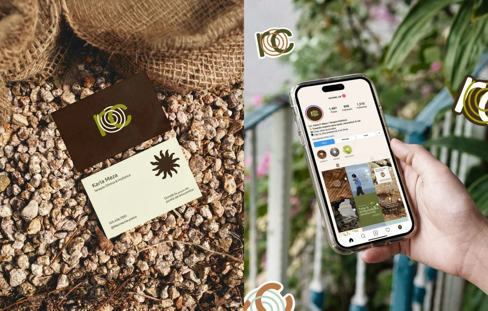
(1) Creative Direction
Leaning into organic textures and subtle symbolism, the overall direction was meant to feel nurturing, introspective, and rooted in nature’s rhythm.
All with one powerful message: "La pausa como punto de encuentro"
(Where the pause becomes a meeting point) one where you get to meet yourself.
Like this project
Posted Dec 8, 2025
A holistic therapy practice that draws from the natural cycles of life as both metaphor and guide for moving through life’s ups and downs.
Likes
0
Views
3