Branding for Crypto Consultancy
Diana Garcia
Coinbolt Identity Design
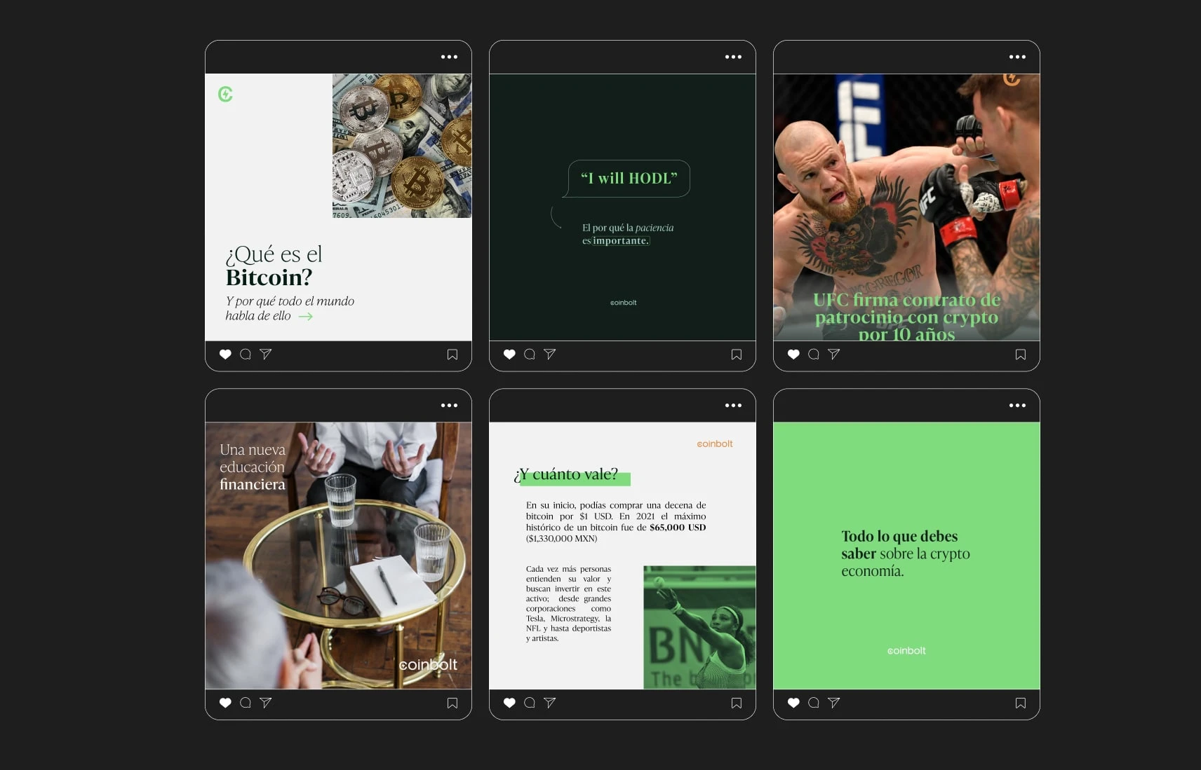
Overview: Coinbolt is a consultant agency designed to bring crypto literacy to Latin America, making financial education more accessible to communities who are often excluded from traditional systems. The goal was to create an educational hub where people could learn the basics of crypto, gain confidence in navigating digital assets, and receive tailored consultations for investing.
Description: The visual identity needed to reflect both the bold and revolutionary spirit of crypto investments and the approachable, trustworthy side of education. The branding leans into strong contrasts and vibrant colors to convey innovation and energy, while pairing them with softer, calmer tones to build trust and a sense of clarity — crucial traits for a consultancy.

Design Solution
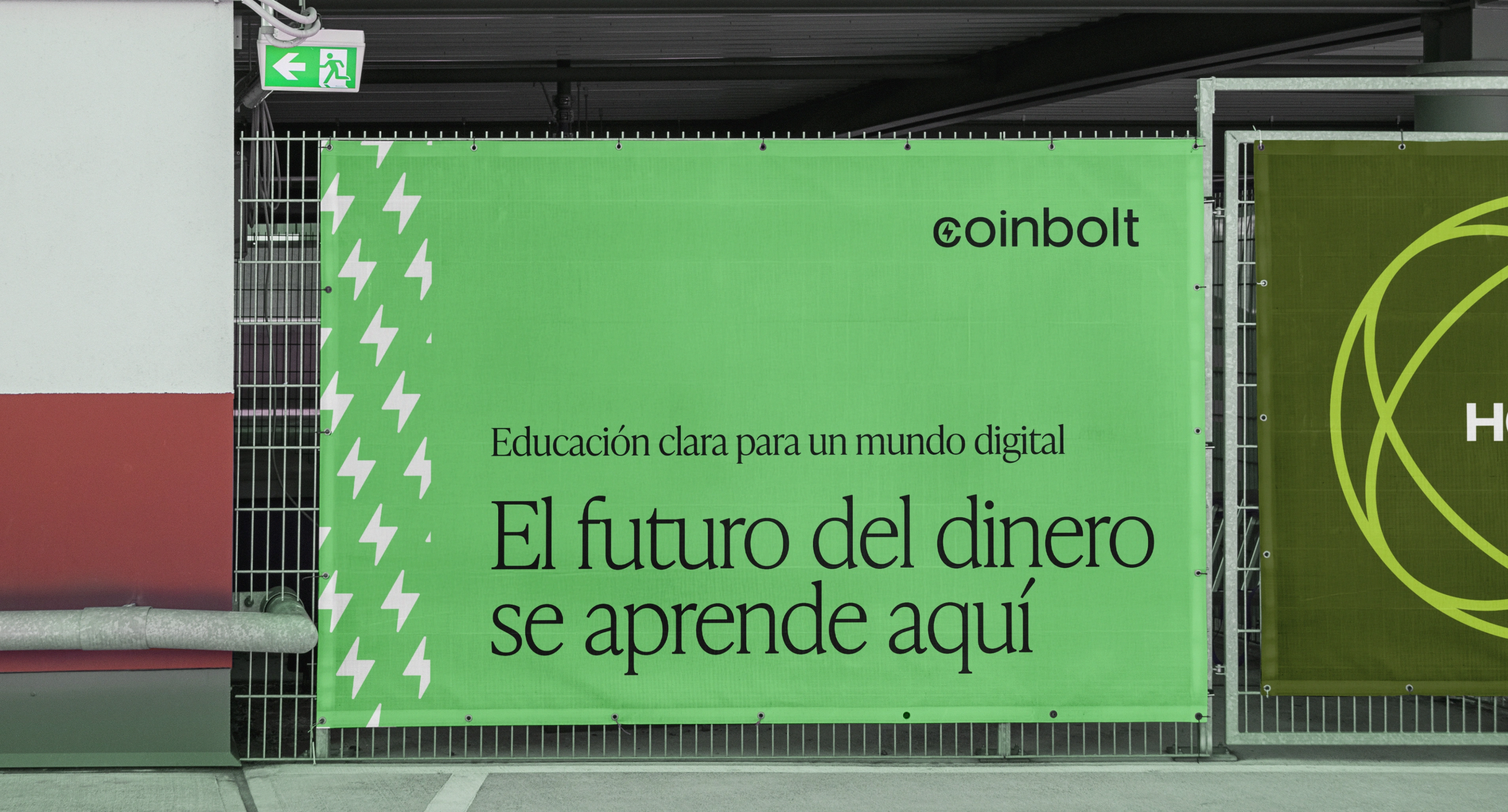
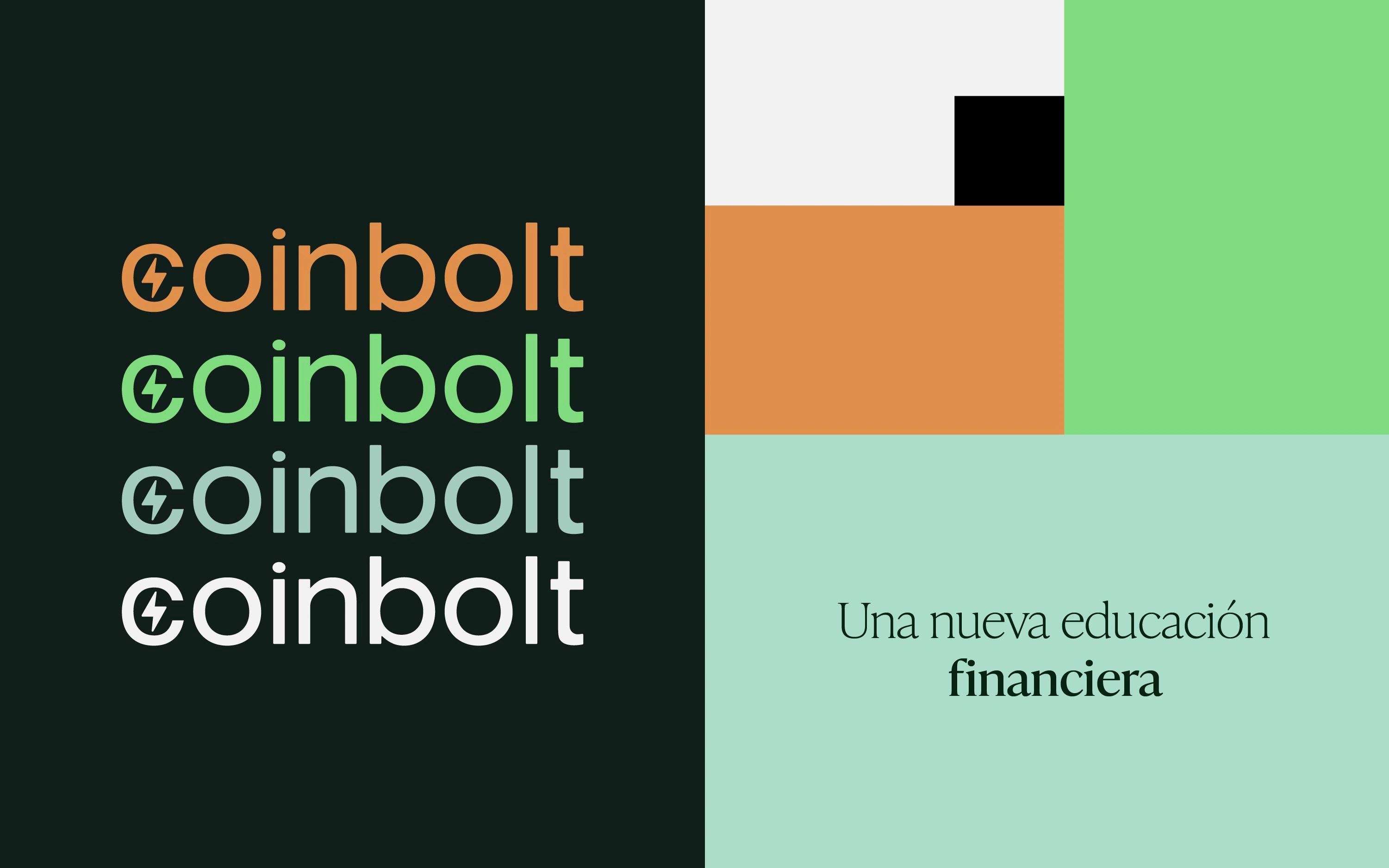
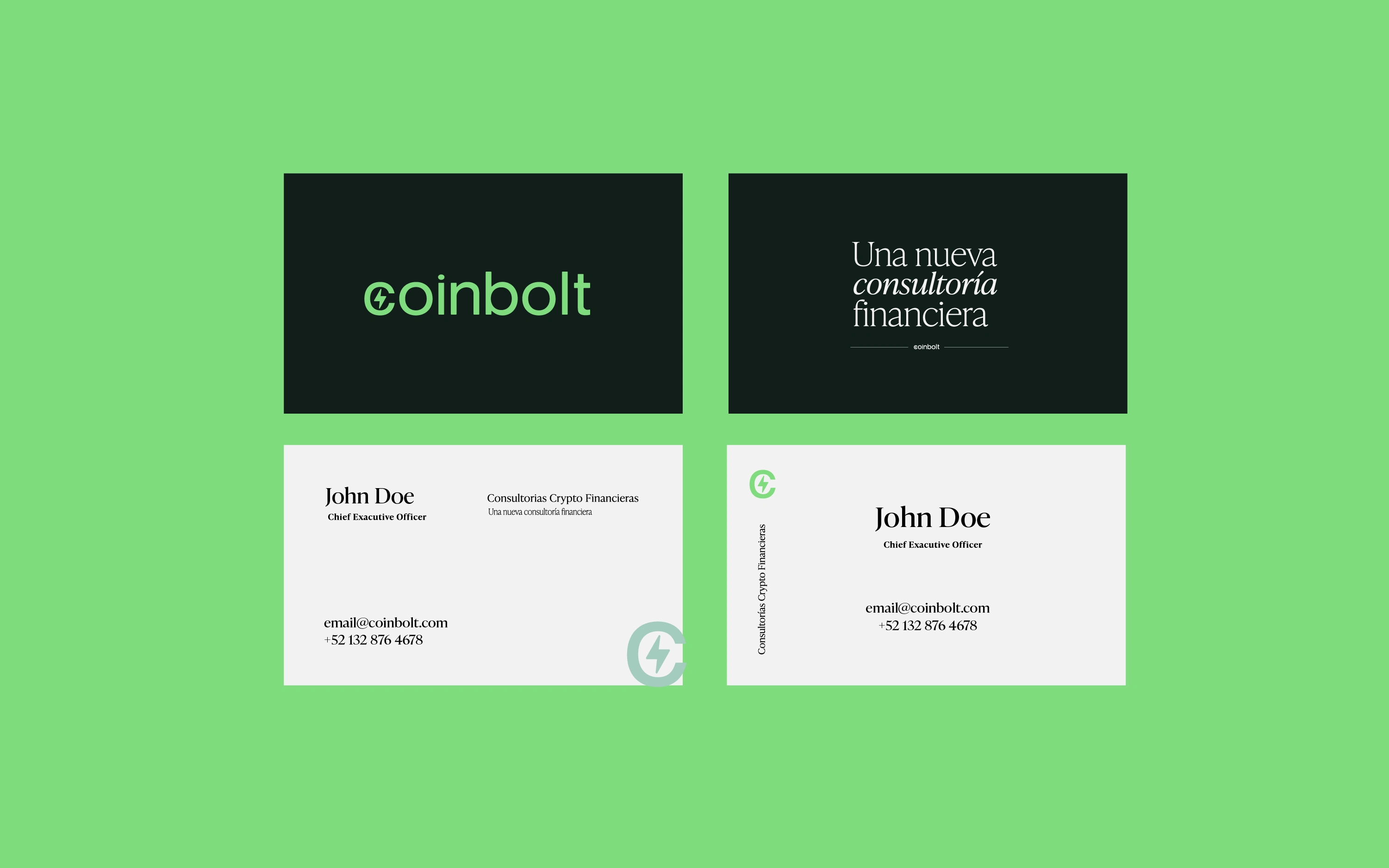
Logo: Modern, energetic, and direct — designed to embody the forward momentum of crypto adoption.
Color Palette: Greens and oranges represent growth, transformation, and boldness. These are balanced with lighter blues to evoke serenity and trust, grounding the visual system in approachability.
Tone: Confident yet approachable, making complex topics like crypto feel less intimidating and more empowering.
.
Impact
The brand design and strategy following the brand tagline of "A new type of financial consulting" positioned Coinbolt as more than just a consultant agency — it became a symbol of accessibility and empowerment for people in LATAM to engage with financial tools that could help shape their future.
Like this project
Posted Aug 22, 2025
Brand identity for Coinbolt, a LATAM crypto consultancy making financial literacy bold, approachable, and accessible through design.