HELIX HR Management Platform UI/UX Redesign

Dennis Duhme


HELIX by Perbility, a Complete HR Management Platform
Role
UI/UX Designer
Tools
Sketch, Illustrator
Industries
Human Resources, HR Technology, Enterprise Software
The Challenge
HELIX by Perbility needed to cover the full breadth of personnel management in a single suite, time tracking, employee self service, HR analytics across finance, employer attractiveness, organizational efficiency, and learning, a full learning management system, structured performance feedback, and the public facing marketing site and event branding that brings new customers in. The client's existing look had grown inconsistent across these surfaces, built up module by module over time rather than as one coherent product. The task was to unify a genuinely large, multi audience system, HR administrators, individual employees, and prospective customers on the marketing site, under one clear design language without slowing down a suite already used by 1.000 plus companies and over 400.000 users.
The approach
Audited every existing module (Analytics, Mein HELIX, Ausbildung, Cockpit) to find recurring patterns already in use, then formalized the strongest ones instead of inventing a new system from scratch
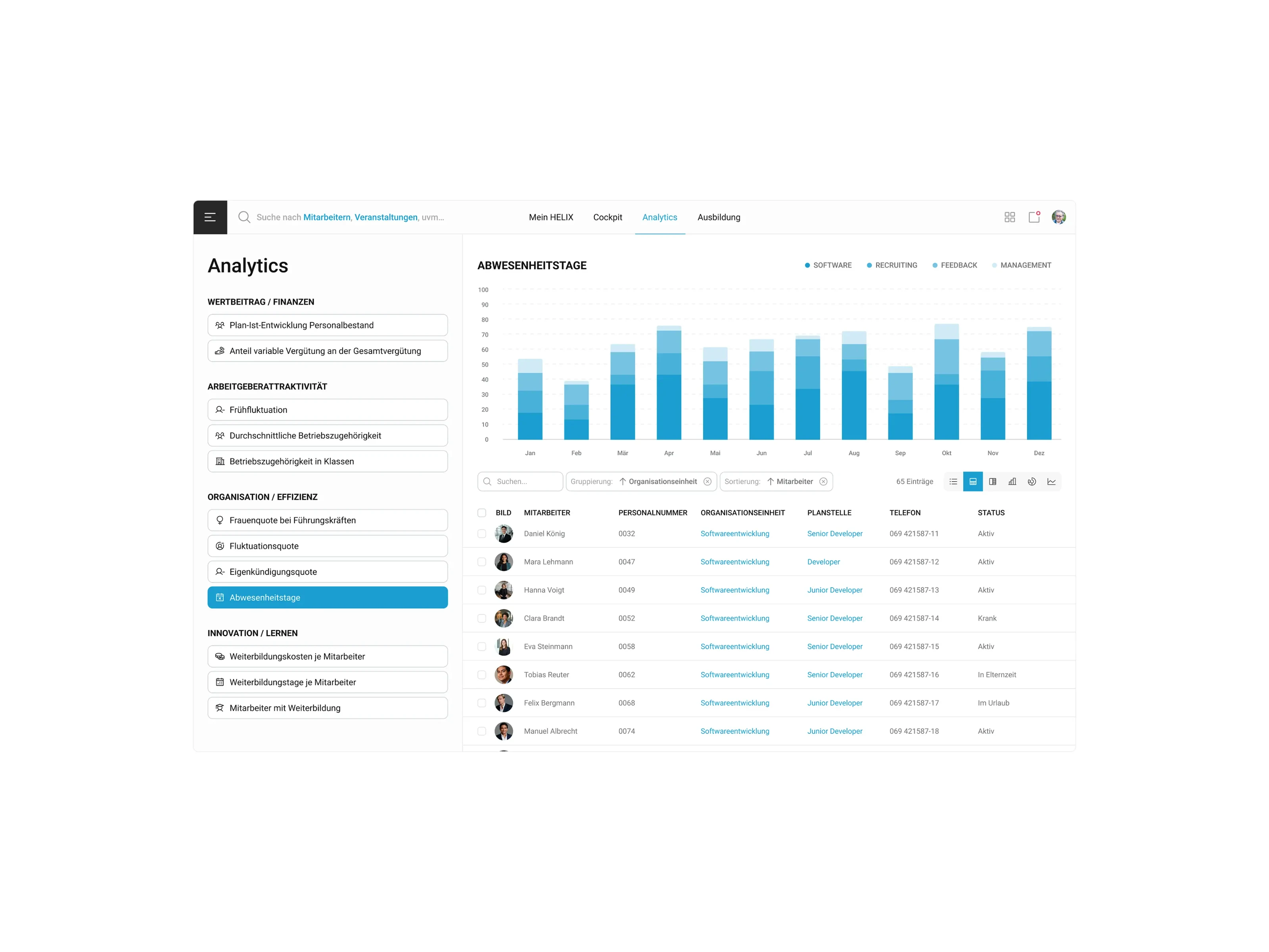
Prioritized a dense, data forward layout for HR admin views (filterable, groupable, sortable tables with inline avatars and status) since HR teams work with large employee datasets daily
Designed the personal "Mein HELIX" employee view with a warmer, simpler layout than the admin views, recognizing that everyday employees need quick self service, not analytical depth
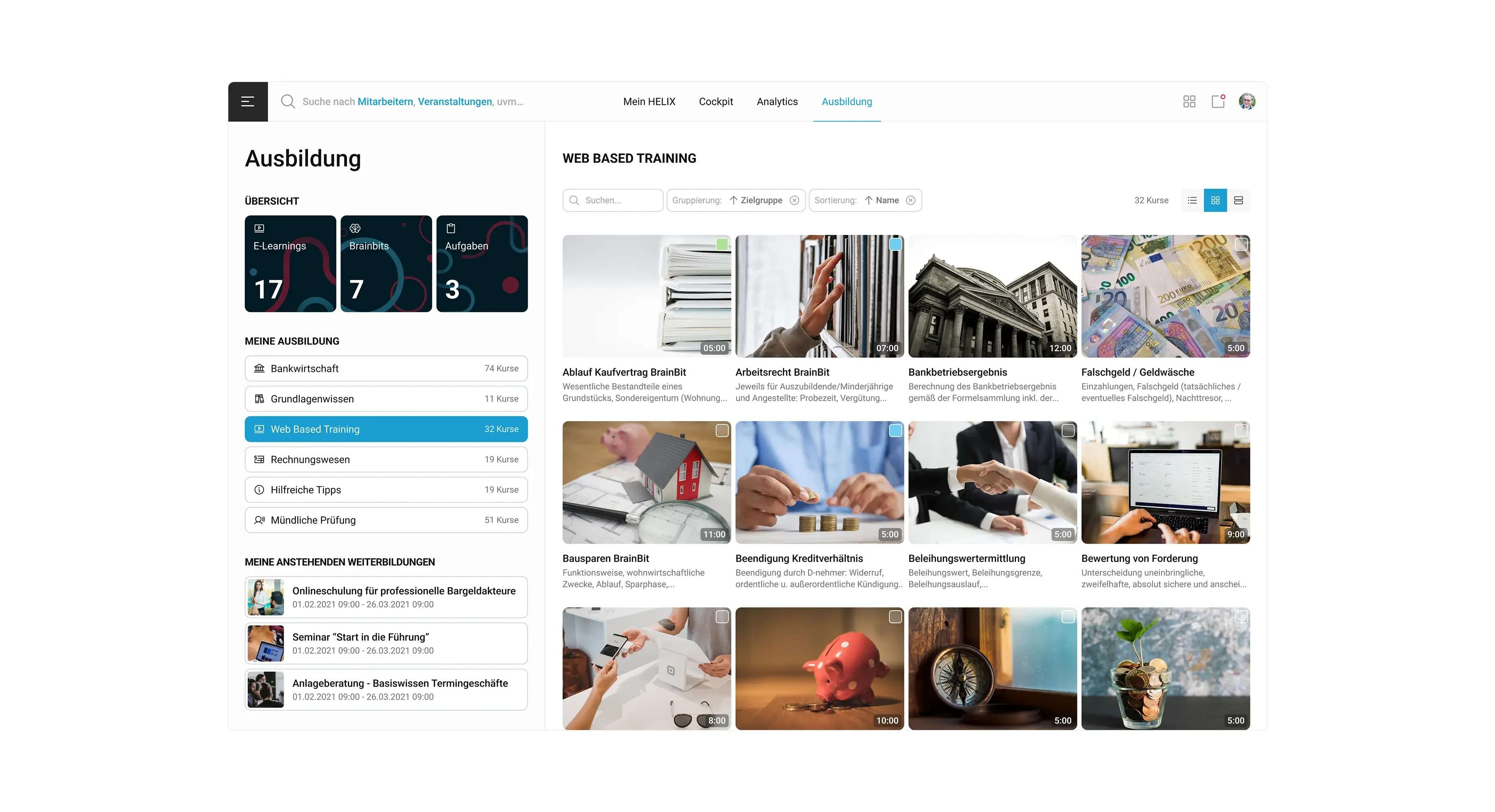
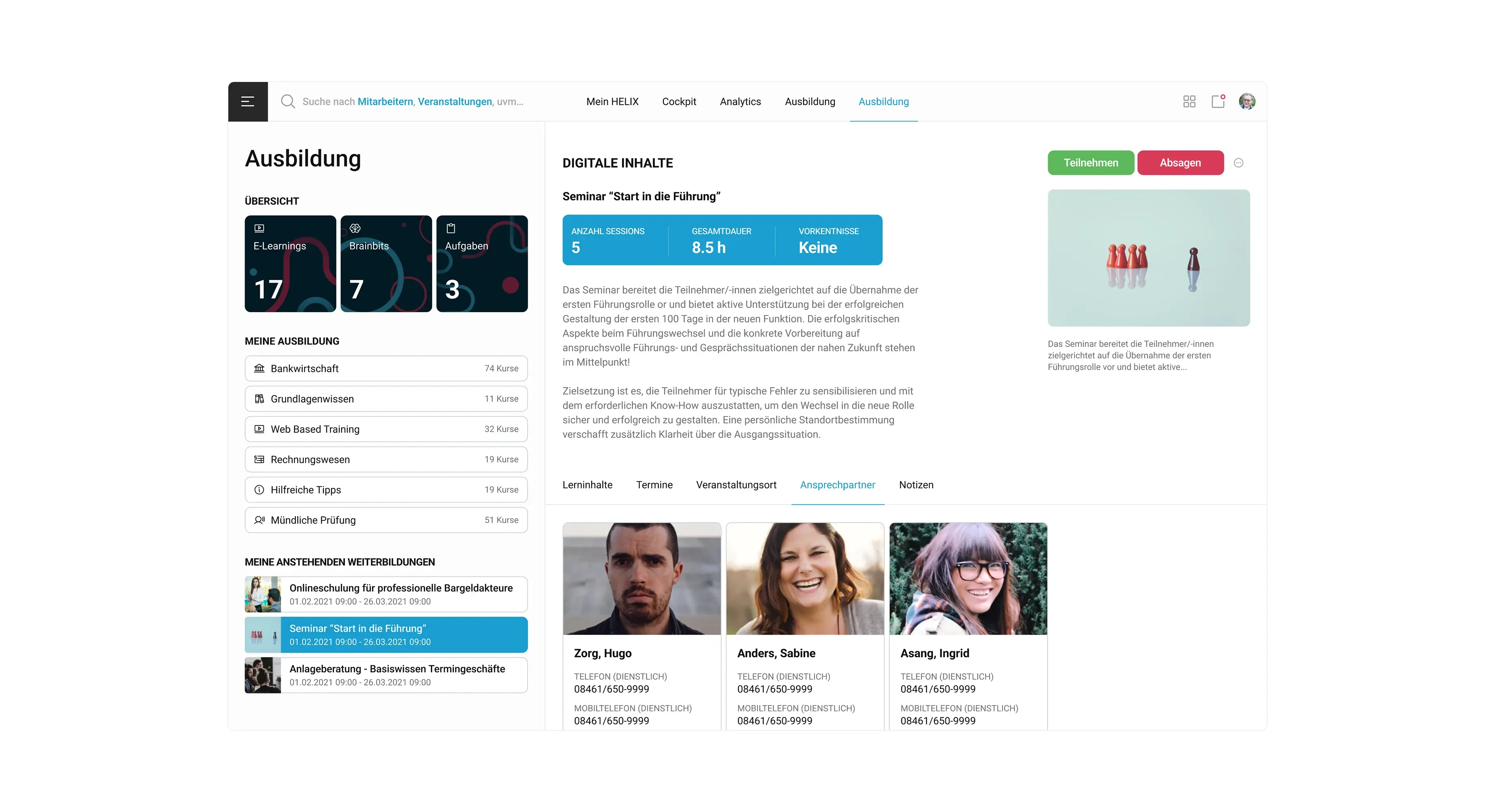
Kept the learning and training module (Ausbildung) visually distinct with card based, image forward browsing, since discovering and starting a course is a different task from reading a data table
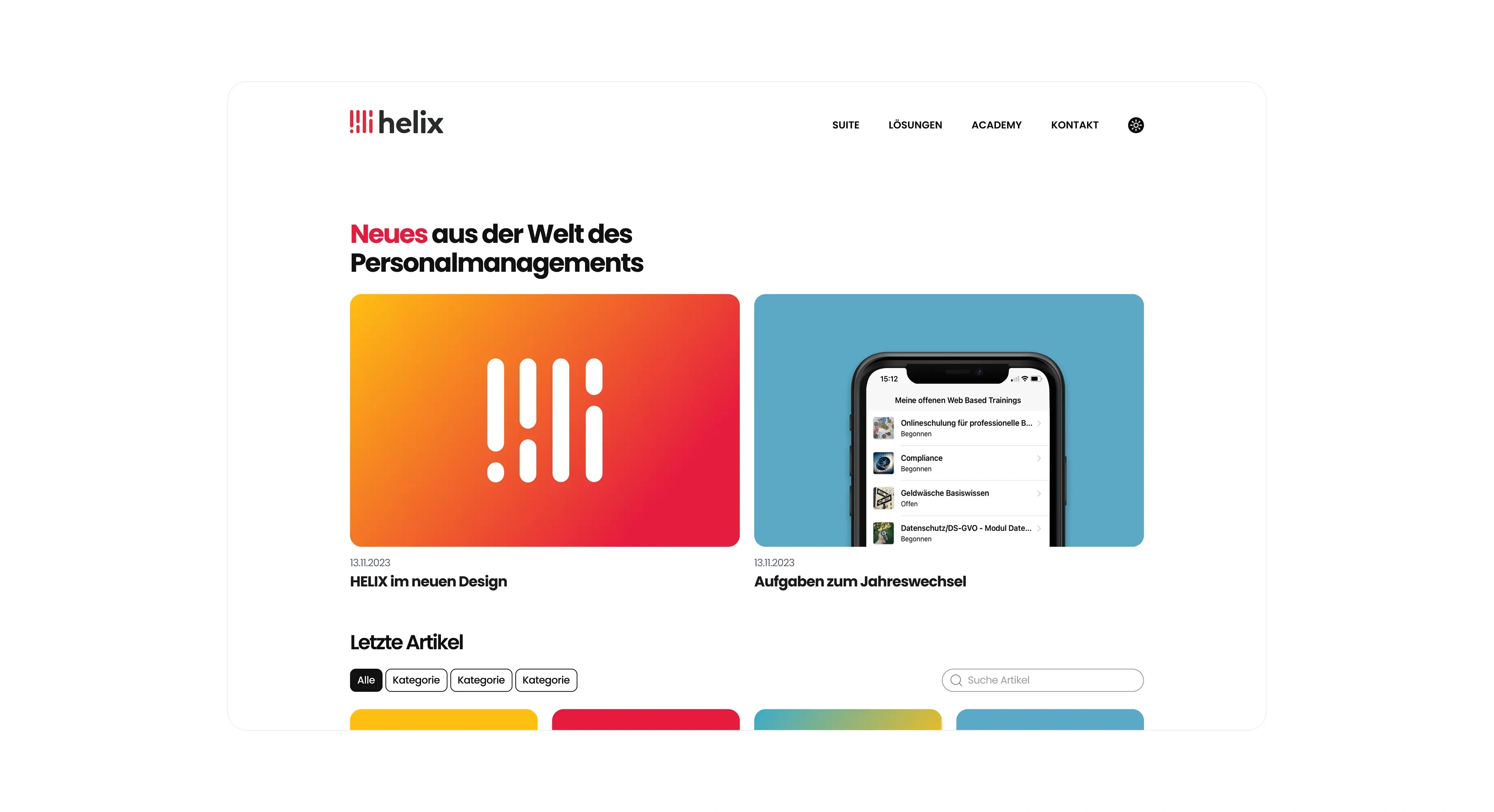
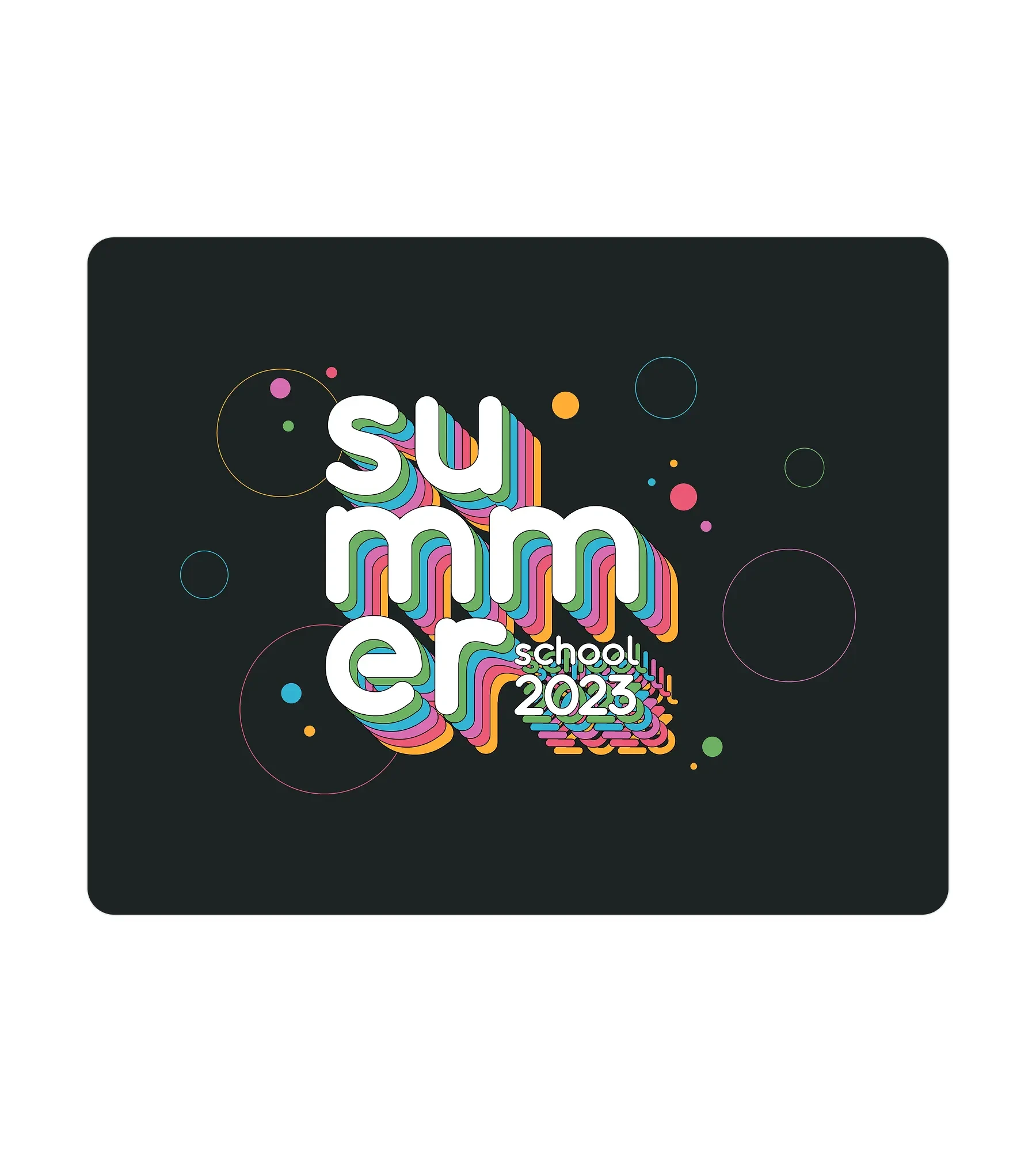
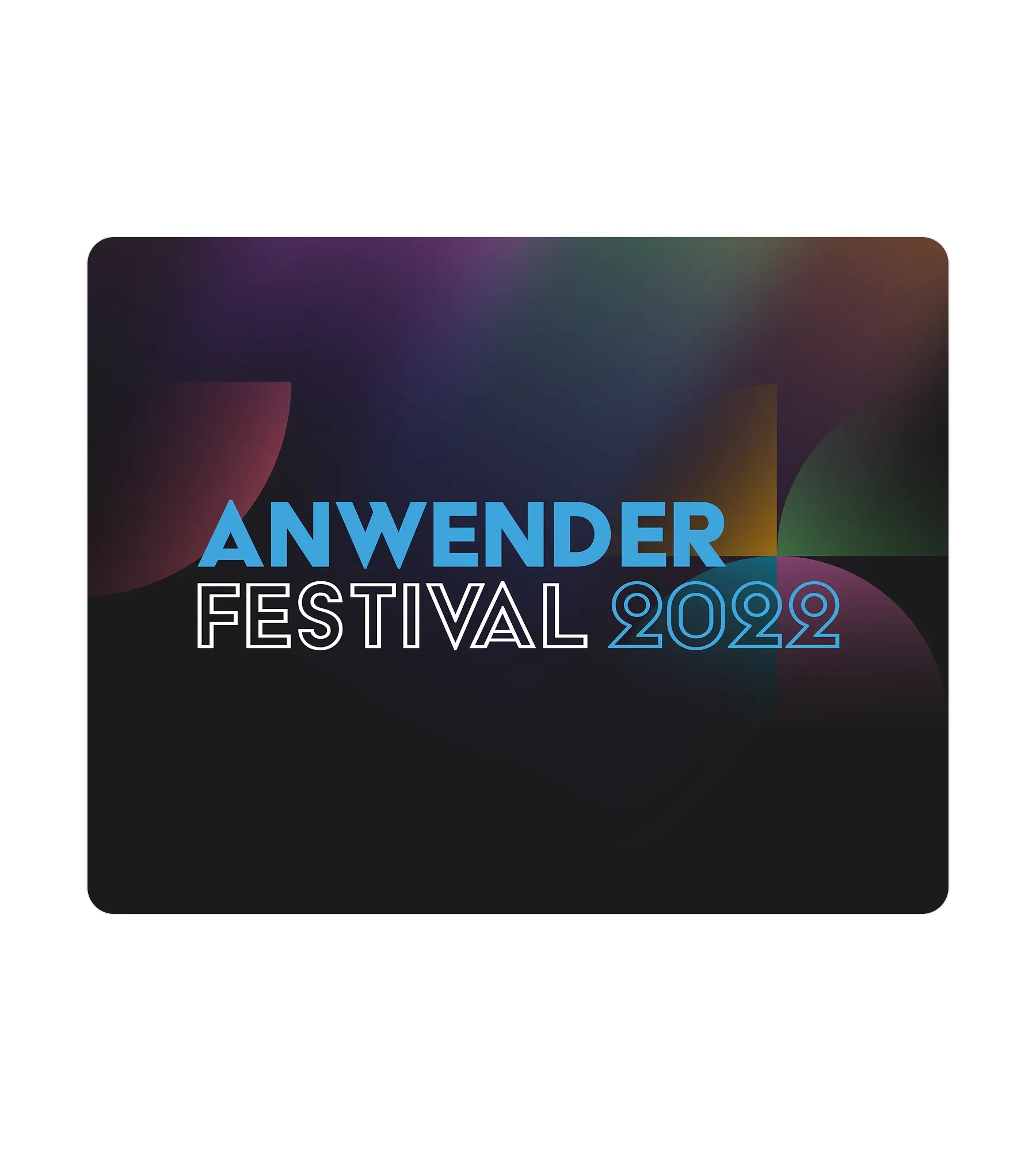
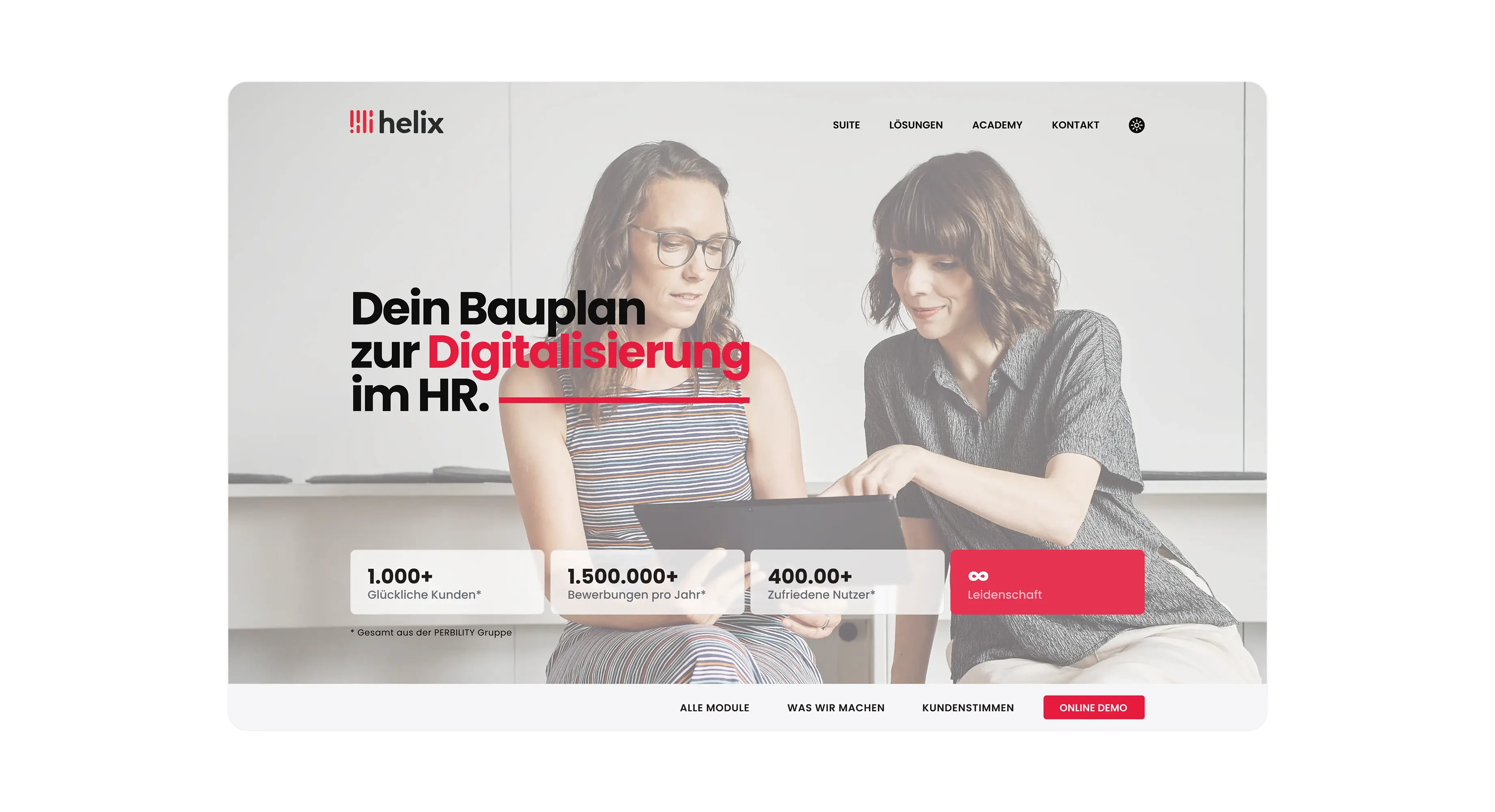
Extended the same visual identity, typography, and red brand accent from the product itself into the public marketing site and event graphics (Anwenderfestival, Summer School), so the brand feels consistent from first website visit through daily product use
Design process
Technical Implementation
Built a consistent sidebar and top navigation pattern (search, module tabs, notifications, profile) reused across every module, Cockpit, Analytics, Mein HELIX, and Ausbildung, so switching modules never feels like switching products
Designed a shared data table component (checkbox select, avatar plus name, grouping, sorting, view switcher) used for both the employee directory and the analytics module's underlying data
Created a flexible KPI card and chart system, spanning stacked bar charts, line charts, and score cards, that adapts to different HR metrics, absence days, fluctuation rate, gender ratio in leadership, without needing a new component per metric
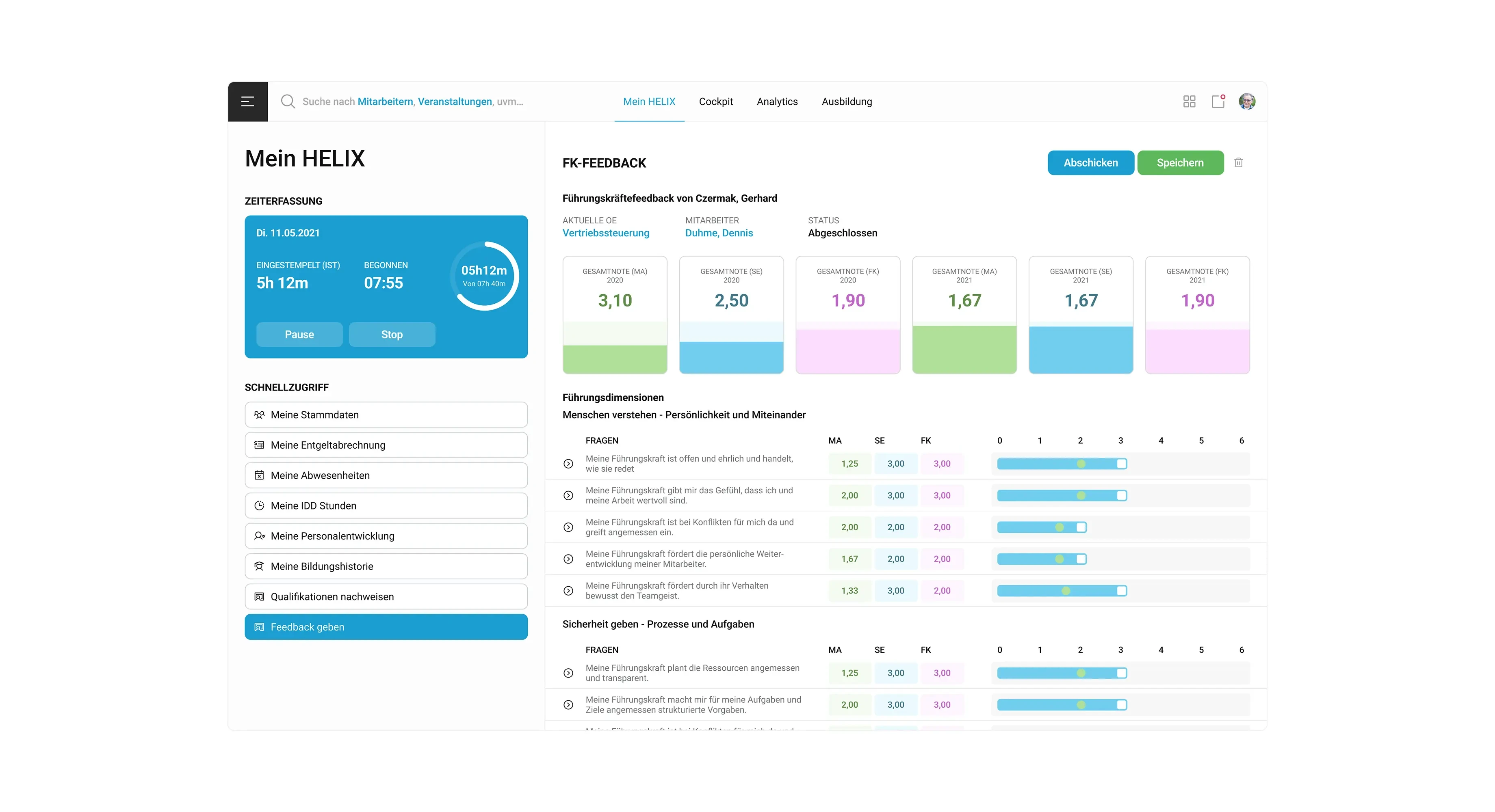
Built a structured feedback and review interface displaying multiple rating sources (self, peer, manager) side by side with year over year comparison, translating subjective 360 style feedback into a clear, comparable score format
Extended brand components, color, typography, iconography, into standalone marketing assets and event graphics, keeping conference and campaign materials visually tied to the core product
Key Design Challenges Overcome
Unifying four functionally different modules, admin analytics, personal employee dashboard, corporate learning platform, and performance feedback, under one design system without flattening their distinct needs, solved by sharing structural patterns (navigation, cards, tables) while allowing each module its own content density
Making dense HR analytics (organizational efficiency, employer attractiveness, financial contribution) approachable for HR generalists rather than only data specialists, addressed through a categorized sidebar of pre built metrics instead of a blank analytics canvas
Presenting multi rater performance feedback (employee, self, manager, across multiple years) without overwhelming the reader, resolved with compact comparison cards above a detailed, expandable question by question breakdown
Keeping a system this large consistent as new modules were added over time, solved by extracting and reusing core components (navigation, tables, cards) rather than letting each new module invent its own patterns
Like this project
Posted Aug 17, 2026
A complete HR suite covering analytics, employee self service, learning management, and performance feedback for over 400.000 users.
Likes
0
Views
8
Timeline
Jul 30, 2021 - Oct 31, 2023
Clients
Perbility