Built with Framer
Medical SaaS Marketing Website Design and Development
Rohan | Founder of WisdmLabs
A Tech-savvy, Product-led SaaS Website Design & Development for a Medical Training Brand
Project summary:
Client: Medical Training & Certification SaaS Brand
Industry: Medical and Healthcare (SaaS product)
My role: UI/UX Designer and Developer
Goal: Modernize the brand, highlight credibility, and drive sign-ups
Key focus: Trust-building, conversion-led flow, product interface storytelling, and innovative visuals
Skills and deliverables: Web Design • UI/UX Design • Figma • Web Development • Website Development
The challenge:
In the medical SaaS niche, people don’t just browse — they validate.
The platform was credible, but the website didn’t feel like a modern SaaS product.
Trust signals weren’t strong enough upfront.
The journey wasn’t explained clearly.
The interface and product value weren’t highlighted.
So the redesign goal was clear: make it feel innovative, trustworthy, and easy to commit to — fast.
The key upgrades: What we improved to drive enrollments (and why it works)
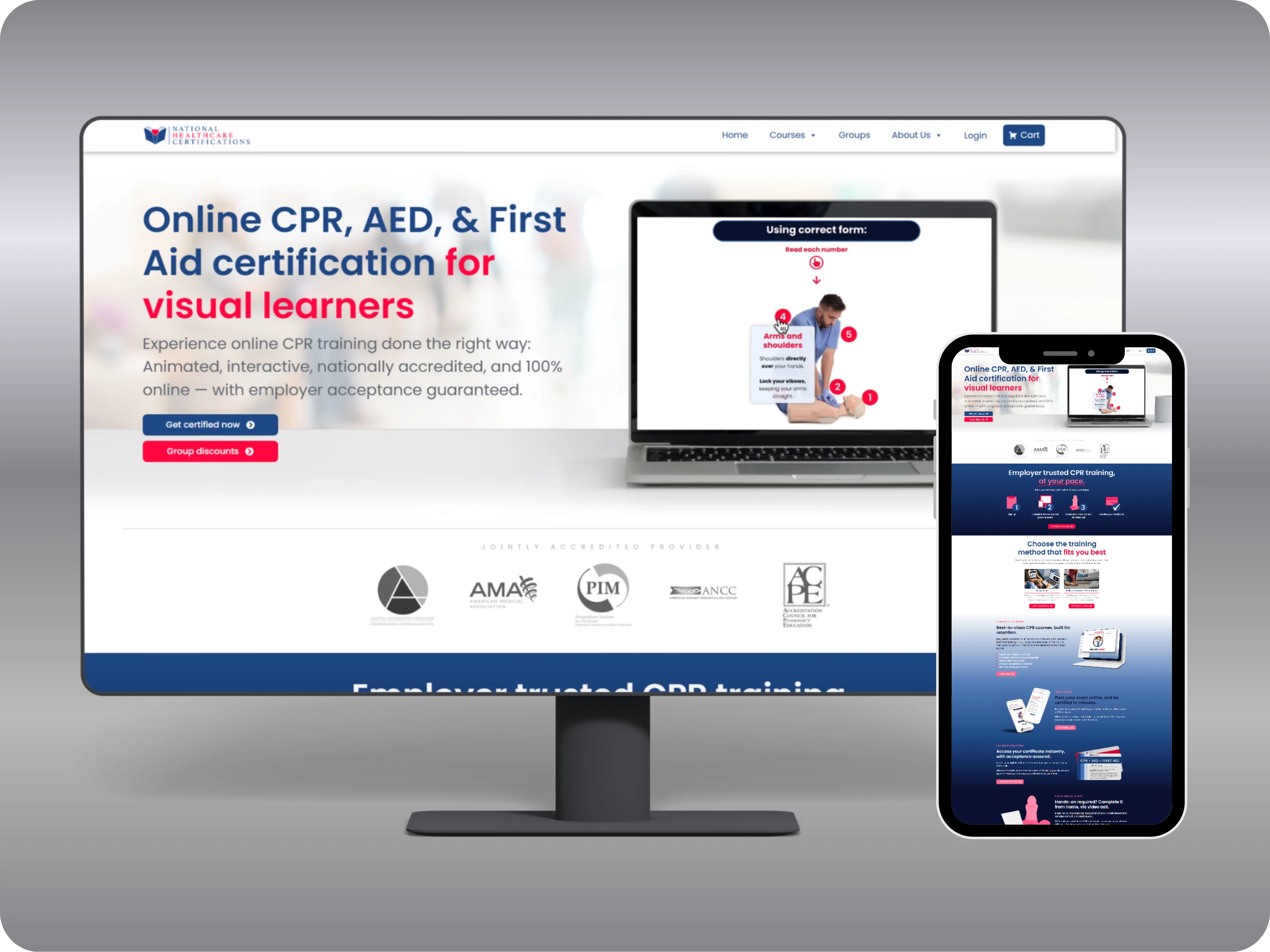
Innovative first impression: A SaaS-style hero with subtle animations, modern gradients, product/video-style screens, and crisp CTAs to create instant momentum.
Trust built like a medical brand: Standards-led positioning, trainer expertise, and nationwide credibility markers surfaced early to reduce doubt before pricing decisions.
Product-led storytelling: Platform interface visuals integrated into the flow so visitors “see the system” and feel the training experience is real.
Clear enrollment path: A conversion-led layout that guides users from value → proof → pricing → sign-up without making them hunt for details.
Value cues that increase confidence: Certificate mockups and training flow visuals that make the result feel tangible and worth the investment.
Polish that feels premium (not loud): Micro-interactions, clean spacing, and modern UI rhythm that quietly signals quality.
Results: A professional, interactive SaaS with increased sign-ups and purchases.
Conclusion:
For SaaS platforms, a website has one job: turn “What the product does?” into “Where do I sign up?”
Hence, this build focused on modern SaaS visuals, product clarity, and trust-led flow—so more visitors move from hesitation to enrollment.
Try an innovative, tech-savvy, and conversion-first SaaS website design with a no-cost custom design mockup — Just contact me or book a strategy session here.
Like this project
Posted Dec 3, 2025
This was a website for an online certification SaaS, designed to build trust and boost enrollments. Goal: Highlight credibility, modernize, and drive sign-ups.
Likes
0
Views
0