Fiberwave Website Redesign and SEO Migration
Vincent Pasili
Fiberwave - Internet That Sells Itself With One Phone Call
A conversion-focused redesign for a real ISP in Western Kenya, shipped to production without losing a single ranking. This is the live site at www.fiberwavenet.com.
At a glance
Role: Design direction, front-end engineering, and the SEO-safe migration: concept to production
Surface: Seven pages: Home, Fiber Plans, WIFI MTAANI (prepaid passes), Coverage, About, Partners, and FAQ
Tooling: Claude Code and Tempo Labs for the design concept, build-out, and migration; React 19 + Vite 7 in production,
sharp for the image pipelineStatus: Live. Serving over 8000 customers monthly across five counties in Western Kenya
0 - Why I made this
Fiberwave is not a portfolio piece; it's a working ISP. Real technicians, real towers, real customers paying by M-Pesa in Eldoret, Kitale, Kakamega, Kisumu, and Vihiga. The old site did its job: it ranked well on Google, listed the plans, and showed a phone number. But it read like a utility page. It informed; it didn't persuade.
The redesign had one goal: make the site sell. In this market, "convert" doesn't mean a checkout flow. The whole funnel resolves to a single action: call 0117 862 217. Every page, every section, every animation exists to get a phone to someone's ear.
1 - The problem
Selling home internet to a Kenyan household is a trust exercise. The buyer is price-sensitive, has been burned by "unlimited" plans with hidden caps, and is very likely reading your site on a mid-range phone over the very connection they want to replace. Three constraints shaped everything:
Convert without losing what already works. The old site ranked. Every canonical URL, meta description, and JSON-LD schema had to survive the redesign byte-for-byte. URLs were frozen:
/fiber-plans stays /fiber-plans. A redesign that tanks your search traffic is a more expensive site, not a better one.Beautiful may not mean heavy. The design called for a full-bleed photographic hero, a motion system, and animated everything. The budget said: no page-speed regression on a 4G phone. Those had to be reconciled in the pipeline, not compromised in the design.
One honest number beats ten vague ones. Prices in KSH on every card, the full setup cost itemised (router 2,000 + installation 500 + first month), and speeds stated plainly. The site earns the call by hiding nothing.
2 - Design: a calm dark theme with one job
The system is a warm near-black canvas, a single sky-to-indigo gradient accent, and a two-voice type pairing: Plus Jakarta Sans for display and body, and a monospace face for anything that is data (prices, speeds, coverage status, eyebrows). Numbers set in mono read like a bill you can trust, not a promo you should squint at.
Motion is the personality. The Fiberwave logo is a waveform that draws itself in on page load and replays on every navigation; sections reveal as you scroll; the big phone number flips into place digit by digit. All of it respects
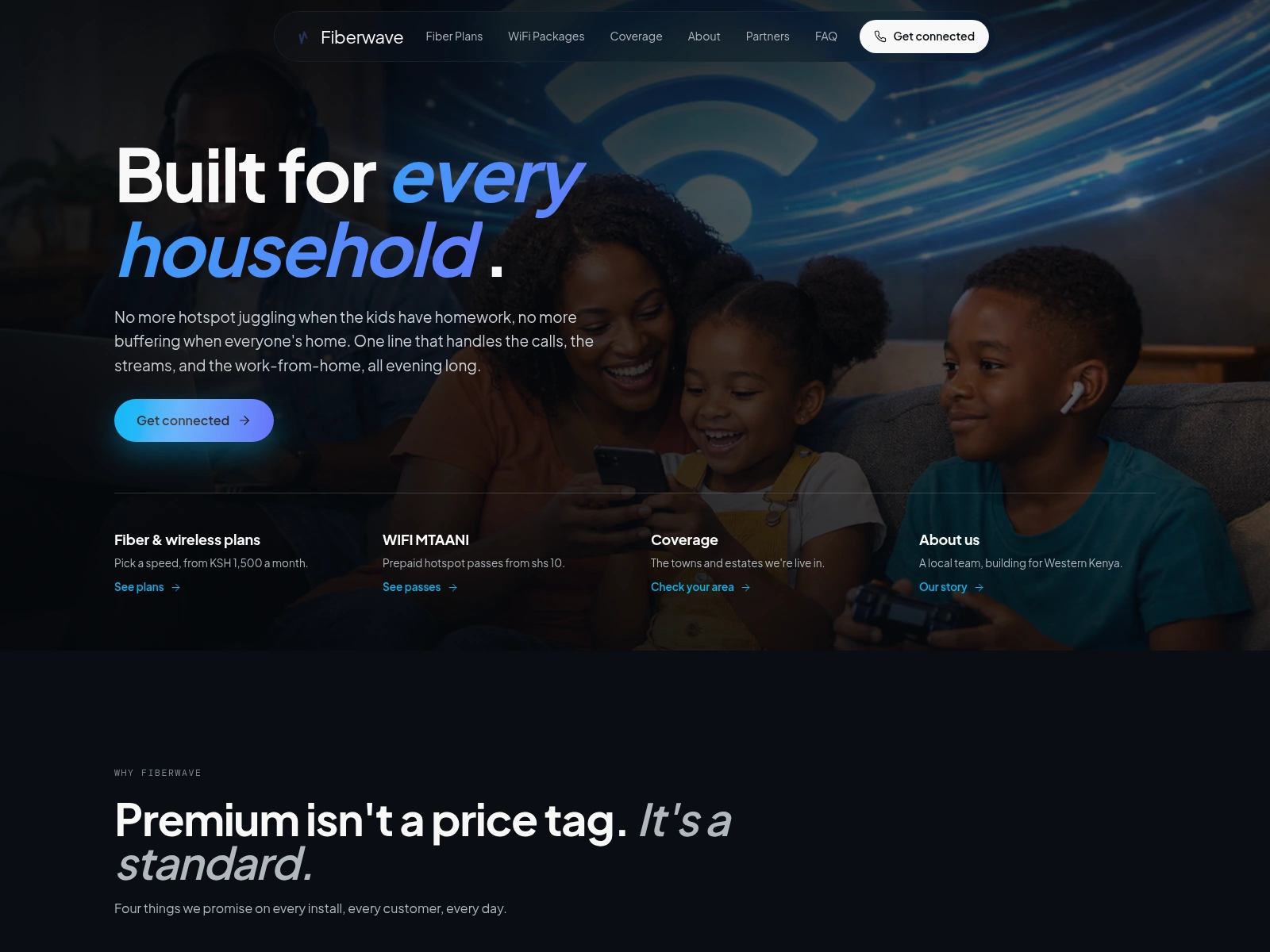
prefers-reduced-motion, and none of it blocks paint: the loader is inline CSS in the HTML shell, dismissed the moment React mounts.The hero photograph (a family on the sofa, everyone on their own screen, nobody buffering) started as a 2.5 MB PNG from the design prototype. It ships as a responsive AVIF/WebP/JPEG
<picture> set; the largest AVIF is 66 KB. That's the whole performance philosophy in one asset: keep the cinema, lose the weight.The landing - the pitch in one screen
The hero pairs the family photograph with the headline "Built for every household." and a single CTA. Directly beneath, four link cards route you by intent: plans, prepaid passes, coverage, story. You can reach anything that matters without scrolling.

Scroll on and the promise section hands off to plan teasers: three cards, the "Most chosen" plan lit up in the accent gradient, every price in mono.
3 - The product: seven pages, one shell
Every page shares the same furniture: the floating pill nav, the mono eyebrow over a big display headline, the same card vocabulary, and a closing CTA band with the phone number set enormous. New pages are cheap; the shell carries them.
Fiber Plans - the honest spec sheet
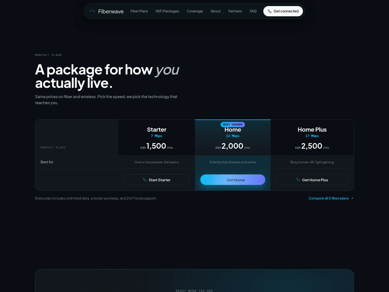
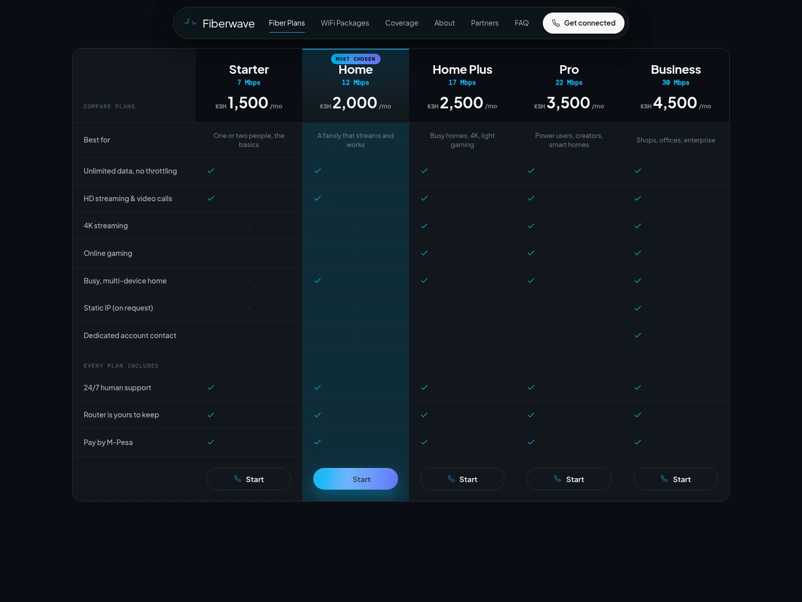
Five plans (Starter 7 Mbps to Business 30 Mbps) in a full comparison table: best-for rows, capability ticks, and an "every plan includes" group (unlimited data, 24/7 human support, a router you keep, M-Pesa). On mobile it collapses into stacked cards. It looks like pricing; it reads like a promise you can hold us to.
WIFI MTAANI - internet by the sachet
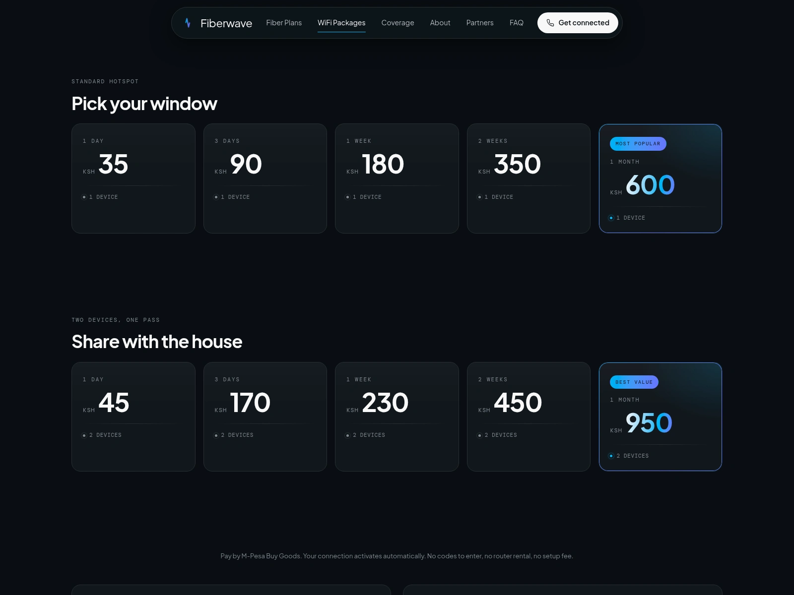
The insight that shaped this page: a huge share of the market doesn't want a monthly bill, they want airtime-style internet. WIFI MTAANI is prepaid hotspot passes from KSH 5 for an hour to KSH 950 for a month on two devices. Pay by M-Pesa and the connection activates automatically; no codes, no router, no setup fee. The cards are deliberately sparse: duration, price in huge mono, device count, done.
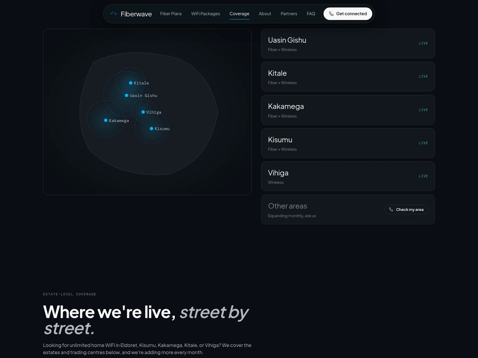
Coverage - a map that answers the only question
"Do you reach me?" A stylised halo map of Western Kenya sits beside a live-status list of the five counties, each with its service mix (Fiber + Wireless). Below, estate-level cards name the actual neighbourhoods (Langas, Kondele, Kiminini...) which doubles as local SEO. The row that matters most is the last one: Other areas: expanding monthly, ask us, with a call button.
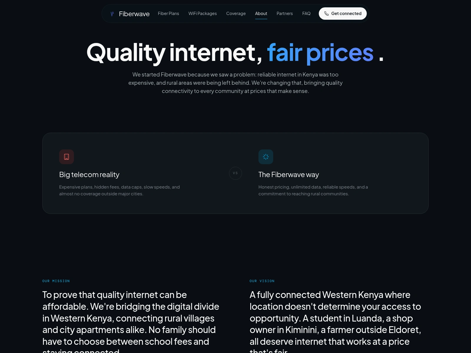
About - the positioning, out loud
The page opens with the brand's whole argument: "Quality internet, fair prices." A two-column comparison states it plainly: big telecom reality (expensive plans, hidden fees, data caps) versus the Fiberwave way (honest pricing, unlimited data, rural commitment). Mission and vision name real places, because the company serves real places.
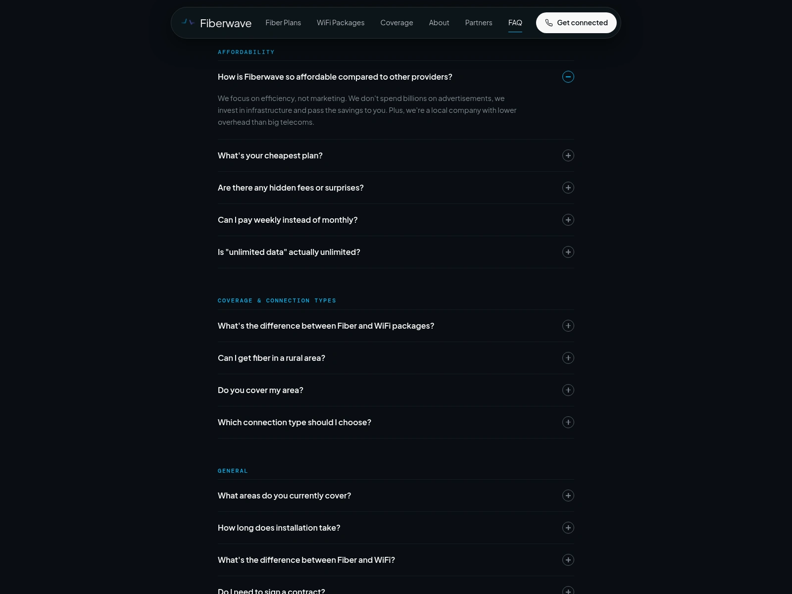
FAQ - objection handling as a page
Twenty-five questions in six categories (Affordability, Coverage, General, Technical, Billing, Support), one accordion, first answer open by default. Every answer is also shipped as FAQPage JSON-LD, so the same objection handling works inside Google results. The questions are the real ones from the phone lines: "Is 'unlimited data' actually unlimited?" Yes, and the answer says so without an asterisk.
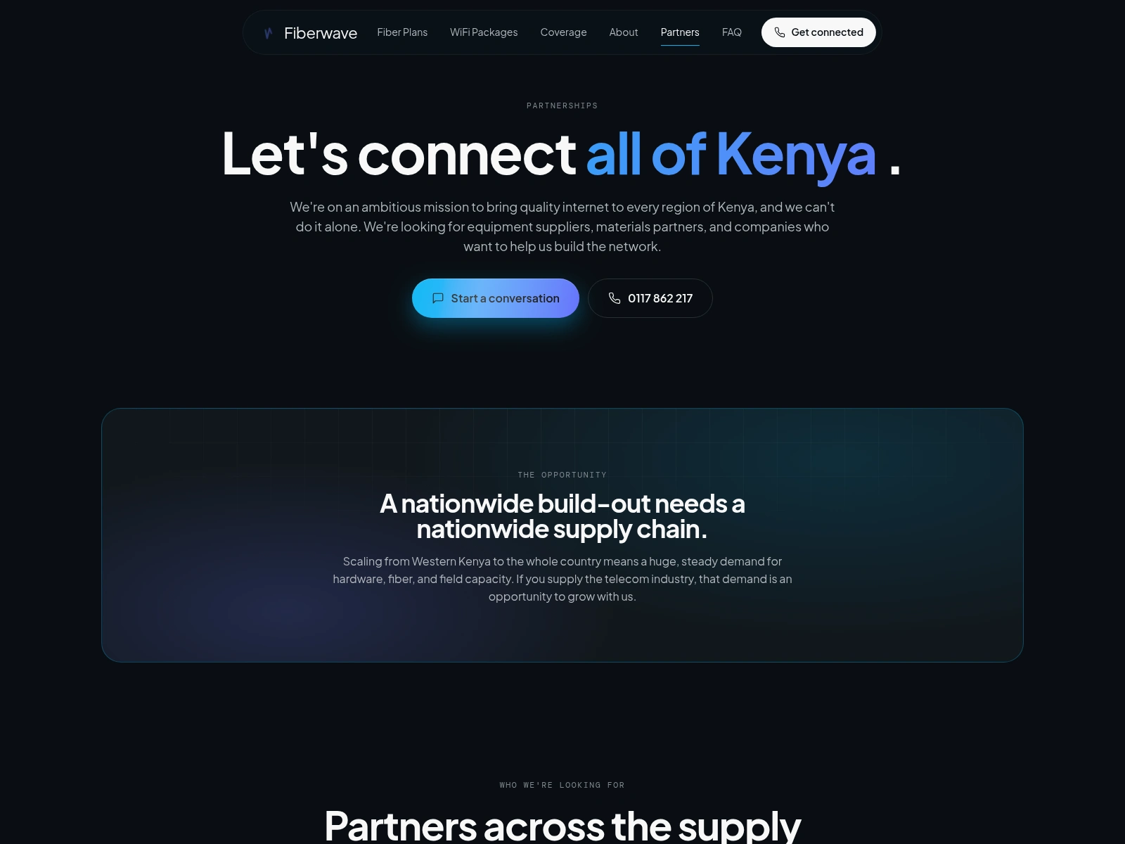
Partners - the growth page
The newest page and the only new URL the redesign introduced. Fiberwave is scaling from Western Kenya toward the whole country, and the build-out needs suppliers: equipment, fiber and materials, civil works, distribution. The page makes the ask with the same calm confidence as the consumer pages.
4 - Decisions worth calling out
SEO was a hard constraint, not a hope. Every rewritten page kept its
useSEO config call byte-for-byte: title, description, canonical, and the JSON-LD graph (Organization, LocalBusiness, Service, FAQPage, Breadcrumb). The migration shipped as one branch, one commit per page, each verified against the live head tags before the next began.The phone number is the buy button. It appears in the nav, in every CTA band set at display size with a flip-digit animation, and in a sticky mobile bar. Nothing on the site asks for a form fill. The conversion event is dialling.
Performance is a design material. Lazy-loaded routes (every page chunk is under 12 KB gzipped), a 73 KB gzipped main bundle, self-drawn SVG icons instead of an icon font, and the AVIF hero pipeline. The site feels rich and stays light because the two were never allowed to trade off.
Data deserves its own typeface. Same trick as a customs worksheet: KSH amounts, speeds, and statuses are all mono. Trust is typographic before it's contractual.
Restraint in the accent. One gradient, used for emphasis words, featured cards, and live-status dots. The dark canvas stays calm, so the family photograph and the numbers carry the page.
5 - What shipped, and where it goes next
Shipped: the full seven-page redesign, live in production, SEO intact, with the WIFI MTAANI prepaid model promoted to a first-class product alongside fiber.
Next:
Per-town landing pages (internet in Eldoret, internet in Kitale...) building on the estate-level coverage data already on the site.
An online pass purchase flow for WIFI MTAANI: pick a pass, M-Pesa STK push, connected, no call needed.
A coverage checker that answers "do you reach me?" from a typed estate name instead of a phone call.
Customer self-service for renewals and balance checks.
Credits
Design direction and build: me. The design concept, system, and production migration (React 19 + Vite, the SEO-preserving rewrite, and the image pipeline) were engineered with Claude Code and Tempo Labs. Hero imagery generated and graded to the site's warm-dark palette. Fiberwave Internet Solutions is a real ISP; if you're in Western Kenya, the number is 0117 862 217.
Like this project
Posted Jul 3, 2026
Every page has one job: make the phone ring. A conversion-first rebuild for a live Kenyan ISP, shipped with Claude Code + Tempo Labs. Zero rankings lost.