Built with MagicPath
Epic Surf Discovery Platform Design
Vincent Pasili
Epic Surf: Find where it's firing, together
A surf-discovery platform that shows where it's firing worldwide and gives the surf community one place to gather. An interactive design exploration.

At a glance
Role: Product & UX design, prototyping
Client: Chillepic, a community venture building a home for the surfing world
Surface: A cinematic discover feed, a live world-conditions map, a spot detail view, a community feed, and an editable profile, desktop-first and responsive, in both light and dark themes
Tooling: Designed and built in Magicpath AI; imagery and videography produced in Kittl
Status: Exploration snapshot, an interactive concept not yet wired to live data
1 - The brief
Surfers already have forecasting tools, and they already have social feeds. What they don't have is one place where checking the surf and belonging to the surf community are the same motion. Conditions live in one app, photos in another, the people in a third.
The brief from Chillepic was to explore a single surface that brings the vast, enthusiastic surfing community together: somewhere you open to answer "where is it firing right now?" and stay because your spots, your people, and your sessions are all there too.
Three principles shaped the exploration:
One glance, one answer. Is it epic? You should know the moment a screen loads, before you read a single number.
Cinematic, not clinical. Surf is emotional. The product should feel like the ocean it describes, not a buoy-reading spreadsheet.
The community is the product. Spots, photographers, and surfers are first-class. Discovery and people share one home.
2 - Design language
The whole interface is organized around one idea: a four-state condition system that travels across the product, so a spot's status is legible the instant you see it.
Epic: red
Good: green
Rideable: amber
Flat: grey
That single taxonomy drives the pills on every spot card and the dots on the map. Learn it once on the home screen and you can read the lineup, including a glance at the world map, without a legend.
Around it sits a restrained kit:
An electric-cyan accent (
#00a8cc) for actions, links, and the brand mark, used sparingly so the surf photography carries the color.Two complete themes from one token set. A clean daylight theme for bright conditions and a deep-space dark theme built on near-black blues (
#080d18) for low light and a filmic feel. Every surface, border, and overlay is a token, so the two themes are the same design, not two designs.Inter as the single typeface (with system fallbacks): tight tracking on headlines, generous on labels. Technical and calm.
Real motion and footage. A full-bleed video hero, an always-moving conditions ticker, and light hover and transition motion keep the surface alive without getting in the way.
3 - Discover: earning the first five seconds
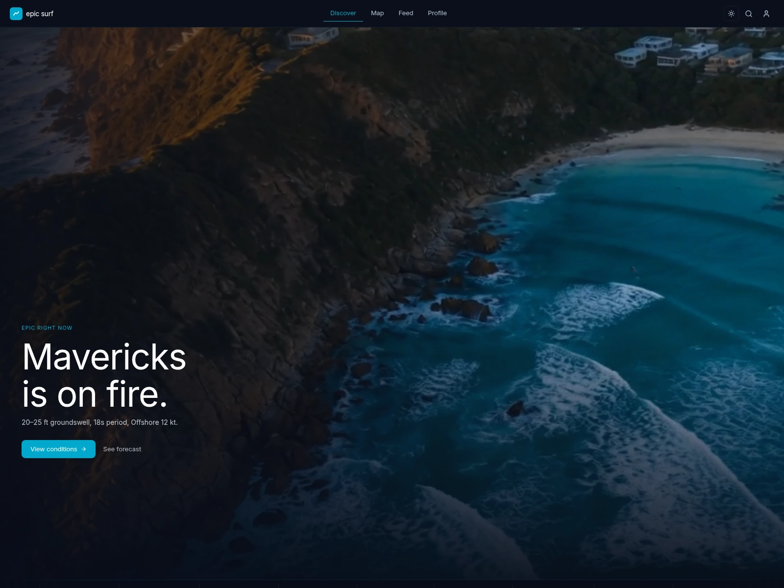
The home screen opens on a full-viewport video hero of a real lineup, graded against the brand so the footage and the UI read as one piece. The headline cycles through the breaks that are firing right now ("Pipeline is on fire."), over a single line of live conditions and one clear call to action.
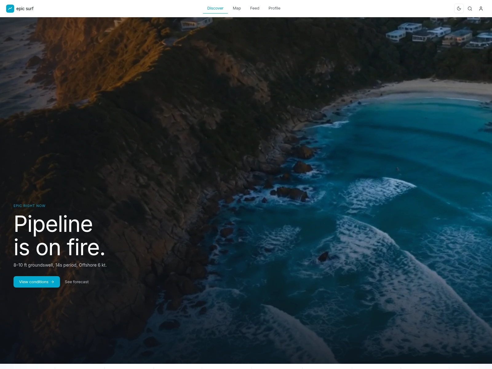
Pinned to the base of the hero is an always-scrolling conditions ticker: a marquee of epic and good breaks with their condition pill and wave height, pausing the moment you hover so you can actually read it.
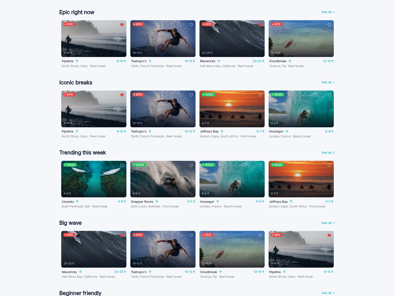
Scroll past the fold and the page turns into a streaming-service-style wall of rails: Epic right now, Iconic breaks, Trending this week, Big wave, Beginner friendly. Every card leads with a condition pill, the wave height in cyan, and a photograph. Hovering a card reveals a tiny seven-day forecast sparkline in place, so you can scan a week of swell without leaving the row.
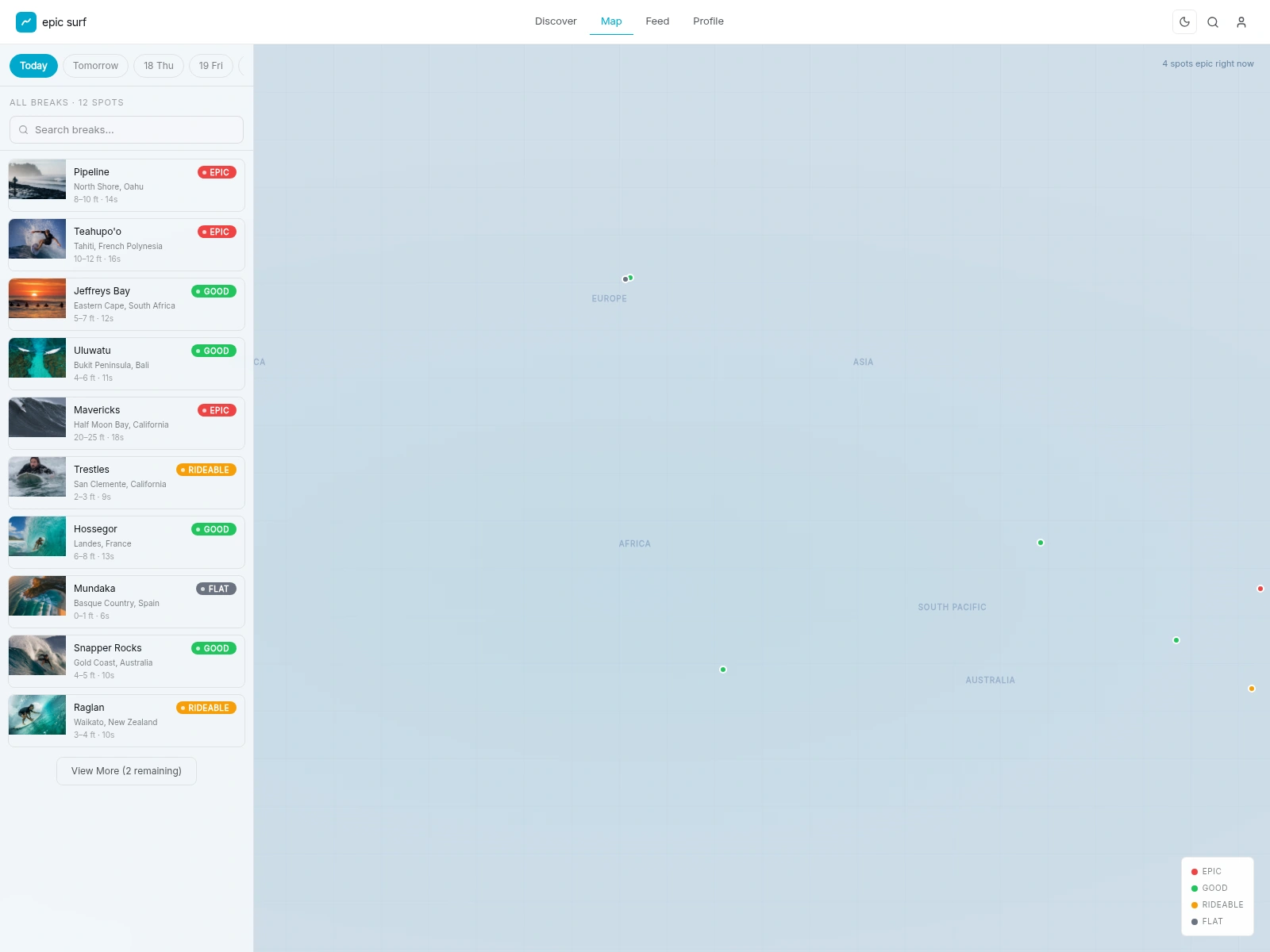
4 - The map: the world's lineup on one screen
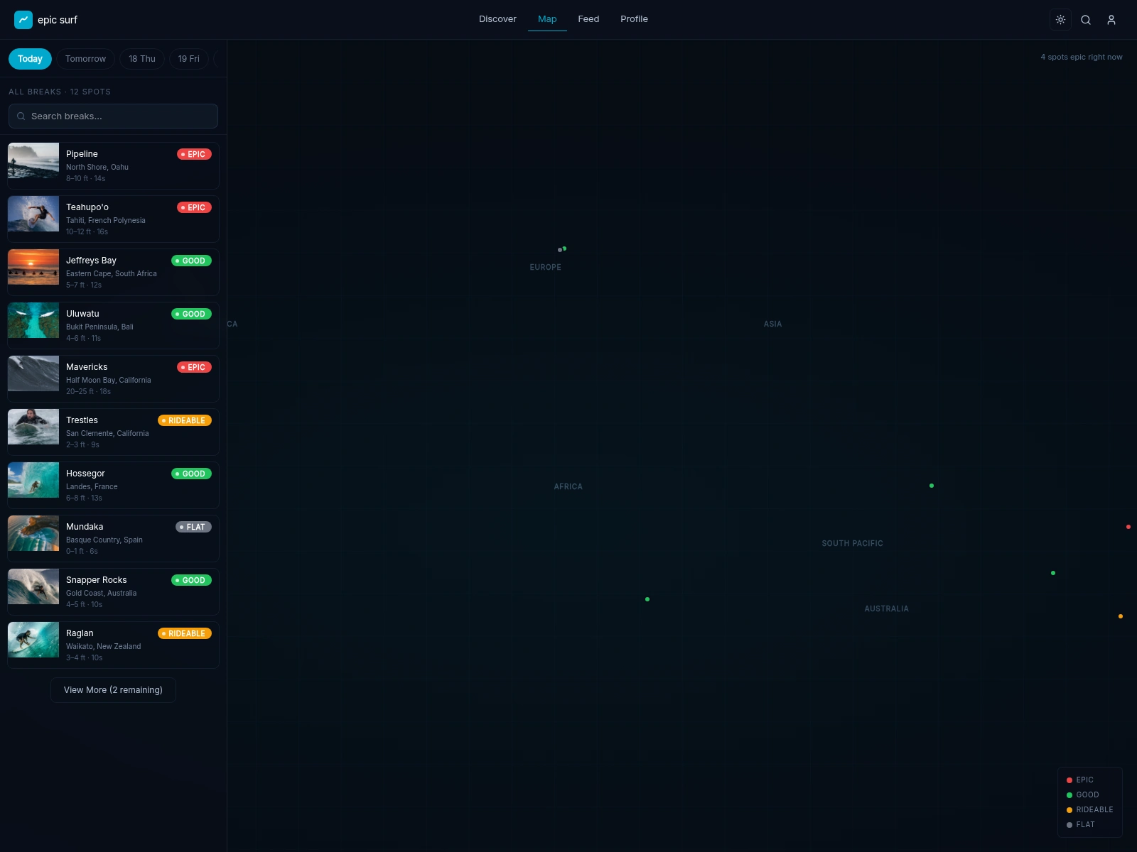
The map is where the condition system pays off most. Every spot is a coloured dot placed by real latitude and longitude, so a single look tells you where on Earth it's epic, and a corner read-out tallies how many spots are epic right now. A frosted-glass panel floats over the canvas with a row of day chips, a live search that filters the list of breaks, and the scrollable list itself; the canvas pans and drags like a real map, and tapping any dot opens a photo popover with a direct route into the spot's detail.
In the dark theme the same map turns cinematic: glowing markers and a faint grid over a deep-space sea. It's the clearest argument for the two-theme system: identical structure, completely different mood.
5 - Spot detail: everything about one wave
Open any spot and the condition system resolves into the full story. A wide, graded header carries the photograph and the condition pill; below it, the name, location, break type, and skill level, with Save and Share actions. A single meta strip lines up the numbers a surfer actually checks: wave height, period, wind, water temperature, visibility, and how fresh the reading is.
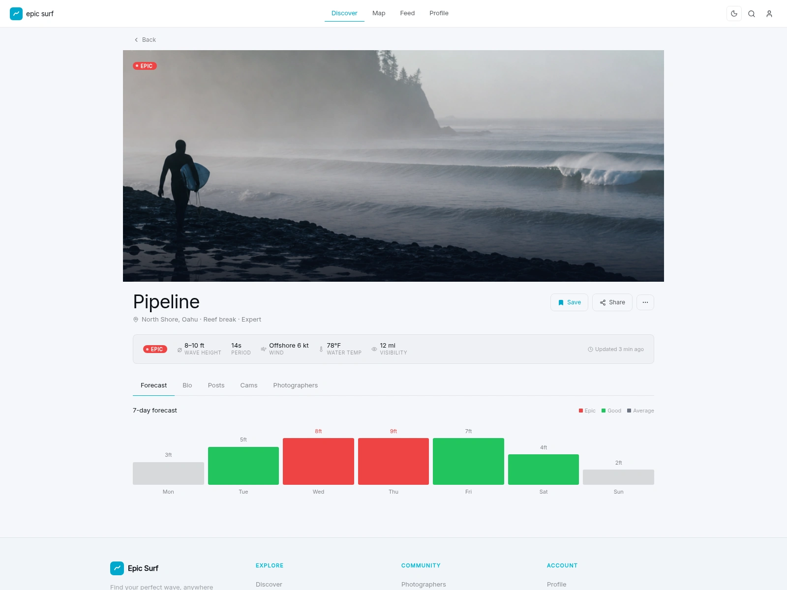
The seven-day forecast speaks the same colour language: epic days in red, good days in green, quieter days in neutral grey, so the week reads at a glance. The detail view is tabbed (Forecast, Bio, Posts, Cams, Photographers), and in this snapshot the Forecast is the one that's built out, while Bio, Posts, Cams, and Photographers are stubbed. That's deliberate: the layout is settled and the rooms are framed, ready to be furnished once the community and the data fill them.
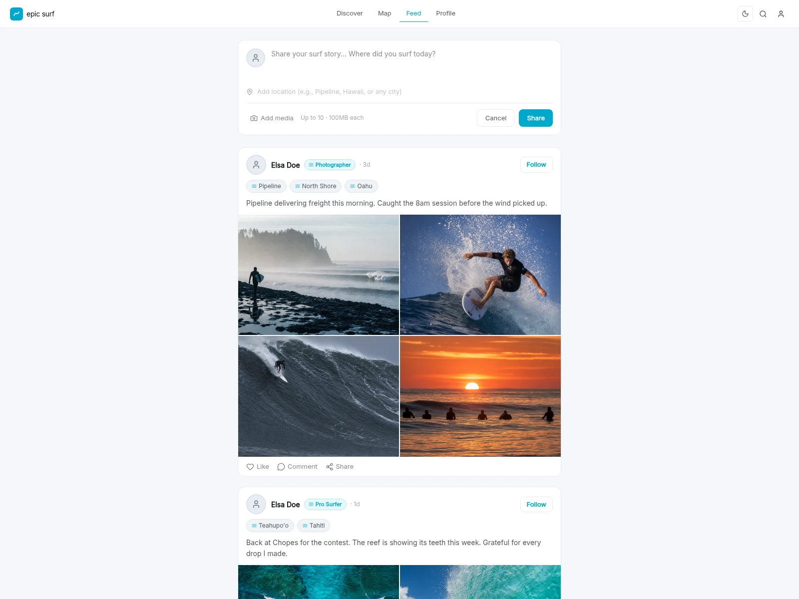
6 - Feed: where the community lives
The feed is the social heart of the exploration. A compose box invites a surf story and a location at the top; below it, posts (from a photographer, a pro surfer) carry spot tags and a photo grid of the session. It's deliberately familiar. The win isn't a new social mechanic: it's that the same condition-aware spots you discover and map are the ones your community is posting about.
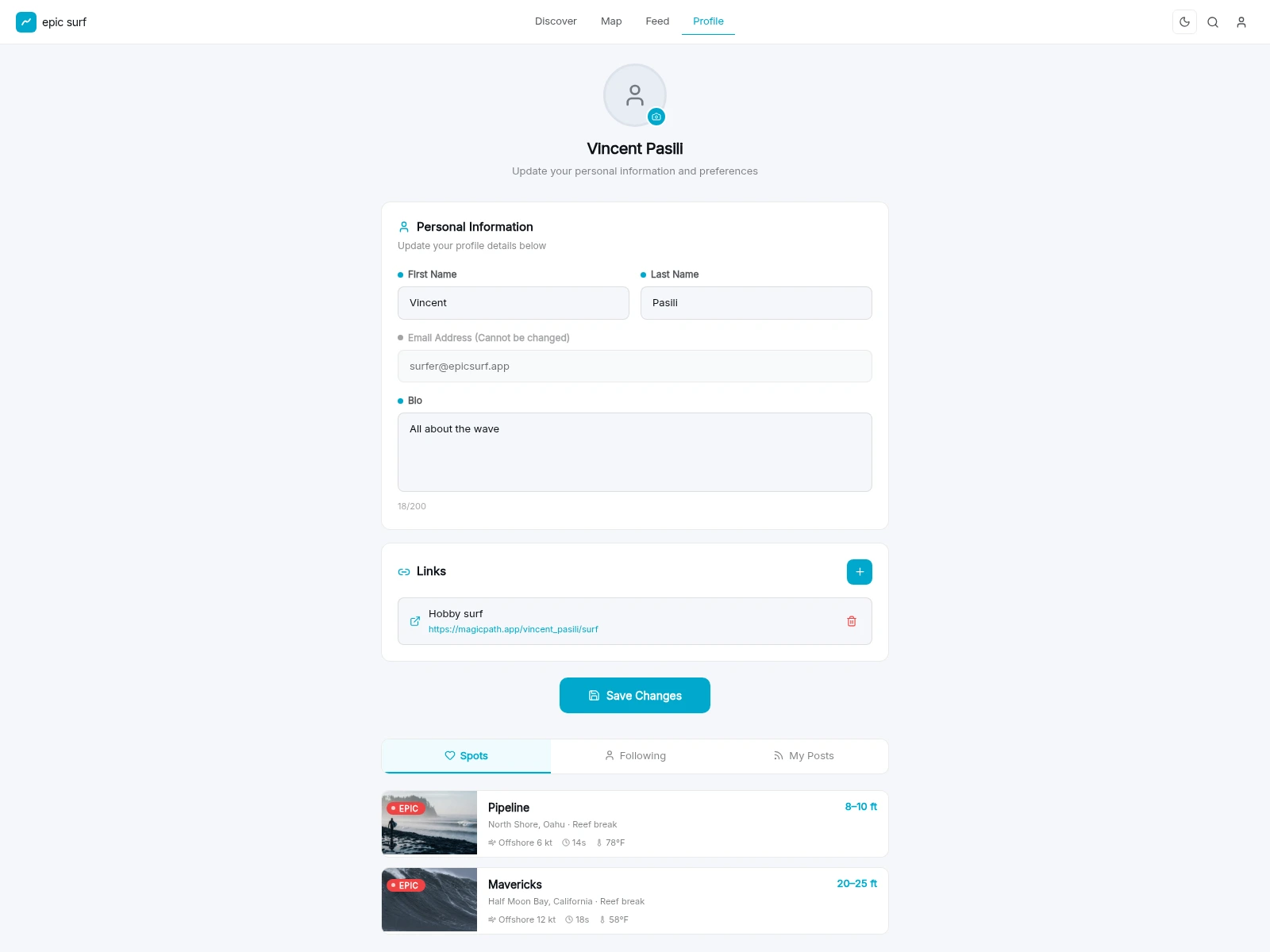
7 - Profile: your spots, your people, your sessions
The profile doubles as identity and settings on one screen: avatar, name, bio, and external links up top (no nested menus), then tabbed access to your saved Spots, the people you're Following, and your own Posts. Saved breaks appear as the same condition-rich rows used everywhere else, so your personal corner of the app speaks the same language as the rest of it.
8 - One design, two moods
Because every colour, surface, and overlay is a design token, the whole product flips between the bright daylight theme and the cinematic dark theme with a single switch. No screen left behind. The dark theme is where the surf photography and the deep-space palette were designed to live.
9 - Under the hood
A few things that don't get their own screen but make the surface cohere:
Global search with popular-spot shortcuts, so you can jump straight from anywhere to a break's detail.
A save state that follows you: like a spot on a card and it's saved on the detail view and waiting in your profile's Spots tab.
Built responsive: on small screens the top nav gives way to a mobile bottom bar, so the same surface works thumb-first.
10 - What's next
As an exploration snapshot, the surface is intentionally ahead of the plumbing. The clear next moves:
Wire it to live data: real swell, wind, tide, and forecast feeds behind the condition system.
Furnish the scaffolded rooms: build out the spot Bio, Posts, live Cams, and a Photographers presence.
Make the community real: accounts, follows, comments, and posting from the feed.
Finish the mobile build: flesh out the responsive bottom navigation.
Credits
Product, UX, and prototyping by Vincent Pasili. Imagery and videography graded against the brand palette so the entire surface, hero video through profile, reads as one product. An exploration for Chillepic.
Like this project
Posted Jun 16, 2026
Designed Epic Surf: a surf-discovery platform that shows where it's firing worldwide and brings the surf community together. A Chillepic design exploration.