Built with Lummi
Pitchlab: AI-Assisted Proposal Tool Case Study
Vincent Pasili
Pitchlab, Case Study
Turn a cold lead into a ready-to-send proposal in under five minutes.
Live app: pitchlabs.lovable.app

1. What it is
Pitchlab is a workspace for independent designers, developers, and small studios who lose hours every week shaping cold leads into proposals. It collapses two normally messy steps, scoping the project and writing the proposal, into a single AI-assisted flow.
How it works:
The freelancer builds a short scope form for a service line (website, brand, etc.).
They send the public link to a prospect.
The prospect fills it in. The submission lands as an inquiry in the freelancer's inbox.
One click turns the inquiry into a proposal draft, written in the freelancer's voice, that they refine by chatting with an AI assistant until it's ready to send.
It is intentionally narrow. No CRM, no time tracking, no invoicing. Every screen exists to move a lead one step closer to "yes."
2. The problem
Freelancers we observed shared the same pattern:
Intake is ad-hoc. Discovery happens over scattered emails. Important context (budget, timeline, decision-maker) only surfaces after a 30-minute call.
Proposals are blank-page work. Even with templates, every proposal is rewritten from scratch because the positioning needs to match the client's specific language.
The gap between lead and pitch is where deals die. The longer it takes to send a real proposal, the colder the lead.
The two halves feed each other. You can't write a tailored proposal without good intake, and you can't get good intake without making the client feel like they're being taken seriously. Most tools solve only one side.
3. The solution
Pitchlab treats the freelancer's pitch as a pipeline with two gates: the form and the proposal. Both are powered by AI.
The scope form is a focused, branded, public form the freelancer designs once per service line. The client gets a serious-feeling intake instead of "reply to this email." The freelancer gets structured answers ready to drop into a draft.
The proposal is an AI-generated first draft built from the inquiry plus the freelancer's profile, with a chat sidebar to revise sections by talking to it. The freelancer never starts from a blank page. Revisions feel like dictating to an editor.
Key features
Custom scope forms with shareable links and active or inactive toggles
An inquiry inbox with status tracking (new, in-progress, archived)
A proposal editor with chat on one side and the draft on the other
One-click export for hand-off into email or a doc
Profile branding that flows through to public form pages
Mobile-first layouts across the entire app
4. The screens
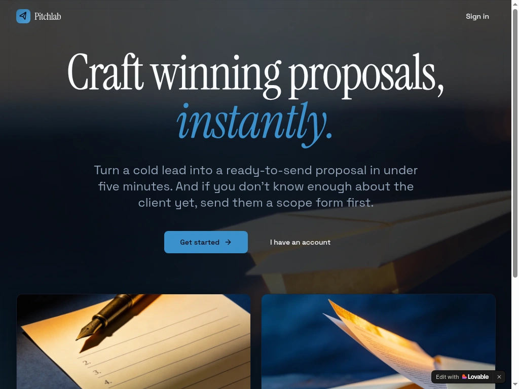
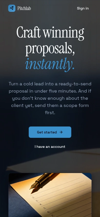
4.1 Landing page
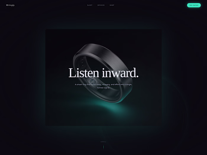
Sets one promise, "Craft winning proposals, instantly," and gets out of the way. A serif headline with an italic accent, two card vignettes for the two halves of the product, and a moment of polish in the entrance animation.
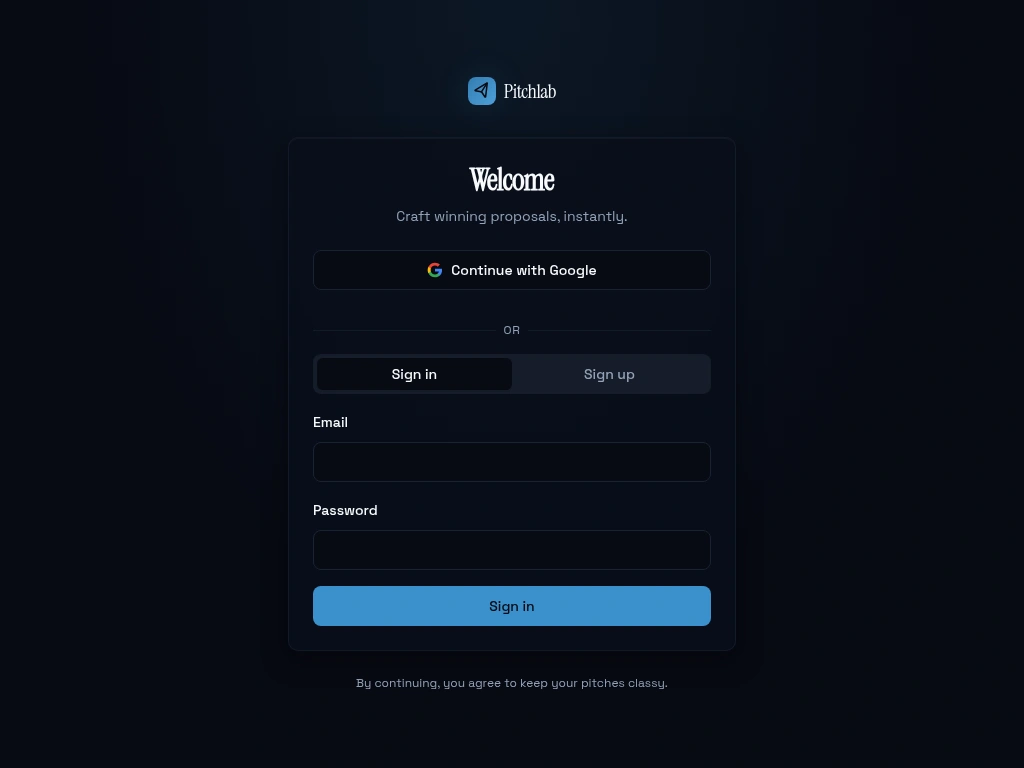
4.2 Sign in
A single combined sign-in and sign-up panel with email or Google. Every protected page is gated, so the right people see the right thing.
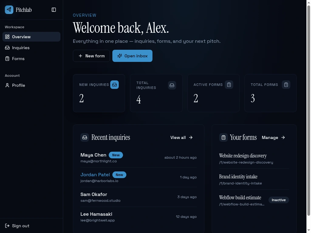
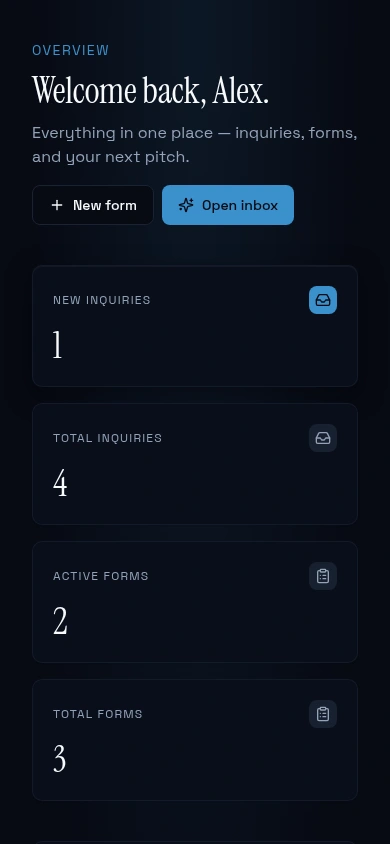
4.3 Dashboard
The first screen after login. A personal greeting, four at-a-glance stats, and recent inquiries plus forms.
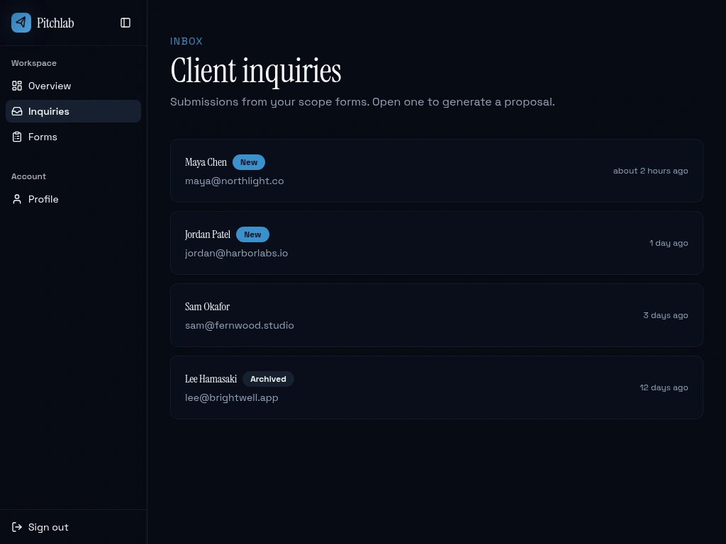
4.4 Inquiries inbox
A flat list, sorted by recency, with status pills. Designed to be skimmable in five seconds. Click to open the detail view.
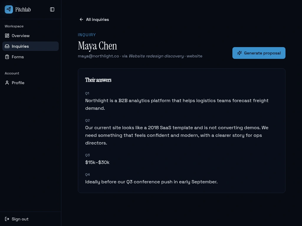
4.5 Inquiry detail
Shows the client's submission against the questions they answered, with a single primary action: Generate proposal. The detail view exists to let the freelancer remember the lead and decide whether to draft.
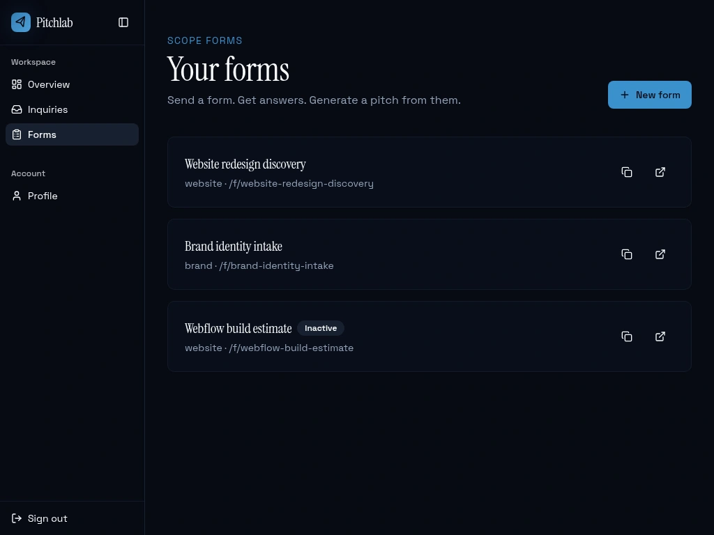
4.6 Forms list
Each form card shows the share link and a copy or open shortcut. Inactive forms are clearly marked but stay visible, so freelancers can re-activate seasonal forms without rebuilding them.
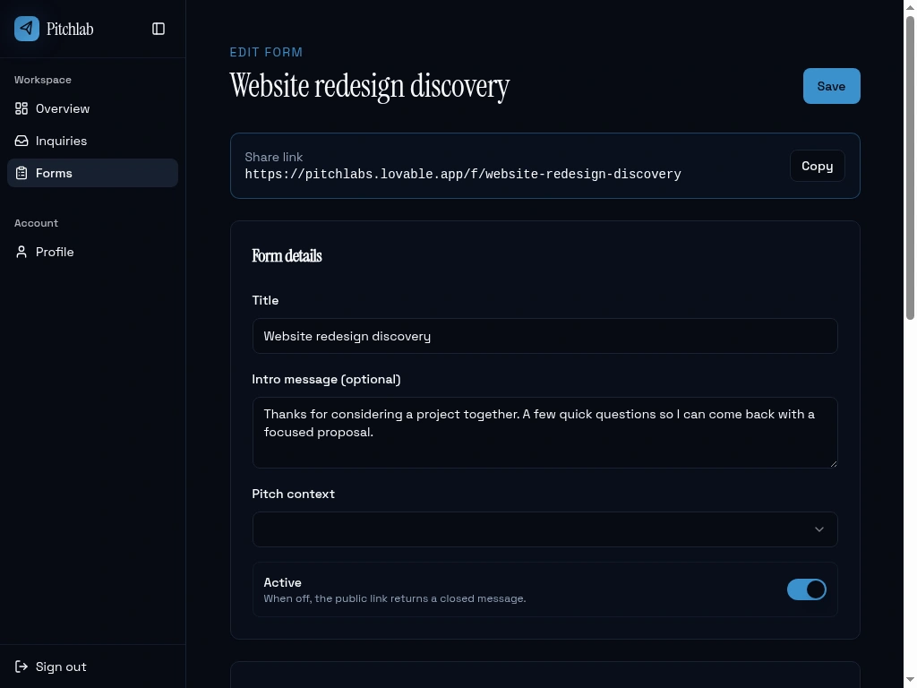
4.7 Form editor
The share link sits at the top because that's the action the freelancer needs most often. Below it: title, intro, pitch context (which shapes the AI proposal style), an active toggle, and the question builder.
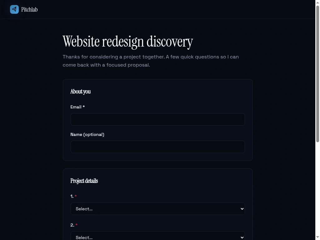
4.8 Public scope form
The page the freelancer's clients see. Branded with the freelancer's name, no Pitchlab marketing.
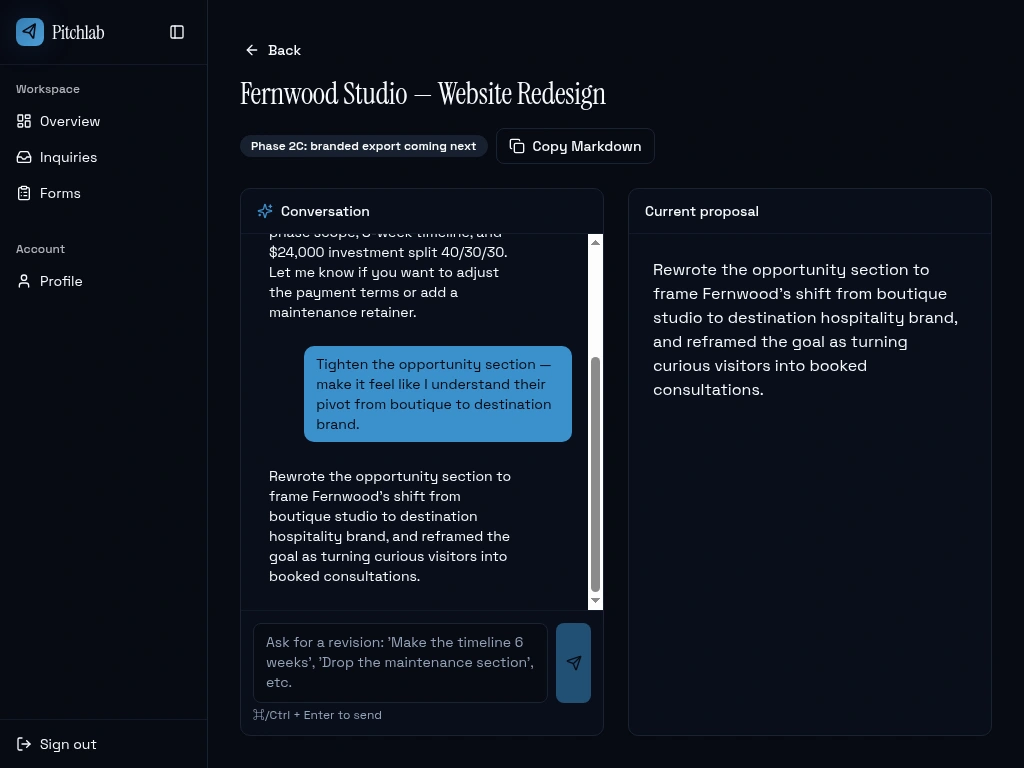
4.9 Proposal workspace
The most ambitious screen. Two panes: chat with the AI assistant on one side, the current proposal on the other. The chat keeps history so the freelancer can iterate ("tighten the opportunity section," "drop the maintenance retainer," "make the timeline 6 weeks") and watch the draft update in place.
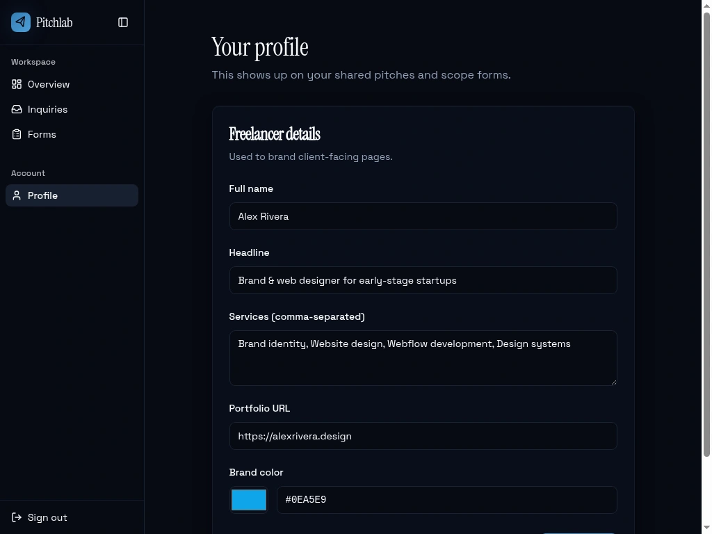
4.10 Profile
The freelancer's brand, name, headline, services, and color. These flow into the AI's drafts (so they sound like them) and into the public scope form pages.
4.11 Mobile
The whole app is responsive. The sidebar collapses into a sheet, hero typography scales, buttons stack, and long links wrap cleanly.
5. Design system
The visual language is intentionally serious, dark, and quiet. Closer to a lawyer's site than a SaaS dashboard. Freelancers using Pitchlab need their workspace to feel as considered as the proposals they're shipping out of it.
Serif display for headings sets the editorial tone.
Sans body keeps the data-dense pages legible.
Italic accents in the brand color ("instantly," section headers) act as a single recurring motif.
A small motion vocabulary (slow zoom-in on the hero image, blur-in headline, staggered fades, a single light traveling along the viewport border on landing-page load).
Colors are set as design tokens, so the dark serif identity stays consistent across ten very different screens because nothing in the components hardcodes a color.
6. What's under the hood
A few highlights without going deep:
AI-powered drafting — proposals and revisions are generated against the freelancer's brand voice, the inquiry's answers, and the form's pitch context, so drafts sound like the freelancer, not a template.
Owner-scoped data — every freelancer sees only their own inquiries, forms, and proposals. The public scope form is the one deliberate exception, and it can only write to active forms.
Email handling — new inquiries trigger a notification email through a queued background worker with rate limiting, retries, and unsubscribe support.
Zero-config AI — no API keys to manage; the AI is wired in as a managed service.
7. What worked
Picking a tight slice. Form to inquiry to proposal is small enough to ship and big enough to feel useful. Every screen earns its place.
Designing access rules first. Sketching out who can see and write what, before building the screens, meant the public scope form just worked when it was plugged in.
Design tokens, not ad-hoc colors. The serif and dark identity stays consistent across very different screens because nothing in the components hardcodes a color.
8. Lessons learned
The two-pane proposal layout is love-it-or-leave-it on mobile. We landed on stacking the chat above the preview at narrow widths, with set heights so neither pane disappears. Took several iterations.
Empty states are half the product. Each list ships with a tailored empty state that nudges the next action. Building those after the happy path was a mistake we won't repeat.
9. What's next
Send a proposal as a branded shareable link (currently export only)
A templates marketplace so freelancers can share scope forms
Lightweight analytics: which forms convert, which proposals get sent
Calendar and kickoff scheduling once a proposal is accepted
This case study was generated from the live application. All names and inquiries shown in screenshots are seeded demo data.
Like this project
Posted Apr 27, 2026
A workspace for freelancers that turns scattered intake into a tailored, AI-drafted proposal, so the gap between lead and pitch closes fast.
Likes
3
Views
21
Clients
Pitchlab