Built with Lummi
Wringly Smart-Ring Health Dashboard Design
Vincent Pasili
Wringly - Listen Inward
A calm, honest dashboard for smart-ring health metrics. Designed and built end-to-end.

At a glance
Role: Product design, UX, and engineering
Surface: Landing site, sign-in, onboarding, a 5-page health dashboard, a device shop, settings, and an AI chatbot
Status: Live at wringly.lovable.app
1 - The problem
Wearable health apps drown people in numbers. Notifications compete for attention, charts fight for space, and the result is anxiety instead of insight. The brief was to design a smart-ring companion app that does the opposite: surface the smallest set of honest signals that help someone understand how their body is doing today, and trust the product enough to come back tomorrow.
Three principles shaped every decision:
One score per question. How did I sleep? One number. Am I ready? One number.
Calm by default. Dark theme, restrained motion, generous whitespace. The UI should never feel like a demand.
Bring your own ring. Don't gate the experience on proprietary hardware. Sync from any wearable the user already owns.
2 - Design, a cinematic dark theme
The visual language was inspired by Oura's ambient calm and high-end audio gear. Three moves anchor the brand:
Deep space backgrounds instead of pure black, so contrast stays soft and readable for long sessions.
Muted electric teal as the only accent, used sparingly for emphasis.
Two typefaces - Fraunces for headlines (warm, editorial) and Inter for body (technical, neutral). The tension between them carries the whole brand.
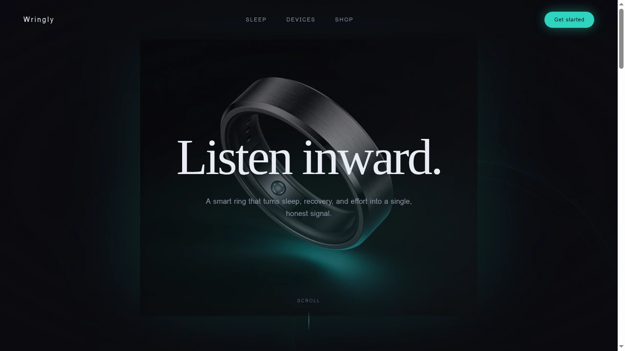
Landing, earning the click
The hero pairs a slow-rotating product shot with a single line of copy. The ring sits inside a teal halo that pulses gently. As you scroll, the ring drifts down and fades while the headline floats up - a subtle parallax that makes a flat web page feel cinematic.
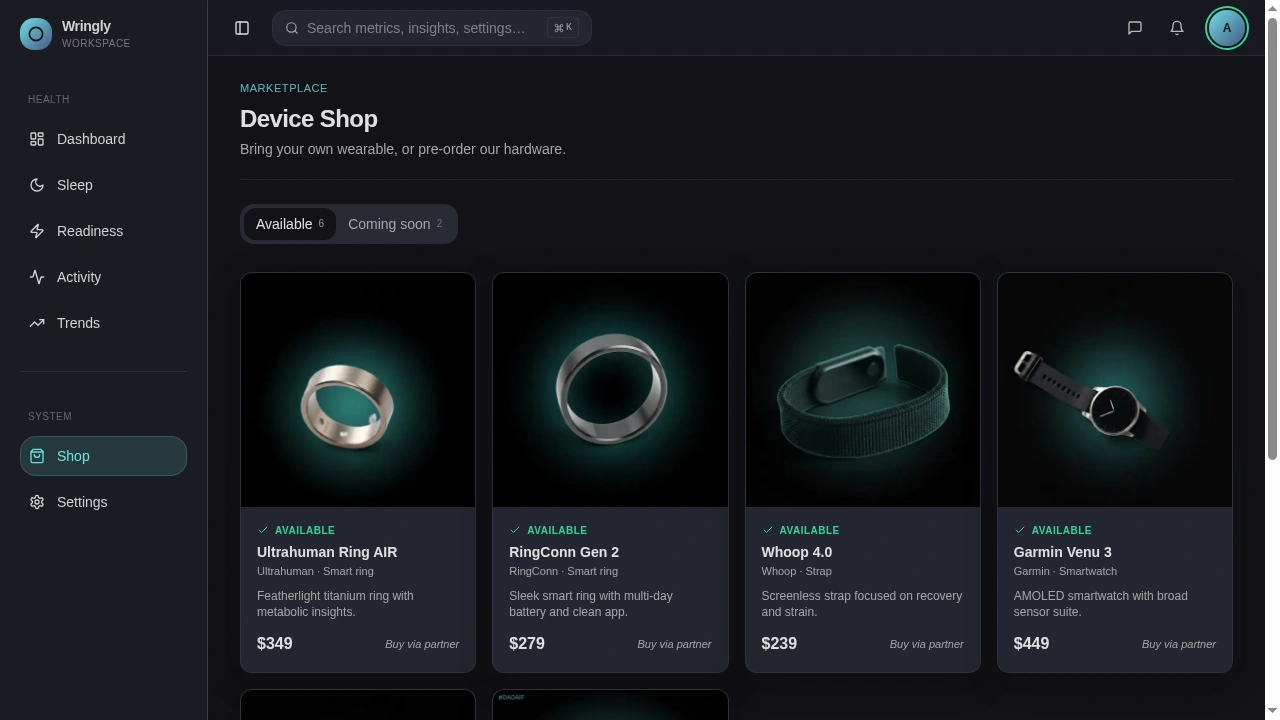
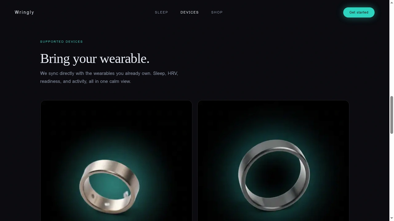
Below the fold, the Devices section answers the buyer's first question (do I have to buy your hardware?) with two supported wearables and two upcoming first-party devices. All product photography was regenerated against the same dark background so nothing breaks the visual continuity.

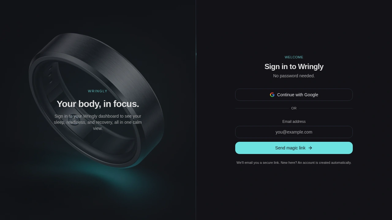
Auth, half product, half brand
The sign-in screen is split: brand on the left, action on the right. There is no password - just Google sign-in or a magic-link email. This removes a common drop-off point (forgotten passwords) and matches the calmer-than-average personality of the product.
3 - Product, the dashboard
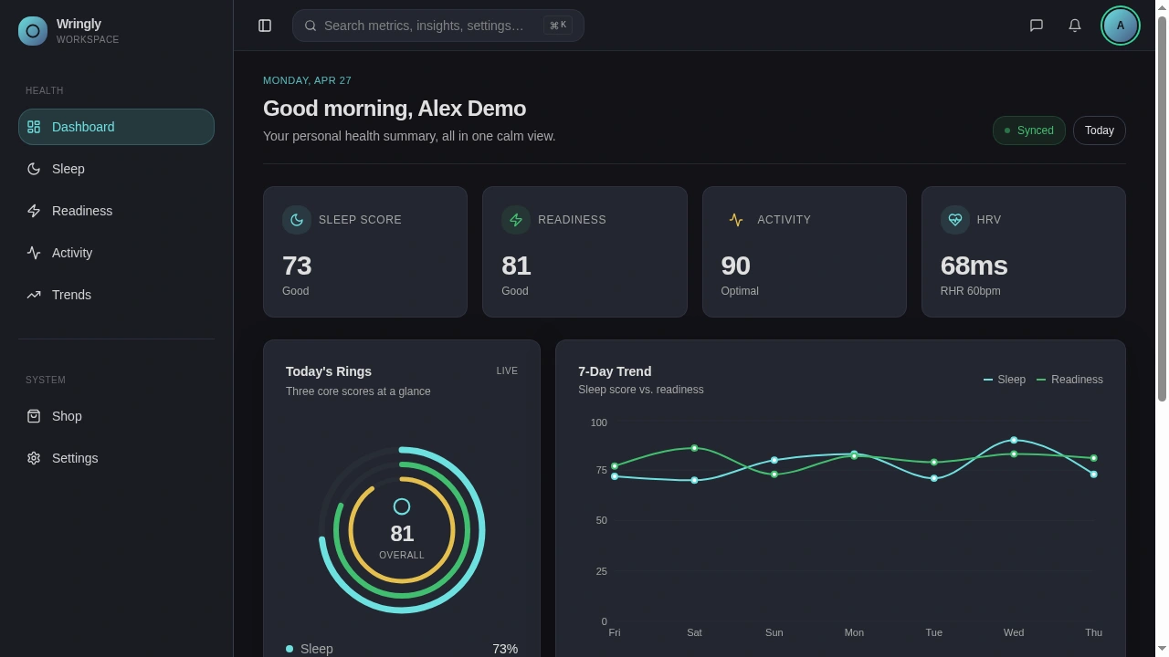
Once signed in, every health page shares the same shell: a collapsible sidebar, a search bar at the top, and a clean page header. One shared layout means new pages take a fraction of the time to build.
Daily summary
The dashboard is the product's center of gravity. Four key stats across the top, then today's three rings (sleep, readiness, activity) next to a 7-day trend line. Everything a user needs to read their morning in under five seconds.
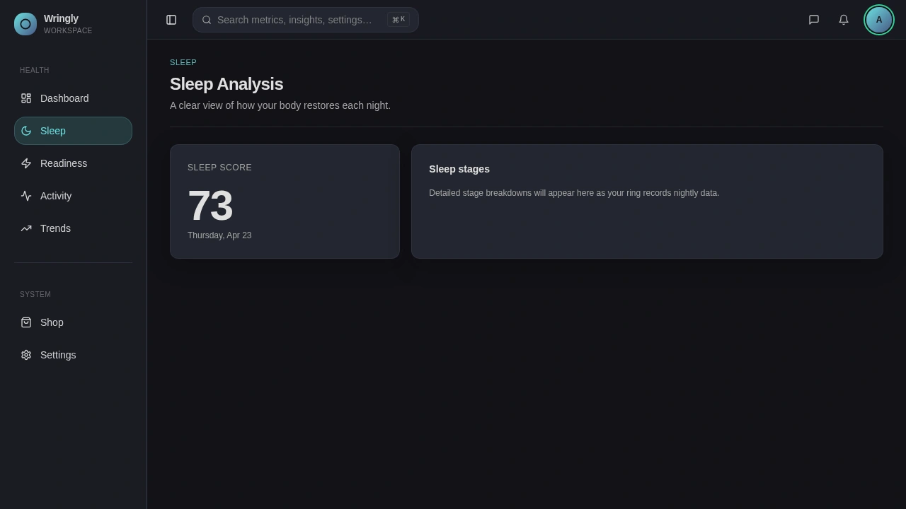
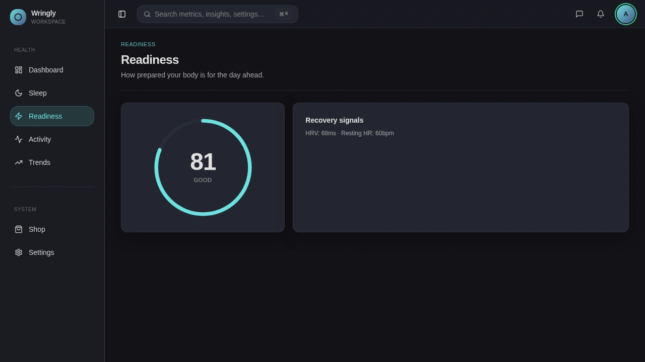
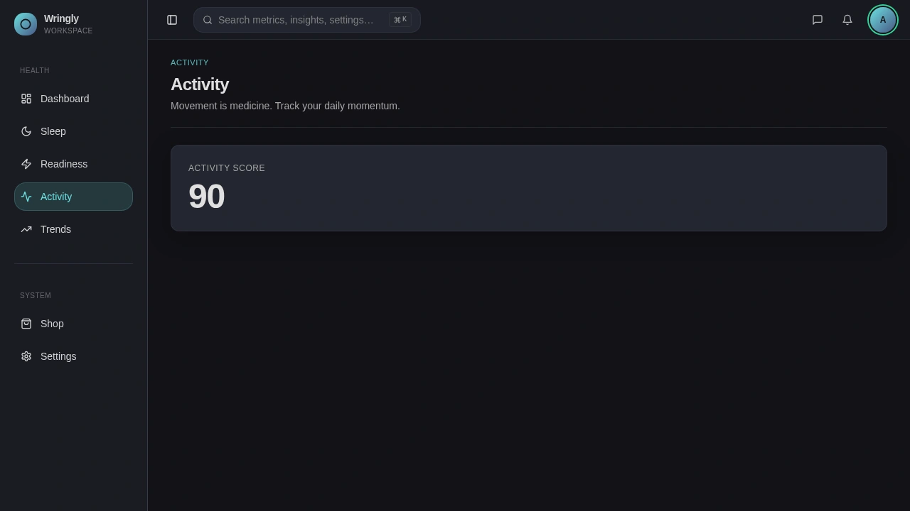
One question per page
Each health page answers exactly one question. Sleep shows the score and how the night broke down. Readiness shows the score and the recovery signals behind it. Activity surfaces effort. The pages are intentionally sparse, leaving room to grow once real users tell us what they want to dig into.
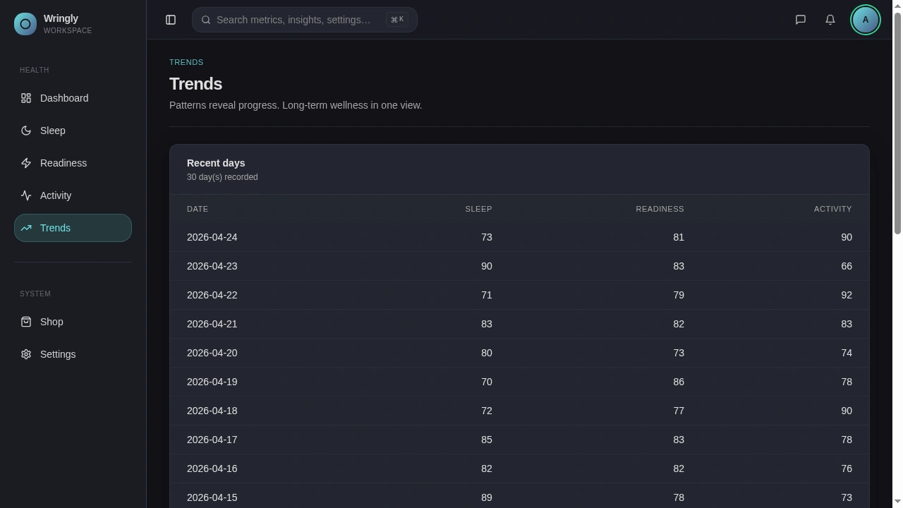
Trends, the long view
Patterns matter more than any one day. Trends shows 30 days of scores in a clean table, with richer charts planned for the next version. Starting with a table means it shipped immediately and works well for screen readers.
Shop and Settings
The Shop doubles as a buying page and a "what we support" page, with cards that toggle between Available and Coming soon. Settings is one screen for profile, notifications, privacy, and sign-out. No nested menus.
4 - What's under the hood
A few highlights without going deep:
AI chatbot - a floating button opens a chat that can answer questions about your data, with safe limits on how much it can take in.
Privacy-first storage - profile photos are kept private and shown to the right person via short-lived links, not public URLs.
Sensible auth - magic links instead of passwords, and a clean handoff between the email click and the dashboard.
Performance - small images, lazy-loaded pages, and smart caching so the dashboard never feels slow or empty.
5 - What I'd do next
Real device sync with Apple Health and Google Fit.
Helpful-or-not feedback on AI insights, so the prompts keep getting better.
A native wrapper so the app can use Face ID or fingerprint sign-in.
Richer Trends charts. The table is the floor, not the ceiling.
Credits
Design, product, and engineering: me.
Photography generated and color-graded against the brand palette so the entire surface - landing through dashboard - reads as one product.
Like this project
Posted Apr 27, 2026
Smart-ring health companion that surfaces the smallest set of honest signals: sleep, readiness, activity, without the anxiety.