Mai Verdant I Brand Identity
Maung Maung Thu
Mai Verdant
Mai Verdant is a contemporary supermarket rooted in the heart of Chiang Mai, Thailand. Inspired by the city’s rich heritage and lush natural surroundings, Mai Verdant is more than just a place to shop—it’s a destination for green living and community connection. Our mission is to make sustainable, local, and healthy choices accessible and inviting for everyone.
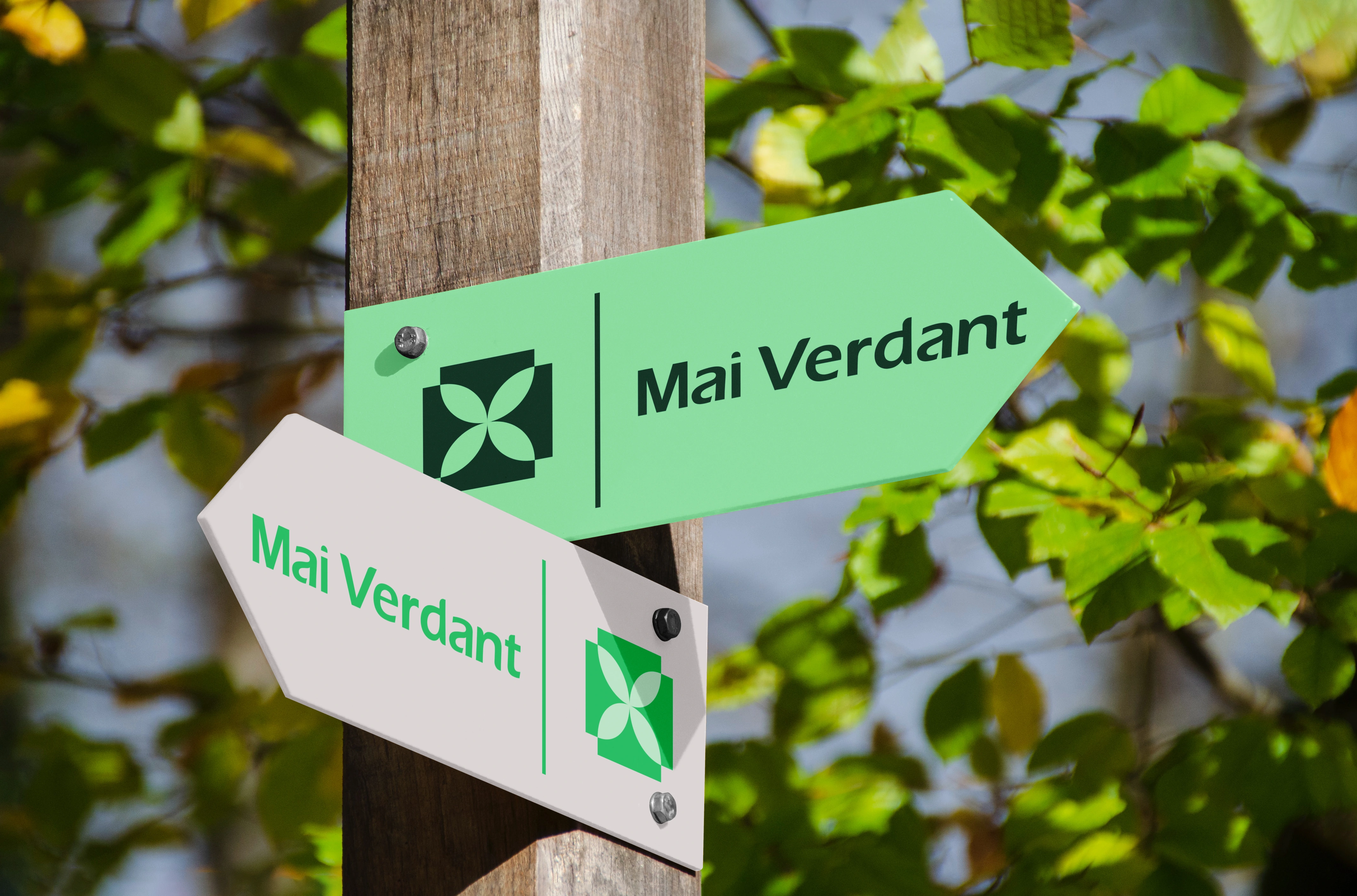
Inspired by Chiang Mai’s Old City Square. The visual identity of Mai Verdant Market draws from the iconic square layout of Chiang Mai’s Old City—a symbol of harmony, protection, and cultural pride. The logo’s square form and floral motif echo the city’s historic walls and blooming gardens, reflecting both the structure and vibrancy of the local landscape. This design grounds the brand in a sense of place, celebrating Chiang Mai’s legacy as the “Flower City” and a hub of community life.


A Verdant Vision
The name “Mai Verdant” combines local roots (“Mai” for Chiang Mai) with the universal language of greenery and growth (“Verdant”). The brand’s signature green palette, geometric flower symbol, and modern rounded typography all communicate freshness, sustainability, and approachability. Every detail—from the logo grid to the pattern applications—reinforces a commitment to eco-friendly practices and a welcoming atmosphere.

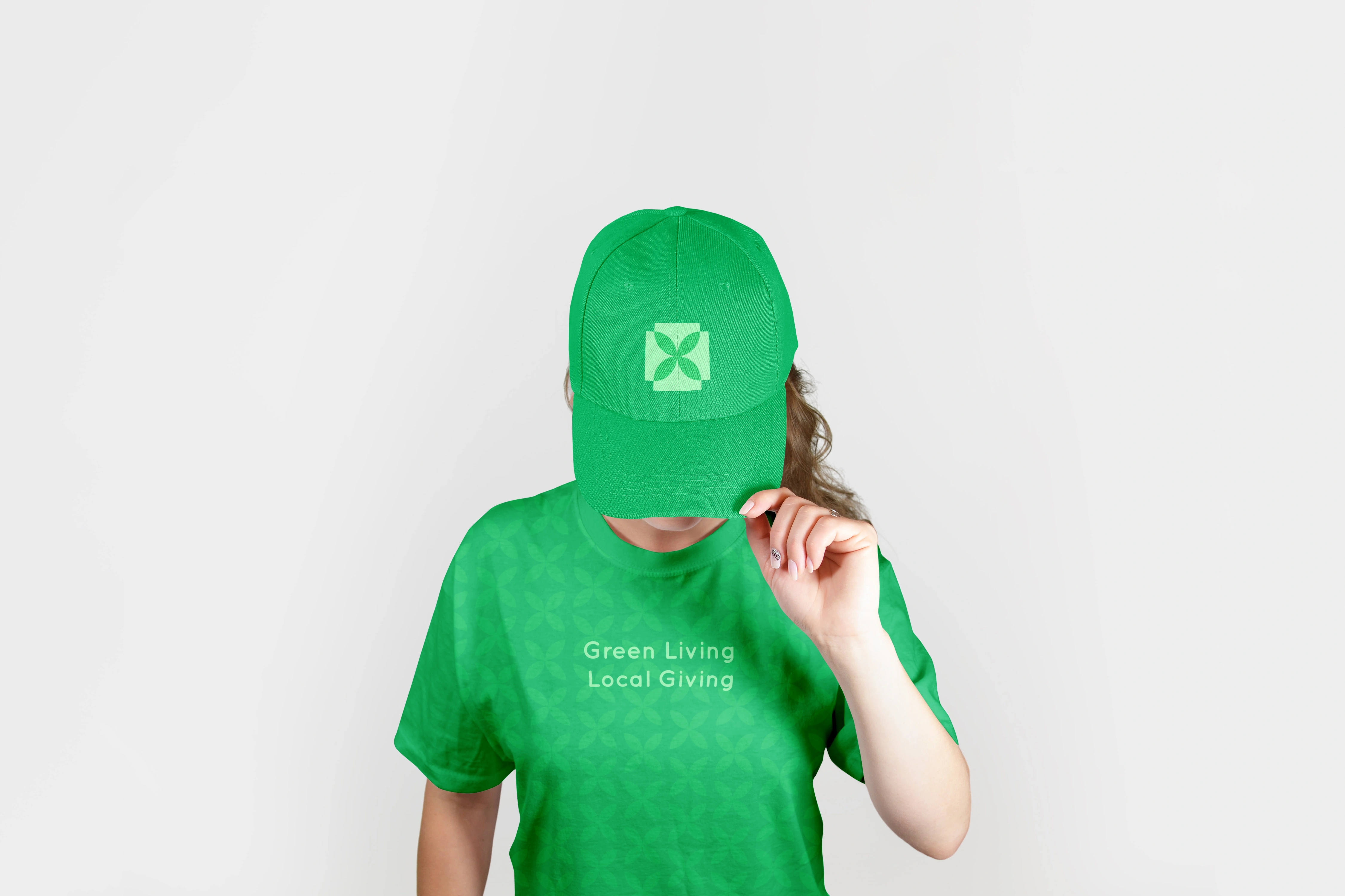
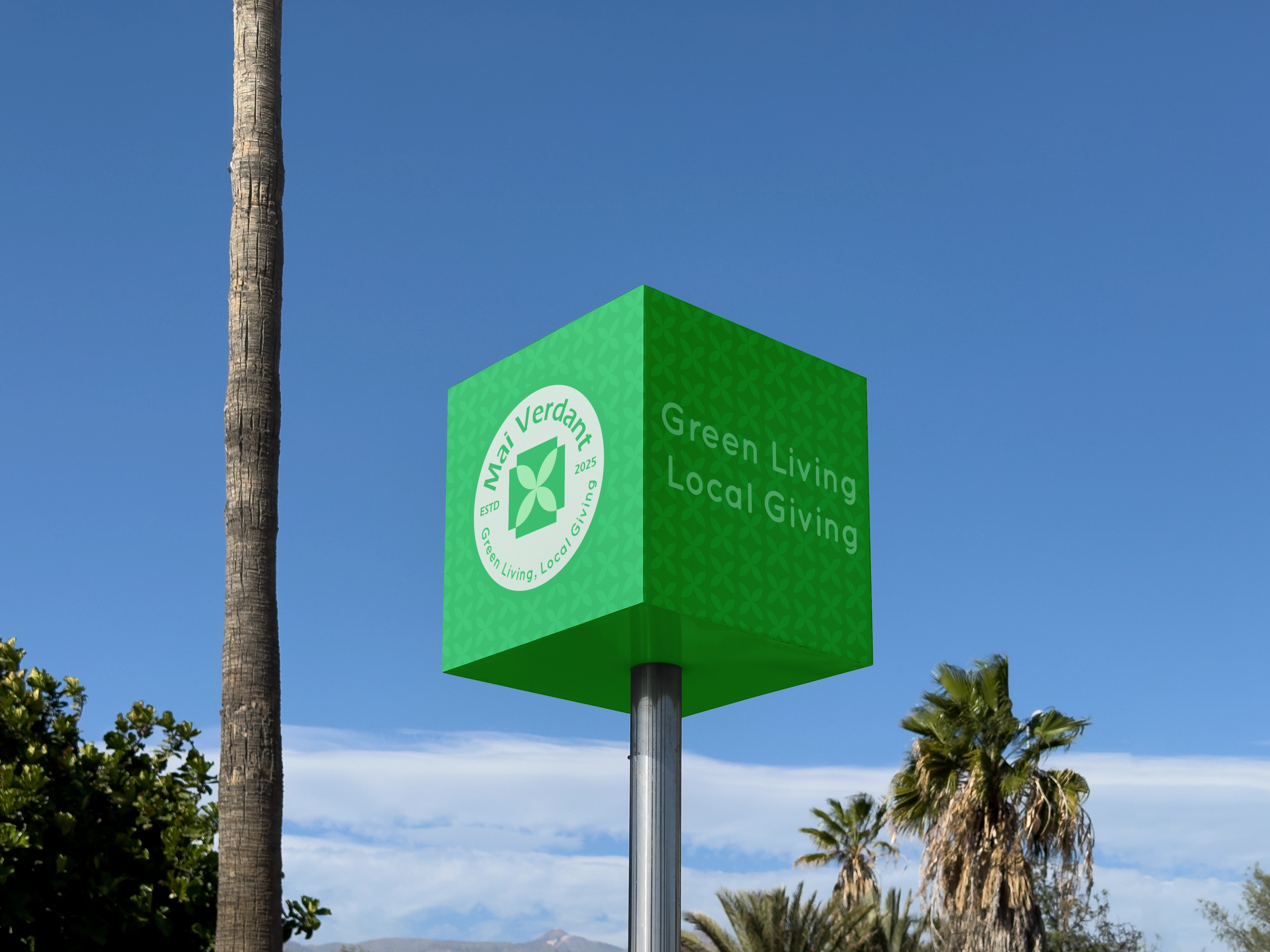
Green Living, Local Giving
Mai Verdant Market stands for more than sustainability; it’s about giving back. Our tagline, “Green Living, Local Giving,” expresses our dual mission: to promote healthier, greener lifestyles and to support local farmers, artisans, and families. This ethos is reflected in every touchpoint, from reusable bags and digital interfaces to in-store signage and community events.


Designed by:
Tidese Studio & Maung Maung Thu
For inquiries:
Email : tidesestudio@gmail.com
Phone : +669 2265 5776
Let's connect: facebook
More Like This !
Save
Like this project
Posted Jun 2, 2025
Mai Verdant features a fresh, nature-inspired brand identity with refined naming, logo, and a harmonious color palette for a modern, sustainable look.
Likes
0
Views
1
Timeline
Feb 1, 2025 - Feb 28, 2025