Tidese Studio - Branding
Maung Maung Thu

Brand Overview
Tidese Studio is a creative branding and design studio that helps businesses establish powerful visual identities and engaging digital content. Inspired by the natural movement of tides—constantly evolving and lifting everything in their path—we aim to elevat brands through strategic and artistic design solutions.


About the Logo
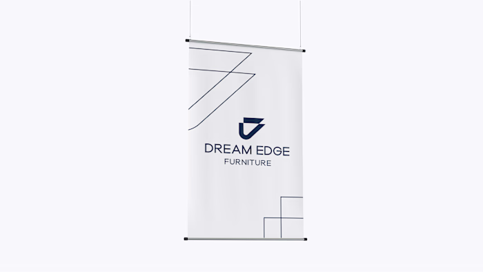
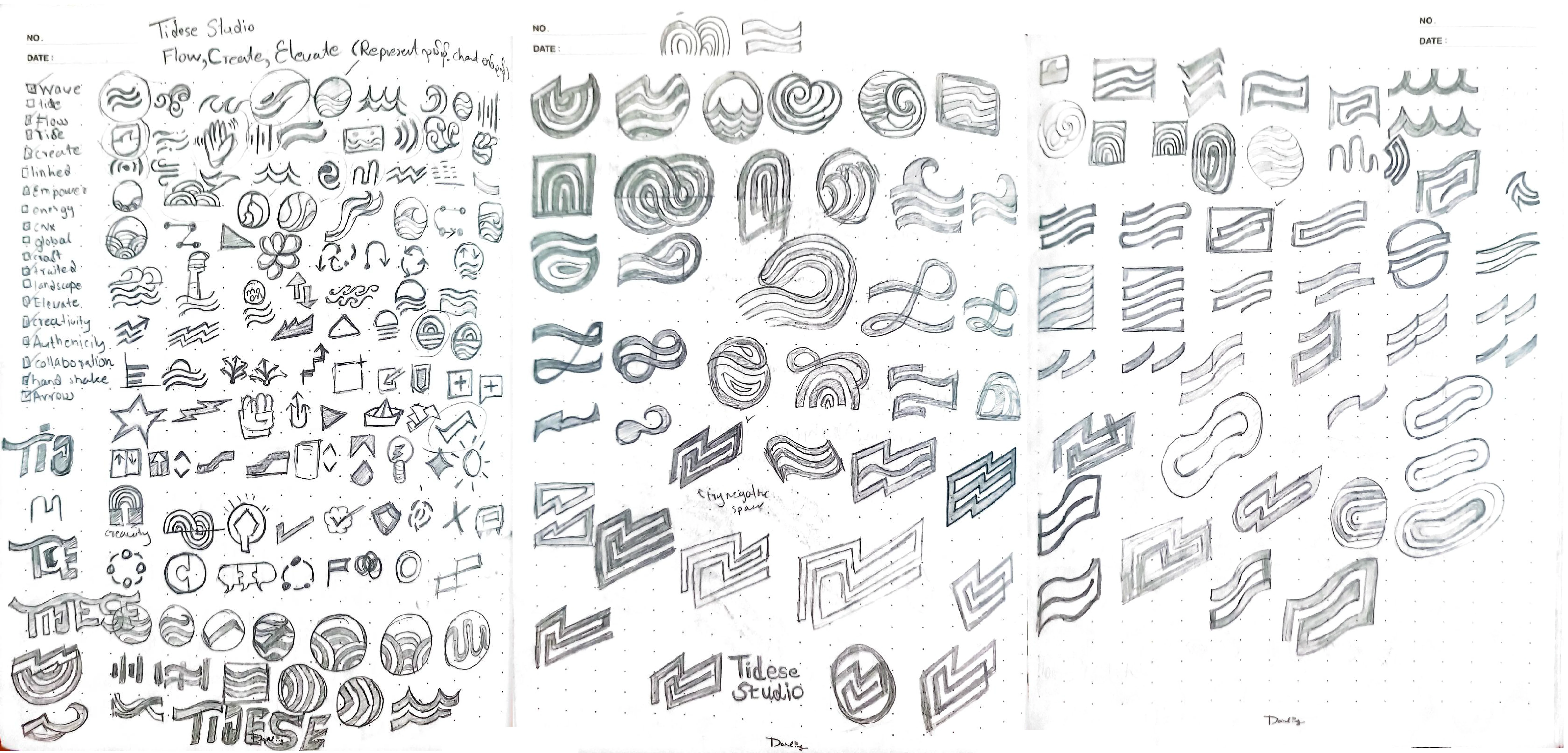
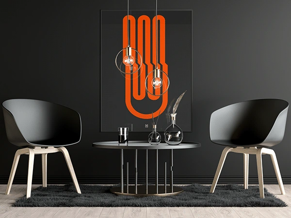
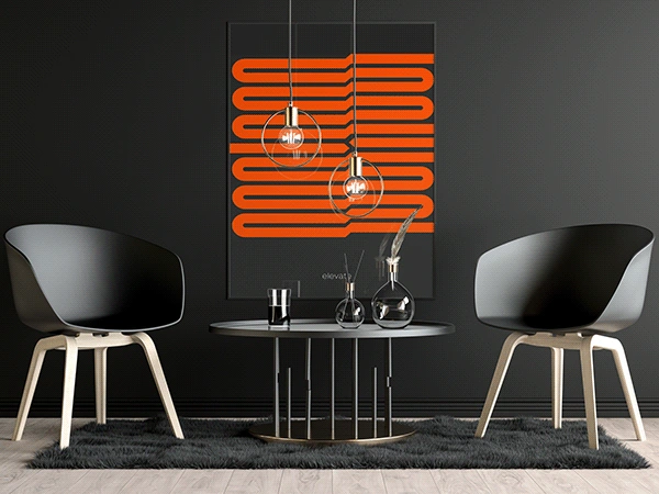
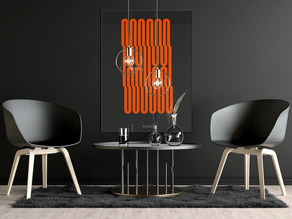
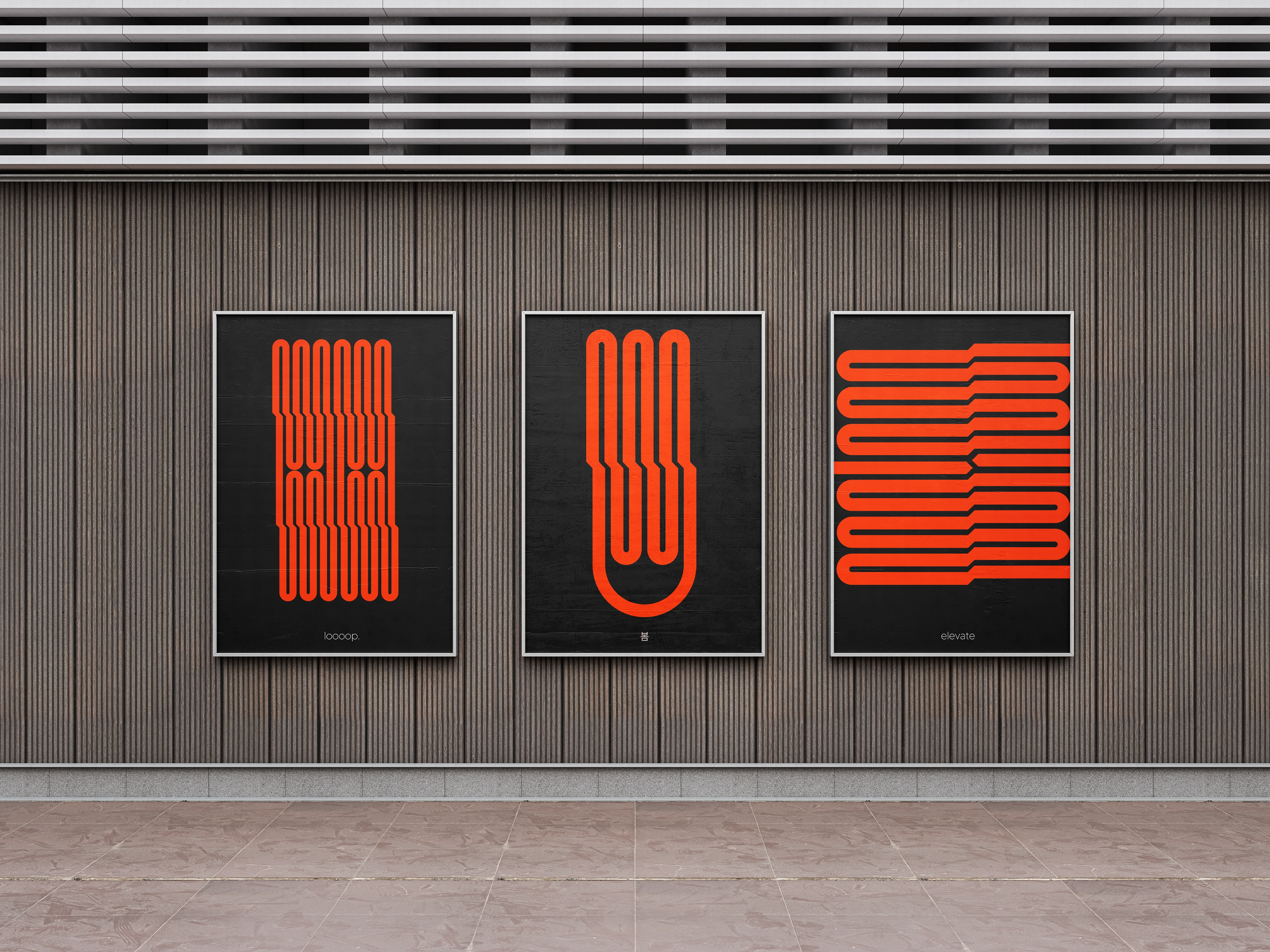
The Tidese Studio logo embodies elevation, growth, and strategic creativity through its geometric and modern aesthetic. The two stacked geometric arrow-like shapes, pointing right and slightly upward, symbolize progress, elevation, and momentum, perfectly aligning with the studio’s mission to uplift brands. The clean, bold lines and structured form reflect a strategic, professional, and contemporary approach to branding and design. The sharp, angular shapes convey stability and reliability, while the minimal yet impactful design ensures versatility across various platforms. This balanced geometric structure reinforces a thoughtful, intentional, and growth-oriented mindset, ensuring that every design decision serves a clear purpose in helping brands rise and stand out. The logo perfectly captures Tidese Studio’s vision of elevating brands through creativity and strategy.

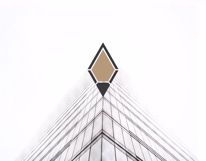
Base in Triangle Shape :
The triangle is a powerful geometric shape in branding and design, symbolizing strength, stability, and direction. Its pointed structure conveys movement and progress, making it ideal for brands focused on growth, ambition, and innovation.


The vibrant orange-red injects energy, creativity, and urgency, making the brand feel dynamic and innovative. Deep Charleston Green adds a touch of sophistication, strength, and professionalism, ensuring a sleek and premium look. The soft white balances the palette, bringing in clarity, openness, and simplicity for a refined, minimalist touch. Together, these colors create a striking yet clean and approachable identity, perfect for a studio that thrives on creativity and modern design excellence.


Like this project
Posted Jun 2, 2025
Tidese Studio’s branding blends clean typography and geometric shapes with a modern palette, creating a creative and professional visual identity.
Likes
0
Views
1
Timeline
Jan 9, 2025 - Jan 24, 2025