Polara Dental I Brand Identify
Maung Maung Thu
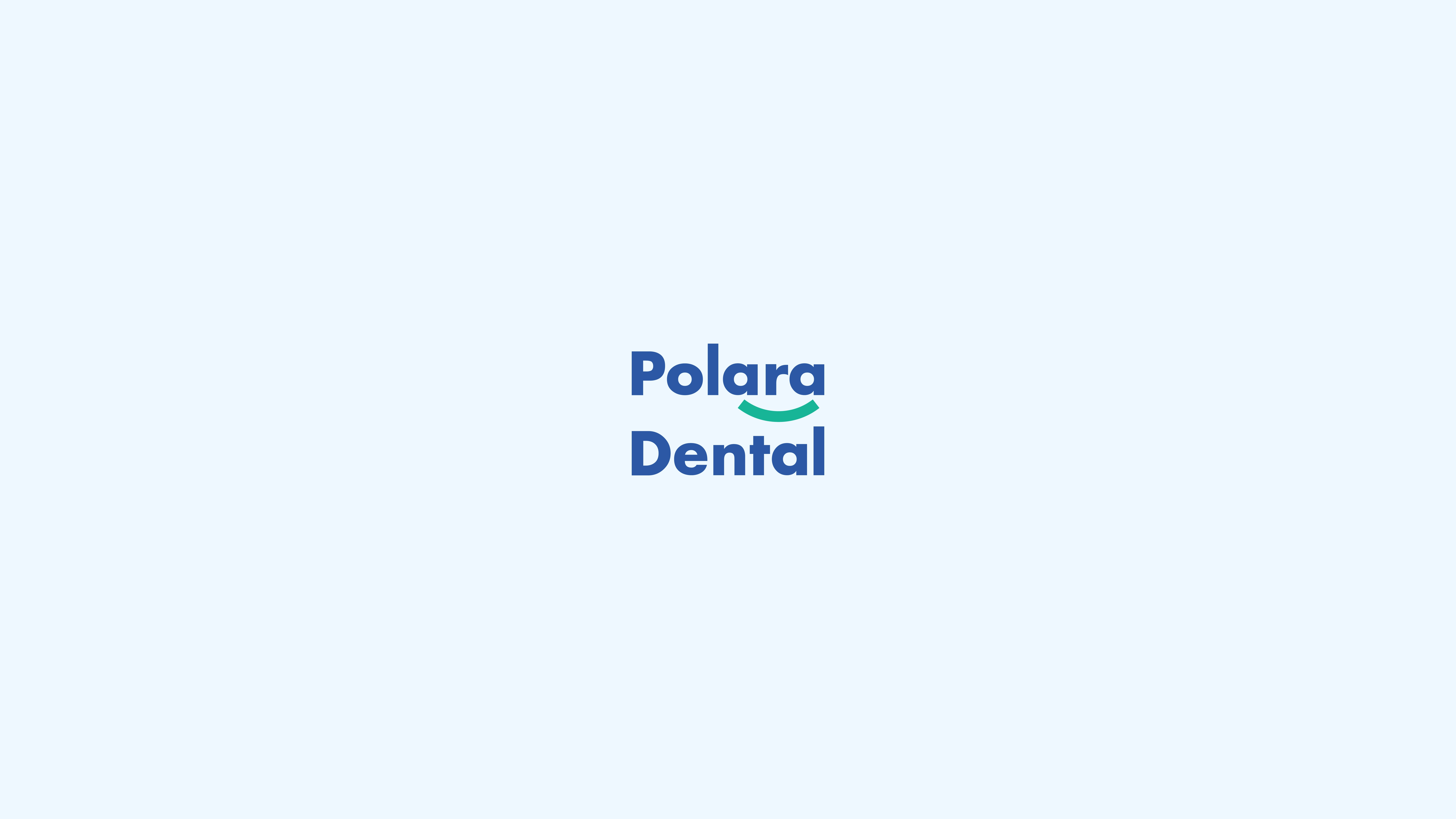
Polara Dental : Brilliant Smiles, Pure Care
Polara Dental’s branding is inspired by the natural beauty and brilliance of the polar lights (aurora borealis). These lights symbolize purity, clarity, and elegance—qualities that align with Polara Dental’s mission to deliver radiant smiles and exceptional dental care.


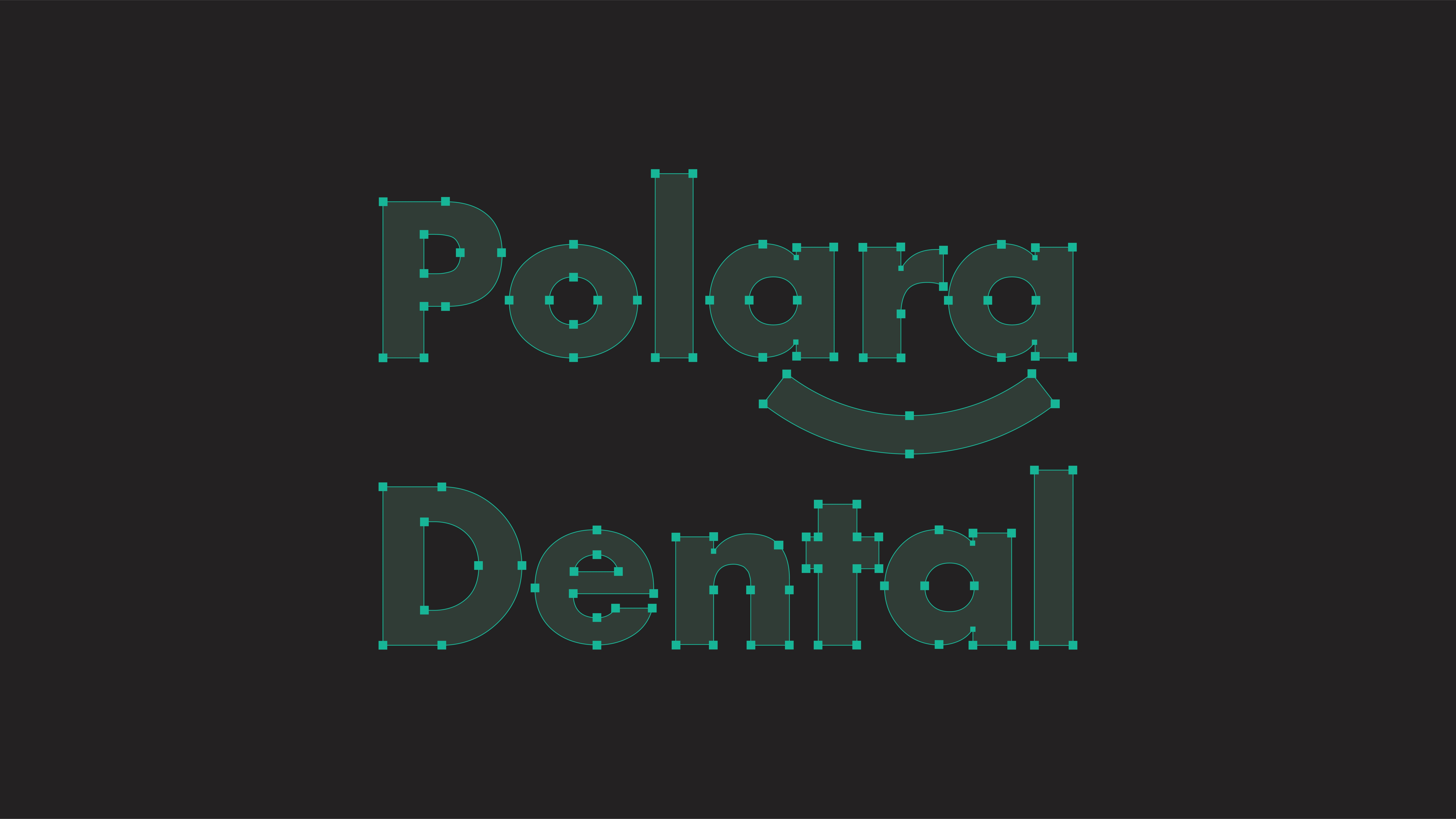
Logo Story
The Polara Dental logo is a perfect blend of minimalism, creativity, and symbolism. Each element is thoughtfully designed to reflect the brand's values:
Typography: The clean, modern sans-serif font conveys trust, professionalism, and approachability. Its rounded edges create a sense of warmth and comfort for patients.
Smile Curve: The teal curve beneath "Polara" represents a confident smile. It also echoes the graceful arcs of the aurora lights, symbolizing innovation and freshness in dental care.

The combination of these colors creates an environment that is both professional and approachable. The teal green and deep blue provide a sense of calmness and trust, while the soft white ensures a clean and modern feel. Together, these colors reflect Polara Dental’s mission to deliver exceptional dental care with precision, innovation, and warmth.This carefully curated palette ensures that Polara Dental stands out as a modern, trustworthy, and patient-centered brand in the dental industry.


Tagline
"Brilliant Smiles, Pure Care" perfectly encapsulates Polara Dental’s promise to provide exceptional dental services with a focus on patient well-being.


Designed by:
Tidese Studio & Maung Maung Thu
For inquiries:
Email : tidesestudio@gmail.com
Phone : +669 2265 5776
Let's connect: facebook
More Like This !
Save
Like this project
Posted Jun 2, 2025
Polara Dental features a clean, modern brand identity with calming colors and simple graphics, reflecting professionalism and trust in dental care.
Likes
0
Views
1
Timeline
Feb 27, 2025 - Mar 7, 2025