Stroll Social
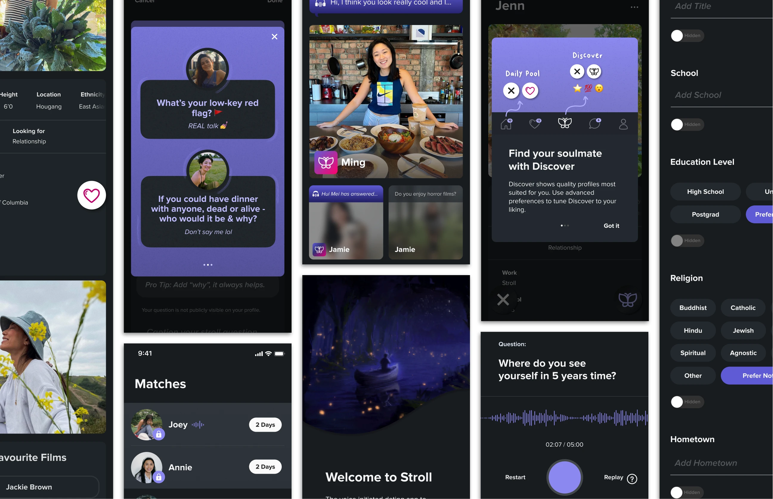
Designed the mobile app interface and the website by researching, identifying, and iterating as an early team member.
The task
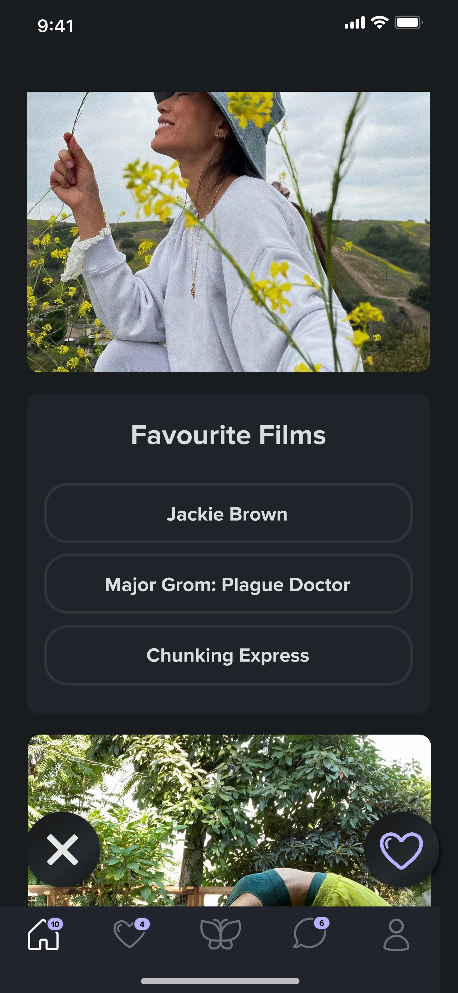
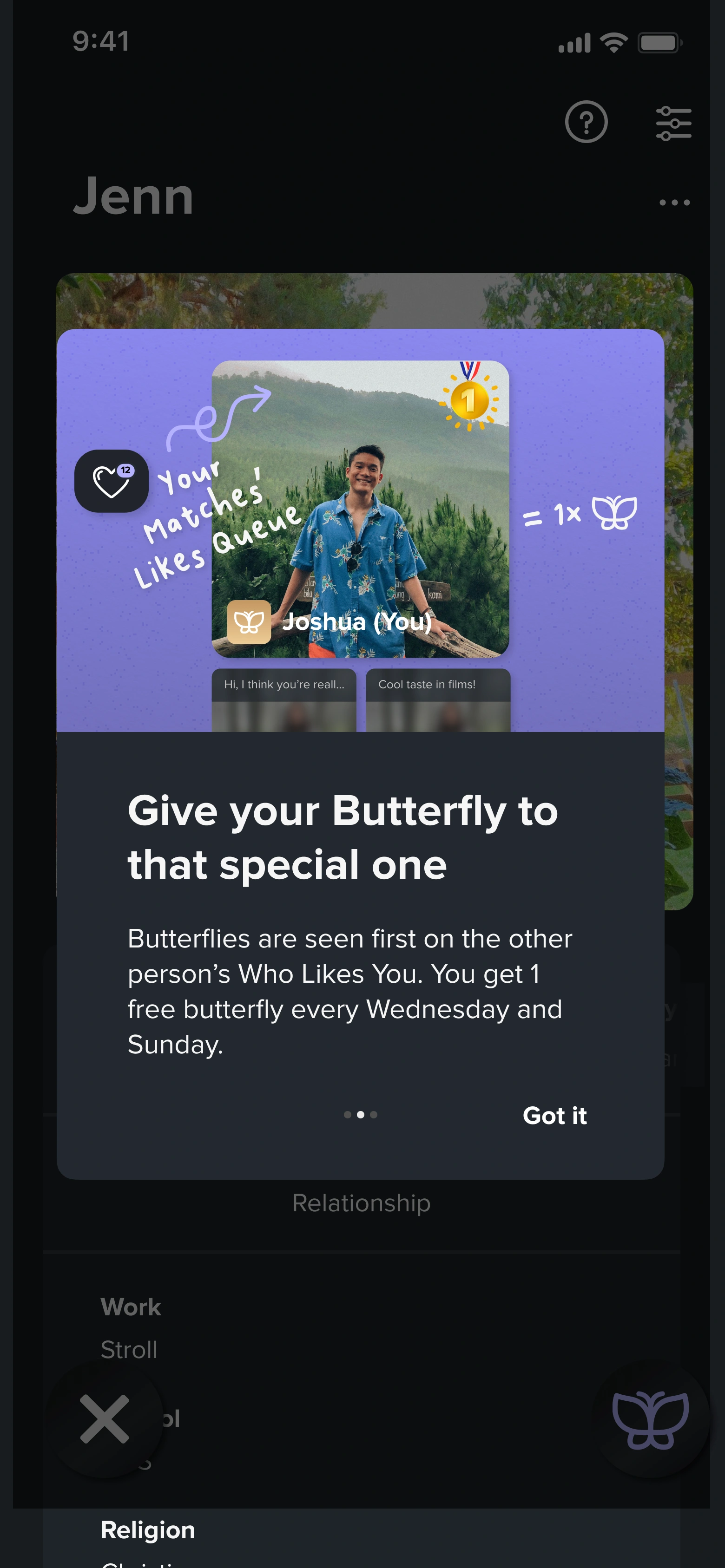
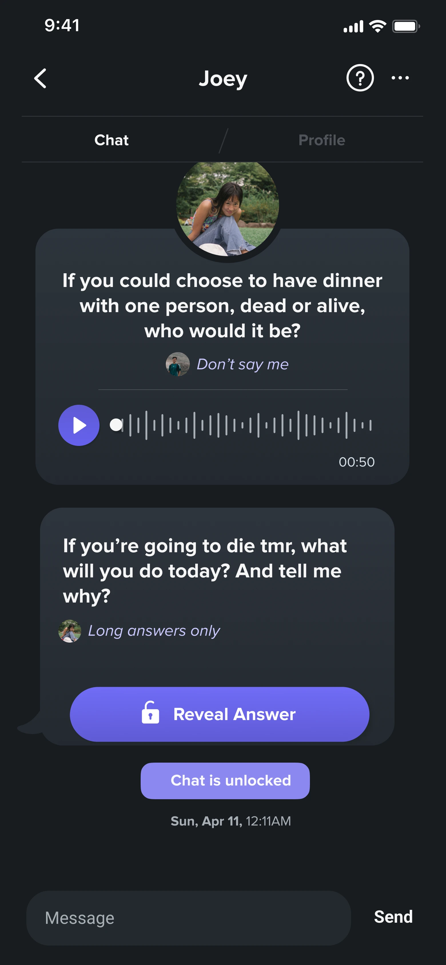
Stroll is an early stage dating app startup.
At the beginning of my internship, primary app flows were complete and in development. My tasks were to identify, research, and redesign user pain points. I also designed secondary features that I identified in the research. I led developer handoff and closely worked with them for the implementation.
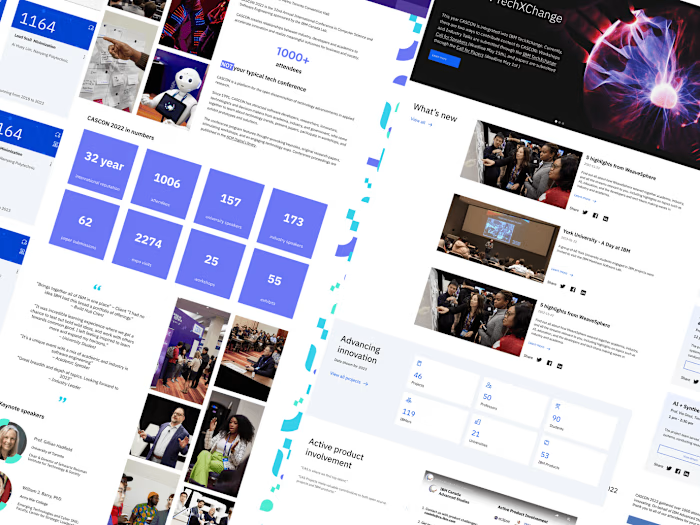
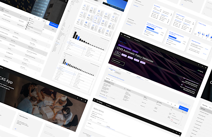
I also created the company website in Wordpress and helped build the design system.
Due to my NDA, I can't disclose all details and projects undertaken.
Impact: My designs were successfully implemented and integrated into the app. The company also launched several marketing channels using these screens
Tools used: Figma, Miro, Excel, Pen & Paper
Team: 2 founders, 2 operations interns, 1 UX Design intern (me!), and 24 remote developers
00. Before the internship
I started my prep by getting familiar with the Material Design and the Human Interface Guidelines before the internship started.
Additionally, I started using competitor products and making a note of everything I liked and didn't like and why I felt the way I did. Further, I researched the Singaporean dating app market.
Although my internship was in person, I could not travel to Singapore for the first two months of my internship due to the Canadian travel restrictions. Hence, I started my internship virtually, working synchronously with a time difference of 12 hours. Fortunately, I was able to travel during March 2022 and meet my team in person!
01. Audit
I identified and recommended changes for user pain points by analyzing Stroll's mobile app against market competitors. I also improved the Figma mockups by fixing constraints, spacing and other issues.
I then compared the product (in TestFlight at this stage) to the existing Figma mockups and discovered numerous inconsistencies in constraints, components, typography, buttons, copy, placement, spacing etc.
Once these were identified and documented, I led the communication and collaboration with developers to resolve this and to set up a system that would prevent this in the future.
02. Research
The next step was to identify and validate user pain points. For this, I conducted several usability tests starting with the students who stayed on university campus (Stroll's target market). I interviewed 10 people and conducted a survey with approximately 30 responses.
Then I led discussions with developers for feature ideas and prioritization. This considered the bandwidth the development team had, the solutions that might require more time and expectations for timelines. Next, I presented results of the research to the founders along with my ideas for designs.
I also told them about the developers' project constraints and if I required any help or resources from the team. I also discussed the ideal and anticipated business outcome for the redesign.
03. Design
After UX audit and research, I redesigned the pain points I had identified and designed for new features.
As problems were identified, I collected them in a FigJam board shared by all core members of the team. This ensured that all ideas, questions, feedbacks and reviews for product features could be efficiently documented and discussed.
This image shows a small snippet of brainstorming. However, this board has confidential content and therefore cannot be shared.
One example is the deleting account flow.
Data from Mixpanel suggested that our early users were very quick to delete the app and did not spend too much time about the decision. Consumer research using interviews with 10 users showed that since the app still had bugs, the user chose to delete it instead of providing feedback.
While designing, I collaborated continuously with the team of developers to ensure that the design translated from Figma to the app.
Before and after screens
More screens from the new delete account flow:
App screens can be viewed in the Figma file below (note that there are multiple pages in the Figma file):
04. Validating the design
As soon as my preliminary designs were done, I put it on a design Slack channel for the team to review it and provide feedback. Further testing involved conducting informal research through conversations and testing with NUS students, and more formal research every month through surveys and interviews by asking users about the new features that were pushed out that month.
Most of these projects underwent several iterations between developer and user feedback before being launched.
Other projects: The Stroll website
Other projects: Design system
Reflection
This internship helped me become become a better designer and collaborate more deeply with all functions.
There were several challenges, ranging from beginning the position virtually with a huge time difference and adjusting to a different country and culture to the company being an early stage startup and therefore having restrictions in conducting consumer research, releasing designs etc.
I wore many hats in this company and each hat helped me become a develop skills that I could apply to my work core: UX Design. It was a very fast paced, all hands on deck position and I learned from it immensely. It was exciting and kept me on my toes. The long hours eating strange new food and trying to pick up Singlish was entirely worth it!
Like this project
Posted Feb 23, 2024
Designed the mobile app interface and the website for a dating app startup by researching, identifying, and iterating as an early team member.
Likes
0
Views
121
