IBM CAS App 2.0
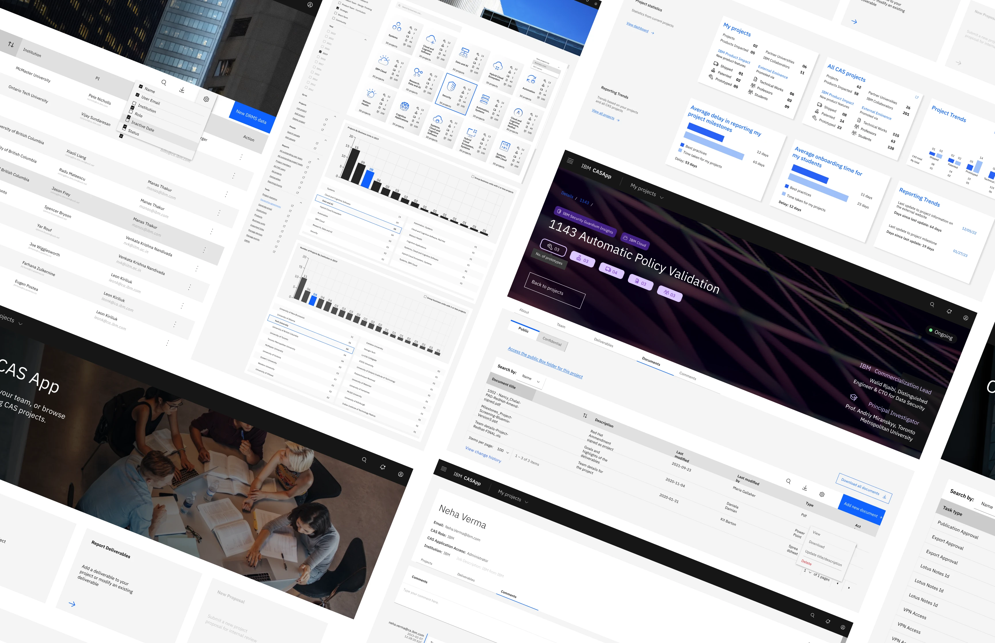
Redesigned the CAS (Centre of Advanced Studies) web based platform for 300+ users across 58 IBM products and 26 universities.
The task
Revamp the platform that manages the research projects, their funding and logistics used further by IBM to enhance its products.
CAS or the Centre of Advanced Studies facilitates the transfer of research ideas into the products and services in IBM. I interned in this unit.
It is not a public facing platform and contains confidential information and therefore, some information and designs have been omitted.
This case study focuses on the design of the Dashboard.
Impact: CAS App 1.0 was successfully replaced with 2.0 version with complete features designed and shipped
Tools used: Figma, Adobe XD, Mural, Github, Carbon Open Source Library
Team: 5 developer interns, 2 UX designers (me! + another intern till April), and 1 technical architect
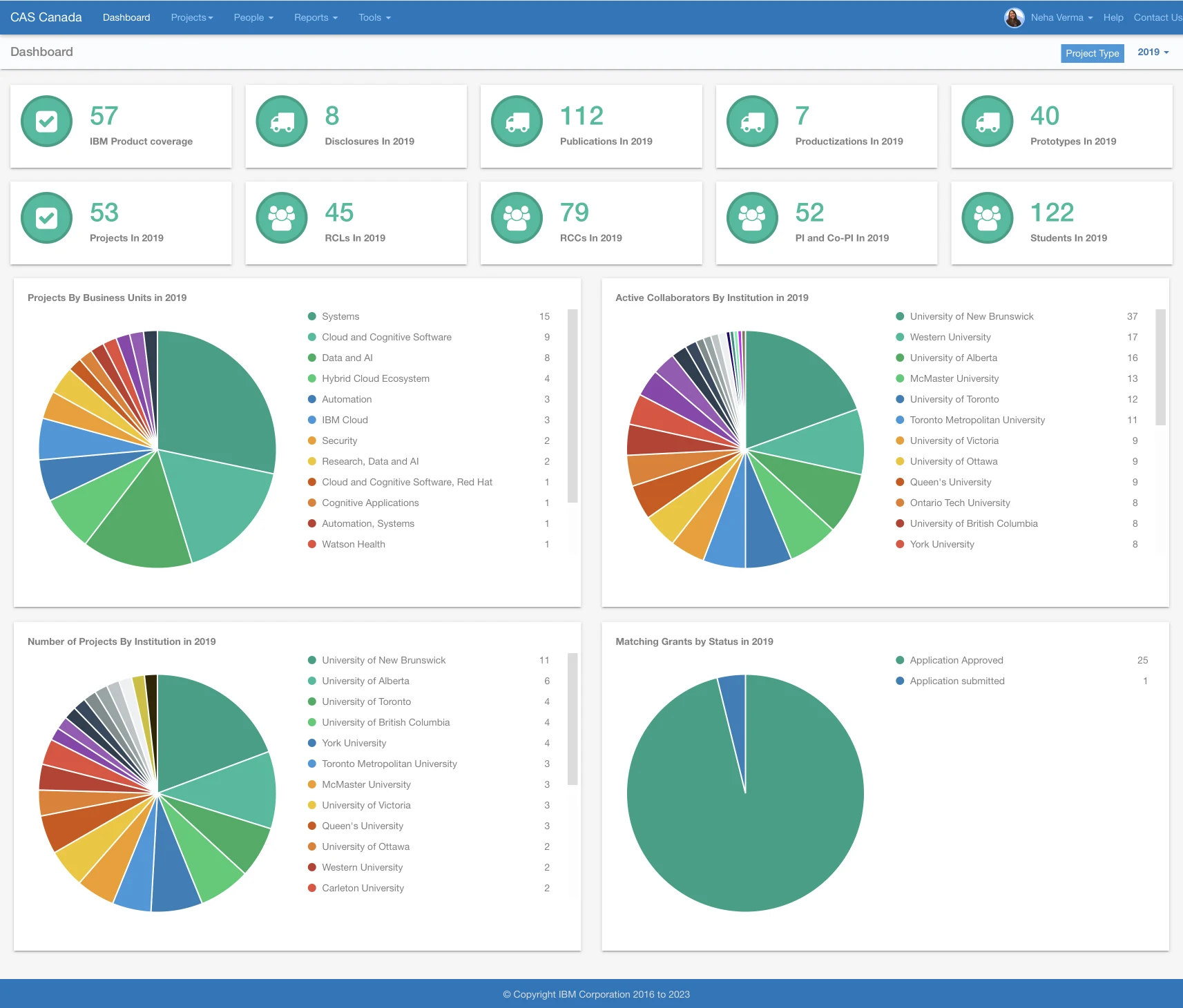
Dashboard before
Dashboard after
⬇ Scroll within this laptop screen!
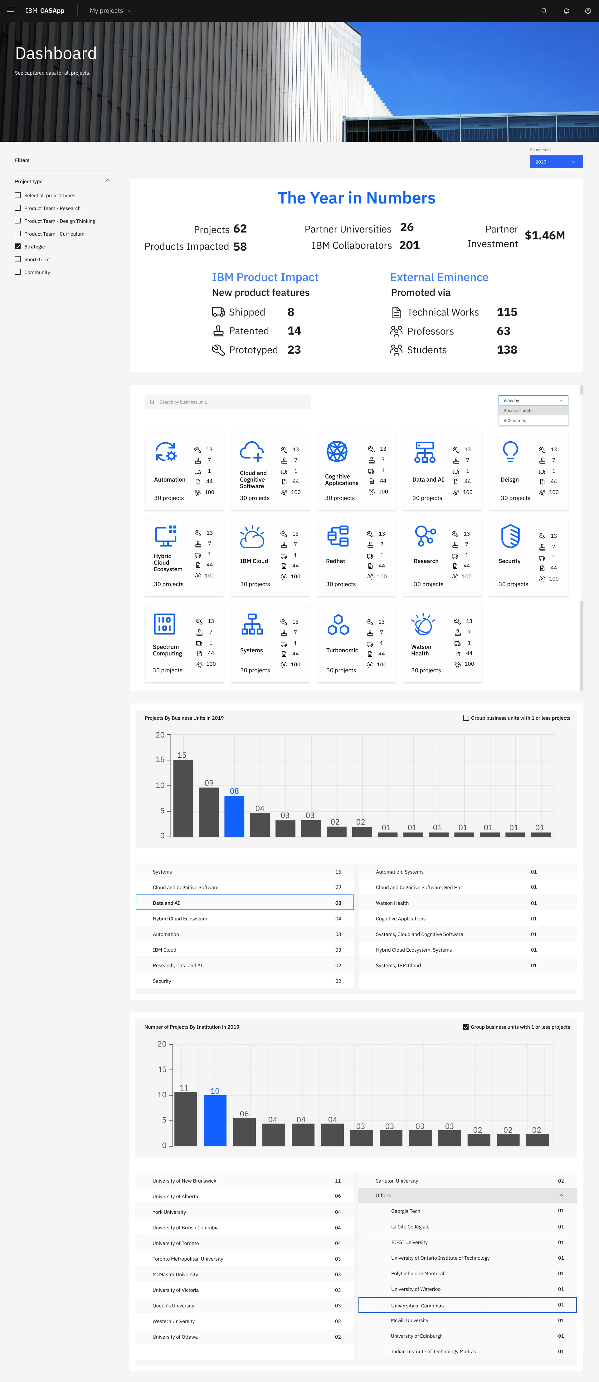
Dashboard: the task
How might we show impact based metrics that captures the relevant information in an efficient manner?
Research found that
71.43%
Participants feel that the information on the dashboard is not relevant they seek more impact based data
Only admins feel the information is relevant to them
42.86%
Participants expressed difficulty accessing CAS App
Problems included finding URL, going through double authentication, limitations caused by VPN restrictions
Heuristic evaluation
Feature development and addition was carefully evaluated before being adopted to 2.0 from 1.0
I used this research as basis but also accounted for new workflow being adopted where commercialization leads and project managers will be delegated more tasks on the platform.
Further, the timeline for development drastically shortened as the CAS team will go from being a team of 12 + a technical support team in India to total team of just 1 at the end of August.
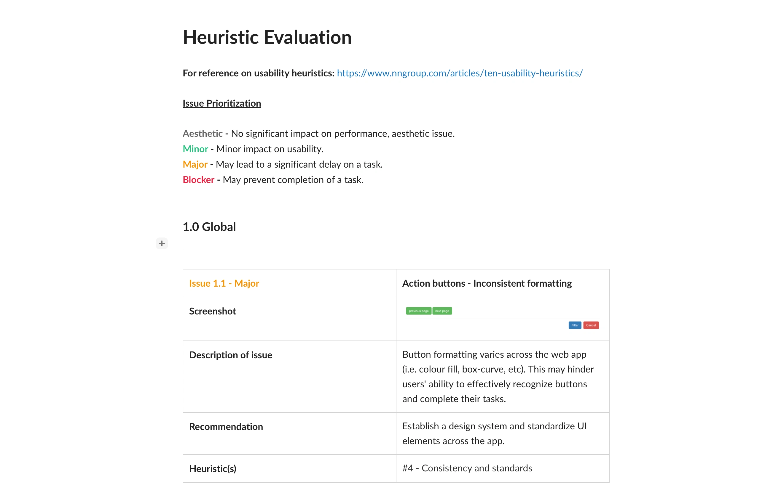
Existing issues
Issue 1.1 - Major
Project Type: Non-descriptive filter options
There is no clear distinction between the "Check all" and "Uncheck all" options and individual filters. The labels and formatting used are not descriptive enough to signify that "Check all" and "Uncheck all" are any different from the rest of the options.
Issue 1.2 - Minor
Information overload
There is an overwhelming amount of information available to users at first glance. For a new user, this may hinder findability and cause them to overlook important information.
Issue 1.3 - Minor
Repetition across section cards
Section card labels and icons are repetitive and provide little differentiation at first glance - they are not representative of the content they represent. This further adds to the overall issue of information overload in this page (e.g. "2021" is affixed to each section card).
Issue 1.4 - Aesthetic
Obtrusive banner
Considering the current layout, banner is not providing any additional value - the title (i.e. "Dashboard") on the left-hand side is repetitive, and items on the right-hand side (i.e. "Project Type" and year) could be better placed without a banner.
How do we align our information displayed to convey data meaningful to stakeholders?
What information do we show that the users care about?
1. Who are the users?
IBMers
This includes RCLs (Research Commercialization Lead), RCMs (Research Commercialization Manager), Project Leads, and Product Teams.
They ensure that the research findings flow into making IBM products better.
Academic collaborators
They hold roles such as Principal Investigators and undergraduate/graduate/Ph.D. Research students in the projects.
The CAS team
We manage all the research projects, oversee the logistics, and allocate the funding.
The CAS (Centre of Advanced Studies) team will only have 1 person from end of August to oversee all operations.
2. What do they care about?
SCA and VRIO Analysis
There was existing research conducted with sponsor users from the different user segments of CAS App 1.0 that assessed navigation, findability, organization, and readability.
Therefore, I decided to use SCA (Sustainable Competitive Advantage) and VRIO analysis to find out what is the SCA for the sponsor users. I further examined whether the SCA is Valuable, Rare, Inimitable, and Organized (VRIO).
Findings
What is our sustainable competitive advantage?
30+ years of deep rooted connections with Universities and Academic collaborators.
What is most valuable to our stakeholders ?
Stakeholders see value in research impact the projects generate.
3. How do we display this information?
Behind the scenes
Brainstorming, ideating, and iterating
Iterations that ended up scrapped
This was one of my earlier design tasks at CAS and the many iterations were an amazing learning opportunity to better understand CAS and IBM design. The designs went through multiple reviews with Stakeholders with a meeting/week with some key users. Additionally, the team reviewed it twice a week.
Iteration 1
Contrast fails accessibility, too much space taken by first section
Iteration 2
Missing information, visuals not appealing
Iteration 3
Changed the year in numbers section as well as added the business units with logos
Iteration 4
Added RCS view, polished up the graphs but still too crowded with unappealing visuals
Iteration 5
Did A/B reviewing with different alternatives to finalize design
Dashboard from the Home page
I also designed elements of the Home page and added two new sections called Project Statistics and Reporting Trends as seen below. Through the several design playbacks and reviews, the feedback I received for this idea was very positive as this data is very useful to the project managers, admin, and all people involved in coordinating the logistics for a research project.
Reporting trends, especially, was a very well received feature as it prompted the research team to improve their onboarding an reporting practices - two areas that were logistically heavy and had to be followed up continuously by the CAS team.
Other key flows
Reflection
A big business consideration was the fact that the development for all my designs for CAS App 2.0 would need to be completed by July (since August would only have us interns + 1 person on the CAS team). By designing this, I learnt data visualisation and how to work with Carbon. I also had the opportunity to discover and align business and research goals.
If I had more time, I would test the designs with the sponsor users by sending a survey for the different units of information presented. This will help validate existing features and help me create a prioritization matrix for new information and features to be added in an extended timeline.
Like this project
Posted Feb 20, 2024
Redesigned the Advanced Studies web based project management platform for 300+ users across 58 IBM products and 26 universities.
Featured on

