Box Thyme 🌿 Cultivating a Memorable Brand Identity
Marla Jeken
Box Thyme: Fresh Branding for Artisan Charcuterie
Project Scope
Logo design • Complete brand identity • Brand pattern system • Color palette strategy • Typography system • Submark variations
The Challenge
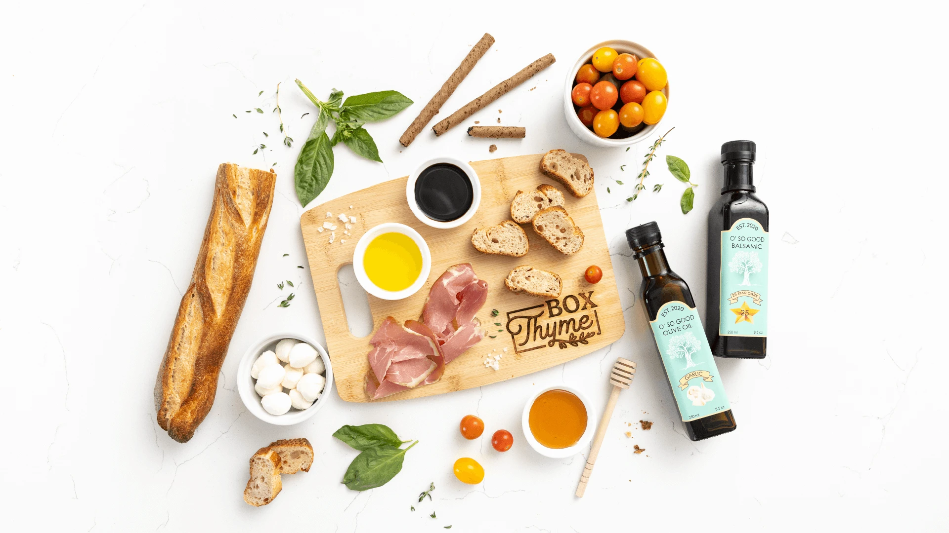
Box Thyme creates signature and customized charcuterie boxes with quality ingredients and personalized touches. Founder Mcartha needed a brand identity that captured the essence of freshness and quality while standing out in an increasingly saturated charcuterie market.
The core issue: differentiate a local artisan business in a category where most competitors rely on similar food photography and generic presentation aesthetics.
The Approach
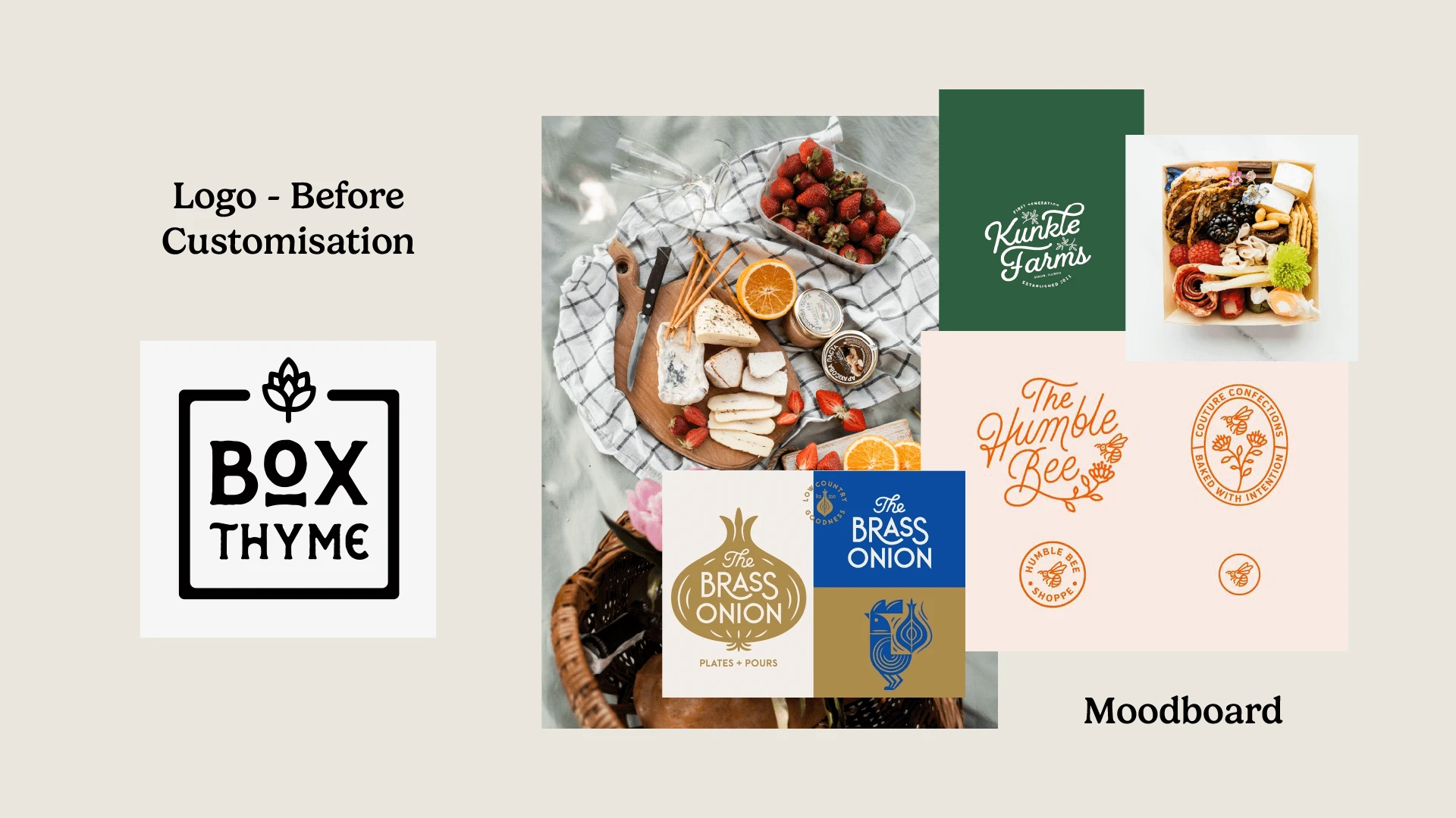
Rather than competing on food photography alone, I developed a distinctive brand identity rooted in the business name itself—using thyme as both visual anchor and strategic differentiator. The approach balanced artisan quality with approachable personality.
Strategic priorities:
1. Memorable brand symbolism
Thyme illustration as signature element connecting freshness, craftsmanship, and the brand name
2. Color strategy for market differentiation
Bright, energetic palette (green, navy, coral) that stood apart from typical neutral charcuterie branding
3. Flexible brand system
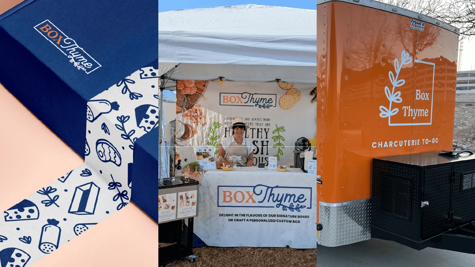
Pattern and submarks enabling consistent presence across packaging, social media, and customer touchpoints
The Solution
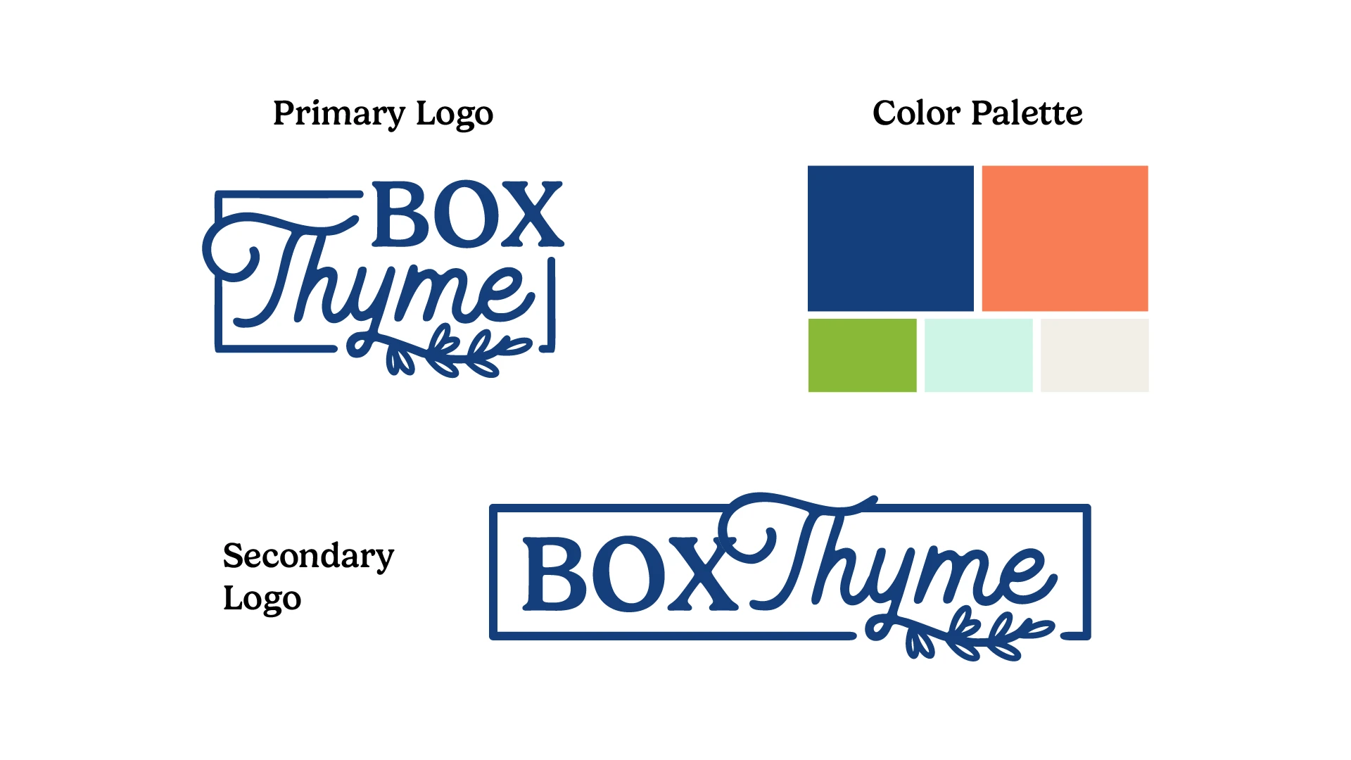
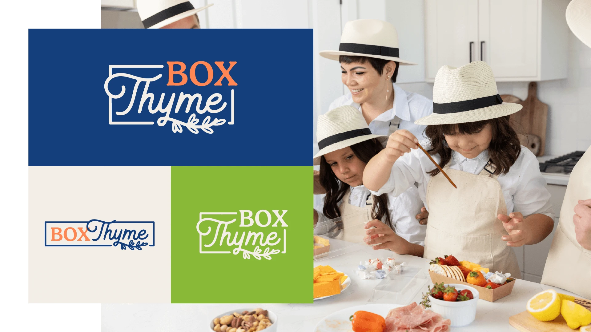
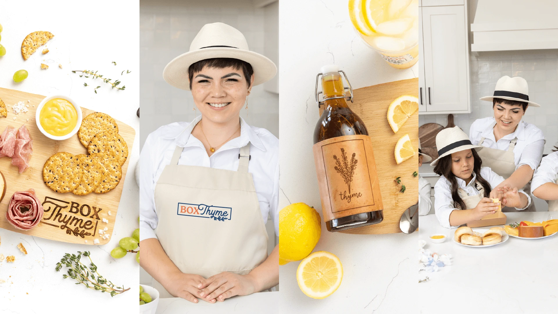
Logo & Visual Identity
Created a primary logo featuring a thyme sprig and hand-lettered script to convey artisan quality and approachability. A secondary, box-inspired submark added flexibility across brand touchpoints.
Color Palette
Chose bright green for freshness, navy for trust, and coral for warmth—standing out from competitors’ muted tones with a vibrant, premium-yet-friendly feel.
Typography
Blended a handwritten script with a clean sans-serif to balance craftsmanship with clarity and professionalism.
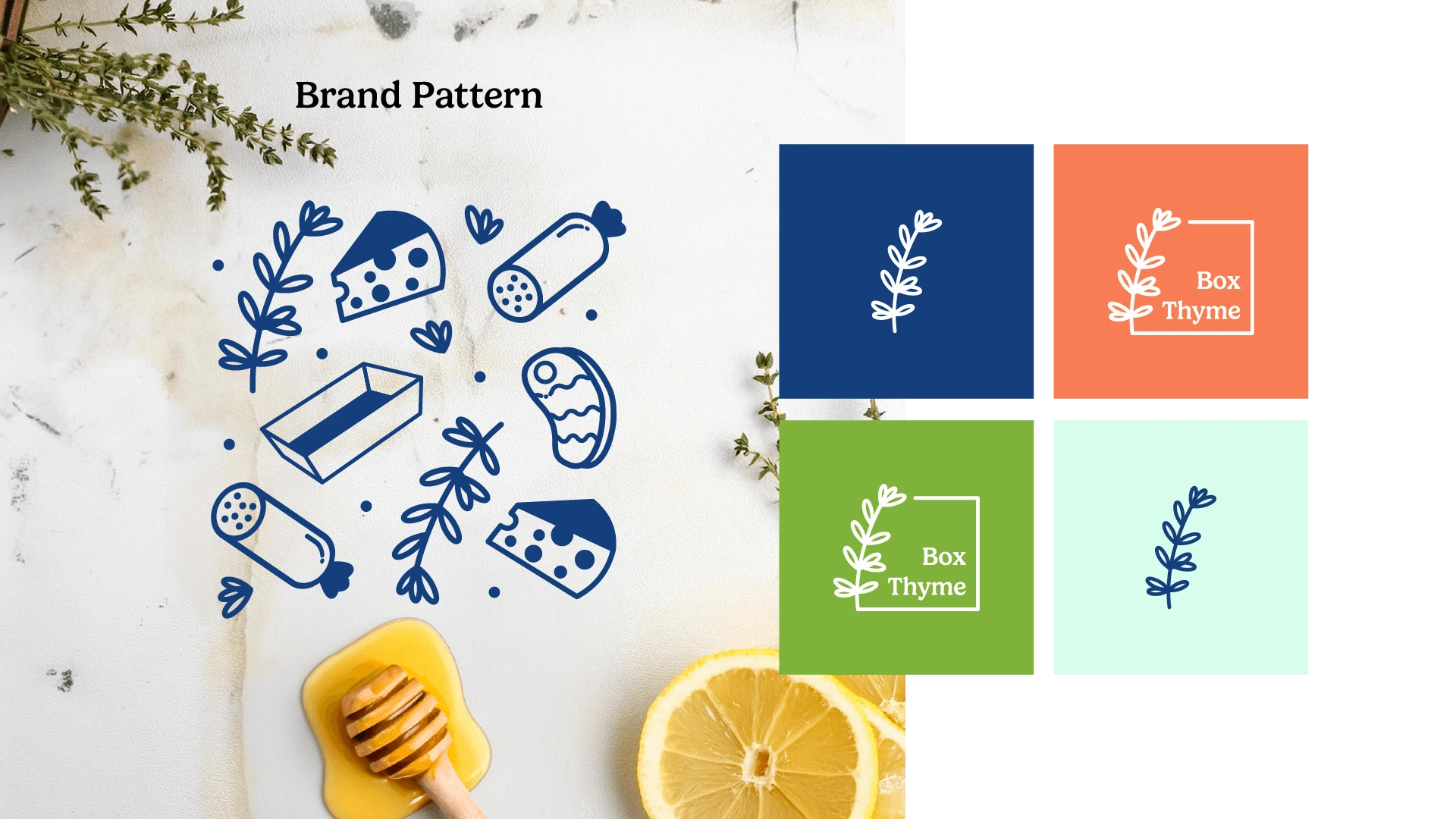
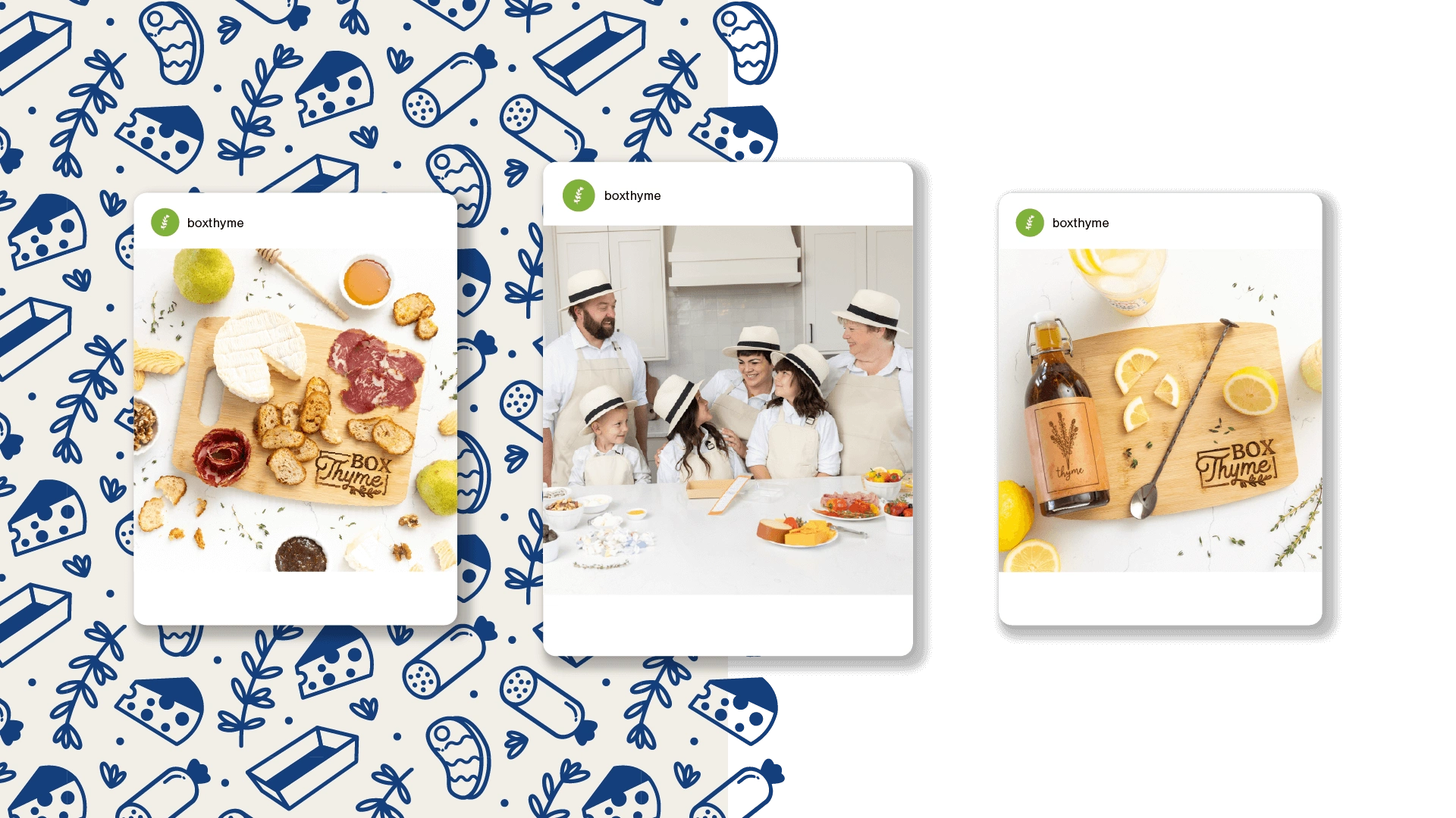
Brand Pattern
Designed a playful illustration system with charcuterie elements and thyme sprigs, adding charm and recognizability across packaging and marketing materials.
Results
Market differentiation through distinctive visual identity in saturated charcuterie category
Brand recognition built through consistent thyme illustration and color strategy
Versatile brand system enabling cohesive presence across packaging, digital, and customer touchpoints
Premium positioning that communicated quality while maintaining approachability

Why This Matters
For artisan food businesses competing in crowded markets, strategic brand identity creates differentiation beyond product photography. Distinctive visual systems and thoughtful color choices help small businesses establish professional presence and build recognition that drives word-of-mouth growth.
Like this project
Posted Nov 22, 2024
Brand identity for custom charcuterie brand. Strategic use of thyme illustration, color palette & playful pattern system differentiated brand in crowded market.
Likes
0
Views
29
Timeline
Jun 1, 2023 - Jul 1, 2023