Visual Identity Development for Plantica
Nina Maar

Branding Plantica
The Challenge
They gave me a challenging assignment: develop a visual identity that unites the engineered with the nature. The brand has to have a modern yet cosy, sustainable vibe, and feel technical without being sterile.

The Solution
In order to determine where organic forms meet constructed lines, I conducted extensive research on climate engineering, examining both greenhouses and plants.
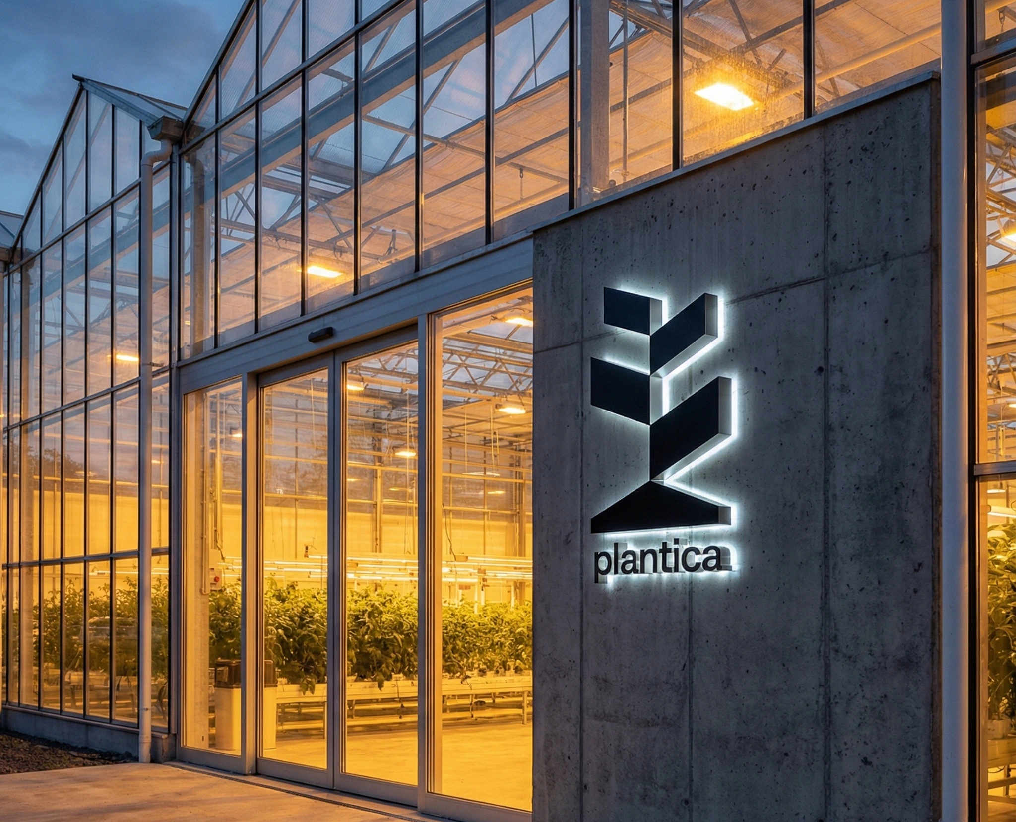
The Symbol: I created a logo mark that resembles both a greenhouse and a plant. A triangle is the plant root, as same as roof structure of the greenhouse. The brand's core values—balance, clarity, and purpose—are encapsulated in the logo, which is flanked by angled shapes that resemble both leaves and window panels.
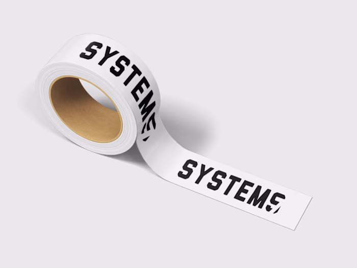
The System: Using a grid and typefaces based on structure, I created a modular identity system with a colour scheme influenced by "soil, steel, and light."
The Results
I delivered a brand identity that maintains clarity across every touchpoint—from delicate schematics to heavy equipment.
Award Winning: The project was named Runner-Up at the Best Brand Awards (2023) for its clarity and design intelligence.
Versatility: The system was successfully deployed across digital platforms, documentation, and environmental signage.

Like this project
Posted Dec 24, 2025
A scientifically precise identity that trades organic clichés for a rigorous Swiss-grid system, establishing the brand as a technical authority.