BloodSugar Diabetes Awareness Campaign
Nina Maar
BloodSugar
The Problem We Don’t See
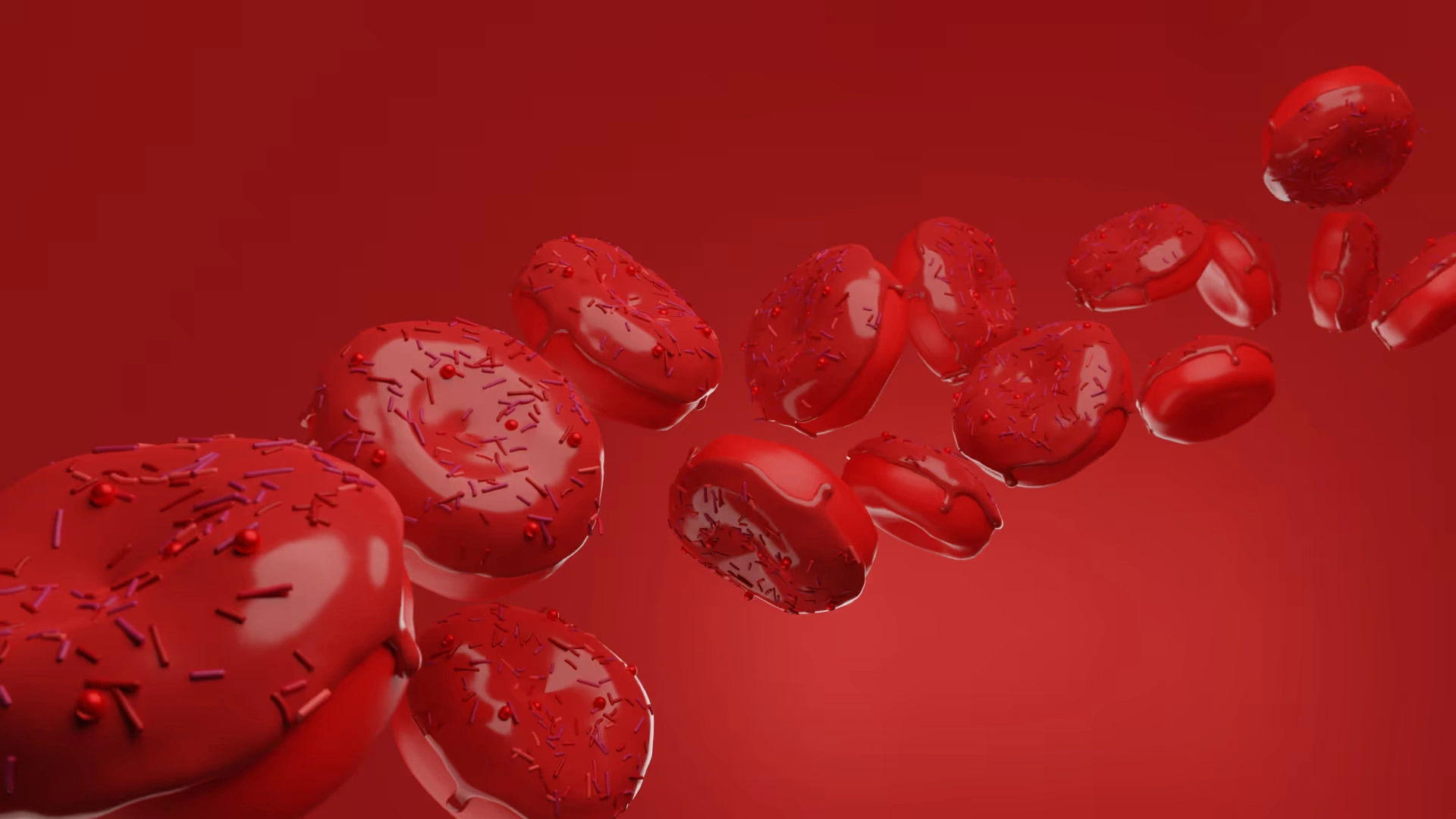
The brief began with a single question — how do you visualize something invisible? Diabetes awareness campaigns regularly rely on fear or data; this one sought emotion through design. The goal was to make people feel the instability of balance, to make blood sugar more than a medical term — to make it visual, human, and impossible to ignore.
The Idea of Contrast
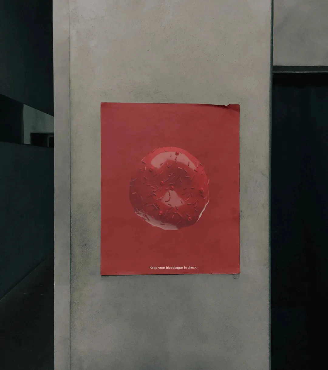
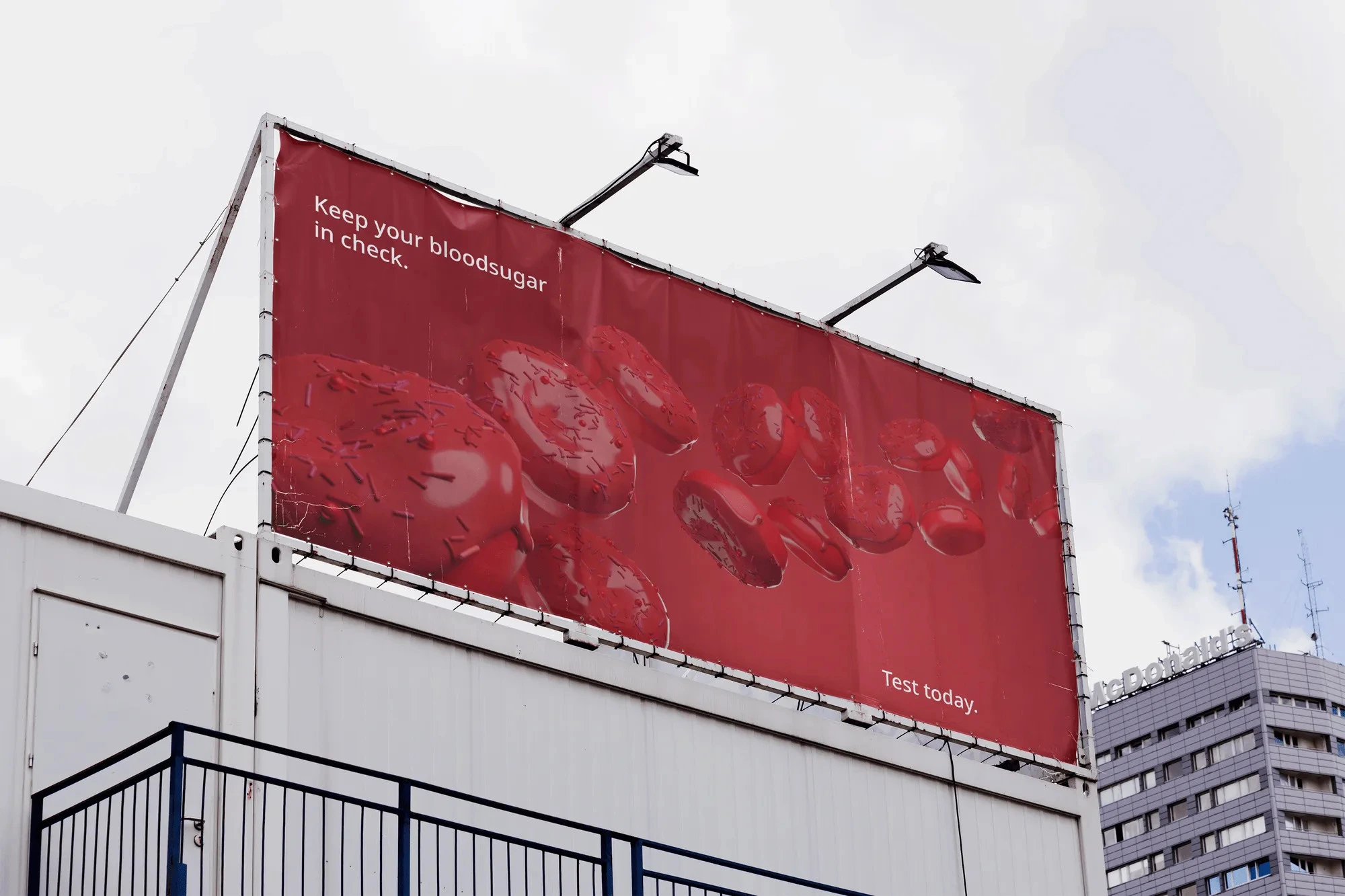
The core concept emerged from duality. A red donut, which is fun, inviting, and familiar, turns into a blood cell. The round shape is both pleasurable and warning, and the color changes between appetite and alarm. By changing a symbol of excess into one of awareness, the design turns sugar into a visual paradox: beauty with consequence.
Making a Difference
The campaign's strength comes from how little it does. A single object on a red field, stripped of extras, draws attention through silence rather than noise. The typeface is clinical but soft, giving information without force. Every detail was designed to sustain tension: sweetness and threat, desire and control, roundness and edge. It’s an image that stays longer than a slogan ever could.
The Aftertaste
Blood Sugar is a place where advertising and empathy meet, and a simple picture can make you think. It doesn’t preach; it pauses. It asks the viewer to look twice, to feel the conflict between what tempts and what harms. In the end, it’s not only about design or health — it’s about awareness as art, and art as awareness.
Like this project
Posted May 25, 2026
A health awareness campaign that uses visual duality and raw emotional contrast to cut through the noise. Every piece balances stark medical reality with human warmth, turning a clinical subject into something people actually stop and feel.