Talga Cosmetics Brand

Nina Maar
Verified


Talga is a Norwegian cosmetics brand rooted in Nordic nature and clean formulation. Sara came to me with a clear feeling about the brand but no visual system to carry it. The brief: build something that feels premium and grounded at the same time. Nature-forward without drifting into botanical cliché.
The Tension
Tallow skincare sits in an odd gap. Clinical dermatology brands are cold and science-forward; romantic botanical brands are warm and vague. Talga was neither. It needed to feel like an artisan apothecary, closer in spirit to a small-batch cheesemaker or a natural wine producer than a beauty brand. Something made, not manufactured.

The Mark
The T and A lock into a single monogram that forms the silhouette of a studio chair. It's a quiet nod to the artisan cosmetic studio behind the brand. The whole identity is built to feel ancestral, not retro. That's why we landed on a monogram in the first place: it carries the weight of something inherited, a maker's stamp rather than a logo. Compact enough for product caps, flexible enough for packaging, web, and print.

Colour + Palette
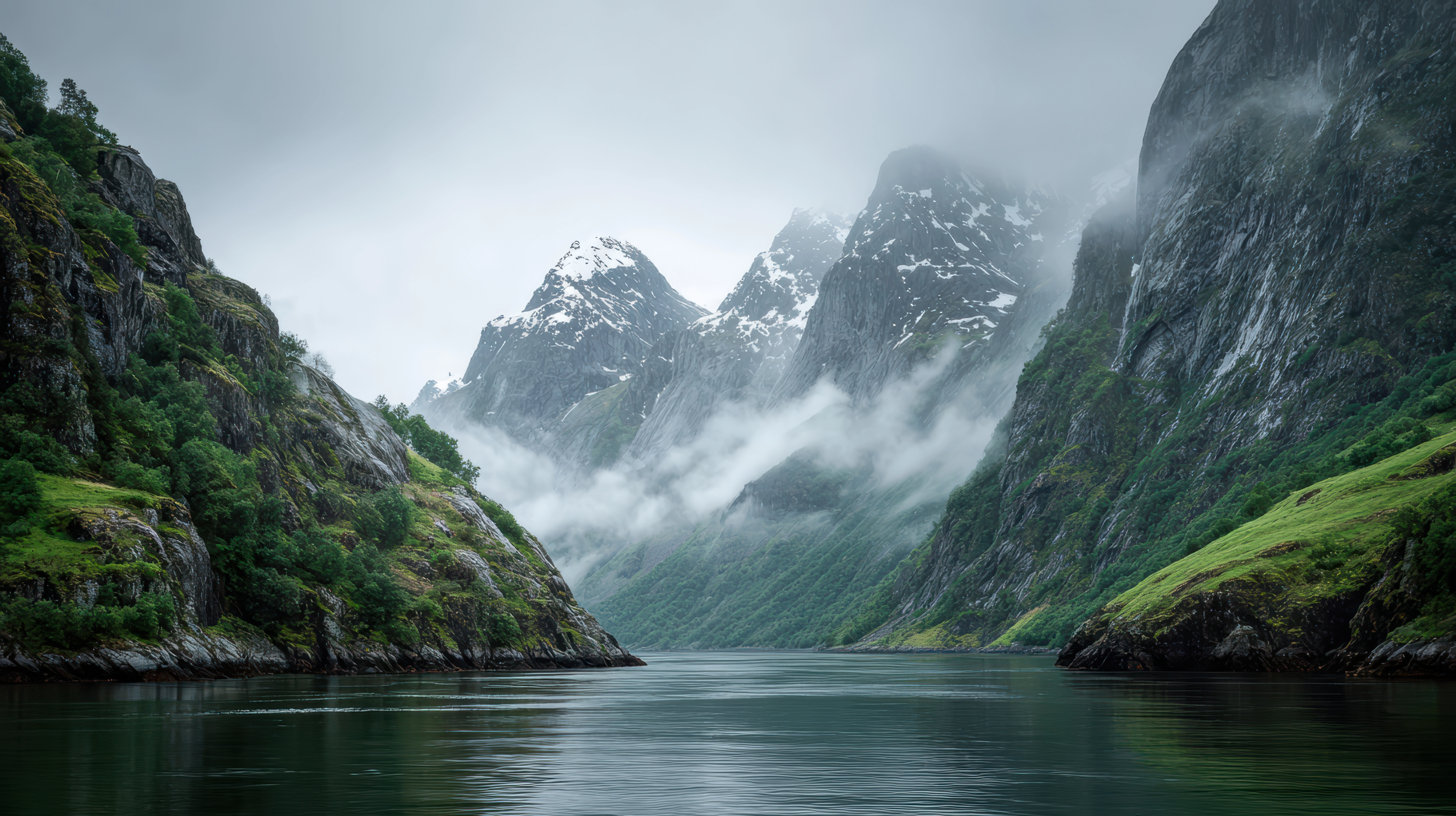
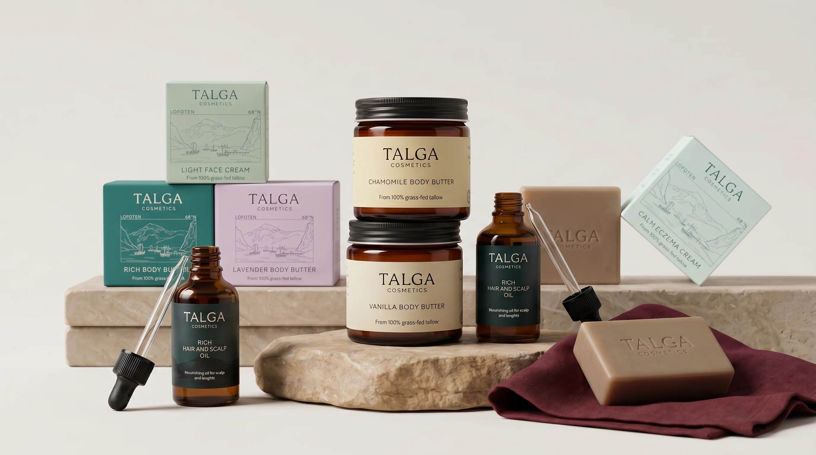
Every colour is pulled directly from the Norwegian landscape. Fjord Teal anchors the identity. Warm Cream replaces white everywhere. Sage Stone, Cloudberry, and Dark Peat round out the system, each tied to a specific landscape detail. The palette grounds the whole range without flattening it into one look; every SKU has its own tone but clearly belongs to the same family.
Photography + Direction
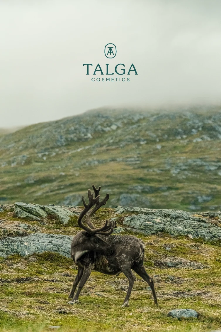
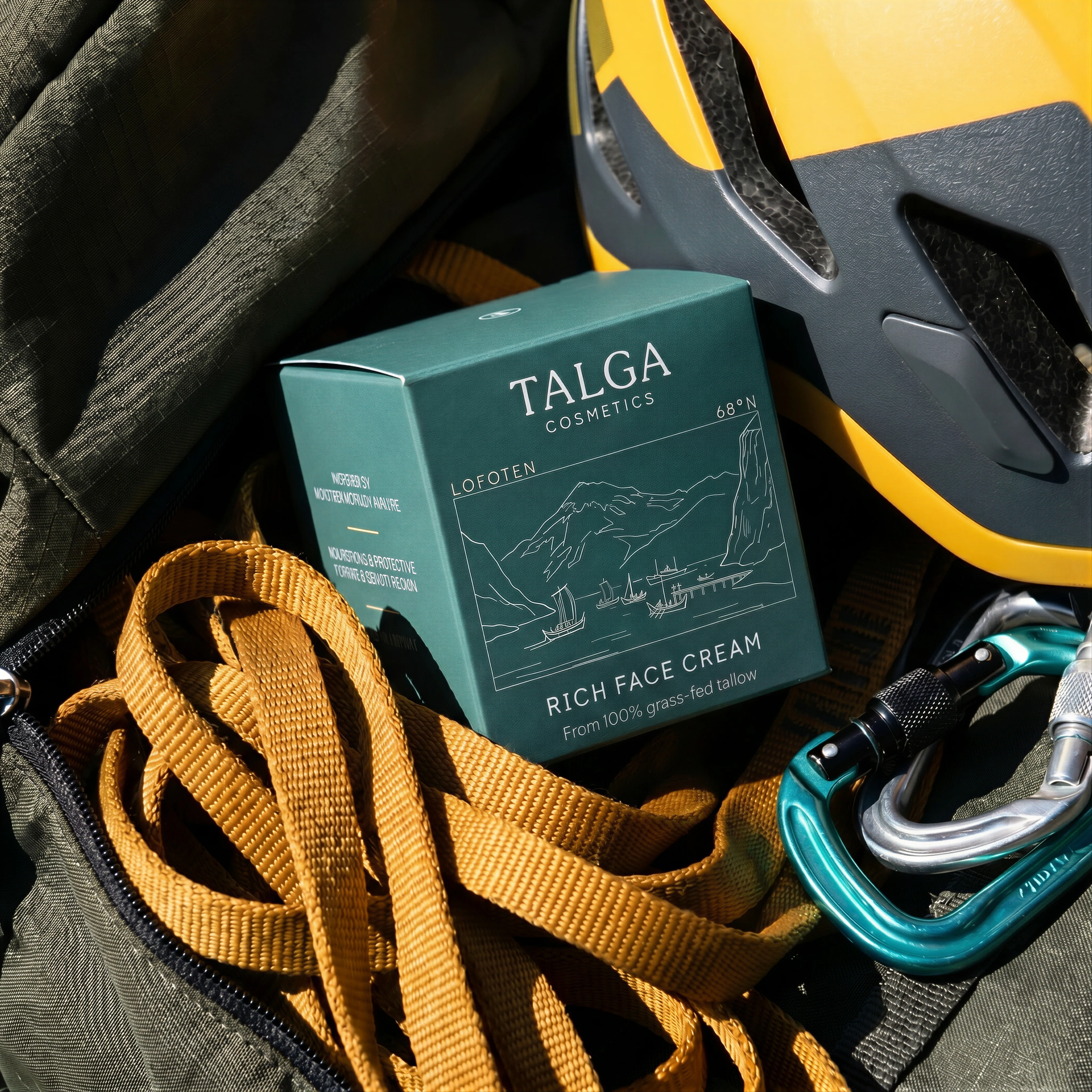
Photography carries the "premium" half of the brief. All shot in the actual North Norwegian landscape: cold arctic light, product sitting on raw stone and unfinished wood. Never isolated on white, never styled like a campaign. The Lofoten coastline, the farm, the texture of the land where the ingredient comes from. The landscape is the brand argument; showing the real place is what makes "provenance over story" credible instead of a slogan.
What I Delivered
Brand identity system including a monogram, wordmark, colour palette, and typography. Photography direction rooted in the Northern Norway landscape. A brandbook that reads as a system rather than a collection of nice pages, where every decision from the grid to the packaging materials traces back to the same founding conviction.
Like this project
What the client had to say
Working with Nina has been a piece of cake from the very start until the final delivery. I cannot possibly express how much the final result exceeded my expectations. Nina is someone who does not give up until you are 100% satisfied.


Sara Jakobsen, Talga Cosmetics
Jul 9, 2026, Client
Posted Jul 14, 2026
Brand identity for a Norwegian tallow skincare studio. Monogram, palette, packaging, and photography direction.
Likes
5
Views
32
Timeline
Jun 9, 2026 - Jul 9, 2026
Clients
Talga Cosmetics