Cvetić Detergent Bottle Design
Nina Maar
Bottle design for Cvetić
The Brief
Cvetić approached the project with a simple challenge: design a detergent that looks as gentle as it cleans. The brand already stood for nature-inspired care, but its packaging needed to tell that story through form and feeling. The goal was to create something familiar yet elevated — a design that could sit comfortably in a home that values both aesthetics and responsibility.
The Idea
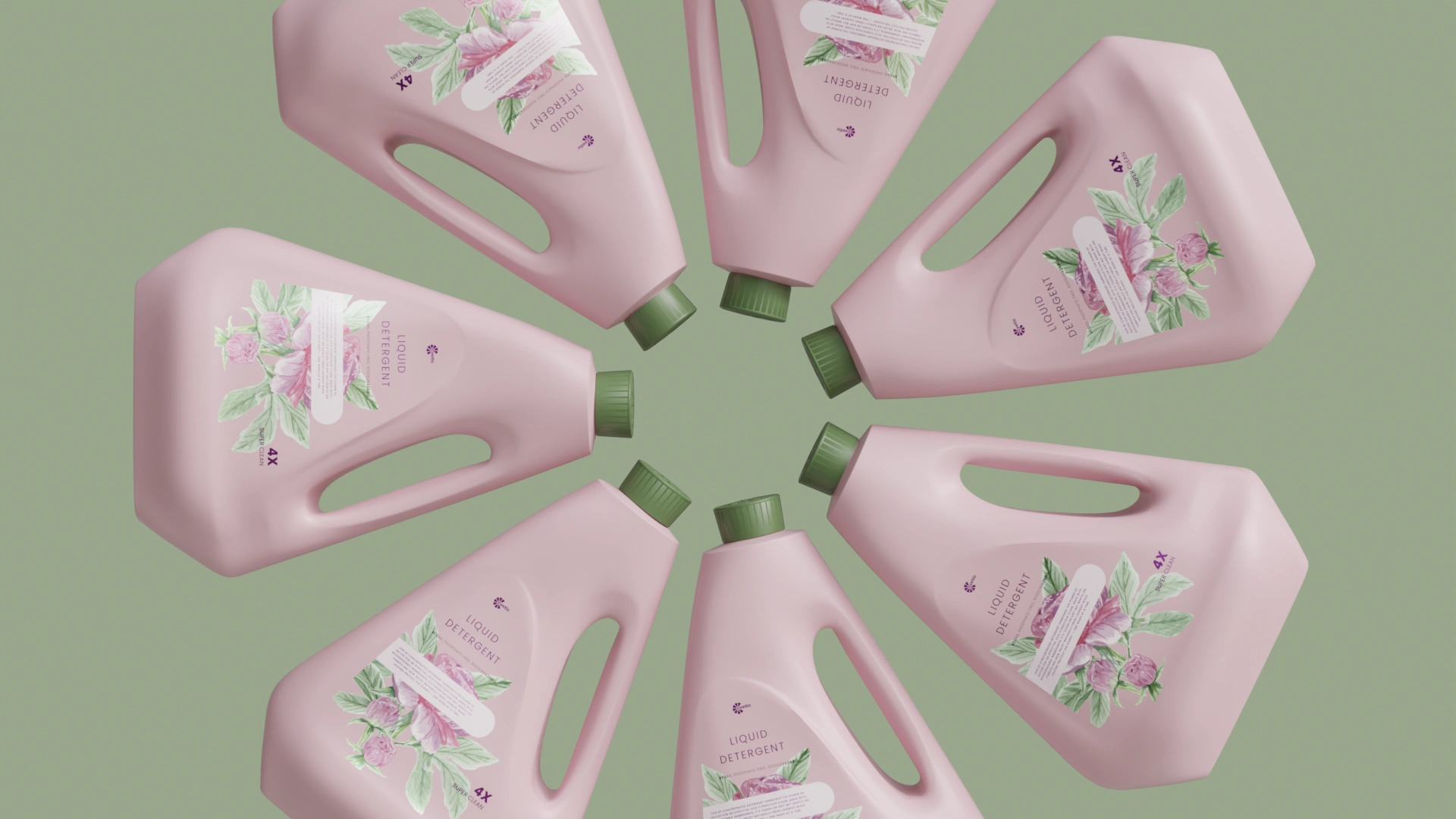
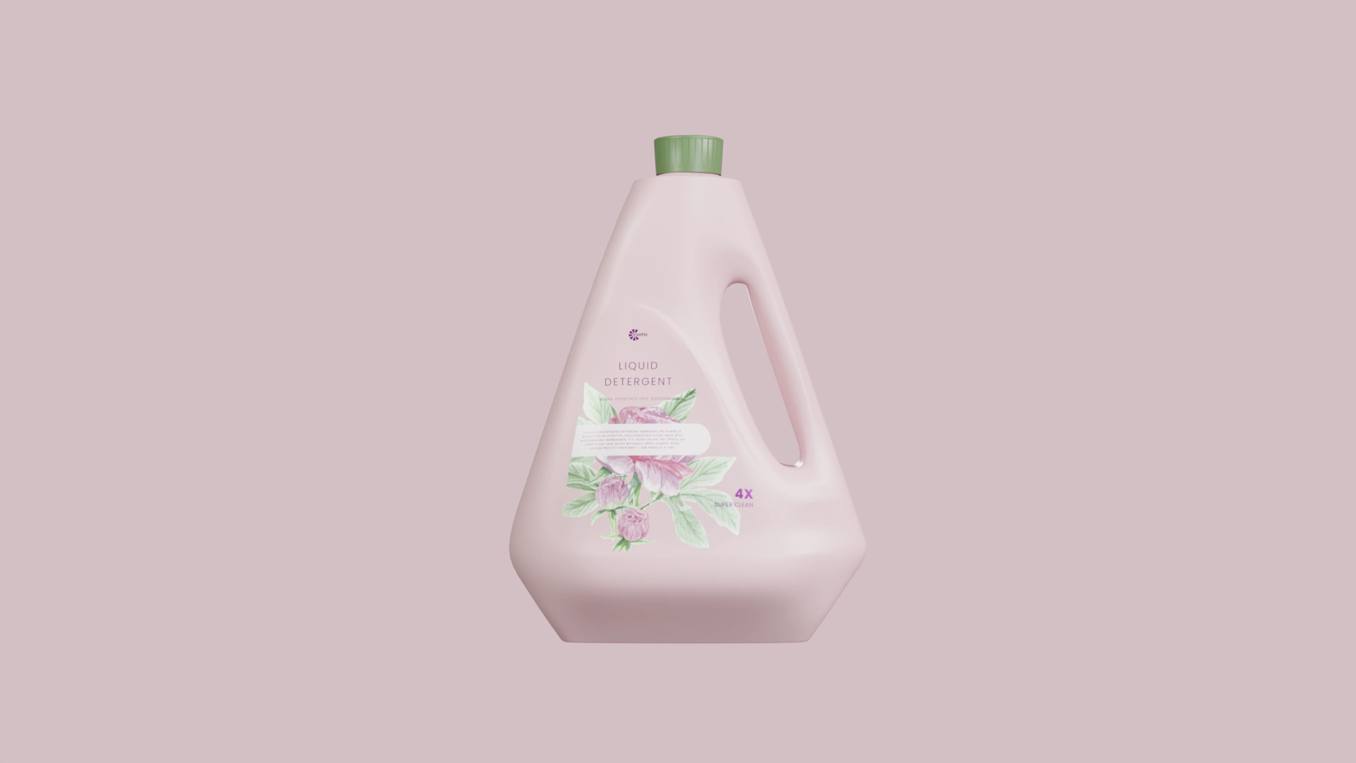
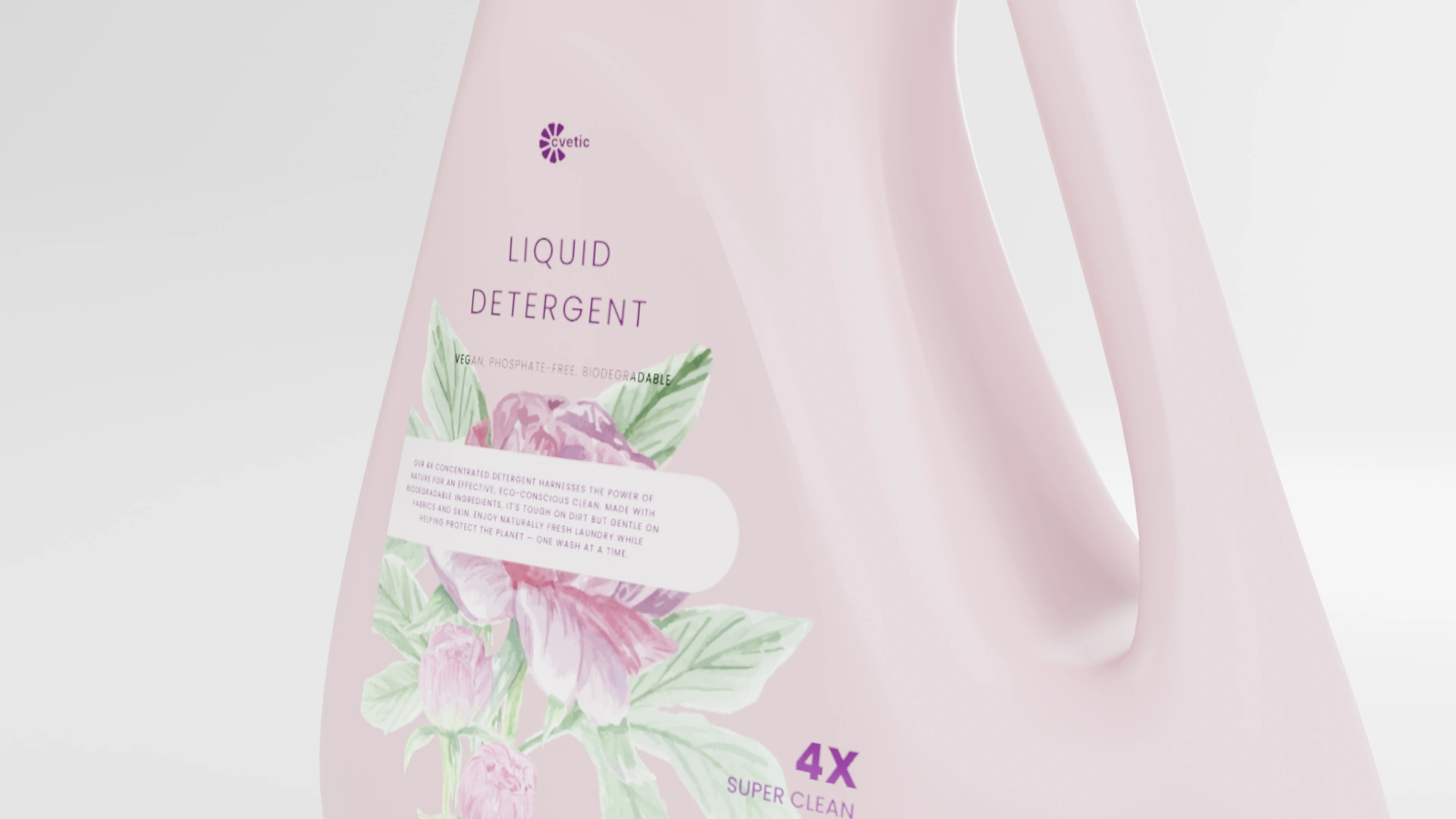
Detergent bottles are usually loud — shouting efficiency, bubbles, power. We wanted quiet. The new form celebrates calm purity: a sculpted silhouette in soft pink, capped in muted green. The label unfolds like a botanical illustration — delicate florals balanced by clean typography. It’s a conversation between science and softness, nature and refinement.
The Process
The design journey began with reduction. Every visual decision — shape, tone, typography — was stripped of excess until only intention remained. The bottle’s triangular form feels steady and ergonomic, while the pastel tone softens its geometry. Illustration and type were treated as one composition: organic linework meets measured alignment. In rendering, subtle lighting emphasized the material’s satin finish, echoing the smoothness of freshly washed fabric.
The Outcome
Cvetić Liquid Detergent stands as a modern statement in domestic design — clean, balanced, and effortlessly gentle. The final product captures a feeling of renewal: something you’d be proud to display, not hide in a cabinet. It embodies the brand’s evolution from everyday utility to everyday beauty — proving that sustainability and style can live in the same bottle.
Like this project
Posted May 24, 2026
Industrial design and 3D visualization for Cvetić, a Serbian detergent brand. Full bottle form development, label system design, and render package, from concept to production-ready files in Blender and Rhino 3D.
Likes
0
Views
5