C + C | Brand Design
Brand image design for an architecture and interior design firm based in Mexico
Corella + Camou, husband and wife, came to me with a story that needed help being brought to life. The idea was something timeless, simple and elegant, and this is how it all started...
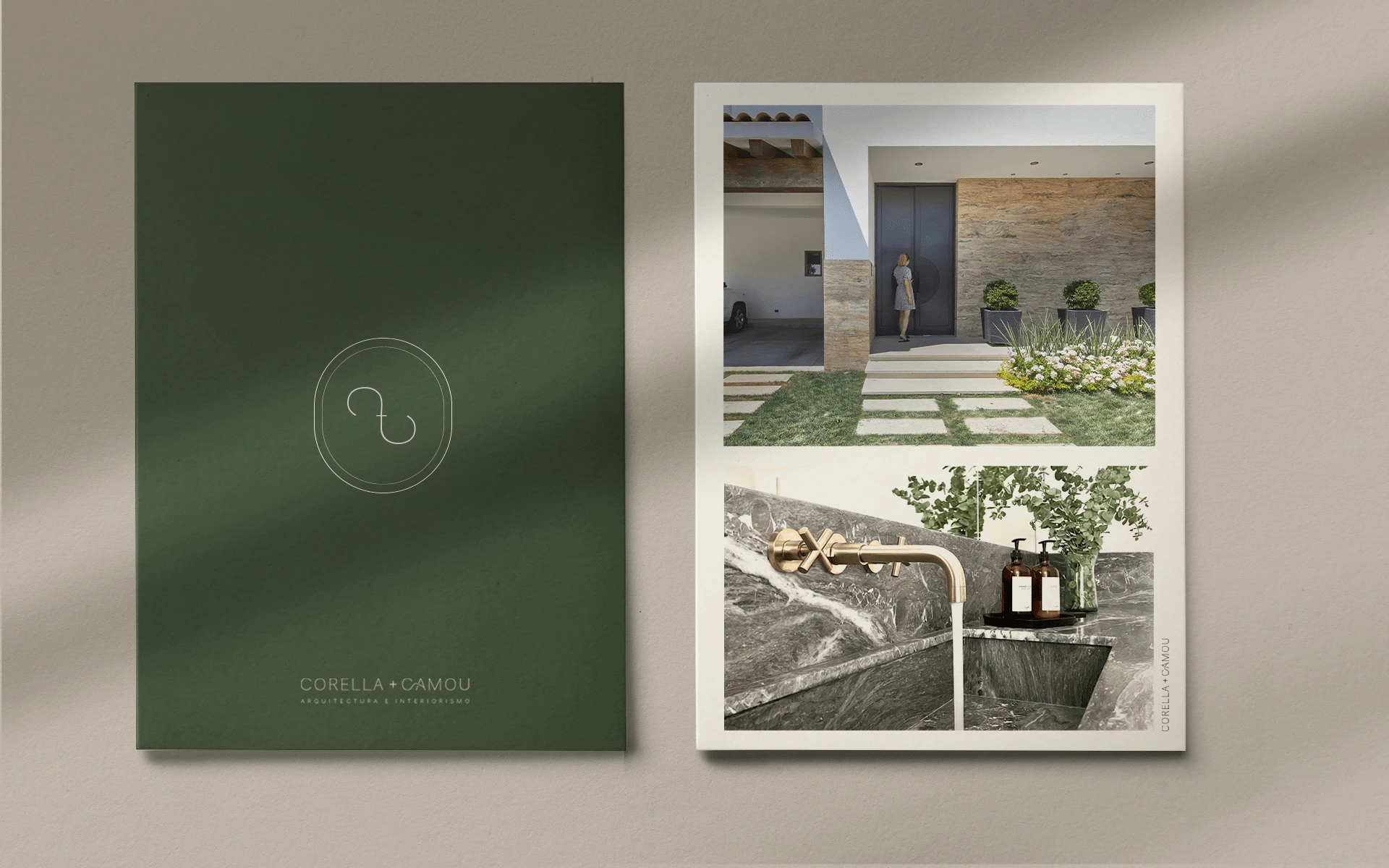
The branding process ✨
Creating a brand design for me isn't a linear process and... it always comes out in a different way, but the first thing this process always has in common is that I like to start by building a mood board (if you're wondering what this is: it's basically a collage) that can represent the idea my mind seeks to create. Sometimes it looks like a pinterest board, a collection of saved posts on instagram or in some other cases a proper mood board built by downloading and inserting images in a white canvas.
After that, comes the sketching process, the hardest part for me 🤷🏻♀️, where the only tools are a ✏️ + 📔 and where there's no wrong way of doing it. After being stuck and finding my way back two million times again I take a picture and pass it to my computer -> Adobe Illustrator, and start converting all those ideas to the digital world.
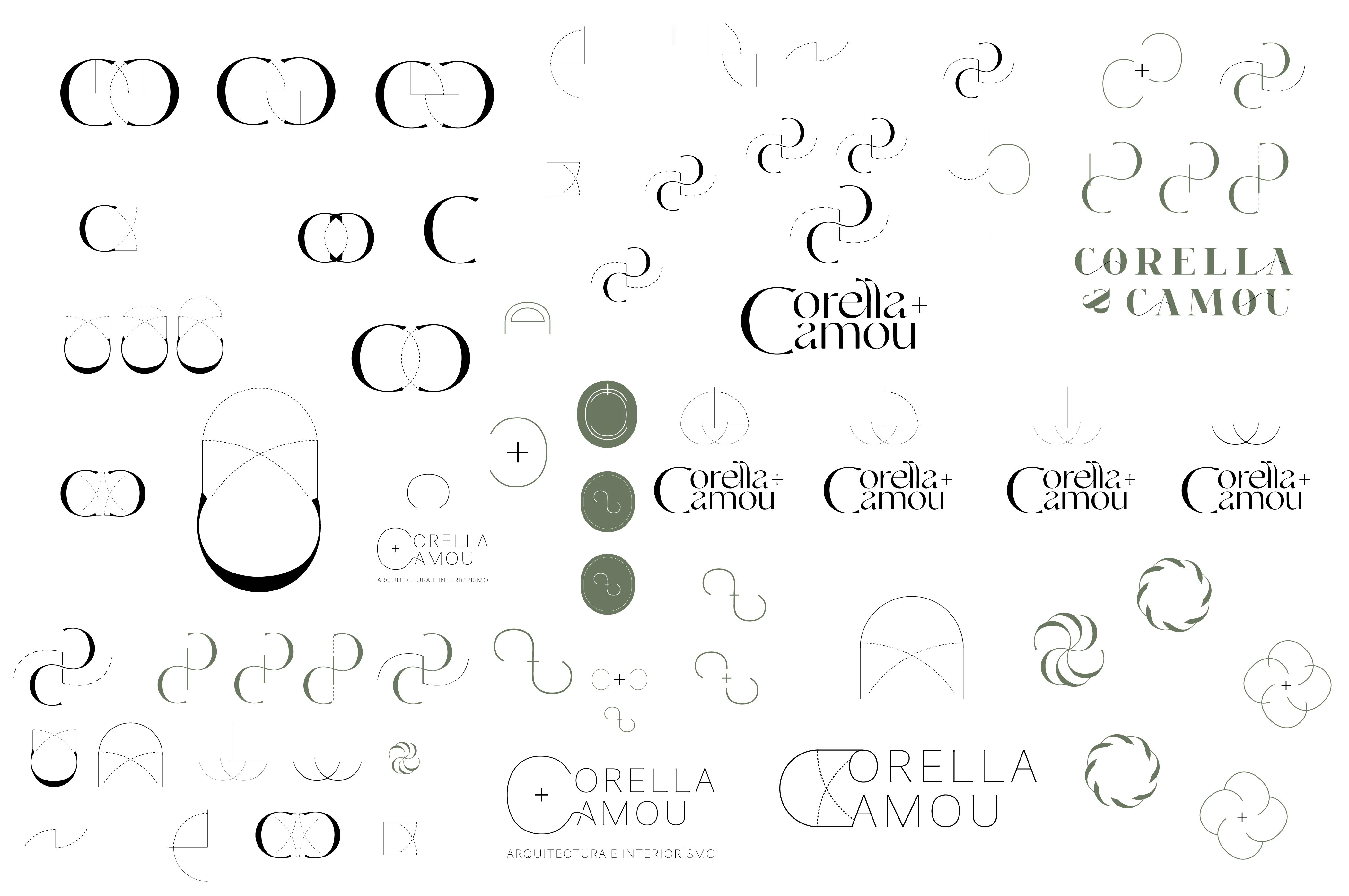
Then comes the typography exploration process, where I basically explore the name of the brand with all the possible fonts, and after a couple rounds of selections... the winner comes to the picture. Then a huge round of design explorations & combinations on what elements can be added to make it unique and representative for the brand goals.
Once this is complete, it's time to build a presentation with the design proposals (the quantity of proposals vary in every project) and sent to the client for review and a round of corrections.
And now... I want you to meet the winner 🏆✨
Starting at the left we have Corella + Camou's submark that represents the union of the two C's of the brands name that comes from the surnames of the couple. The two C's are communicated through the + sign that is also key in the name.
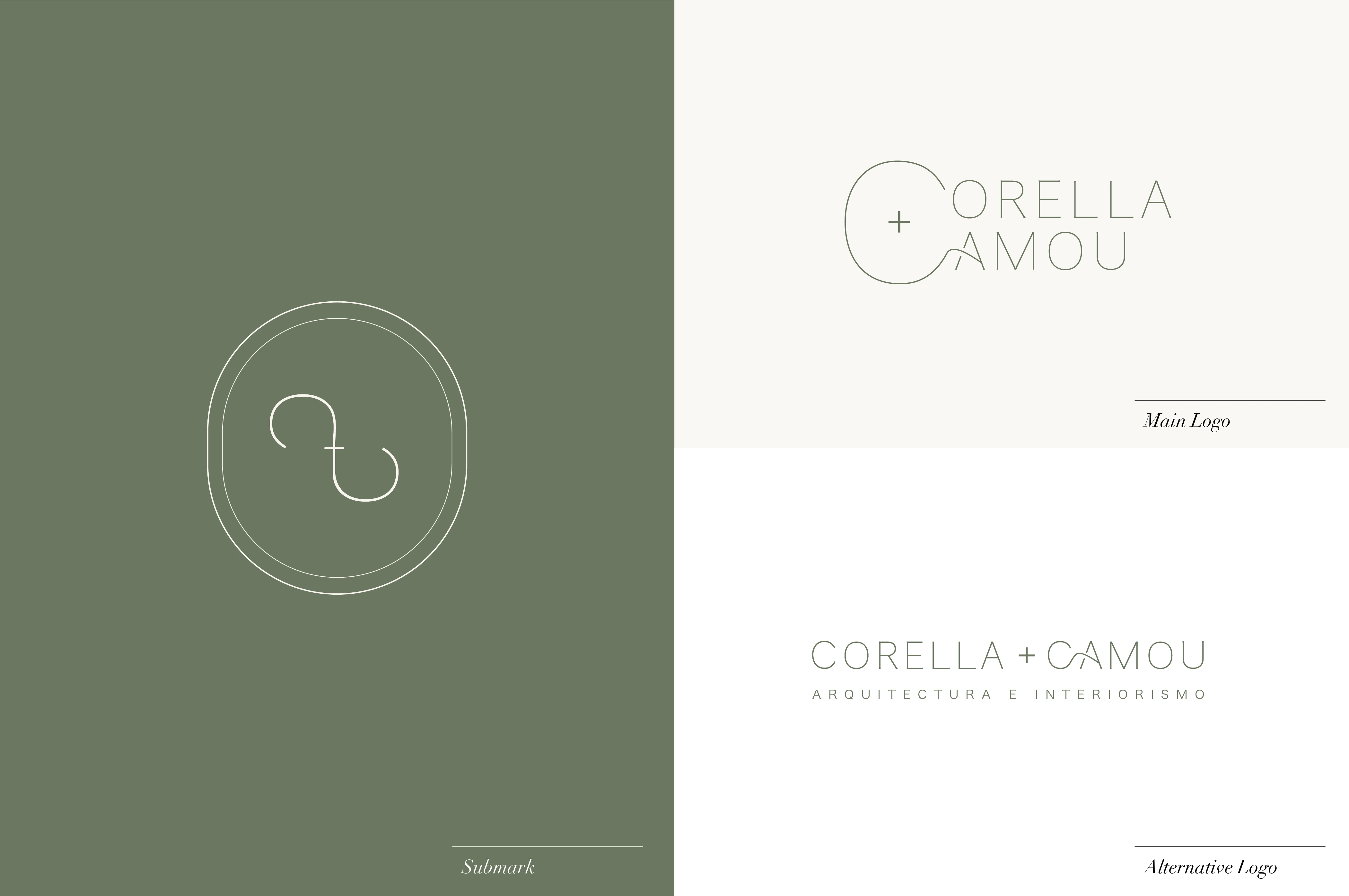
Moving on to the top right side, we have the main & alternative logo with a truly simple, minimalistic and classic design with a flowing touch that connects the letters C and A.
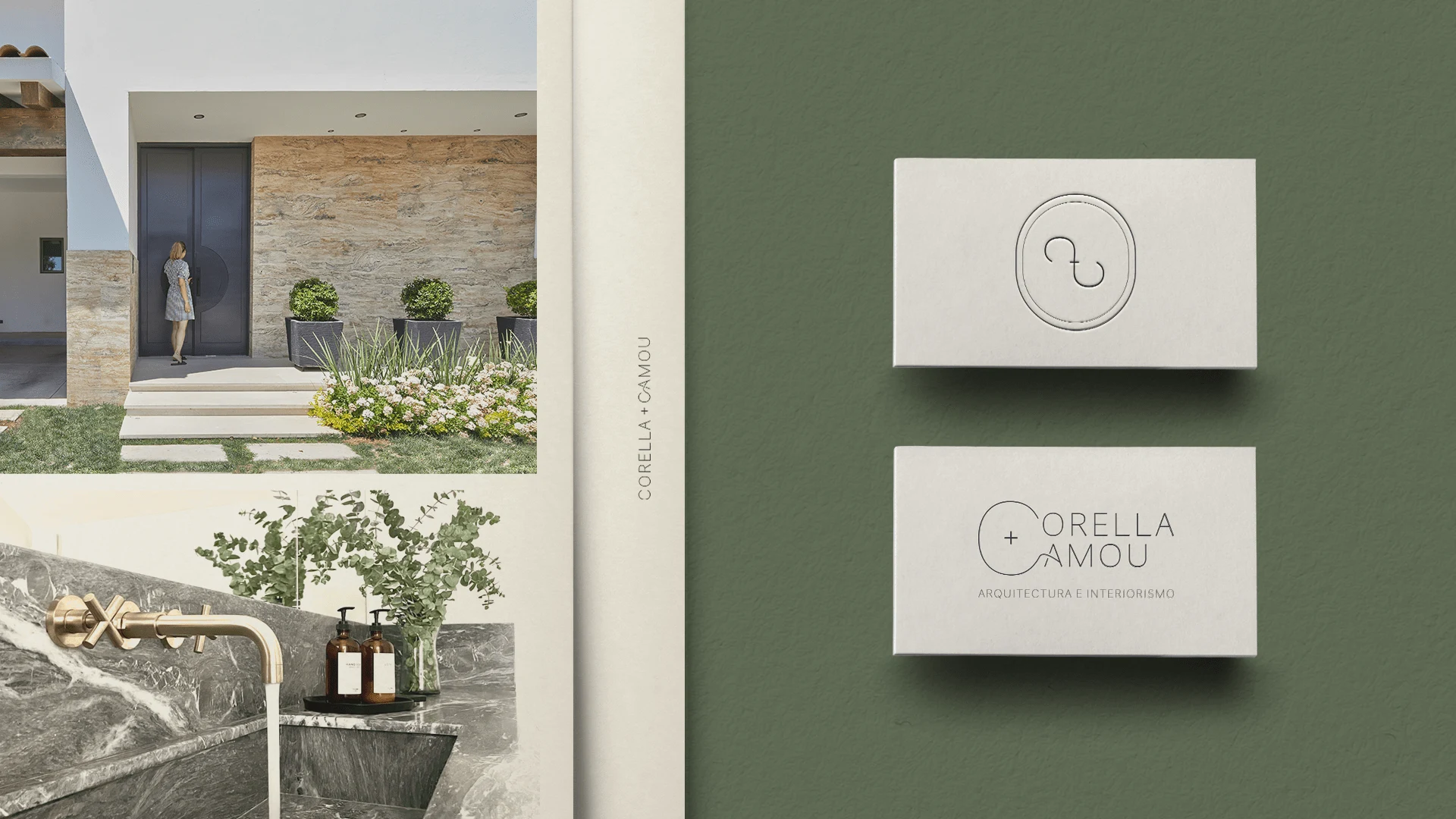
The results ✨
A brand identity that communicates the brands essence through union.
-> Union in the name .
Where two last names represent the married couple.
-> Union in field .
Where architecture meets interiors to create the most exquisite spaces.
-> Union in design .
Where the visual identity has connecting elements through thin lines.
Interested in seeing your brand worked in this way?
✨ Contact me here ✨
Corella + Camou Instagram Account : @corellacamou
Like this project
Posted Jul 29, 2021
Likes
0
Views
129
Clients
Corella + Camou
