Case Study: How I designed the Food Donation app 🥘
In this Case Study, I’m going to give you a walkthrough of how I designed an app for restaurants to donate extra food to charities and what was my process and design thinking behind.
👈 Background Context
Recently I participated in Crowwwn weekly challenge. These are weekly UX challenges in which they give a problem statement, and participants have to come up with a design solution within a week.
The Challenge
When I have extra food at my restaurant, I want to be able to find charities that will take it, so I don’t have to waste food and can help people who need it.
🤔 Possible Solution
An app that can channelize the remaining food of restaurants to charities.
In this process, local volunteer groups can play an important part by becoming a bridge between restaurants and charities, they will pick the food up from the restaurants and distribute to charities. In return they will get a certificate of appreciation.
(Why I chose smartphones over computer?, Number of people using smart phone is rising. Possibilities of restaurant owners having smart phones is much higher than them having computer).
🤯 Brainstorming
I wanted to make the app as minimal and simple as possible. After signing up with restaurant registration number, they need to upload the menu of restaurant.
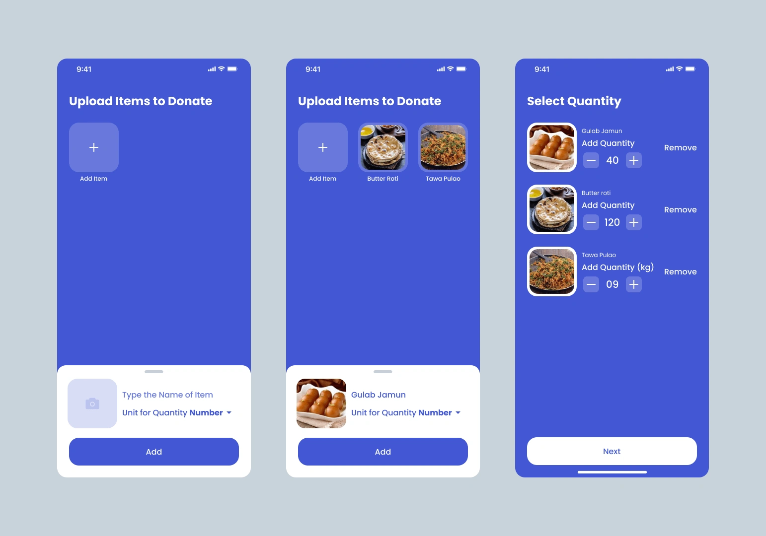
whenever they left with extra food, they would select the items, add quantity, select available volunteer group and charity whom they want to donate.
Volunteers will pick it up and distribute the food at the charity. They would also take pictures and upload it. That will give confidence to the restaurants to keep donating extra food.
🔬 Research
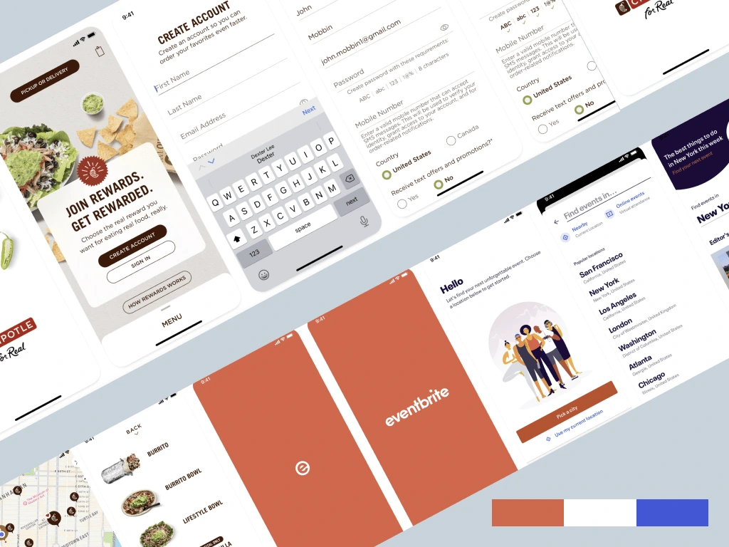
It all starts with inspirations, I went to mobbin and screenlane to check UI of established food ordering apps.
🎨 Designs I submitted
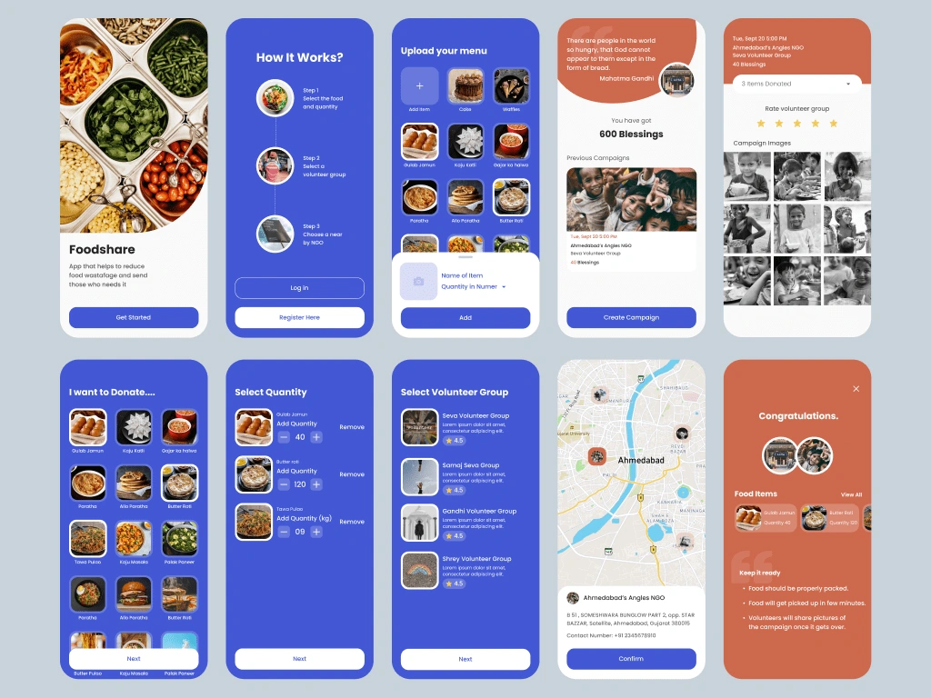
After waiting for 7 long days, they announced the winner. It was not me. 💔

⚠️ What went wrong ?
There is no need for restaurant to upload whole menu.
Volunteer side is missing.
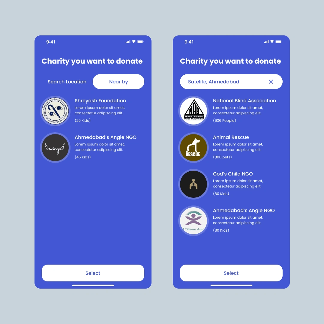
Selection of NGO should be prior to the selection of volunteers.
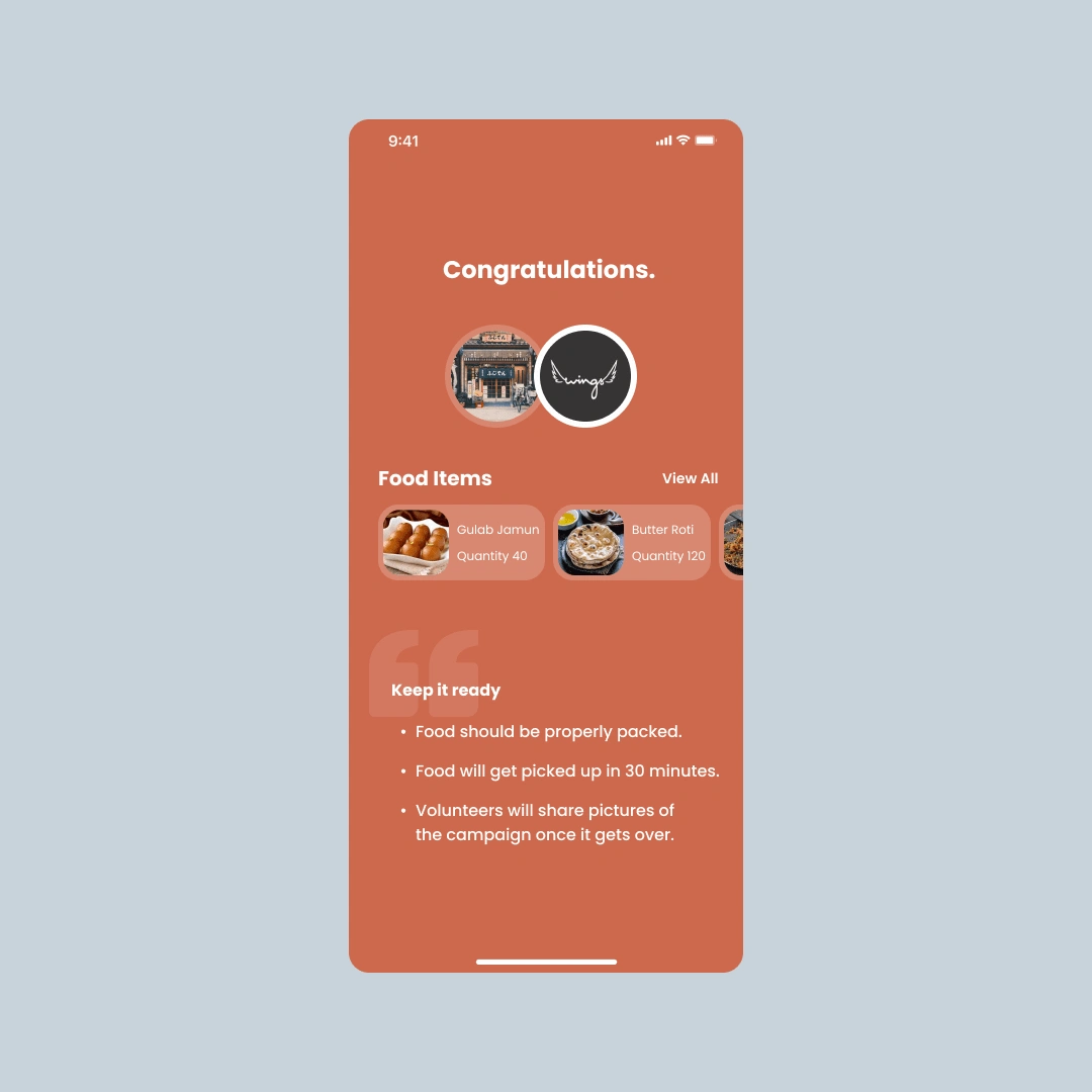
Pick up time should be available in the success screen.
Sort by date option should be available to see previous campaigns.
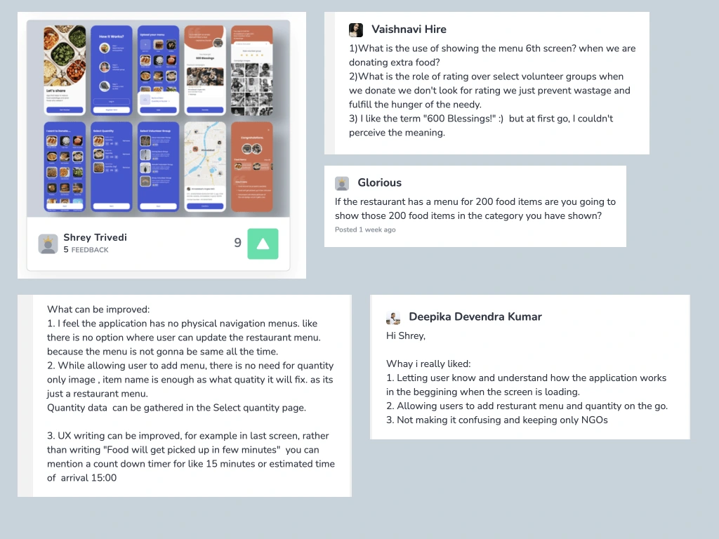
I got some mind blowing reviews. I re-examined the flow and design of the app. I also analysed other participant’s work and came up with the some amazing changes.
🚀 Final Design
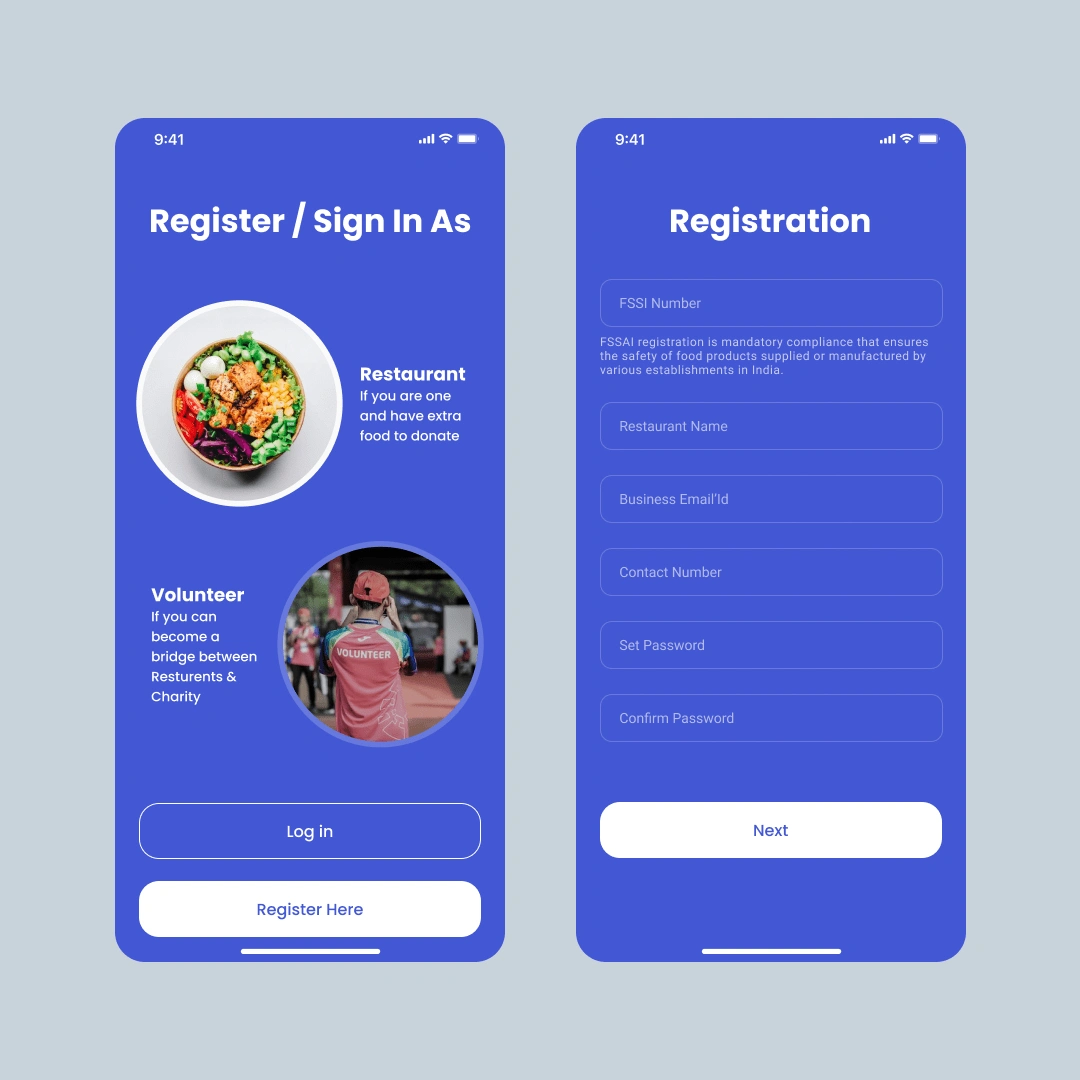
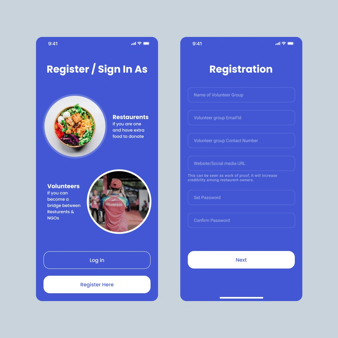
There are two types of users of the app. If you are a restaurant owner, sign up/in as that. If you are a volunteer group, sign up/in as that. Restaurant owners need to add FSSI number which is given by the government.
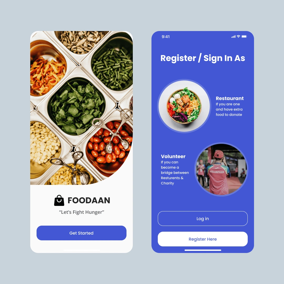
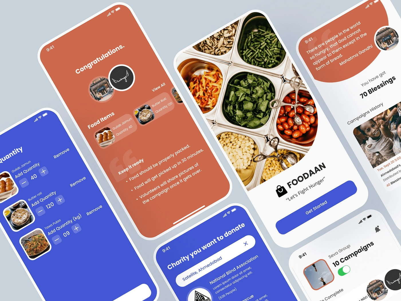
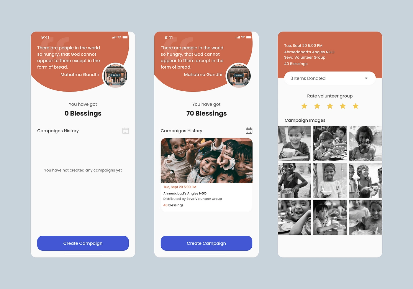
After sign in as restaurant, user can see its previous campaigns or create a new one. Here, blessings refers to the number of people got meal donated by you. User can also see the pictures of previous campaigns, that were taken by volunteers. There is an option to rate volunteer as well.
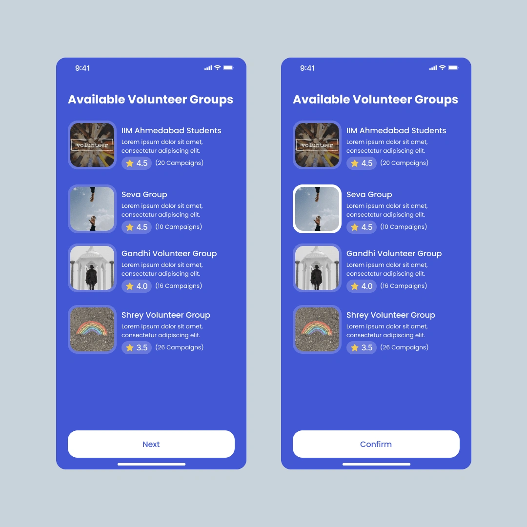
This is the process to create campaign and donate extra food items. Once the item and quantity has been selected, You can choose the charity and volunteer group (that is near by the your restaurant) that can pick up the food within 30 minutes. You can see the rating of the volunteer groups based on their previous work.
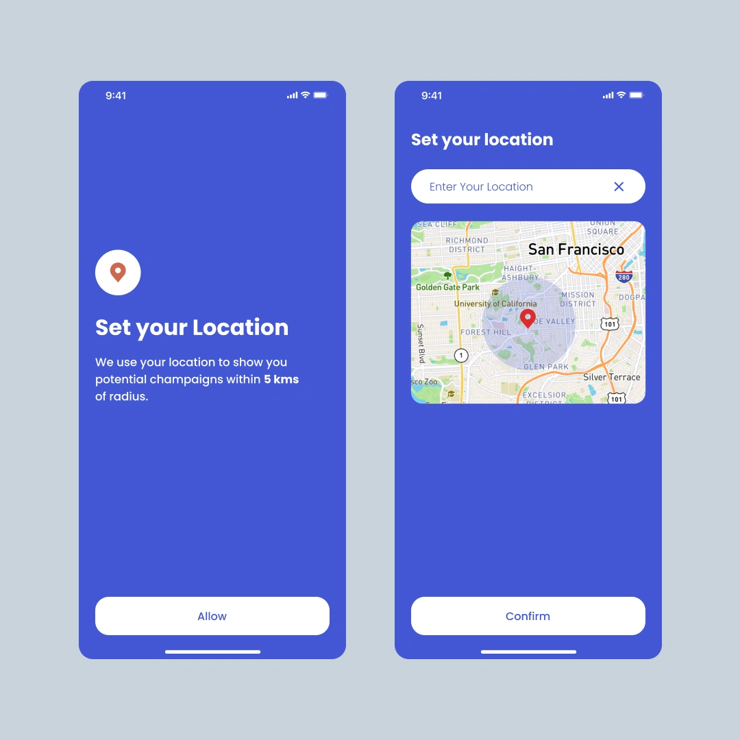
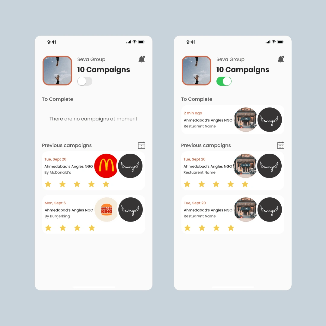
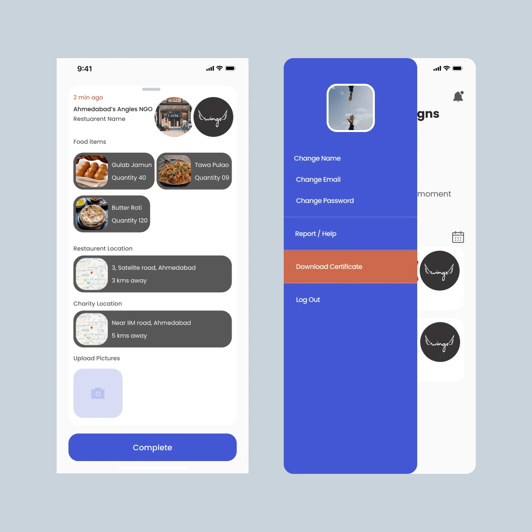
Registration process of volunteer group is very simple. Once they got in, they get an option to make themselves available or not. They can also see their previous campaigns. If they click on the profile picture, they can change few things such as name, PFP, email, and password along with the download certificate option. Once they are available, they will be able to get campaign task to complete with all the necessary details of it.
📹 The Prototype Video
here is the prototype video of the app that I ended up designing for this project.
🧑🎓 Learnings
Reviews are goldmine. They can make design from good to great. Good reviews can help to make product easy-to-use.
Like this project
Posted Feb 10, 2024
Designed and Prototyped a Food Donation App in a week using Figma and Protopie
Likes
0
Views
42

