Redesigning GrowthSchool’s Application form — UX Case Study
Shrey Trivedi 🔥
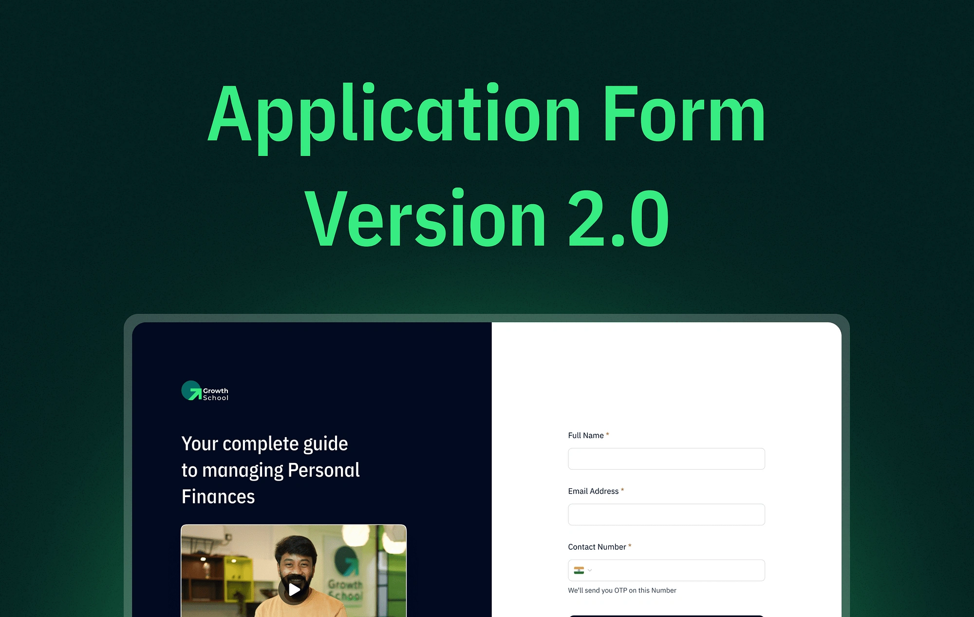
Thumbnail
Overview
Each program is overseen by its program manager, who formulates the questions for the application form.
To enroll in any of our courses, users are required to complete an application form. The information provided by users plays a crucial role in assisting our sales team in gaining a better understanding of the applicants. Additionally, this data empowers our marketing team to comprehend leads more effectively, ultimately enhancing the conversion process.
In this article, I will explain the version 2 of the form that we created at our company, which is making a significantly positive impact on revenue 💰
Problems with the earlier version
💰 Business Side
Different Program managers create questions for application forms in their own ways for the program they manages. This makes it hard to store the information consistently. Sometimes, important questions for salespeople might be missing, which leads to lower-quality leads and fewer successful conversions.
✨ Users Side
Looking from the user’s perspective, they have to go through all the questions, even the ones that don’t apply to them. This can be frustrating and might explain why more users are dropping off and not completing the process.
The process
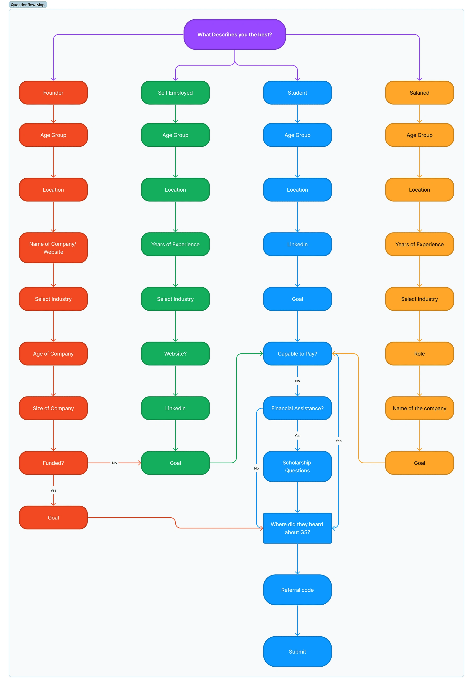
The process started with the realisation that we needed a standard set of questions for every application form. We asked ourselves, “Which questions are crucial to include as a standard to provide vital information for the sales and marketing teams?”
To address the drop-off problem, we decided to make the form adaptive. For instance, if you mention you’re a student, the form will show only the questions related to students, making the process easier for you.
Given that our courses attract four types of purchasers — Students, Salaried individuals, Self-employed, and Founders — the challenge was to establish standard questions tailored to each of these personas.
User Journey
To understand the situation better, I took a closer look at how users get to the application form. There are two different paths:
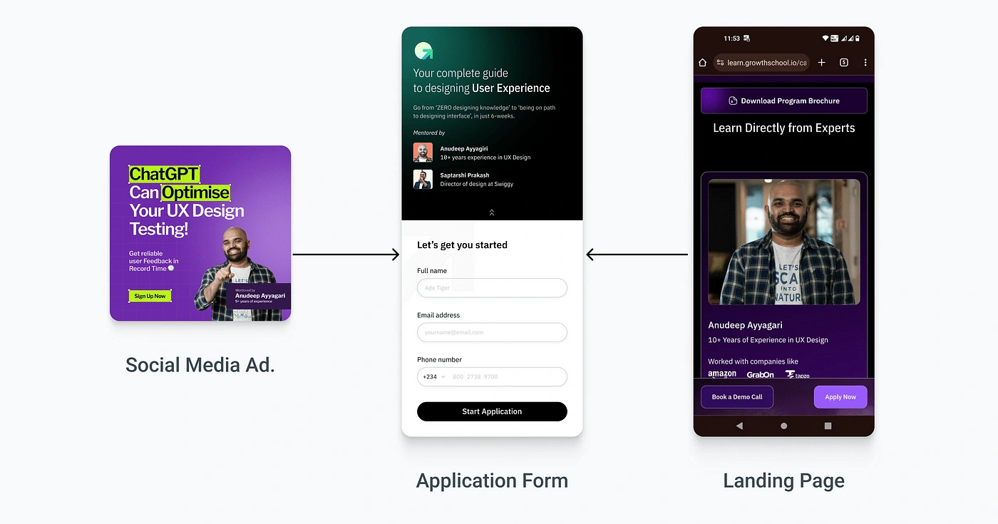
Path 1: As you scroll through your favorite social media, you might spot a cool GrowthSchool ad. Click on it, and it will take you straight to the application form, skipping the landing page.
Path 2: Start by going to the course’s landing page. There, you’ll see a big “Apply” button. Click on it, and you’ll be taken to the application form to begin applying.
Primary Research
Through structured discussions with our sales, marketing, and program teams, I worked on understanding the information needed for students, salaried individuals, self-employed, and founders.
Following this, I meticulously crafted the standard questions and established their logical flow. This methodical approach ensures a streamlined process for efficiently gathering necessary information.
Additionally, we integrated questions for scholarships for those requiring financial assistance and exit questions to trace lead sources (Needed for Marketing team).
Question-flow Diagram
To design this, I crafted a holistic approach organised into three clear phases. The initial phase focused on optimising the first screen, followed by the second phase dedicated to refining the question flow and presentation. Lastly, the third phase concentrated on enhancing the Success screen experience.
Phase 1
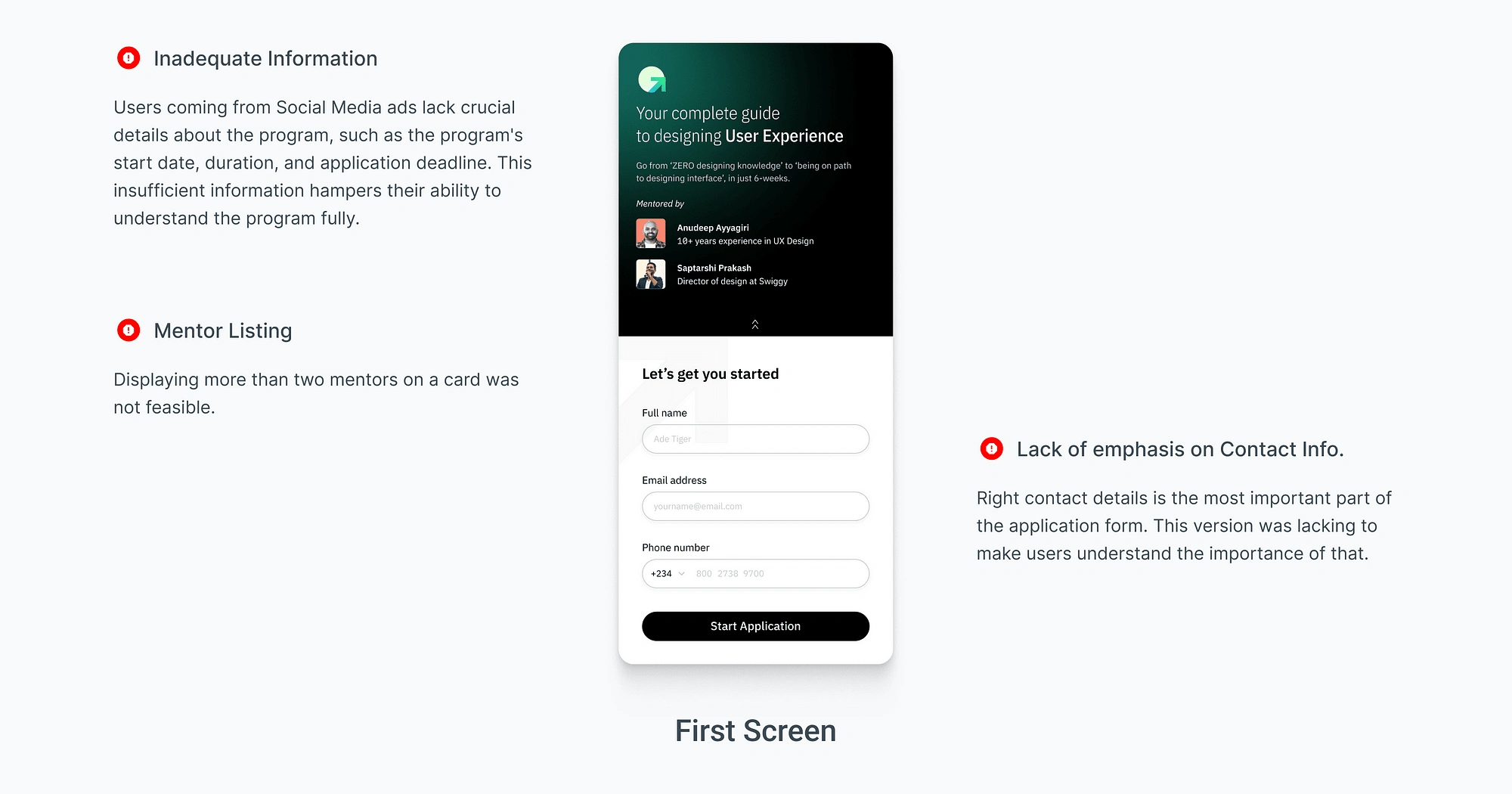
I did an evaluation of the older first screen version and identified areas for improvement.
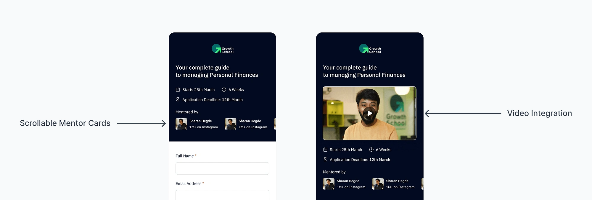
Redesigned Version & Variations
I designed two versions: one without a video and the other with a video.
The second version is specifically tailored for individuals coming from social media ad, who might not have seen a landing page as they directly land on the application form. Recognising this, we decided to include a video in the second version to help them better understand the program. This ensures that even those arriving from social media get a clear understanding of what the program is all about.
Building on insights from the sales team, where we observed issues with inaccurate contact details. to reduce this I designed two versions: one with OTP verification and another without. In the latter case, there will be a prominent note beneath the input field, clearly stating that the provided number will be used for future communication.
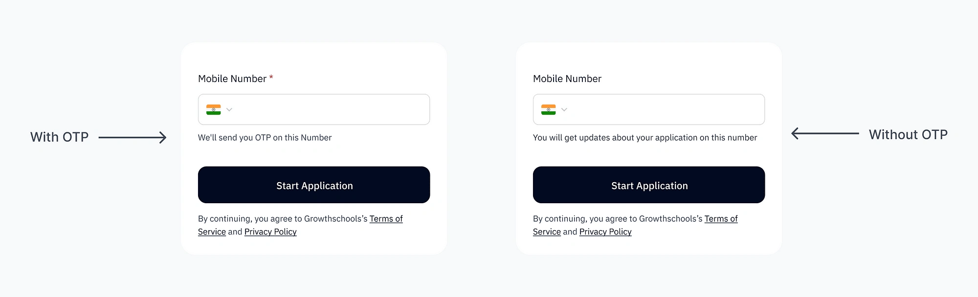
As part of our future plans, we aim to conduct A/B testing to assess the performance of both versions, striving to identify the most effective approach for improving data accuracy.
Phase 2:
Secondary Research
As part of my secondary research, I analysed various form platforms including Typeform, Google Form, Zoho, Airtribe, and Formstack.
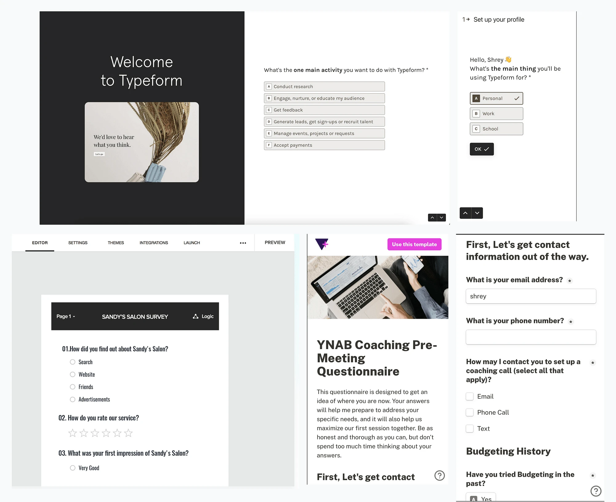
After careful consideration, I chose to model our form presentation after the Typeform approach. This decision was based on the effectiveness of displaying one question at a time, allowing us to create a focused and streamlined application process tailored to our specific needs. This approach proved to be particularly suitable, especially when considering adaptive questions.
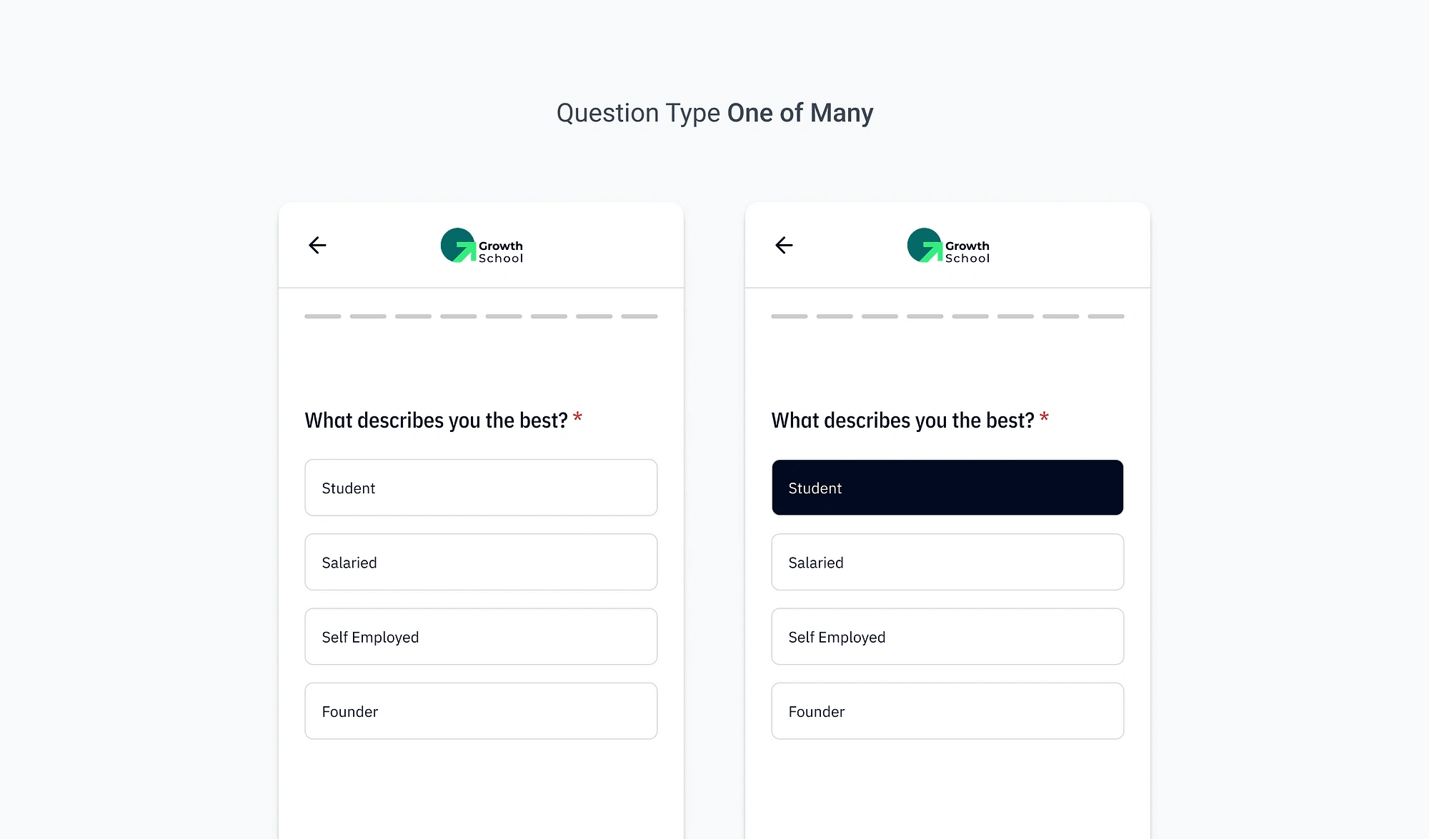
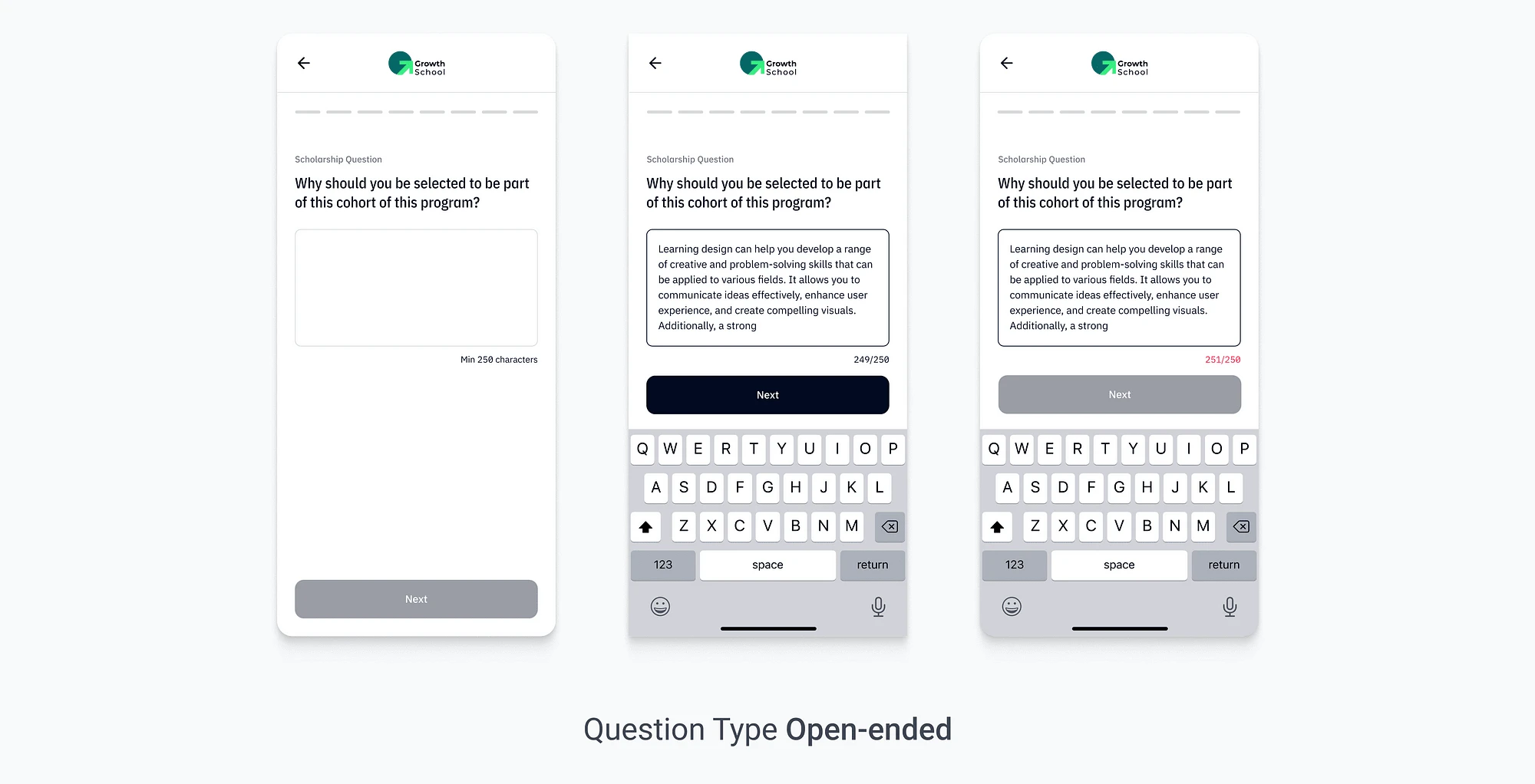
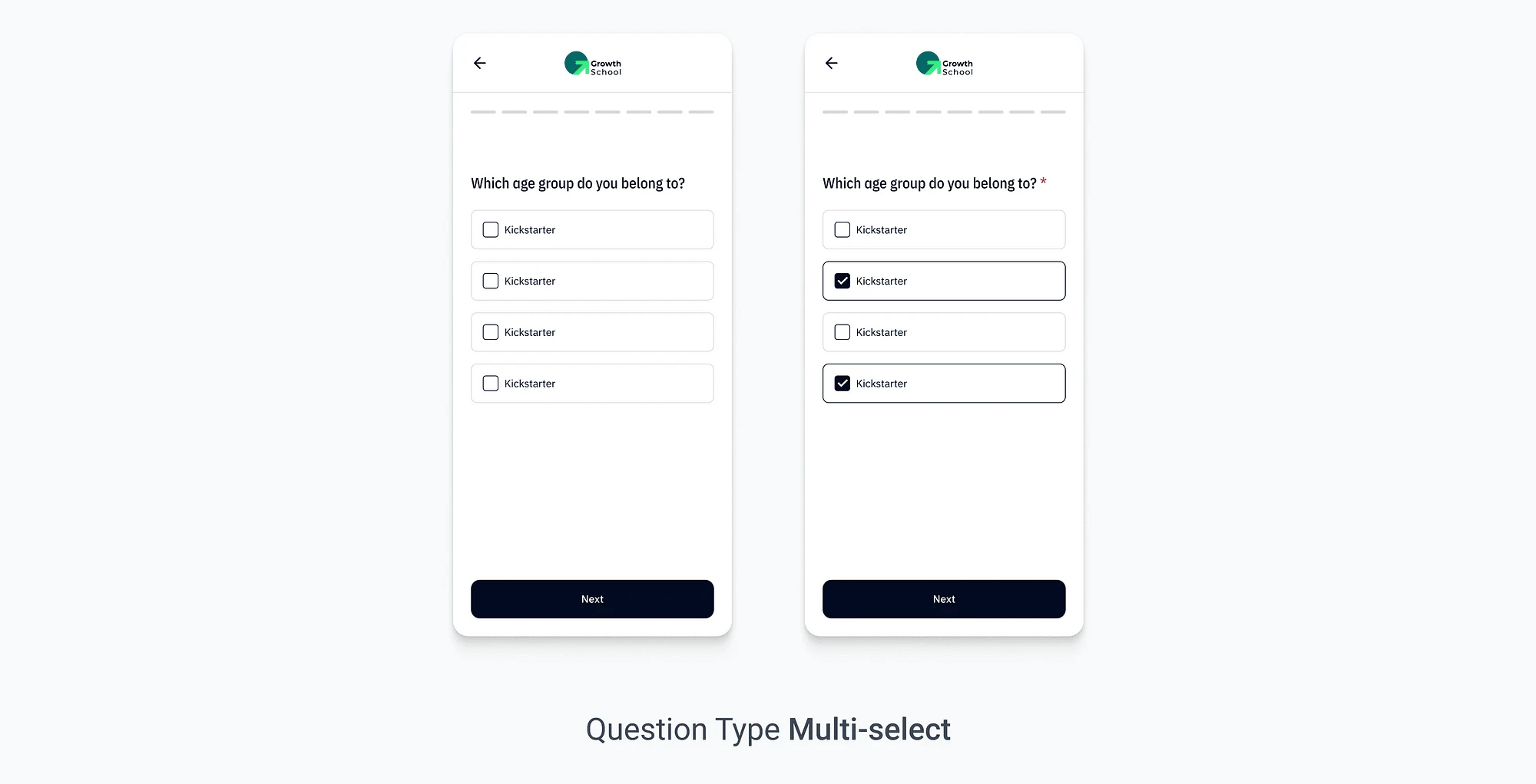
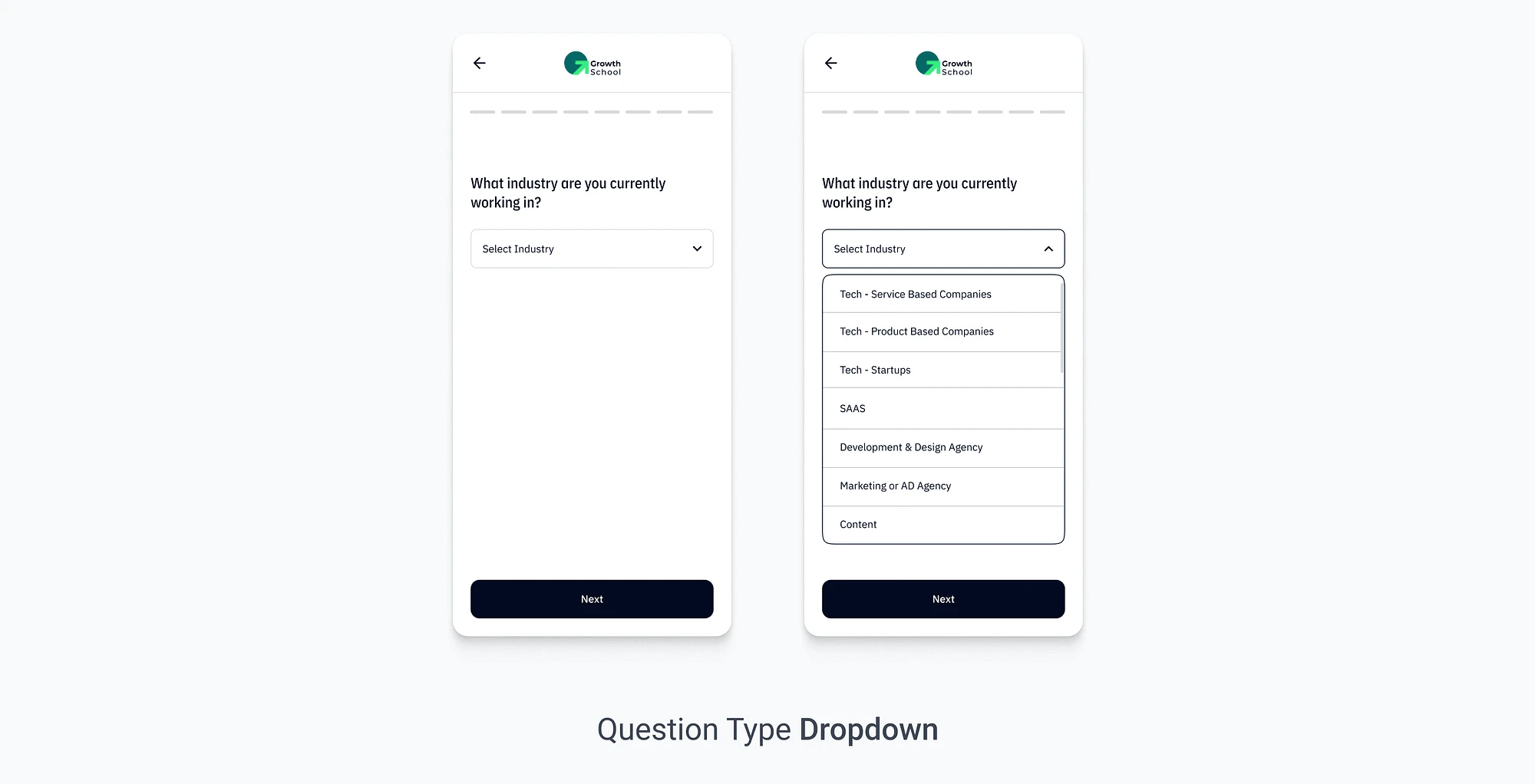
Redesigned Screens
I designed a variety of question screens to cover every possible type. These screens are designed to accommodate each type of Standard questions, scholarship questions, Exit questions and Custom questions.
Custom questions are those that can be added by program managers, which may be missed in standard questions.
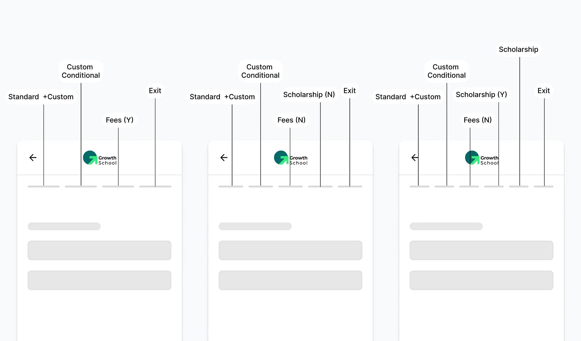
Progress barWe adopted an Instagram Story-like approach for our questionnaire, divided into multiple “pills” or sections. Each pill represents set of questions.
Back Interaction
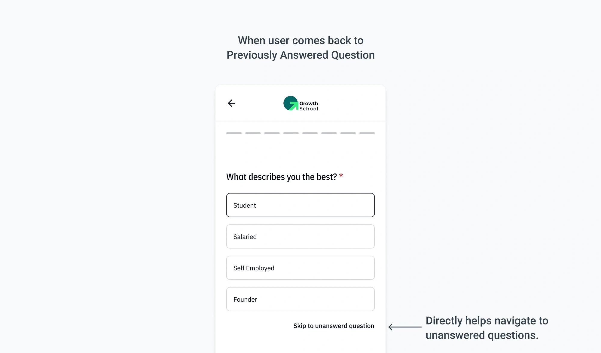
To improve user experience, we added a “Skip to the latest question” button in the application form, which will appear while user makes edit by going on previous questions. This button lets users jump directly to the most recent unanswered question, reducing the need for repetitive “Next” clicks when making edits. This enhancement streamlines navigation and minimises unnecessary clicks for a smoother user interaction.
Phase 3
Success screen
I did evaluation of the previous version’s success screen and identified areas for improvement.
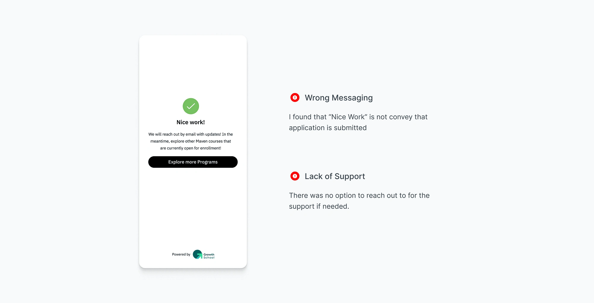
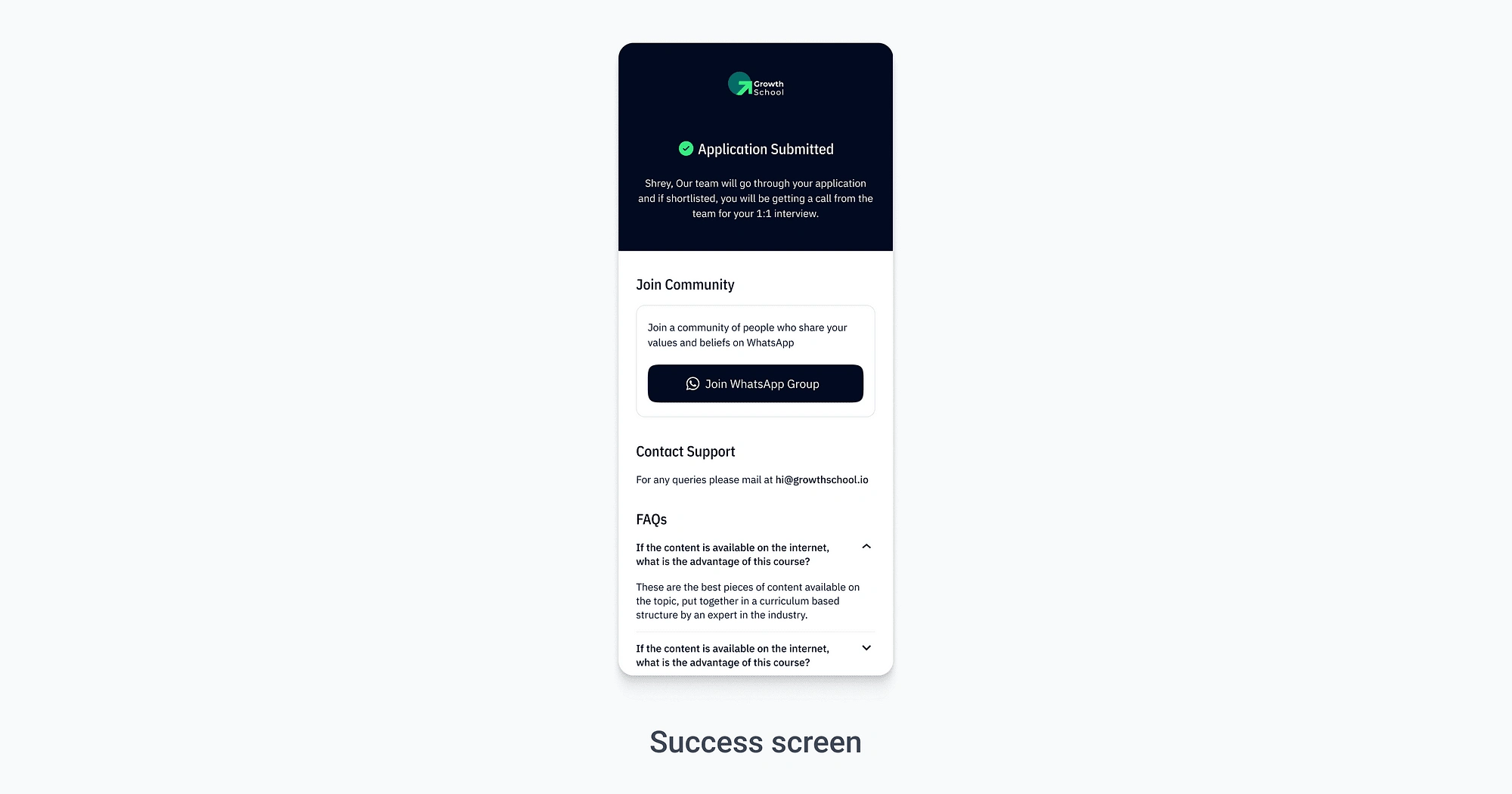
Redesigned Success Screen
I changed the text from the generic “Nice work” to the more informative “Application Submitted” for clarity.
To enhance user support, I added a contact email address, allowing users to reach out at any time for questions or issues related to their application or the process.
I introduced a Frequently Asked Questions (FAQs) section to provide users with self-help resources and quick answers, reducing the need for direct support contact.
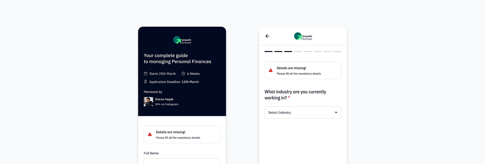
Error Screen
Impact
The redesign is making a positive impact by enhancing user experience, providing sales with deeper insights for increased revenue, and supporting marketing in delivering more personalised course ads through richer user data.
Learnings
🤝 Collaboration is the Key
During this project, I worked closely with Founder, Product Managers, Program Managers, Front-end Engineers, and Backend Engineers.
Collaboration with both frontend and backend engineers is crucial for project success, ensuring that design concepts are feasible and align with technical constraints.
🗒️ Importance of Documentation
It’s essential to document every design decision; this not only provides justification for your choices but also lays a crucial foundation for future iterations and improvements.
Like this project
Posted Nov 17, 2023
In this article, I will explain the version 2 of the form that we created at our company, which is making a significantly positive impact on revenue 💰