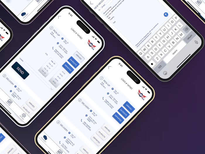
Training Peaks calendar
Training Peaks allows endurance athletes of all ability levels to monitor their progress toward whatever goal them have for themselves. It is rich in options and information available to the user.
Problem: The vast quantity of data and options feels overwhelming to the novice user. Specifically, the calendar section is not intuitive, and some sections are difficult to navigate as a result.
Solution: Use very clear and obvious signifiers to let user know what is possible on the screen. Make all actions and data accessible within two clicks.
Please note that my recommendations are based on the current Training Peaks application, though I did not work with Training Peaks or their parent company, Peaksware.
Like this project
Posted Oct 3, 2023
Redesigned calendar of app that monitors athletes' training. The goal was to make the UI incredibly navigable, specifically within two clicks.
Likes
0
Views
5


