Rebranding a Construction Services Firm for Global Buyers

Mufaddal Aurangabadi

Context
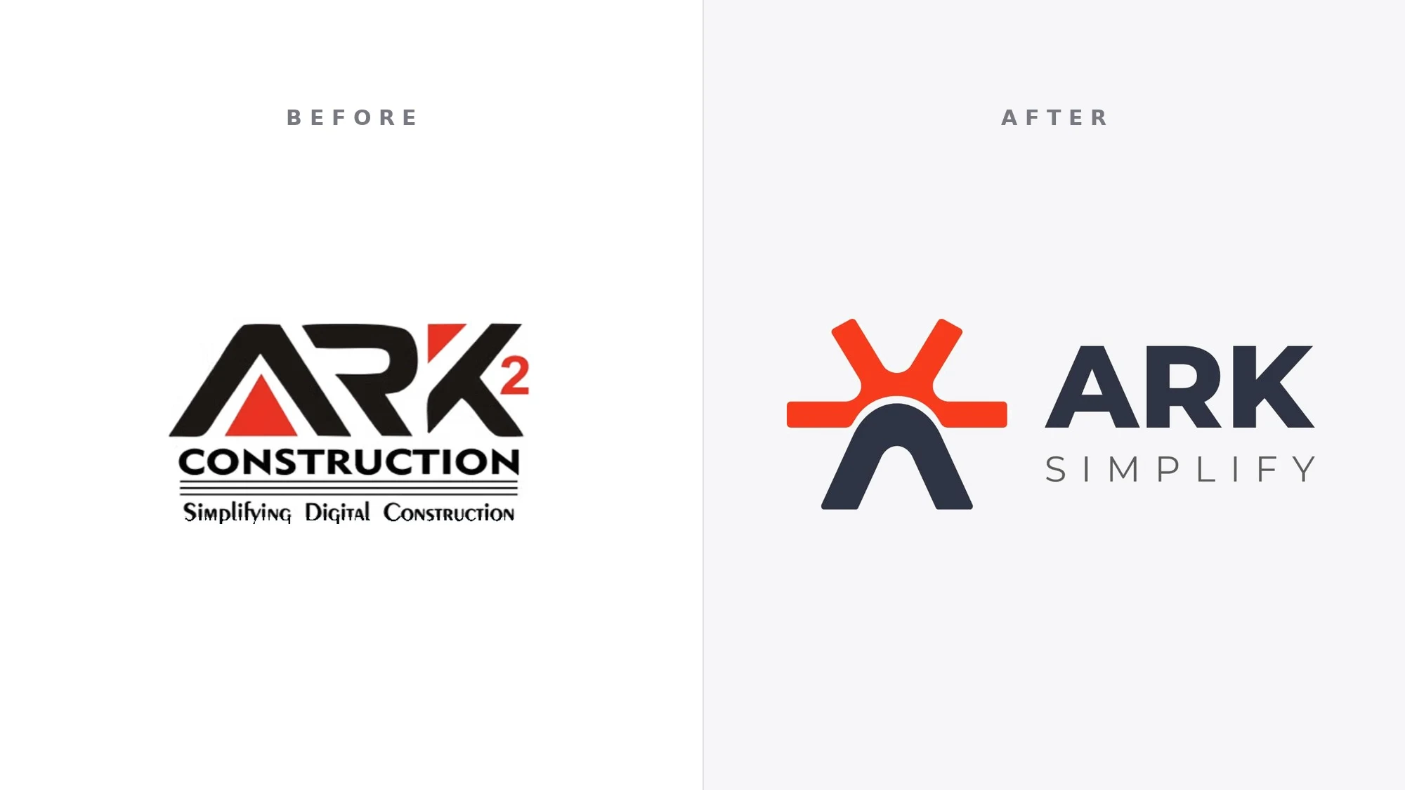
ARK Simplify provides outsourced construction estimating, preconstruction, detailing, project management and bookkeeping support for contractors, subcontractors and manufacturers in the US and UK. The company previously operated as ARK² Construction.
Problem
The business had grown beyond its original identity. The old ARK² Construction mark was dated and busy, the name tied the company to construction alone while it was also delivering finance and bookkeeping support, and the brand did not look like a partner that US and UK firms would trust with their bids and financial operations.
Positioning
We repositioned the company from a construction outsourcing vendor to a dependable operations partner that simplifies the work behind project-led businesses. The positioning is built around the ARK Simplify name, which covers both the construction and finance offers and states the promise directly. The core message became support built around how each client's team actually works.
Identity
The new mark was developed from the idea of a ship's wheel and a rising sun: steering, direction and a clear path forward. Those forms were reduced to a single geometric symbol that also reads as an A, paired with a clean wordmark. A focused palette of signal orange and deep navy replaced the old black and red, giving the brand a calmer, more established presence that works across the website, app icons and dark and light backgrounds.
Website
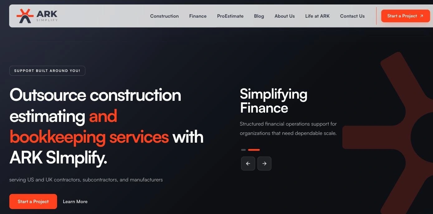
The positioning and identity were carried into the new website, which leads with a direct statement for its buyers: outsource construction estimating and bookkeeping services, serving US and UK contractors, subcontractors and manufacturers.
Deliverables
Brand positioning and messaging
Logo and identity system
Colour palette and brand applications
Brand rollout on the company website
Like this project
Posted Sep 29, 2026
Repositioning and rebrand of ARK2 Construction into ARK Simplify, an estimating and bookkeeping partner for US and UK contractors.