Absa Home Loans: 59 pages, 11 products, one pattern

Will Derman


I tested the part I was least worried about
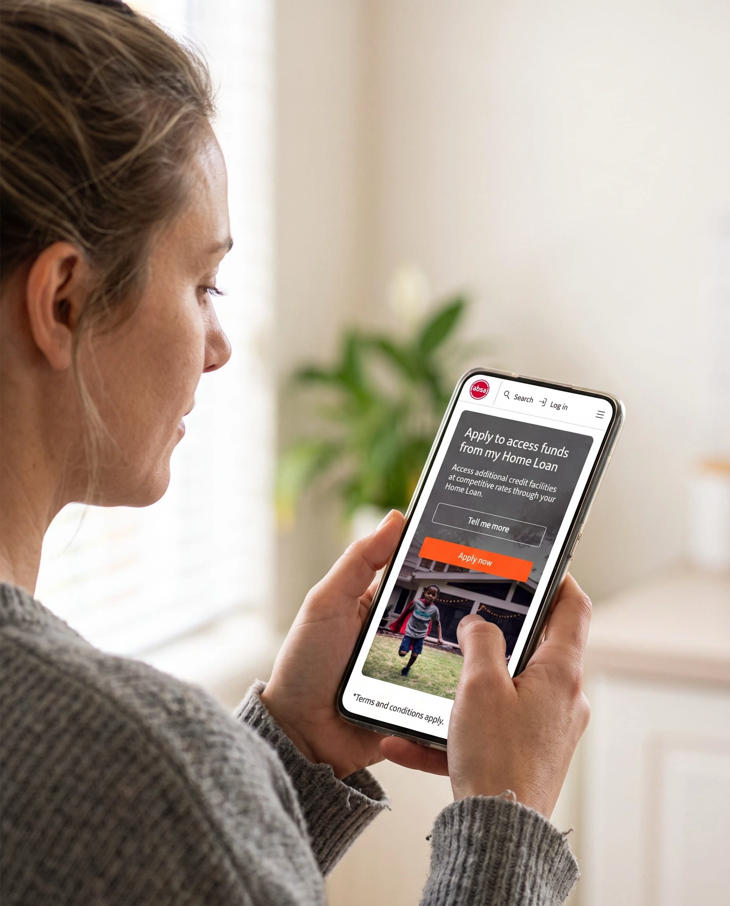
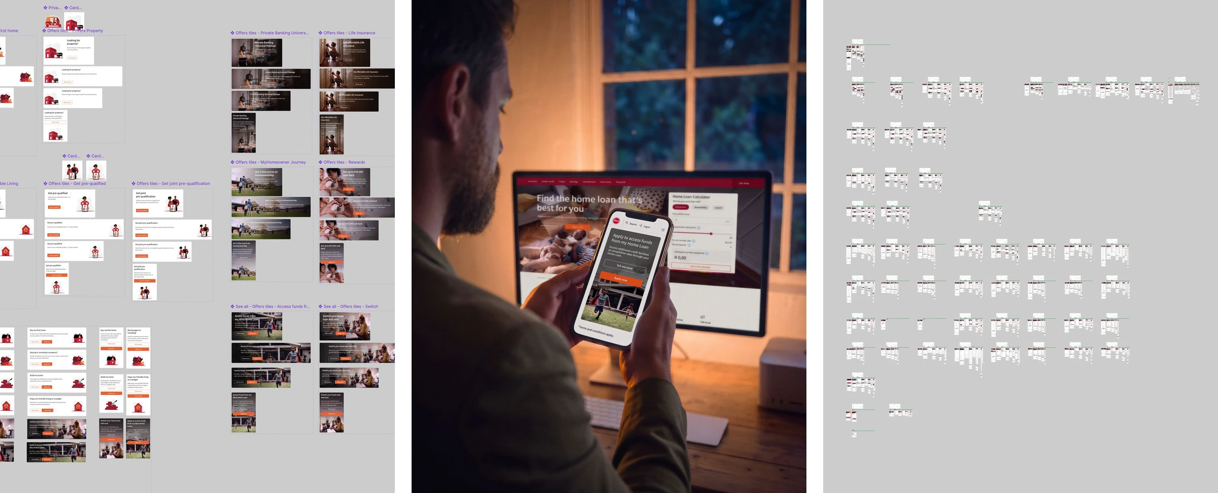
I was lead UX designer on the fifty-nine pages where Absa customers choose between eleven home loans. I set the structure and the layouts, and ran the testing that showed which part actually needed fixing. Shipped in 2025, and being measured.
Eleven ways to borrow against a house, and the names do half the explaining
A first-time buyer's bond explains itself. Readvance, Further Advance, Flexi Reserve and Future Bond do not, and all four release money from a house the customer already owns. Most visitors cannot tell which of the eleven is theirs.
No page here takes an application. Each is where someone decides whether to start one. I expected the hard part to be the structure.
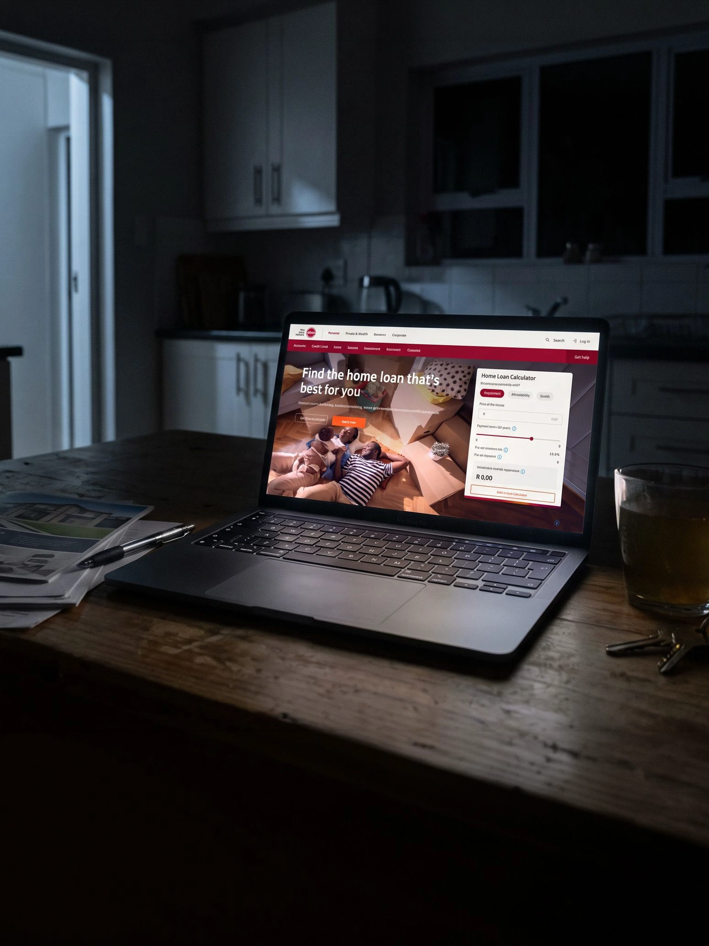
The structure survived testing. The vocabulary did not
Twelve moderated sessions, six with people who have held a home loan and six with people who never have. The architecture came through almost untouched.
Several product names and terms were read as something they are not, so they changed. The calculator kept its place at the top of the home page. On the product pages it moved lower, because on a phone it had pushed the product's name off the screen.
The findings are confidential. That the testing happened, that it changed the words rather than the structure, and that the project is being measured are not.
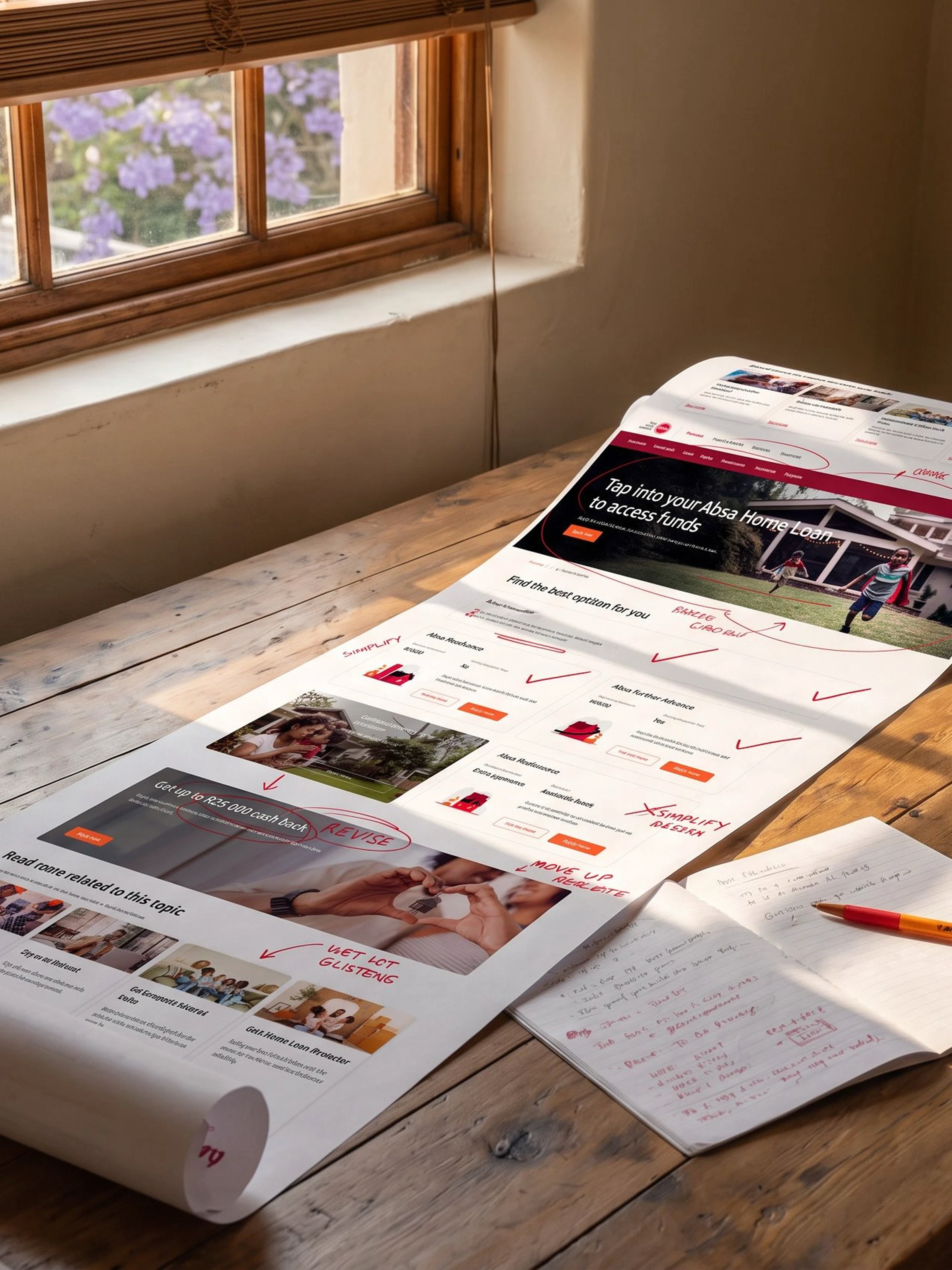
The website
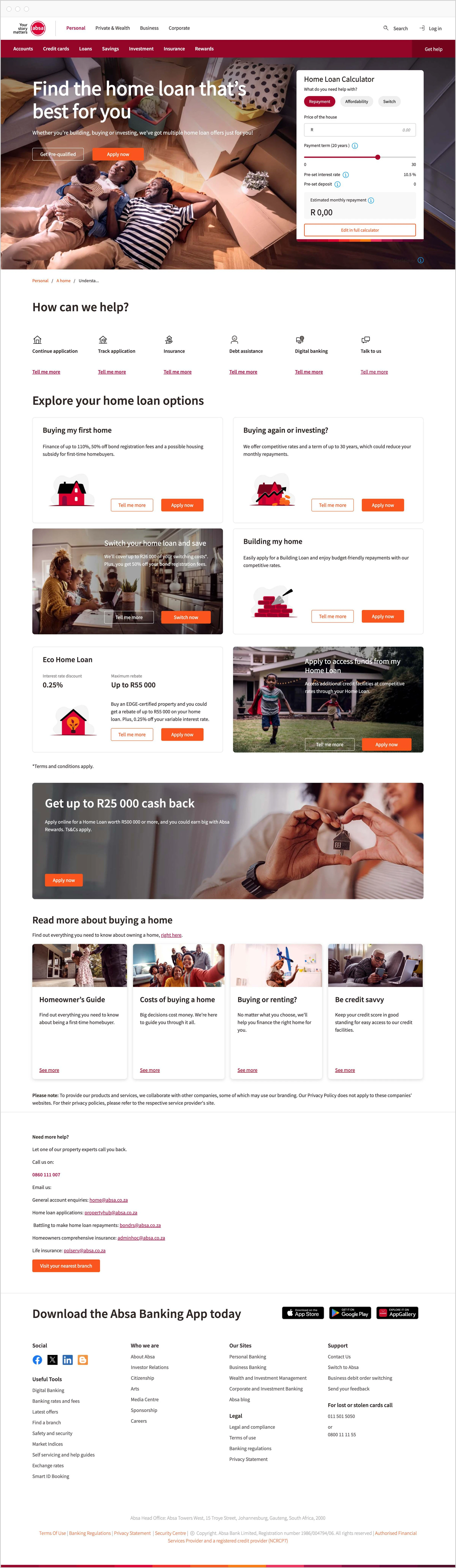
The work
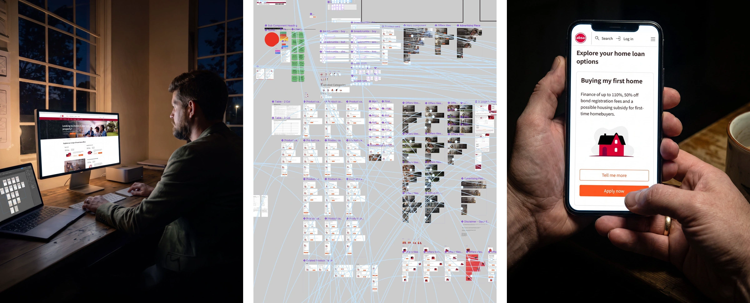
The numbers
Pages redesigned: 59
Home loan products: 11
Moderated sessions: 12
Changes the information architecture needed: few.
Like this project
Posted Sep 13, 2026
Lead UX designer on the 59 pages where Absa customers choose between eleven home loans, tested with twelve people. Shipped in 2025 and being measured.
Likes
0
Views
4