Nergy - Commerce Learning Platform

Nabeel M

Project Commerce Education Infrastructure
Role UI/UX Lead
Scope Web, Mobile, and Webdesign
Infrastructure System Of
Commerce Education
What is NEP and why it matters?
The Indian government changed the rules of education.
It wasn’t enough to teach commerce as theory anymore.
Schools and colleges were expected to prove practical learning happened,
not just finish chapters.
That shift put pressure on teachers and departments. They needed infrastructure to run practical commerce work, track it, and show outcomes.
That’s the gap Nergy Vidya stepped into.
The Big Problems
Commerce departments needed practical learning, not just theory.
Nergy already had 120 plus commerce tools, but students faced friction because key content fell below the fold, discoverability was weak, and long click paths made it hard to resume where they left off.
Direct user interviews were blocked by channel partners, so we needed another way to find what was actually failing.
There were no clear reference platforms or proven patterns to model this on, so we had to define the approach from scratch based on commerce needs and real user behavior.
The Solution
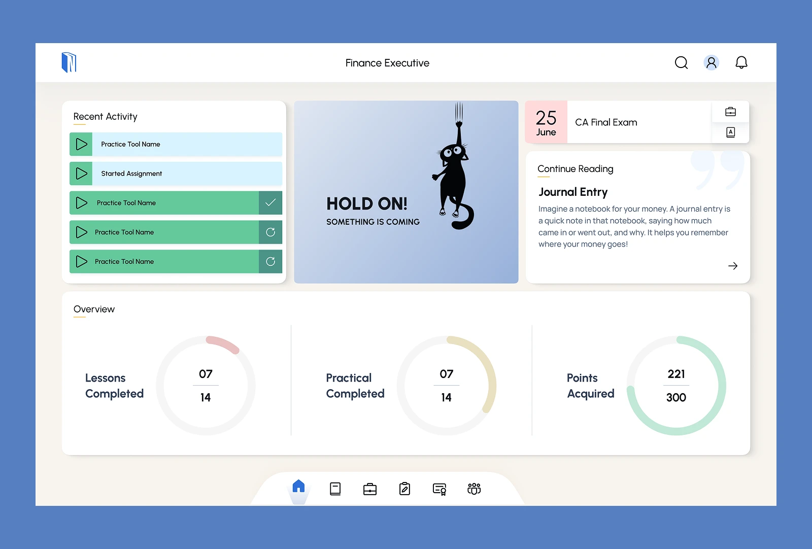
We treated the existing portal as the baseline and improved it in stages instead of rebuilding everything. The goal was to reduce drop-offs, increase visibility of important content, make resuming easier for returning students, and remove UI elements that take space but add little value. In parallel, we fixed the website messaging so the platform is clearly positioned as infrastructure for commerce departments and a practice sandbox for students.
Discover
Since we could not access students directly, we started with what the product was already telling us through usage. We looked for repeat patterns: where students stop, where they keep scrolling, which elements get ignored, and which paths take too many clicks. This gave us a list of high-friction zones to tackle first.
Research
Behaviour evidence guided the priorities:
Core student journeys had high usage, so small friction scaled fast roughly 24K to 91K page views and 29K to 91.5K clicks across key pages.
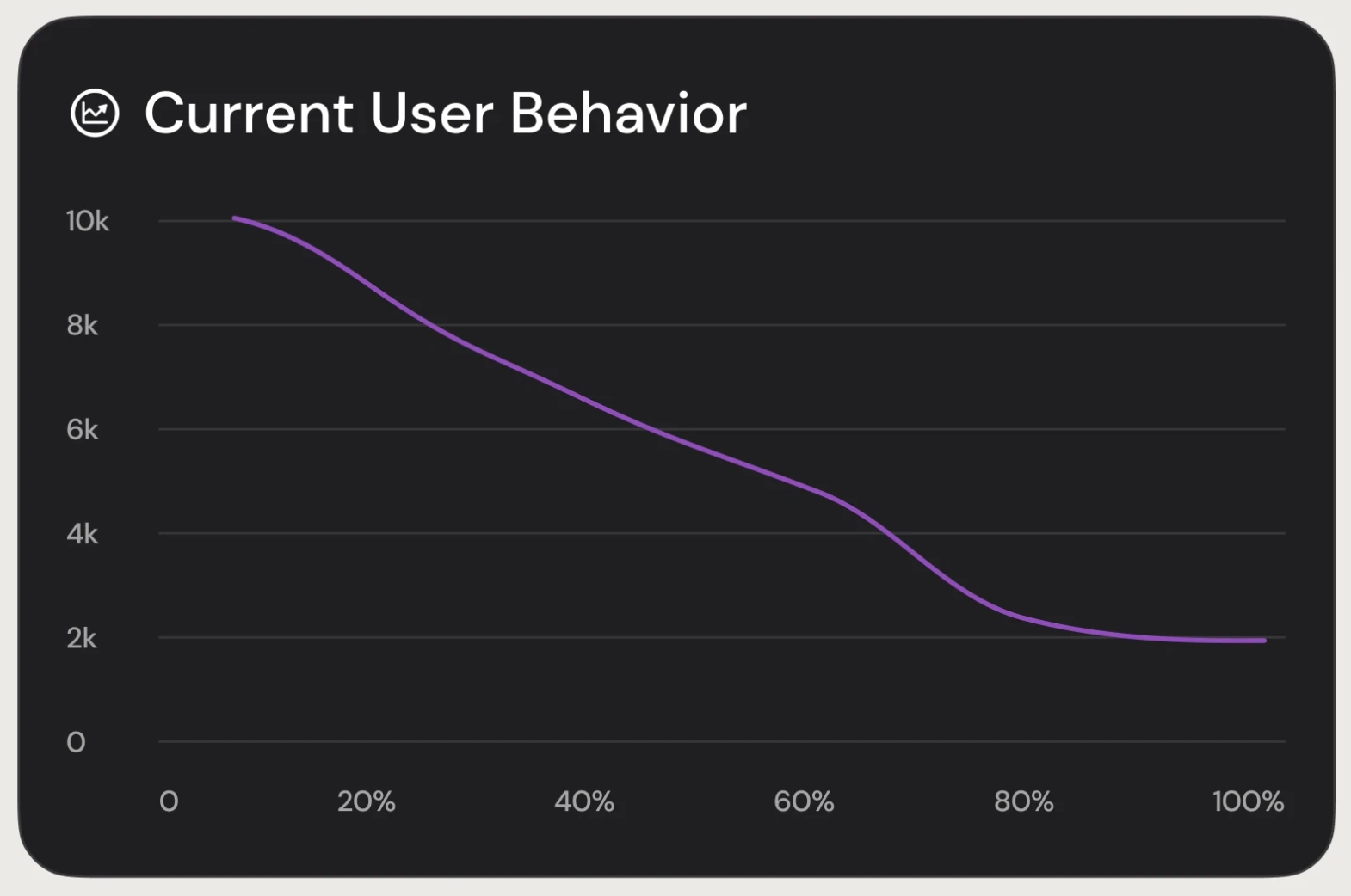
Users mostly stayed near the top of long pages: almost everyone reached only the first 20 percent, and drop off increased sharply beyond 70 percent.
Low value UI consumed space: footer clicks were near zero on some pages, and help was rarely used 74 clicks, 0.08 percent.
Returning users were high 60,199 over 100 days, but resuming required too many steps.
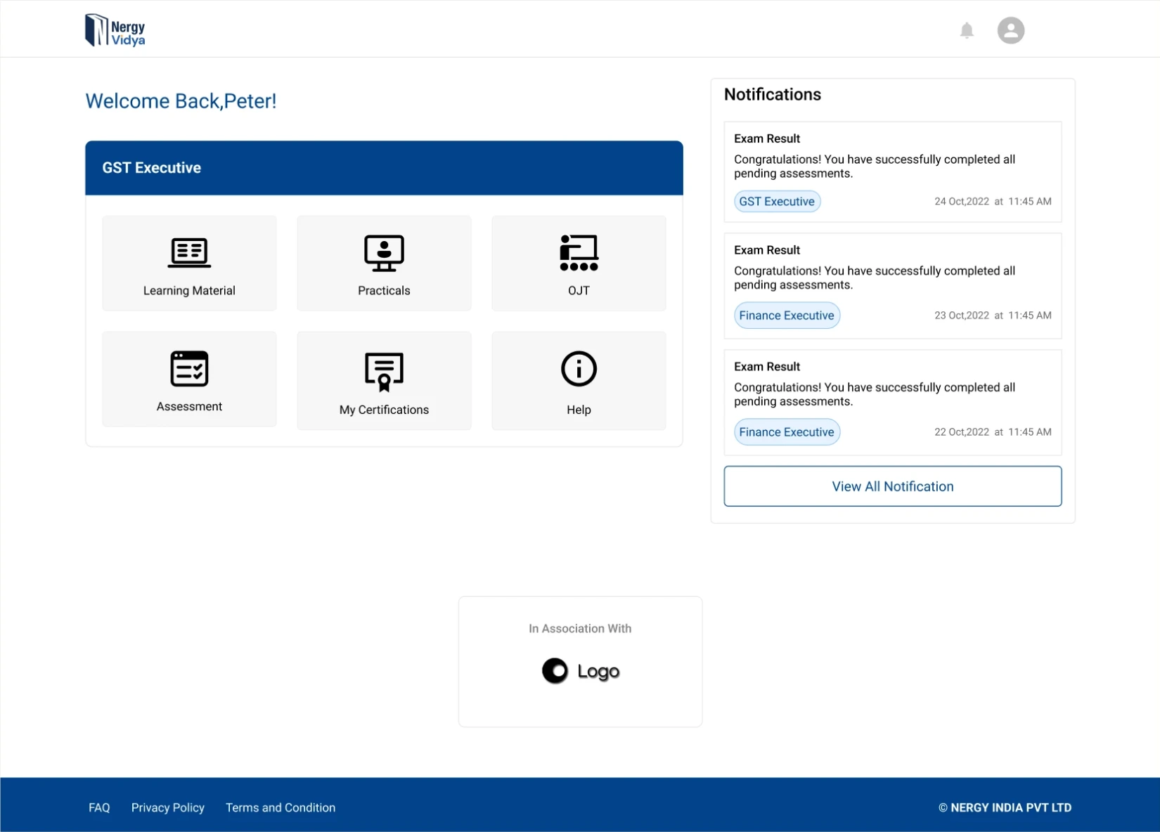
Old UI
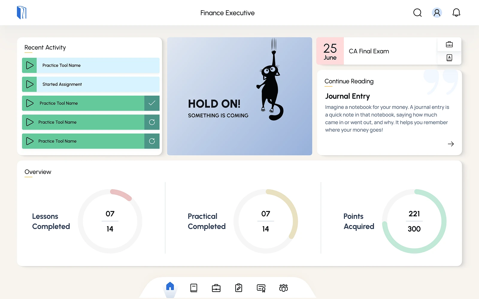
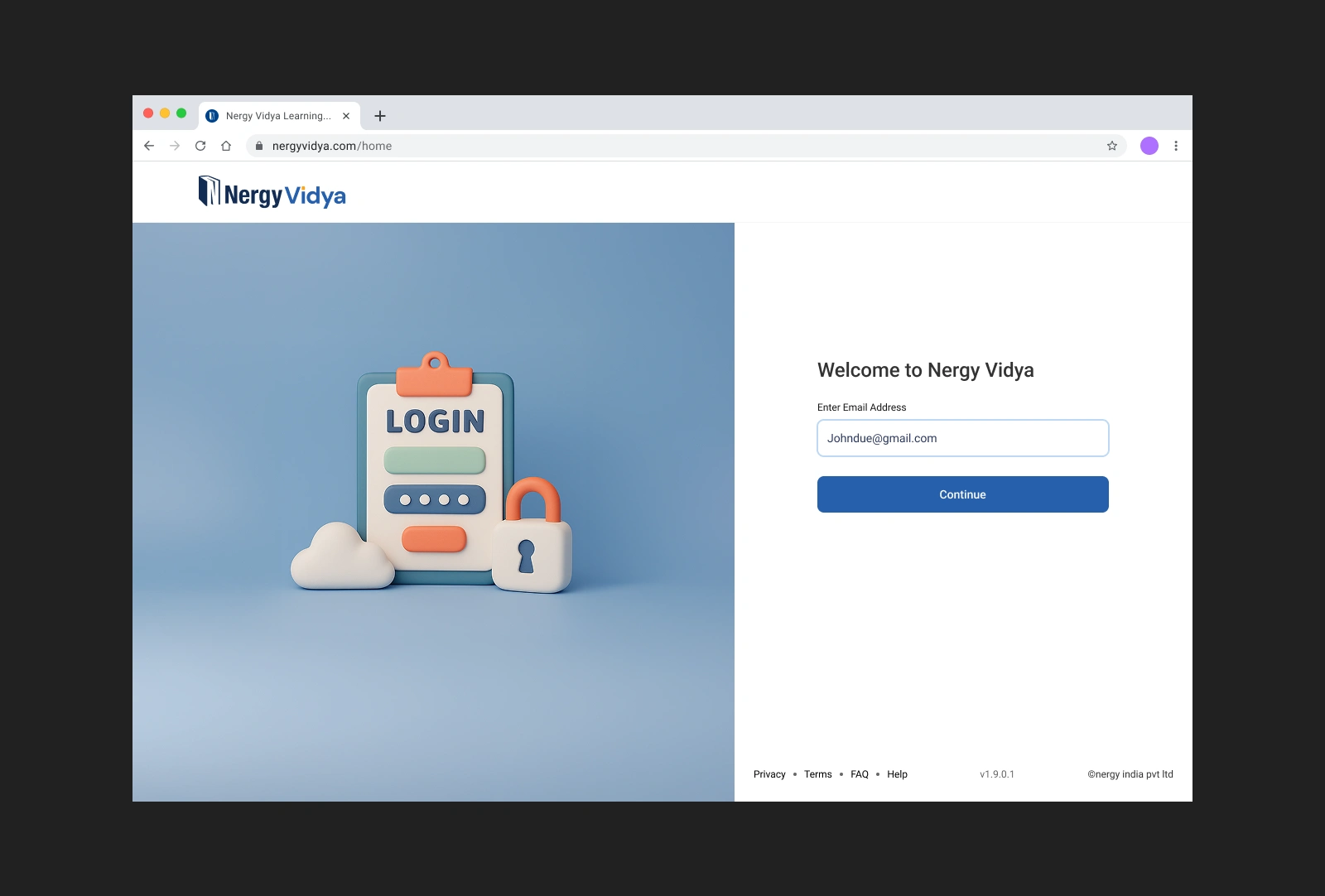
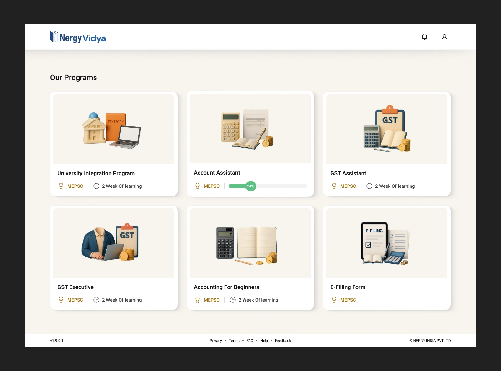
New User Interface
Thank You
Like this project
Posted May 23, 2026
Redesigned a commerce education platform to reduce friction, improve discoverability, and support practical learning at scale.
Likes
0
Views
8