Royal Drive: Luxury Car Discovery Concept

Nabeel M

Royal Drive Cover
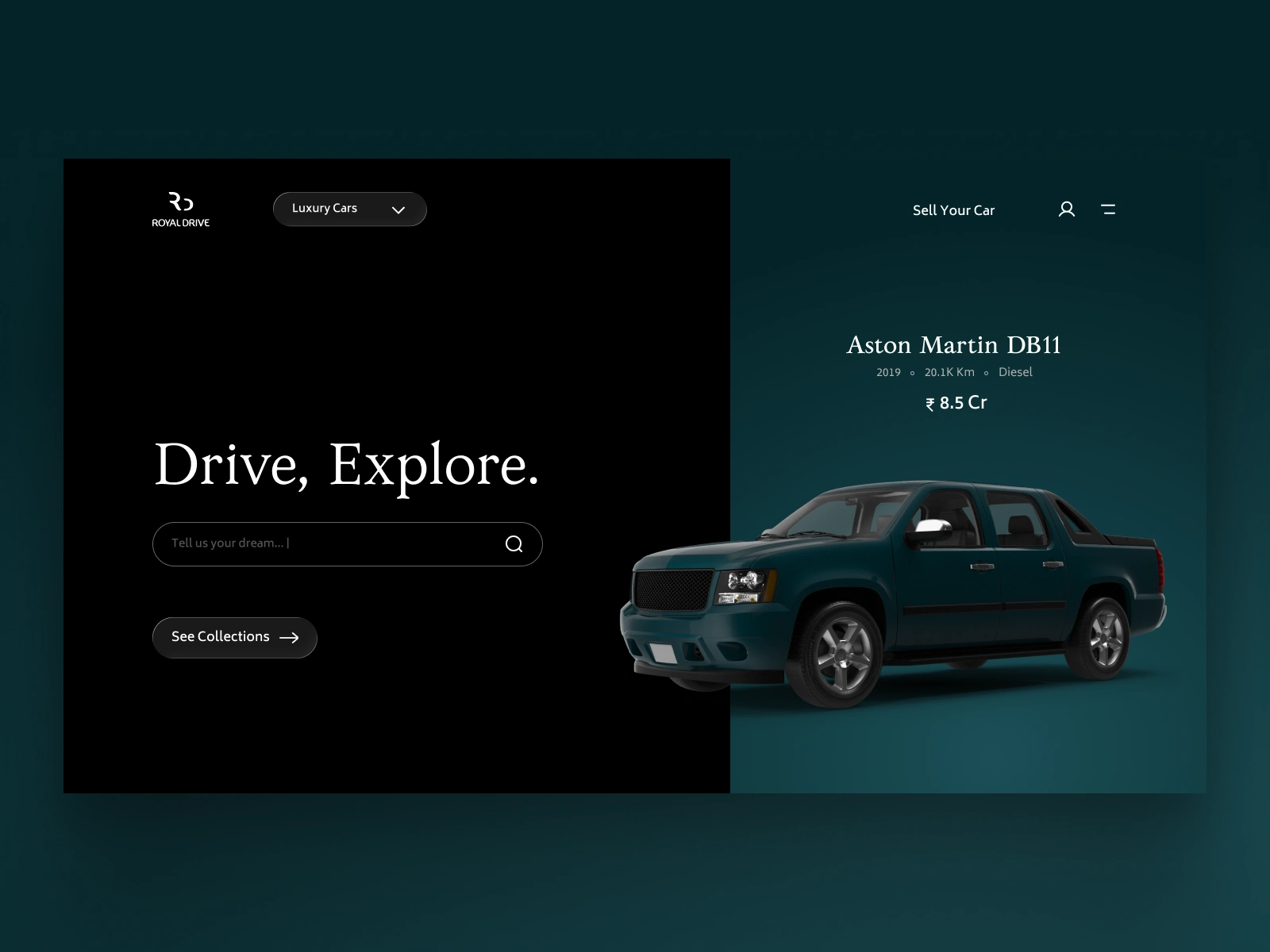
Royal Drive is a luxury car discovery and listing concept designed to make high-end vehicle browsing feel more premium, focused, and emotionally engaging. The problem I explored was that most car listing interfaces are heavily functional, with too much visual noise, dense filters, and a marketplace-like experience that does not match the value or aspiration of luxury cars.
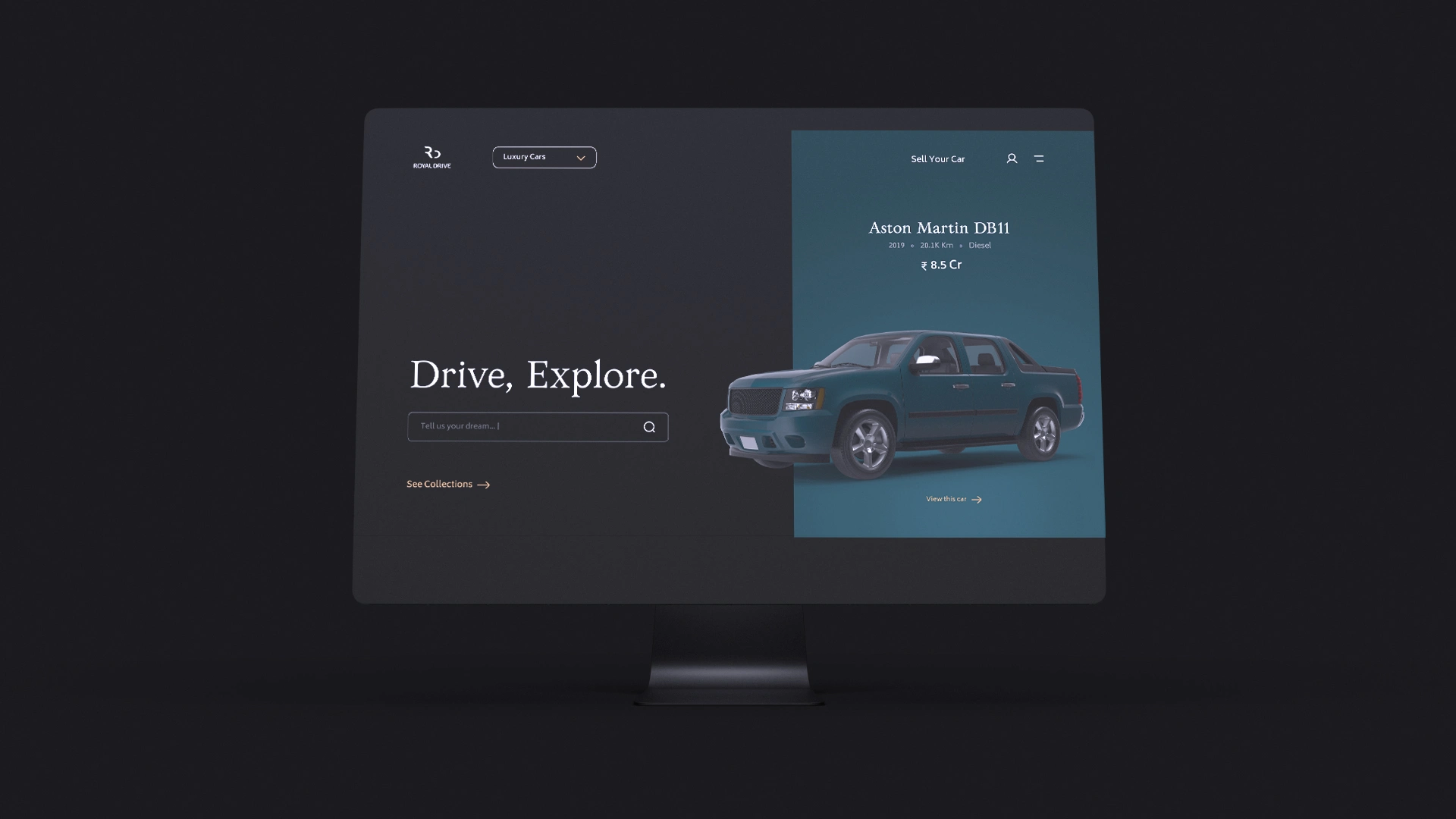
Royal Drive Screens
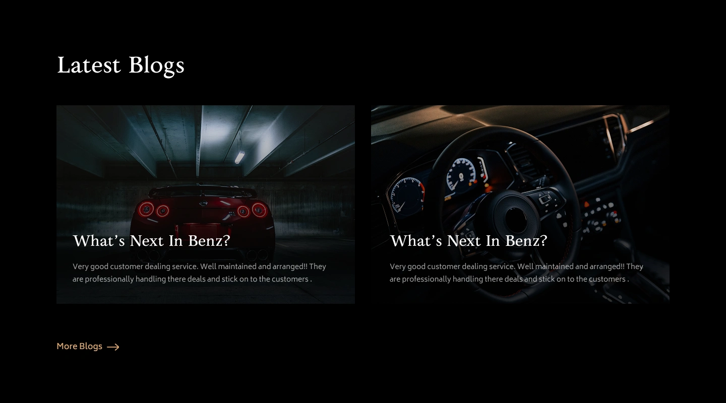
I designed the interface around a darker cinematic visual language, large vehicle-focused layouts, minimal typography, and a cleaner discovery flow so the car itself becomes the hero. The experience includes key browsing actions such as filtering by body type, budget, brand, and year, along with search, collection browsing, and individual car highlights.
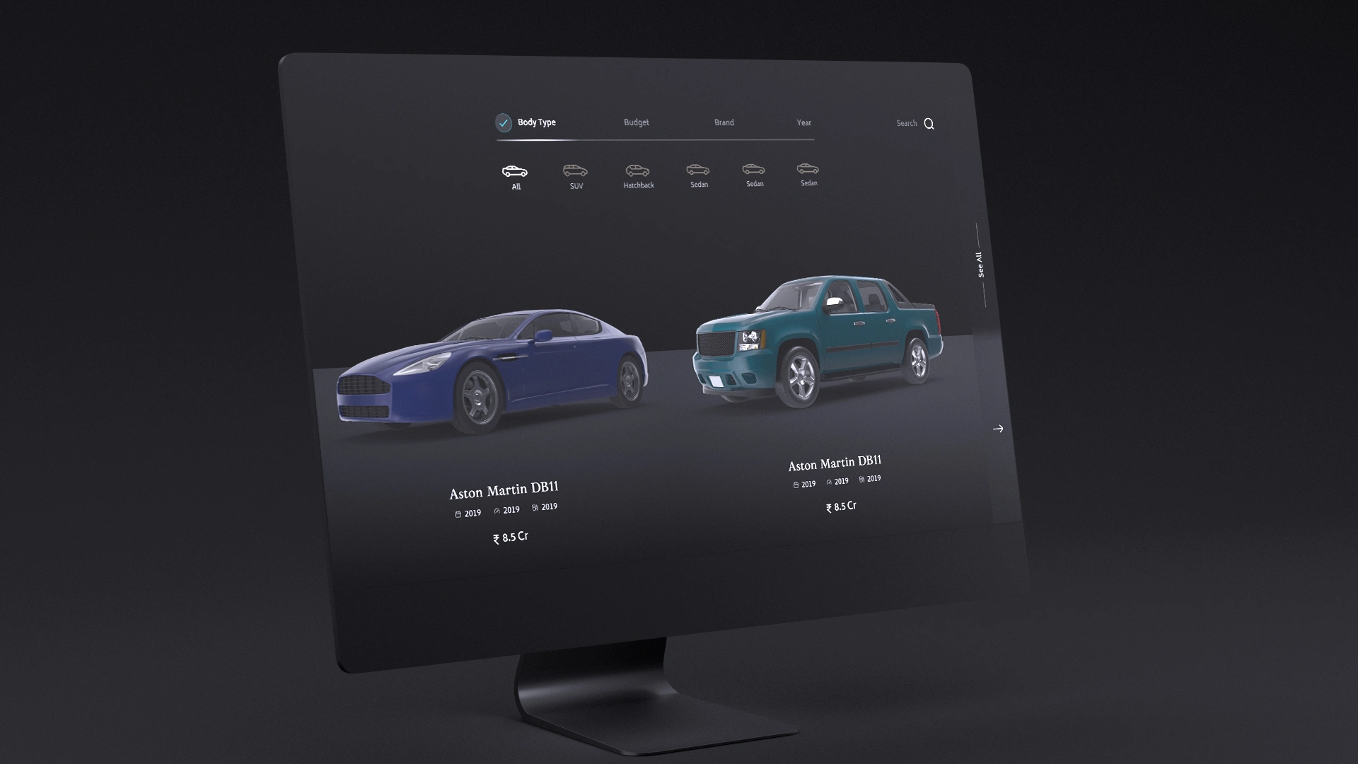
Royal Drive Interface
My focus was on reducing visual clutter, improving product focus, and creating a sense of exclusivity while still keeping the interface practical for users who want to explore, compare, and shortlist luxury vehicles.
The final direction turns a standard car browsing journey into a more refined digital showroom experience, where premium vehicles are presented with stronger visual hierarchy, more breathing space, and a brand feel that better matches the expectations of luxury car buyers.
Font
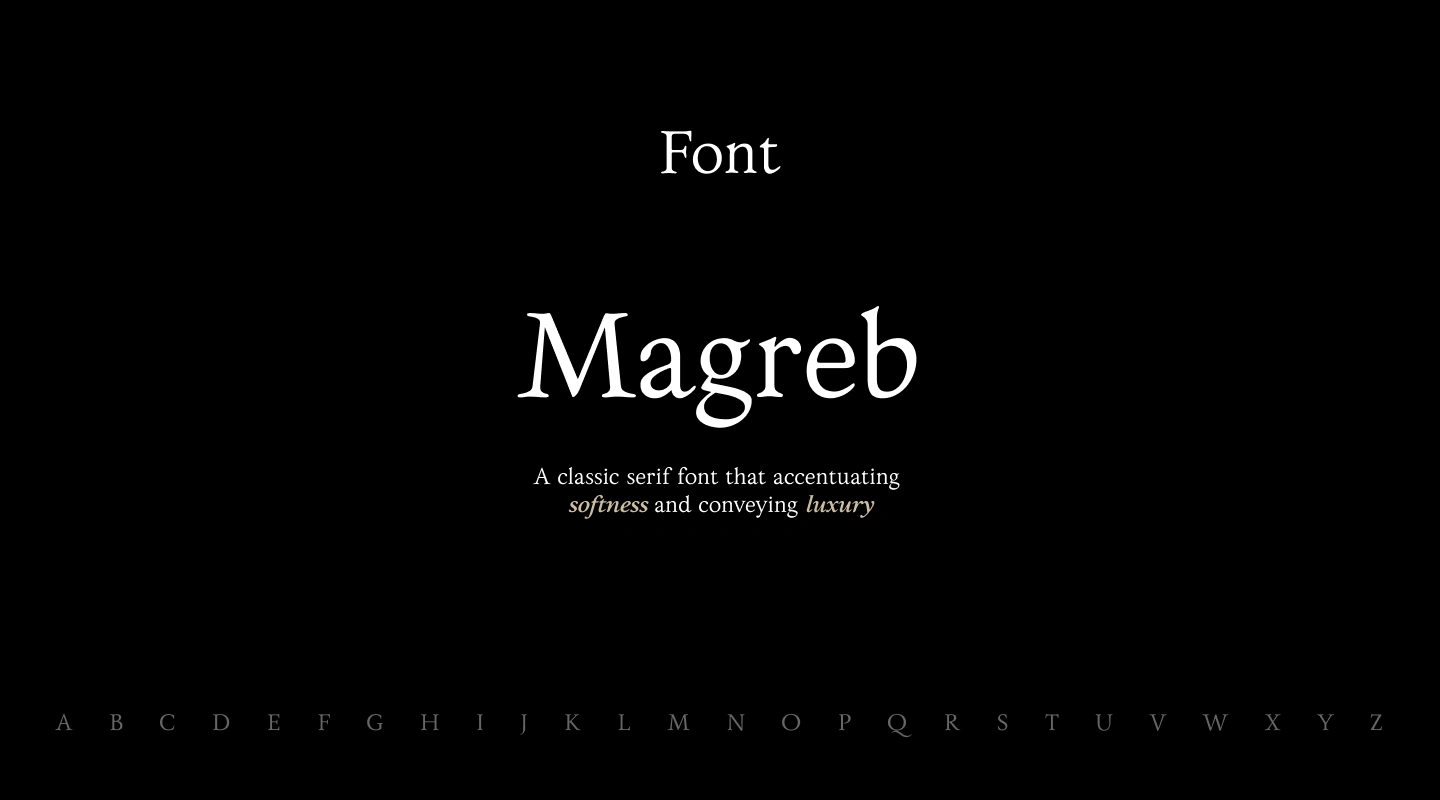
The visual direction started with typography because the brand needed to feel premium without becoming too sharp or aggressive. The logo had a smooth, refined character, so I wanted the interface typography to carry the same softness while still giving the product a luxury feel. I chose a serif direction because it naturally adds elegance and trust, but I was very particular about finding a typeface that felt calm, polished, and slightly warm instead of overly formal. It took me around five days to finalize Magreb, because the font had the right balance of classic luxury, softness, and visual personality. This decision helped the whole interface feel more like a curated digital showroom than a regular car marketplace.
Colours
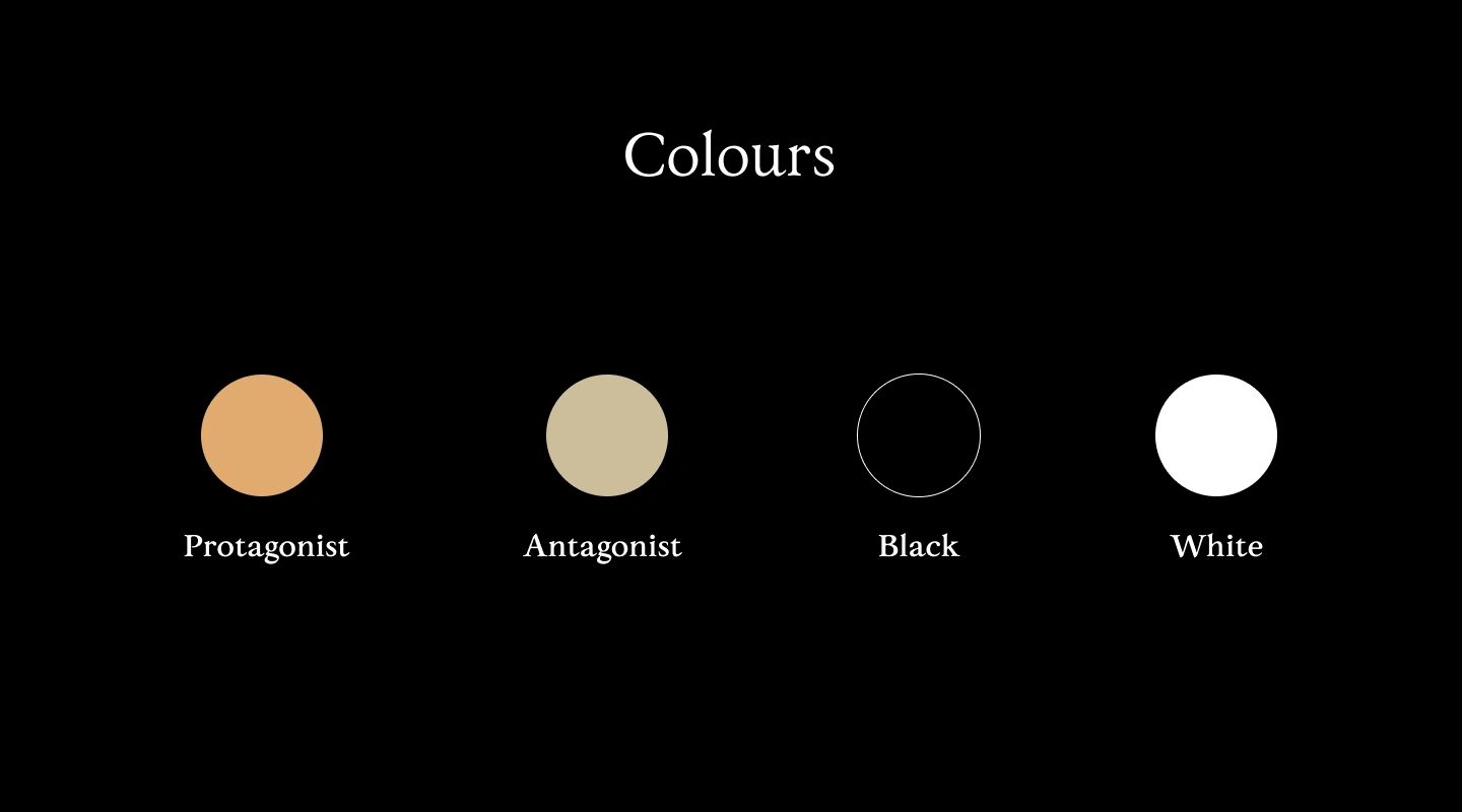
The colour system was built to support a premium, cinematic showroom feel. I used black and white as the core foundation to keep the interface minimal, high-contrast, and focused on the cars. The warm gold tone, named Protagonist, was used for key actions and highlights, giving the experience a sense of luxury without making it loud. The muted beige tone, named Antagonist, added softness and balance, helping the dark interface feel more refined and less harsh. Together, the palette created a quiet luxury mood, where the vehicles stay visually dominant while the interface feels polished, calm, and intentional.
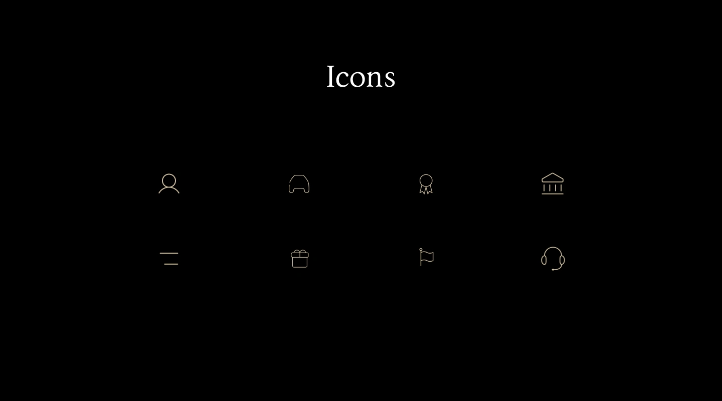
I designed the icon system to stay as quiet and refined as the rest of the interface. Since the product was built around a luxury showroom feeling, I avoided heavy, generic, or overly detailed icons that would make the experience feel like a regular marketplace. The icons use thin strokes, soft curves, and minimal forms so they support the interface without competing with the cars or typography. I also kept the icon colour close to the muted luxury palette, which helped the system feel consistent with the serif typography, dark background, and smooth brand identity. The goal was not to make the icons decorative, but to make them feel elegant, usable, and visually aligned with the premium nature of Royal Drive.
The User Interface
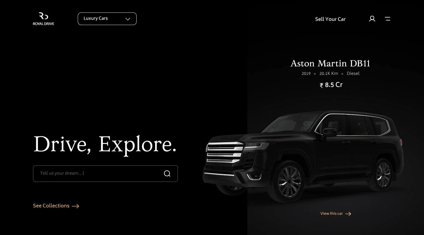
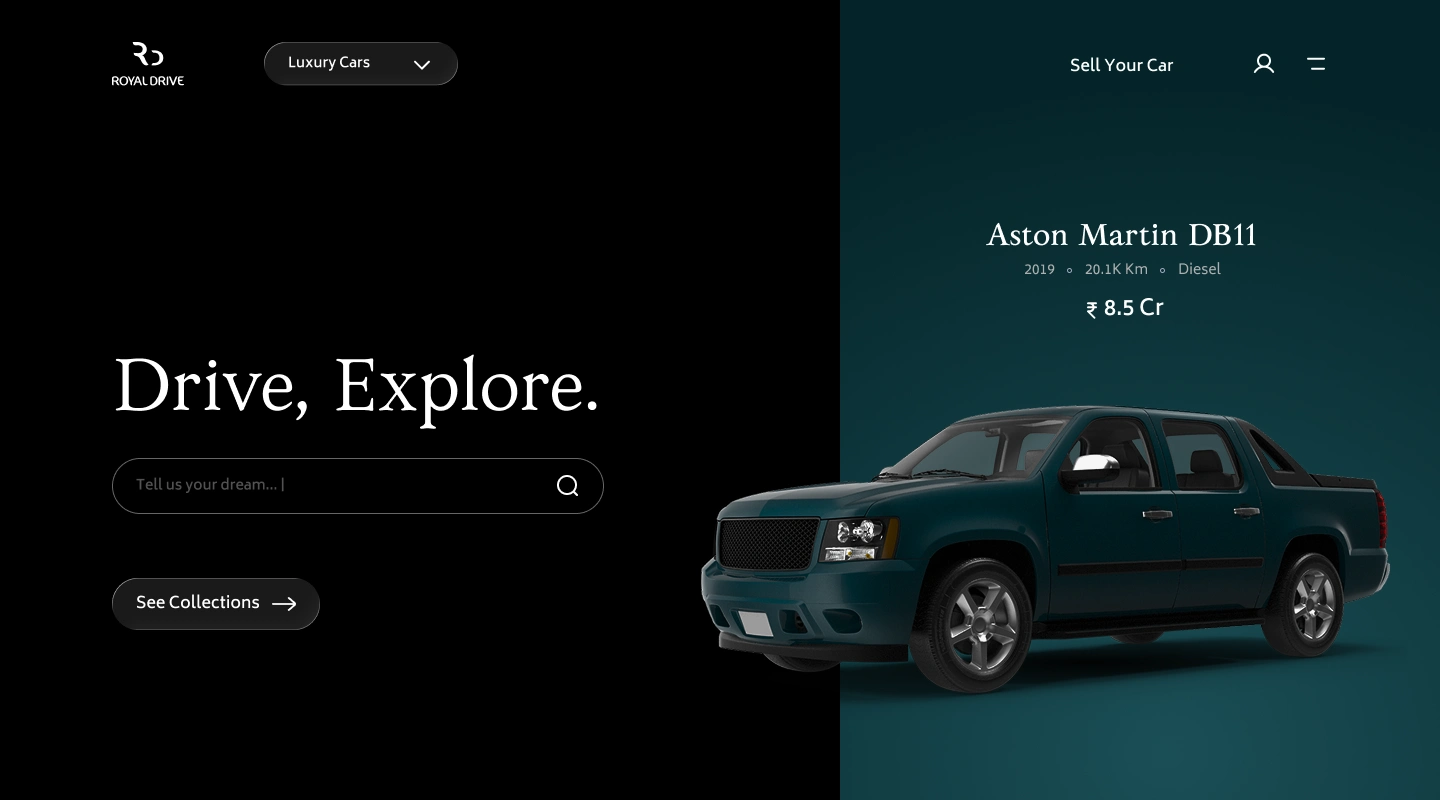
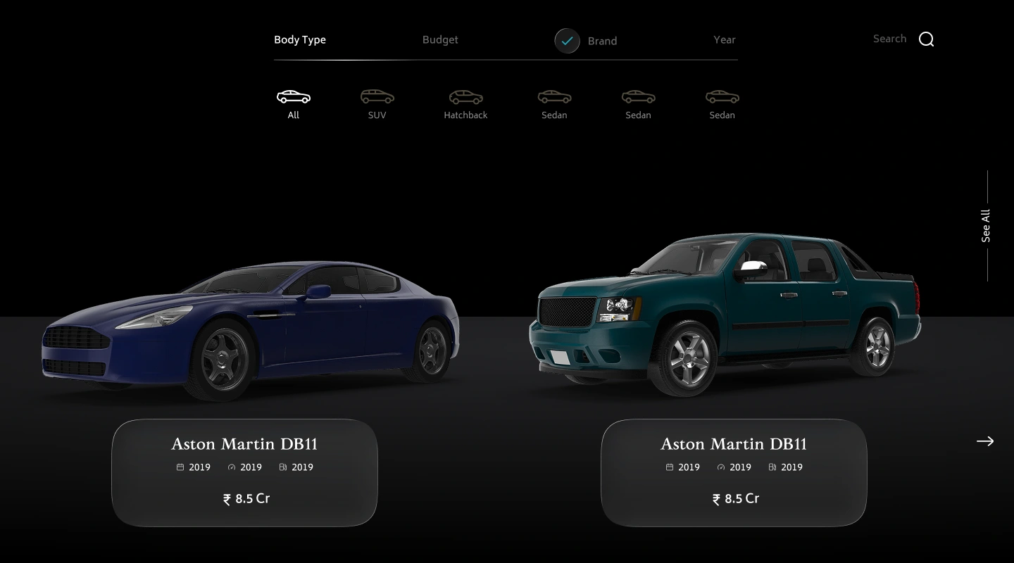
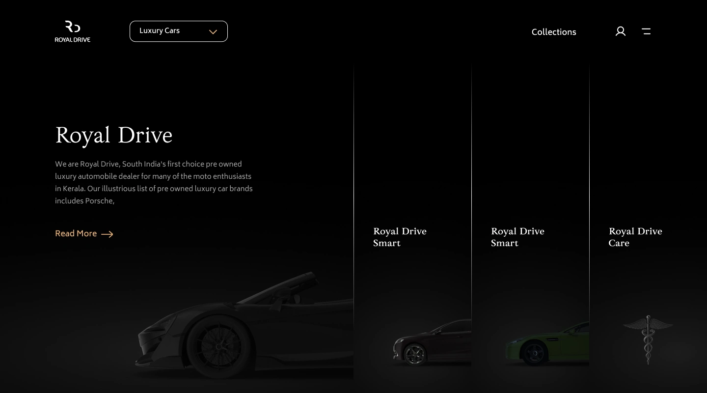
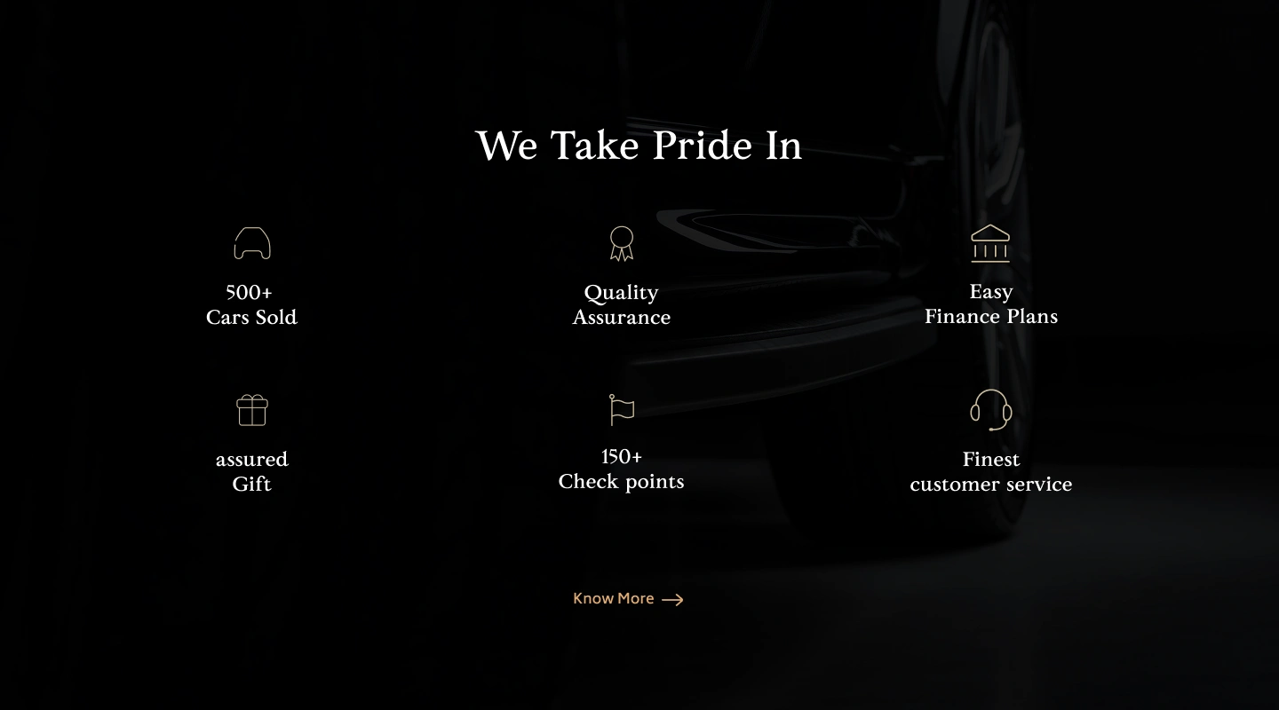
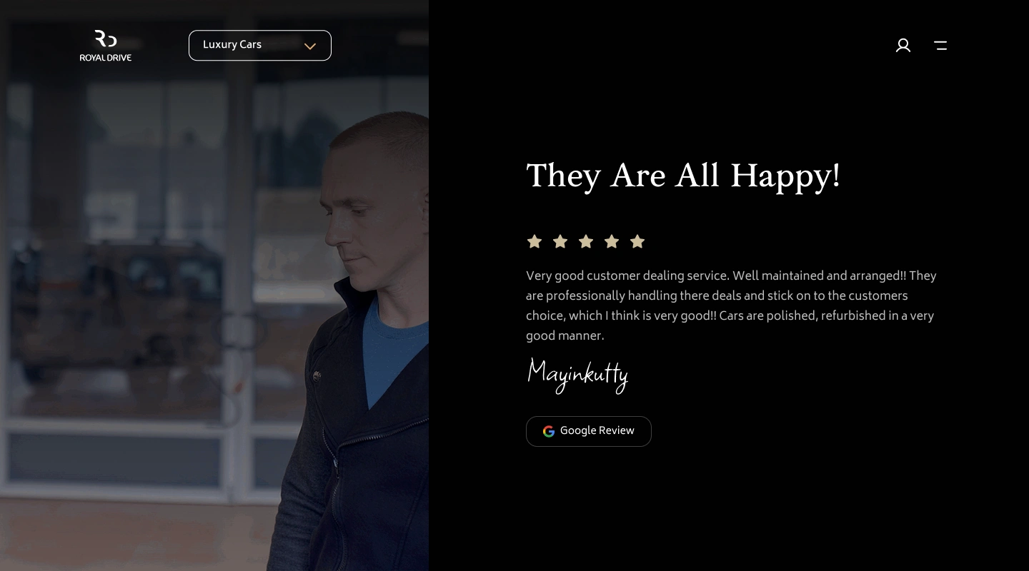
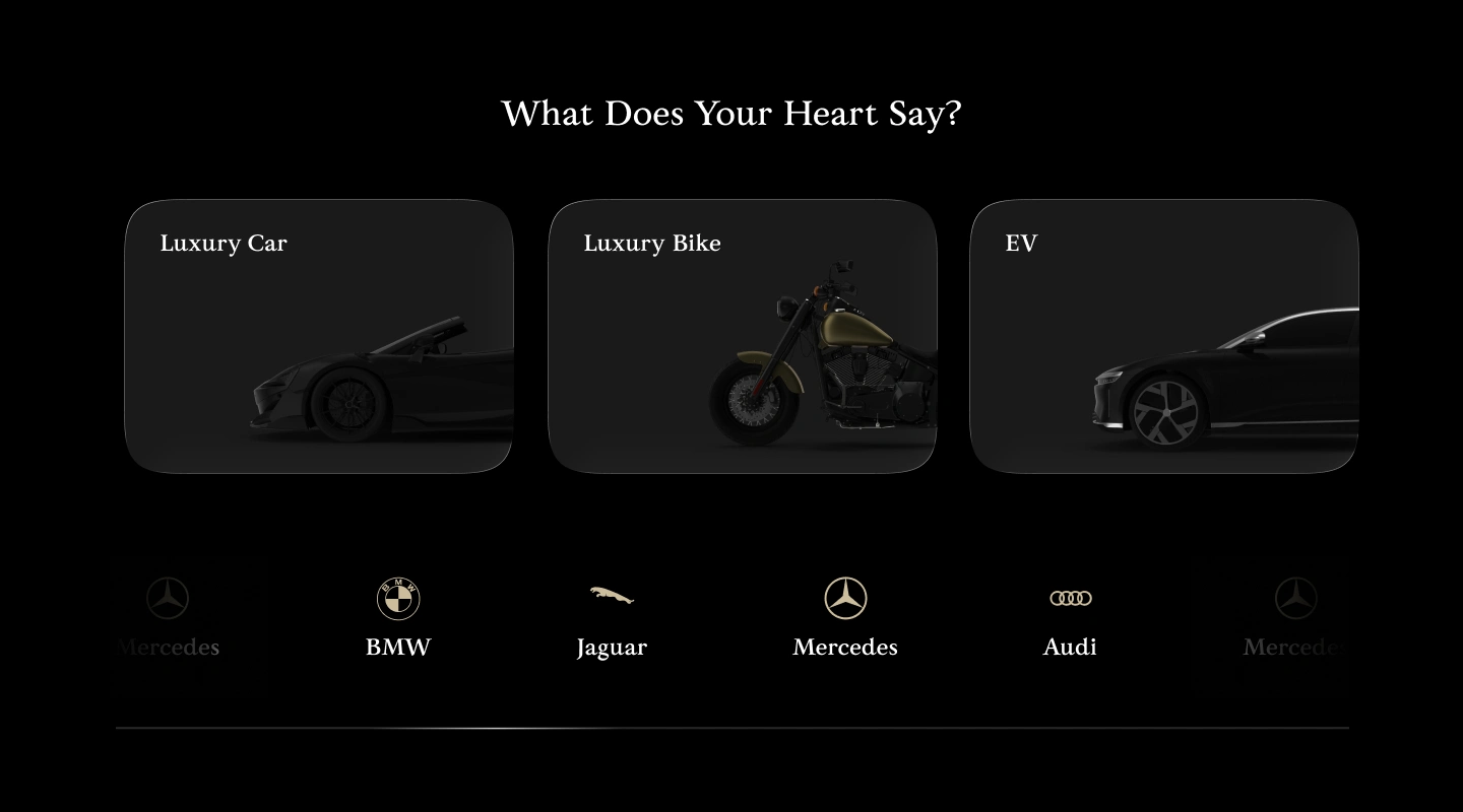
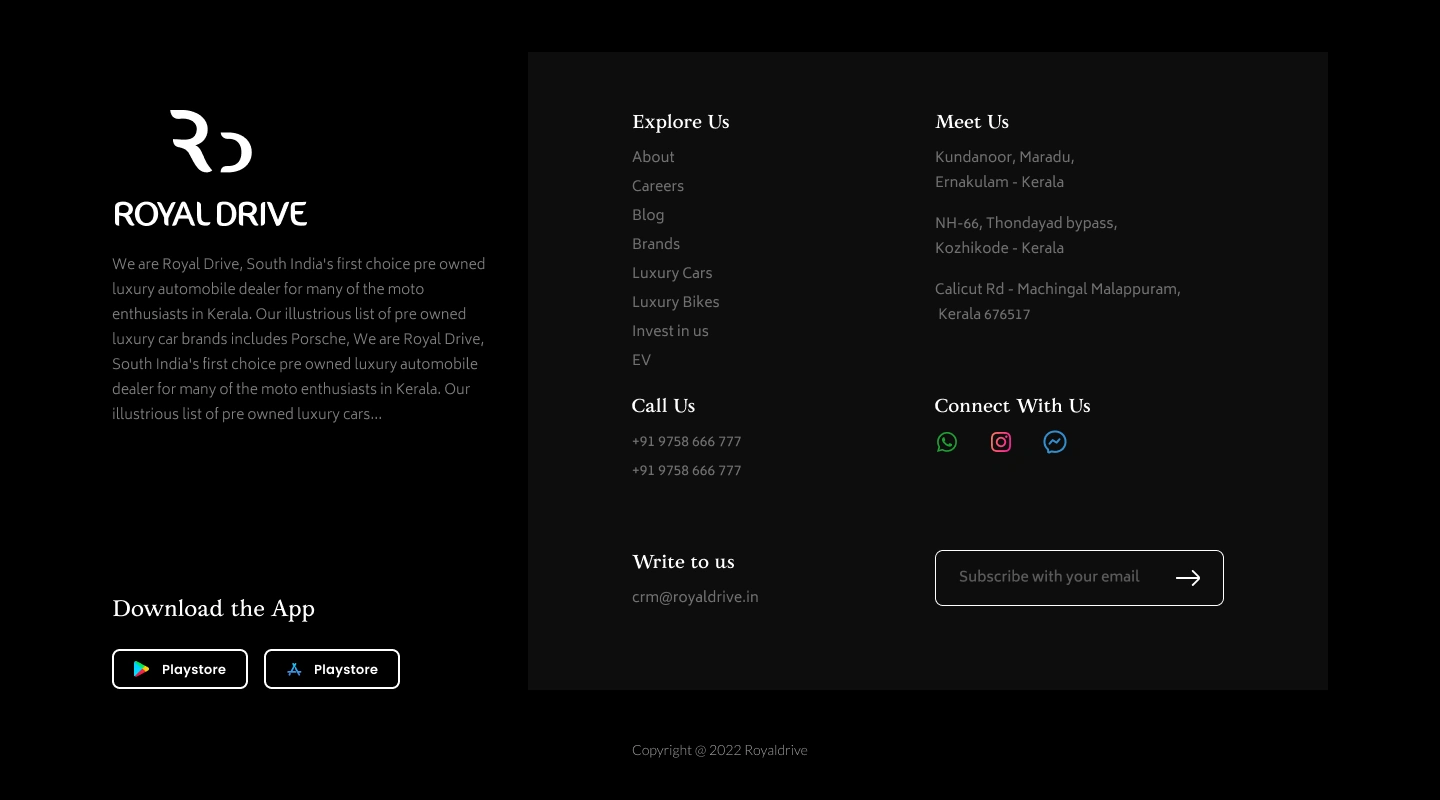
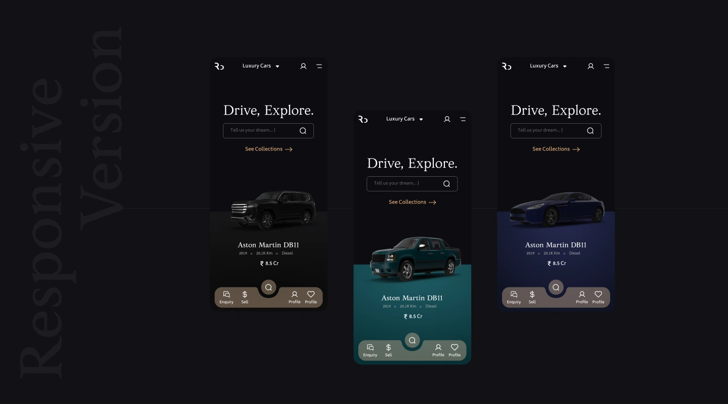
This case study showcases my original design direction for Royal Drive, including the visual system, interface concept, typography, colours, and premium showroom experience designed before implementation.
Like this project
Posted May 22, 2026
Luxury car discovery experience with cinematic visuals, cleaner browsing, and a premium digital showroom feel.
Likes
0
Views
12