Built with Kittl
Wok & Roll: A Flavor Riot in a Box
Gureesha Singh
Wok & Roll — A Flavor Riot in a Box
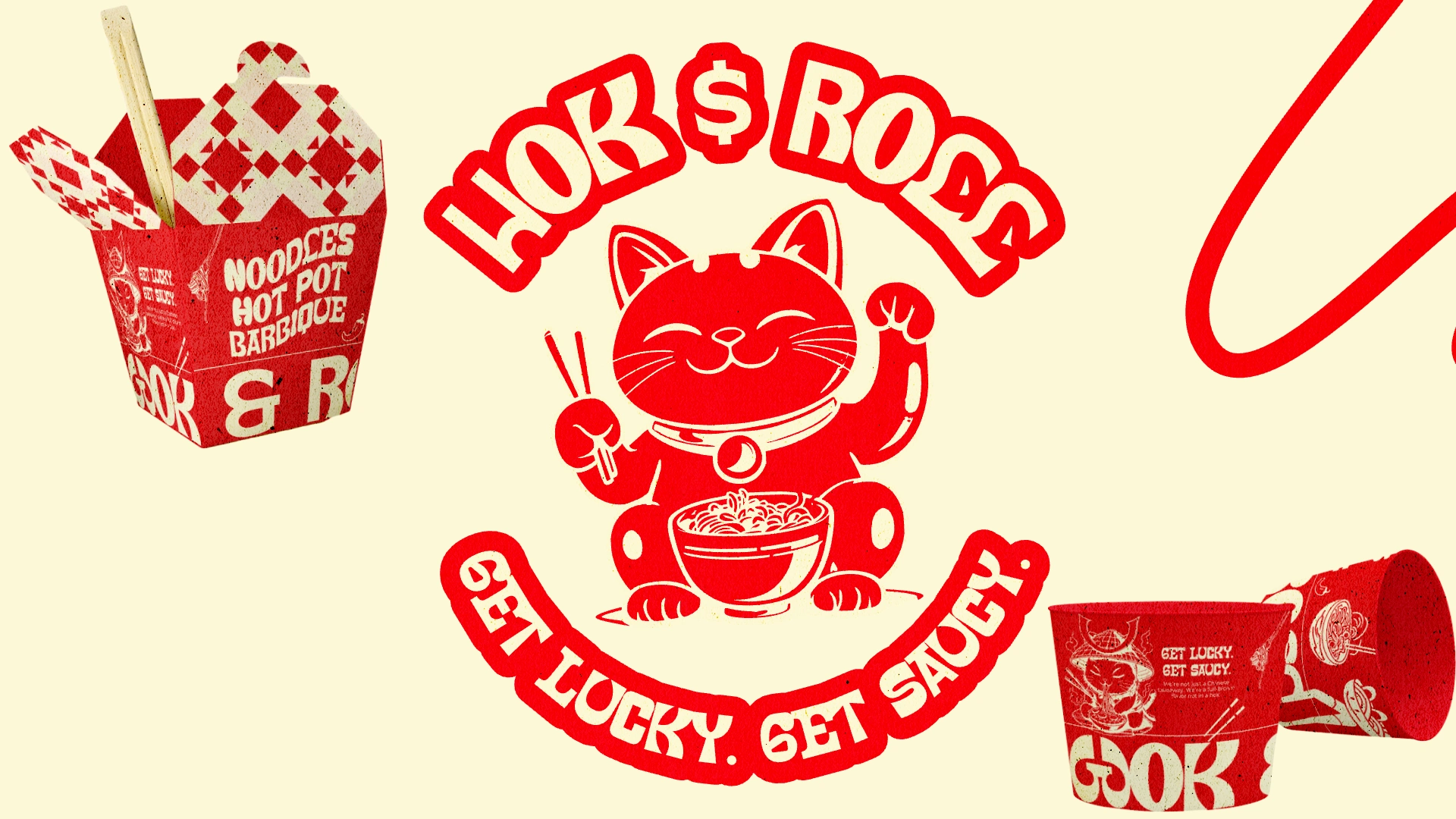
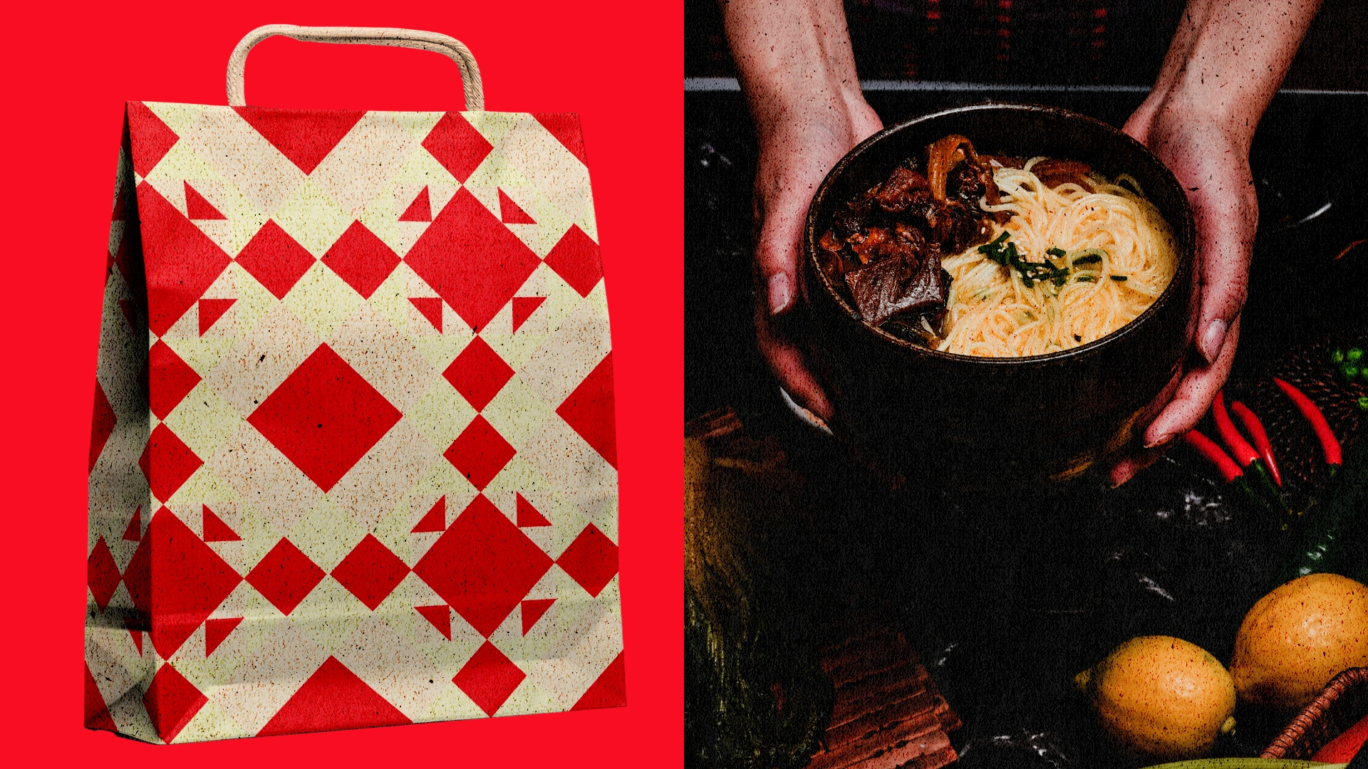
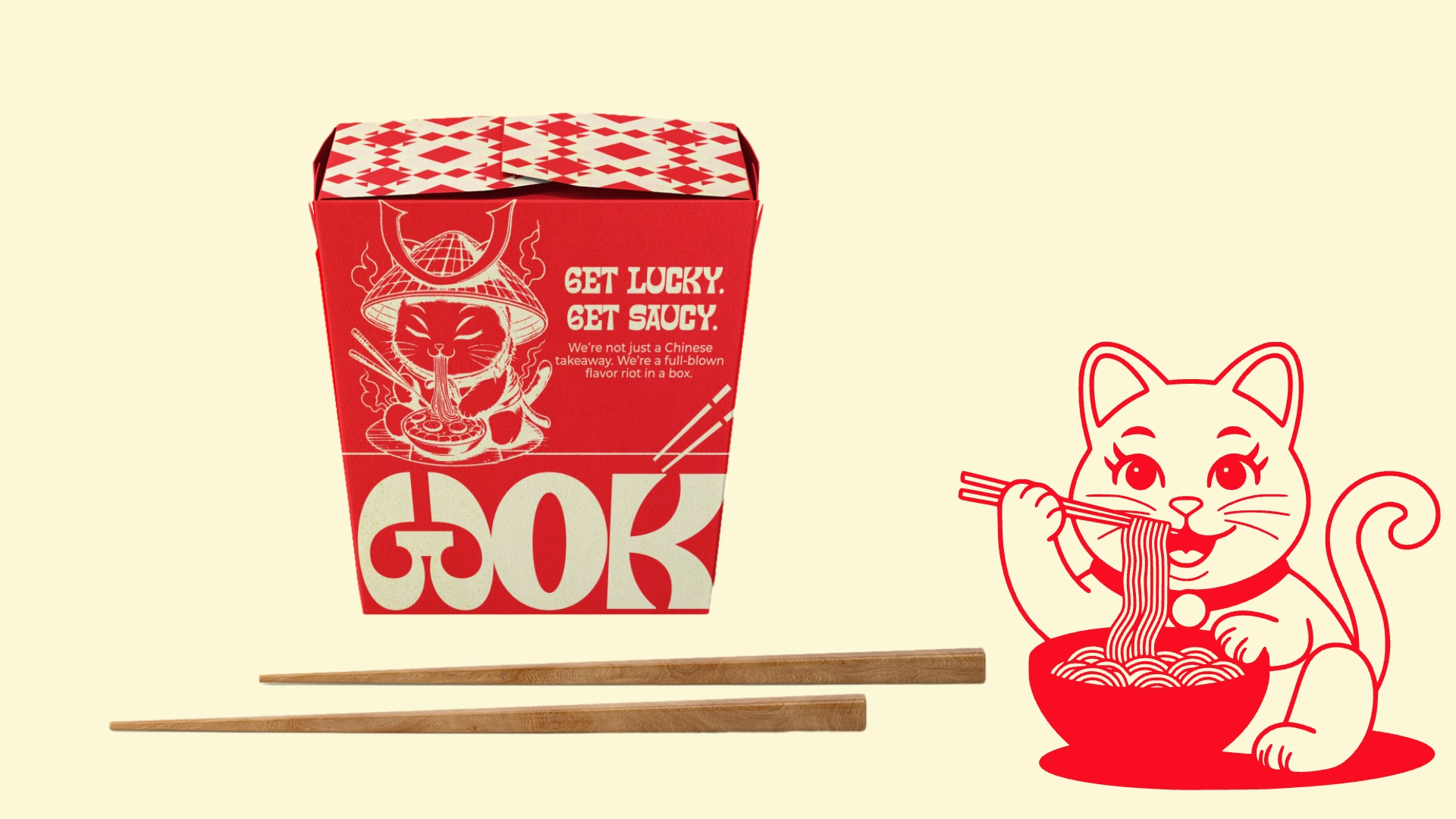
Wok & Roll is a fictional Chinese takeaway brand designed for the bold, the hungry, and the sauce-obsessed. This project reimagines traditional Asian packaging through a rebellious retro lens — combining nostalgia, punky typography, and a feisty maneki-neko mascot. The result? A brand that punches through clutter with spice and swagger.
Scope of Work
Brand Naming & Positioning
Retro-Inspired Visual Identity
Mascot Design & Variations
Tagline Copywriting (“Get Lucky. Get Saucy.”)
Packaging (Noodle Boxes, Dipping Cups, Delivery Bags)
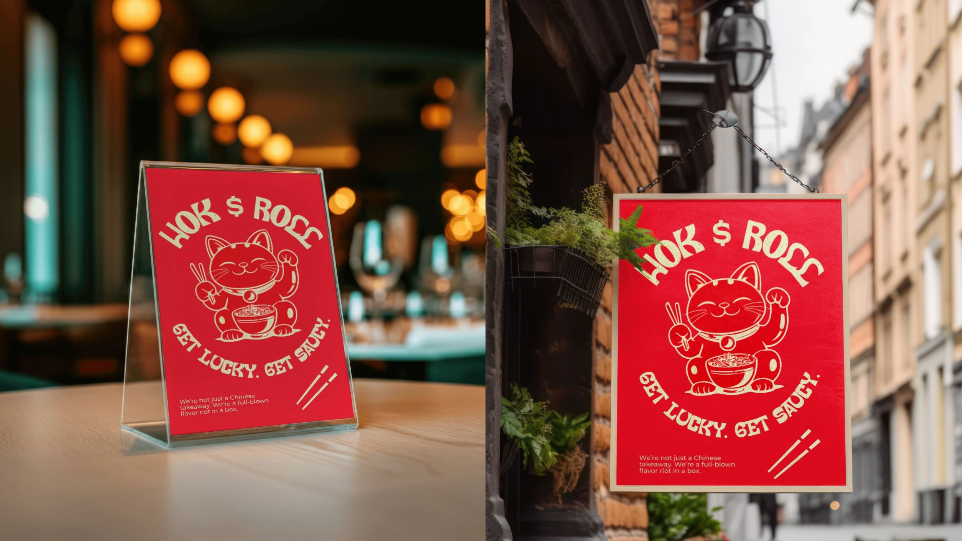
Print Collateral & Signage
Poster Art Direction
Social-Ready Content
Design Concept
Built on a tight red and coconut cream palette, Wok & Roll uses a heavy type system and punchy messaging to evoke a street-style aesthetic with vintage warmth. The hand-drawn mascot — part lucky charm, part noodle warrior — anchors the brand across every surface, from takeout boxes to storefront signage.
Voice & Messaging
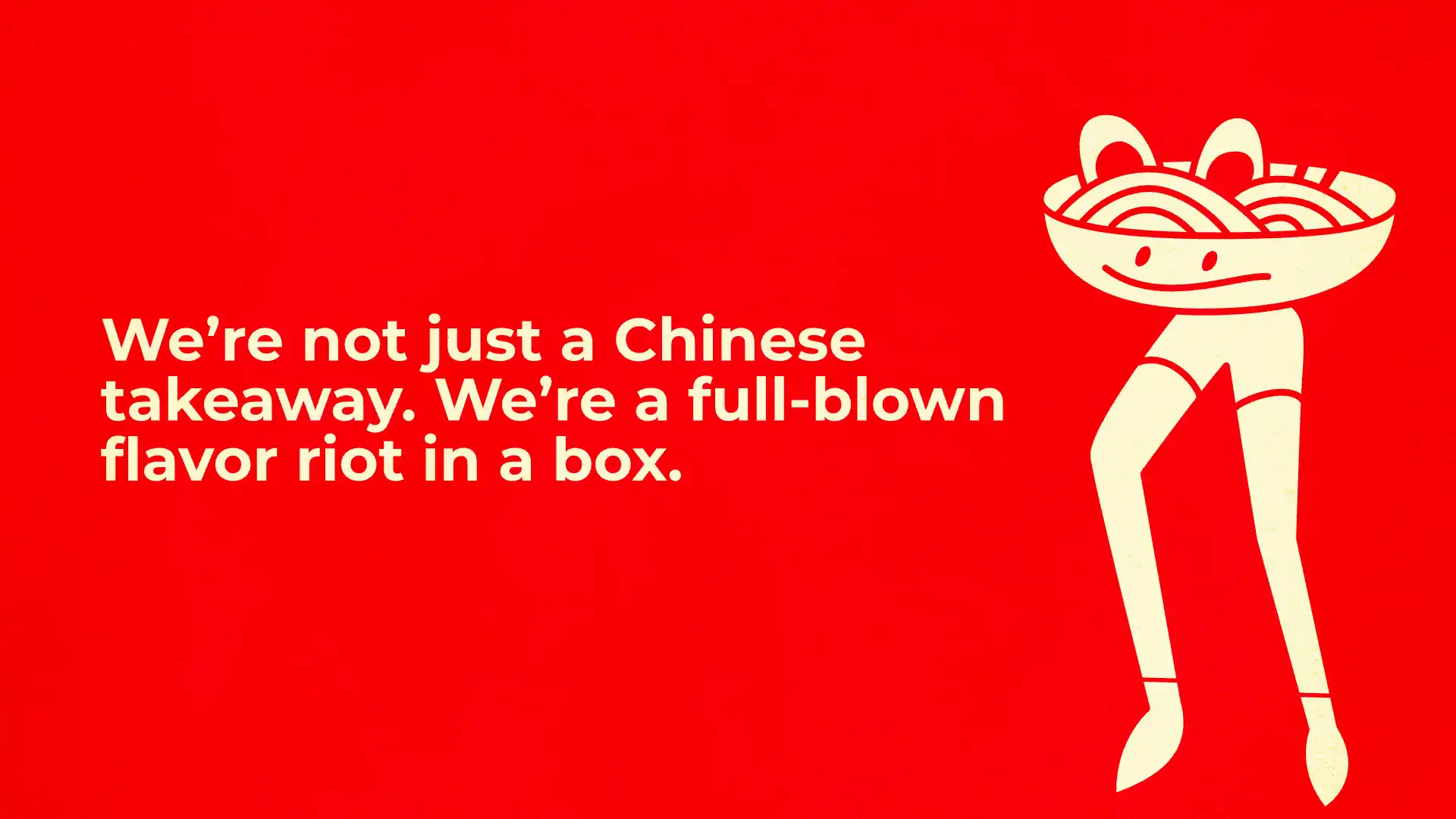
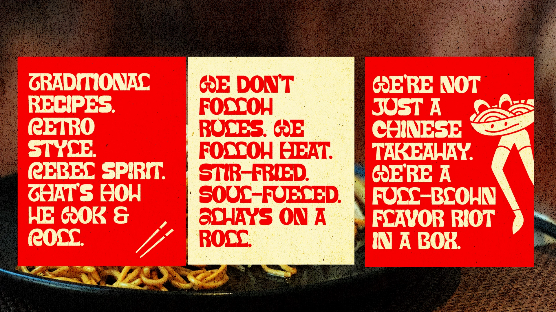
We don’t just serve Chinese food.
We stir-fry moods, roll attitude, and sauce every damn thing.
Traditional recipes. Retro style. Rebel spirit.
That’s how we Wok & Roll.
Outcome
A sticky, sassy, scroll-worthy identity system made to be loved, posted, and ordered again.
Like this project
Posted May 26, 2025
Wok & Roll is a fictional Chinese takeaway brand brought to life through a bold and playful visual identity.
Likes
2
Views
12
Timeline
May 23, 2025 - May 26, 2025