A trip down the memory lane with MEMENTO
Case study: A trip down the memory lane with MEMENTO
Overview
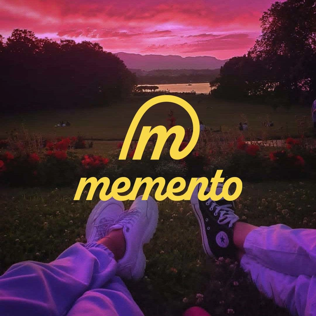
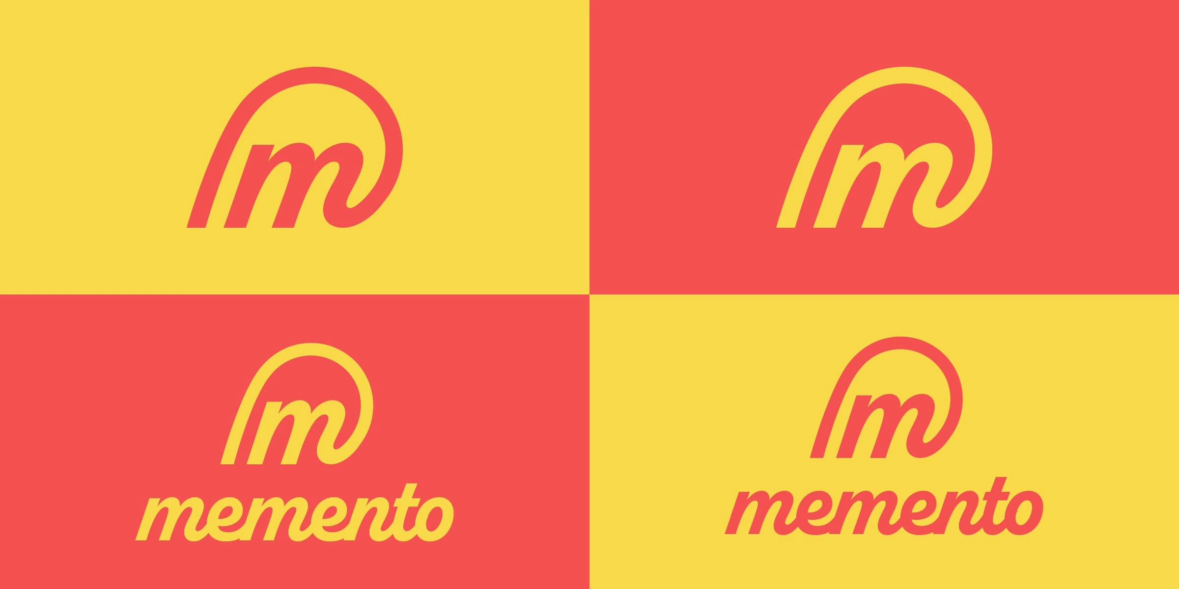
Memento, a social media app required an emotionally resonant logo that conveyed nostalgia and happiness. The app's USP was letting their users relive their cherished memories and even share their happiness with others.
As a designer, it was my job to convey the sense of happiness, positivity, nostalgia, and community with a logo that would act as bridge between the past and the future.
Challenges
Balance nostalgia and modernity.
Creating a design that genuinely resonates emotionally with users and effectively conveys the desired feelings of nostalgia and happiness.
a logo that remains effective and legible across various sizes, backgrounds, and mediums (mobile apps, websites, print materials) while retaining its emotional impact.
Selecting the right colors to evoke nostalgia and happiness without making the logo appear outdated or overly sentimental.
Design Process
1. Research and Conceptualization
Before getting anywhere close to the computer, I had to start mind-mapping on a piece of paper. I had to come up with adjectives and keywords that related to the brand and it's audience. and build from there.
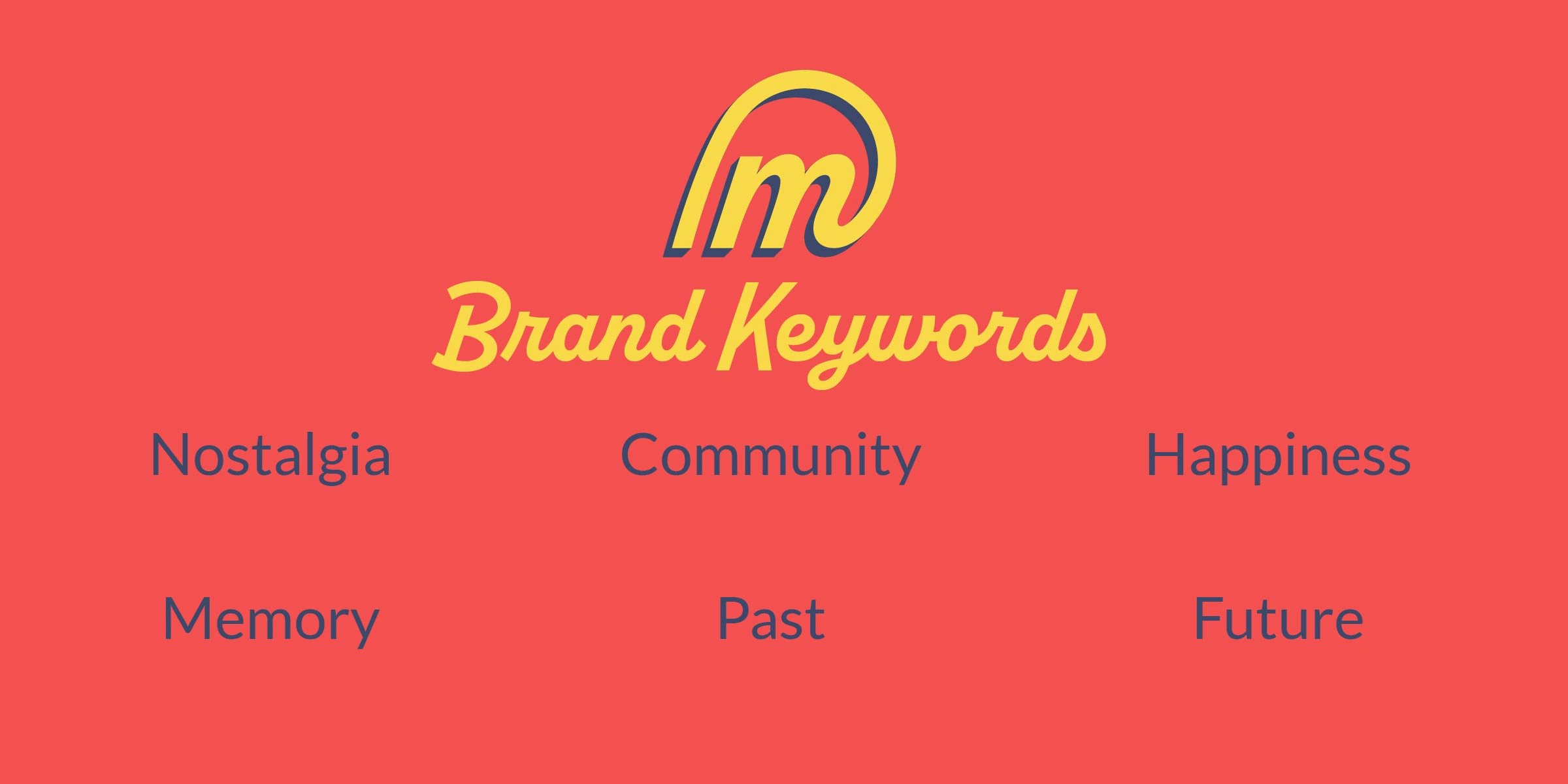
This step would direct the entire creative process.
2. Initial Sketches
Continuing with some clarity, I now knew the basic elements our logo should have
I chose to design a lettermark for Memento, which would make a recognizable icon
I needed to incorporate elements such as curves, circles for the positive aspects of the brand, and a loop to represent reliving the past
3. Digital Drafting
Now it was time to bring the chosen sketch to life

4. Color Palette
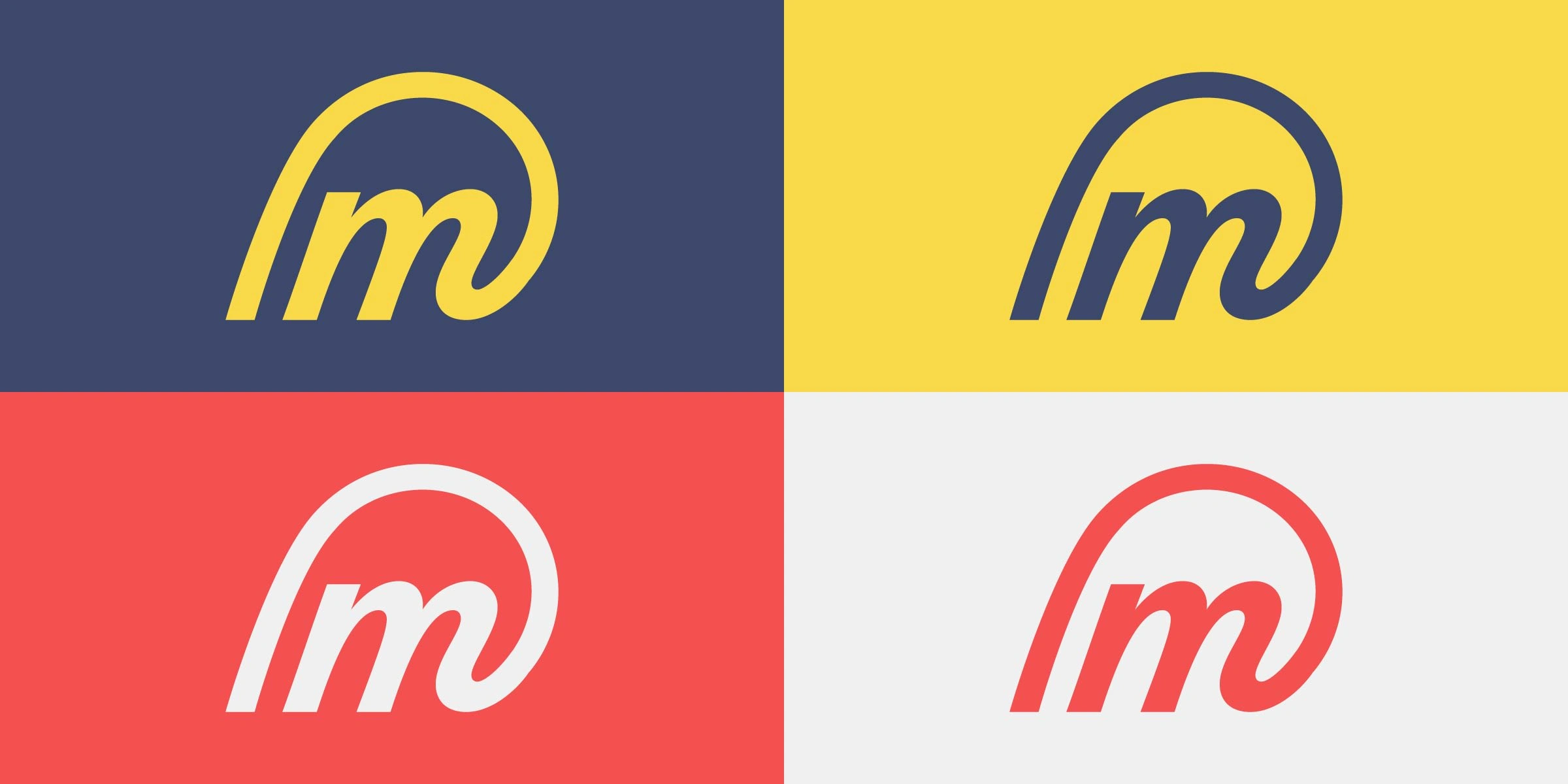
Keeping in mind that Memento is an app, I chose two neutral colors to go with Memento's red and yellow.
Red and Yellow would be accent colors in the app but main colors in the logo.
5. Typography
Like this project
Posted Sep 25, 2023
Logo design for Memento, a social media app that lets you relive your cherished memories.

