Mindful logo for MindfulBites
Case study: Mindful Logo for MindfulBites

Overview
Mindful Bites, a health-conscious brand dedicated to mindful eating, embarked on a journey to develop a mobile app that promotes mindfulness in nutrition choices. The app needed a logo that encapsulated its core values of well-being, awareness, and healthy eating habits in easy and fun way, while resonating with users seeking a mindful eating experience. They also needed a logo that would work across a wide spectrum of mediums and sizes.
Challenge:
Create a logo that represents the app's mission to encourage mindfulness in nutrition.
Ensure the logo aligns with the principles of health, awareness, and nourishment.
Design a logo that stands out in the competitive app market and appeals to individuals seeking healthier eating habits.
Design should be eye-catching, and designed to be used in different sizes.
Design Process
1. Brand Exploration and Ideation
The design journey began with a deep exploration of the brand's values and mission. Mindful Bites' commitment to health, mindfulness, nutrition, and ease of access served as the foundation for our design concepts.
2. Sketching and Concept Development
I initiated the design process by sketching various concepts that visually conveyed mindfulness, nutrition, and the idea of 'taking a bite' with awareness. These sketches formed the basis for our exploration.
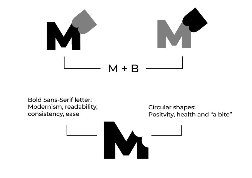
I also brainstormed how the logo would subconsciously signal the brand values to the users' mind through shapes. And connect those shapes back to the brand.
Circular shapes with a Sans Serif letter mark made sense because, it joined the idea of health, positivity, and mindfulness with a modern typeface that also conveyed ease, and consistency to the brand.
3. Digital Drafting
Selected sketch was translated into digital drafts. I experimented with typography, and iconography to strike the perfect balance between health-consciousness and mindfulness.
4.Color Palette
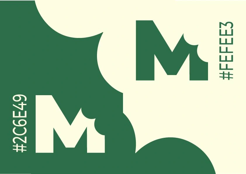
The next step was to choose a color palette for MindulBites that would best represent the brand's vision of healthy and better life and also set it apart from the herd.
5.Typography
Since MindfulBites is an app that has introduced a modern approach to build conscious and healthy life, It made sense to choose a modern sans serif typeface. By using Montserrat Bold in the Icon and Montserrat medium as the logoType we achieve this goal and also nudge the brand to adapt a easier-to-read font in their app UI.


Final results

Like this project
Posted Sep 13, 2023
MindfulBites is an app that enables its users embrace better eating habits by encouraging them to make conscious dietary decisions.
Likes
0
Views
8

