Minimalist Streetwear Concept

Muhammad Bilal

Minimalist Streetwear Concept
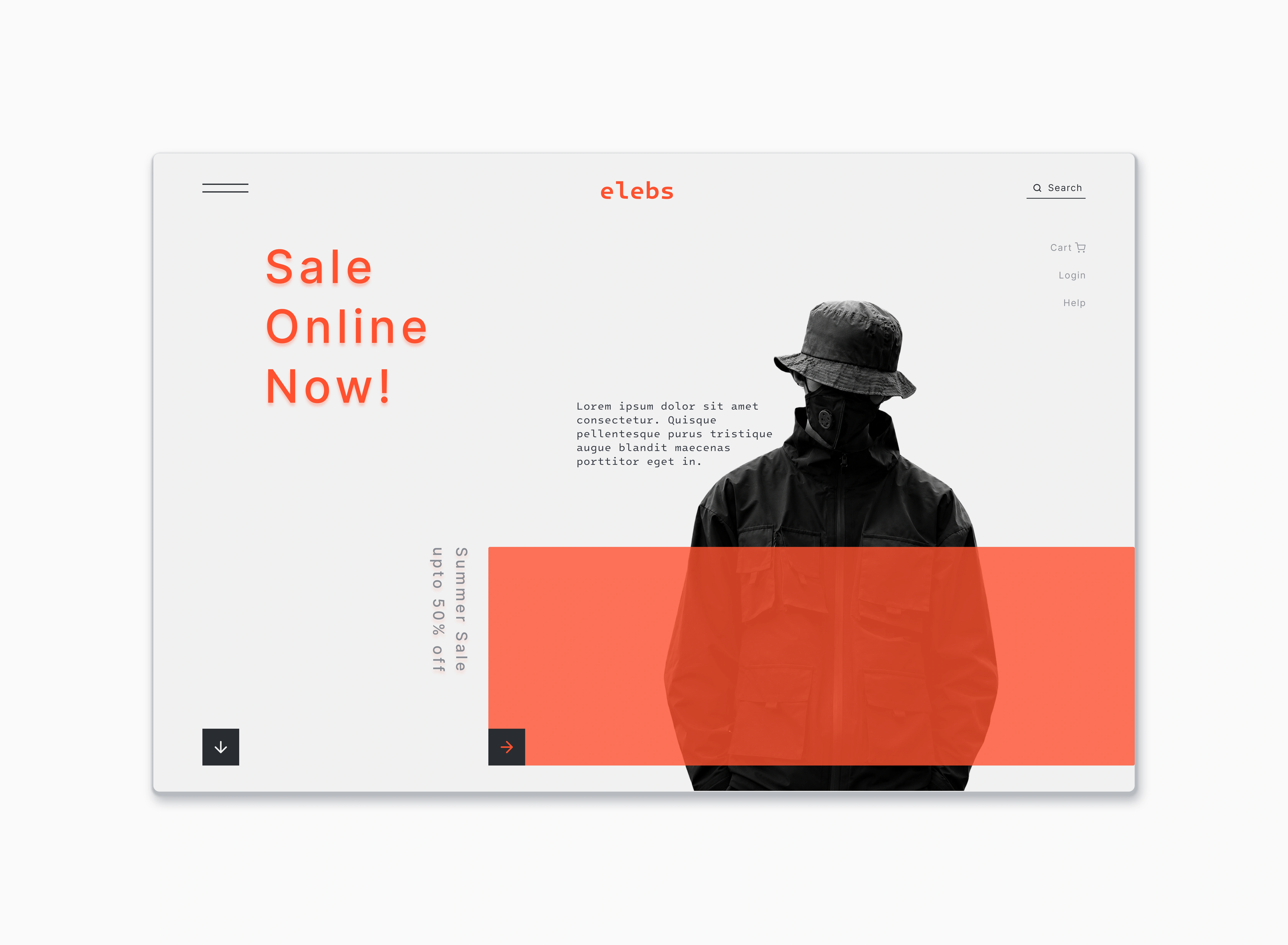
The core objective behind this concept for elebs was to challenge standard retail e-commerce layouts by utilizing aggressive asymmetry, negative space, and editorial typography to create a premium, brand-forward digital experience.
Vibrant Coral Accent & Brutalist Contrasts: The interface uses an off-white background to establish an editorial feel, completely dominated by an intentional coral red accent color. This hue bridges the primary typography ("Sale Online Now!"), brand mark, and a large horizontal banner overlay to guide the user's focus immediately toward seasonal promotions.
Layered Visual Depth: By overlapping a solid coral band across a high-contrast, black-and-white greyscale model photograph, the layout creates an architectural, multi-layered depth that mirrors contemporary streetwear lookbooks.
Asymmetric Typography Hierarchy: The primary typography intentionally experiments with tracking and vertical text strings (e.g., "Summer Sale upto 50% off"). This forces the user to interact with the page sequentially rather than scanning it in a standard, predictable patterns.
Stripped-Back Utility Navigation: Interface utilities—such as the Hamburger menu, Search bar, and minimal action links (Cart, Login, Help)—are pushed to the absolute safe margins of the viewport. This maximizes the breathing room for the central campaign graphics while keeping primary conversion workflows entirely accessible.
Minimalist Interactive Signposts: Micro-interactions are subtly introduced via low-profile, dark-filled block arrows at the base of the layout, serving as clear visual anchors that indicate horizontal sliding and vertical scroll opportunities.
Like this project
Posted Aug 31, 2026