Financial Dashboard

Muhammad Bilal

Financial Dashboard — Mastering Wealth with Elegant Data Visualization
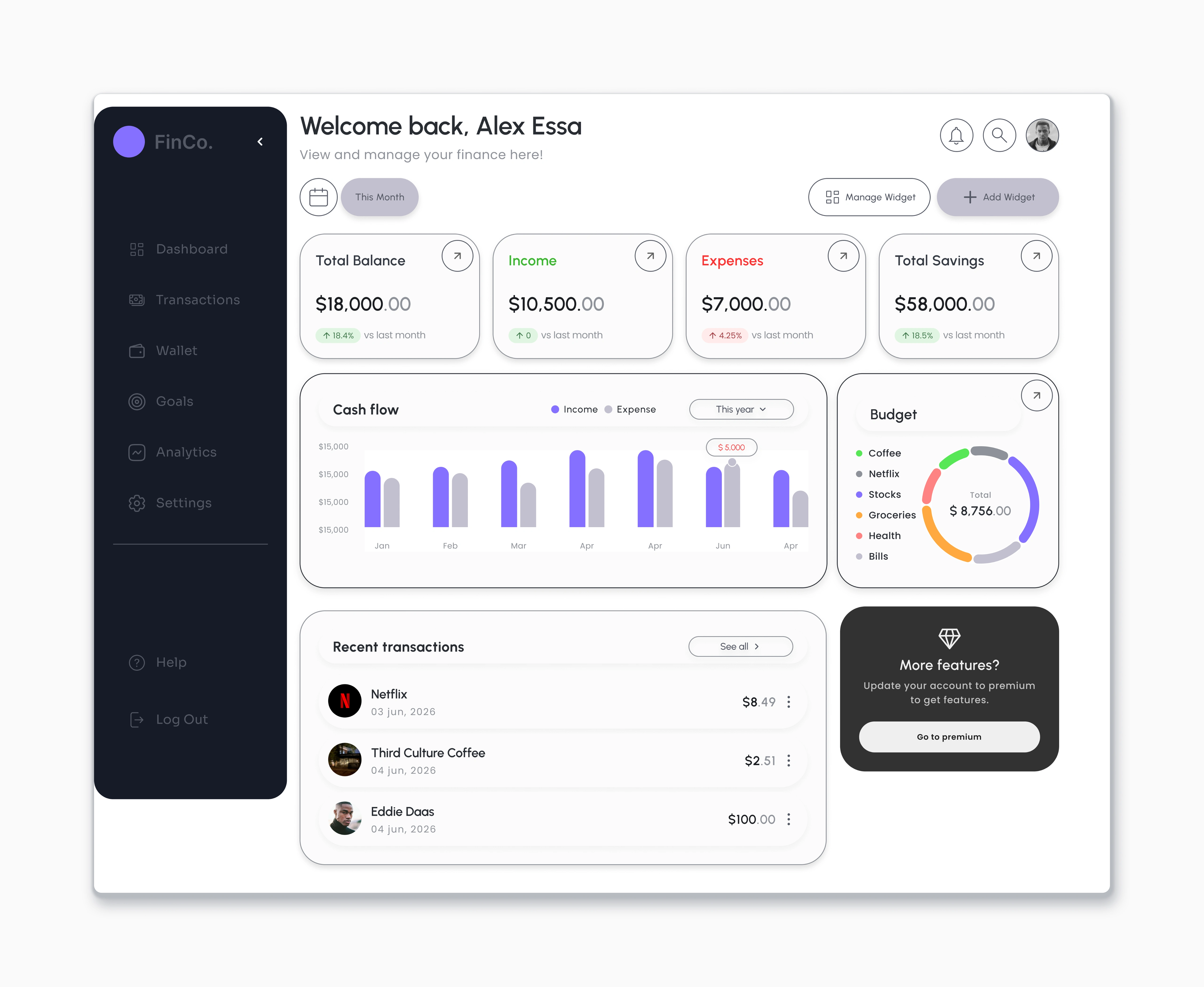
For this case study project, I focused on designing a sophisticated SaaS financial management dashboard named FinCo. The primary design challenge was to synthesize complex personal accounting data into an intuitive, high-converting desktop interface for the modern investor.
Prototyping & Flow Analysis: By integrating interactive prototyping for this screen, my goal was to simulate a seamless navigation experience. I prioritized micro-interactions within the widget library and optimized the "Go to premium" flow, validating how dynamic data transitions improve user retention.
Structural Analysis: The interface relies on a clean, light-mode background anchored by a contrasting dark left navigation menu. This ensures maximum legibility and strict visual separation between system utilities and primary data metrics. The information architecture is organized into distinct, modular cards to prevent cognitive overload.
Key Design Features:
Color-Coded Kpi Taxonomy: The main financial metrics (Balance, Income, Expenses, Savings) utilize specific accent colors. This enables instant categorical scanning, allowing users to grasp their financial pulse in milliseconds.
Aggregated Cash Flow Chart: A custom multi-bar chart breaks down yearly income versus expenses. This aggregation streamlines trend analysis by providing an immediate visual comparison across twelve months.
Doughnut Budget Matrix: A multi-layered doughnut chart organizes dynamic budget allocation (Coffee, Netflix, Stocks, etc.). It calculates total dynamic spending alongside fixed percentage breakdowns for efficient forecasting.
Premium Conversion Widget: An isolated, high-contrast dark box frames the "Go to premium" call to action. By using subtle diamond iconography, it establishes a premium visual hierarchy to drive account upgrades.
Like this project