Healthcare2U Brochure Design
M Usman
Direct Primary Care Plus Brochure Design
Direct Primary Care Plus Brochure Design
Healthcare2U – Direct Primary Care Plus Brochure Design
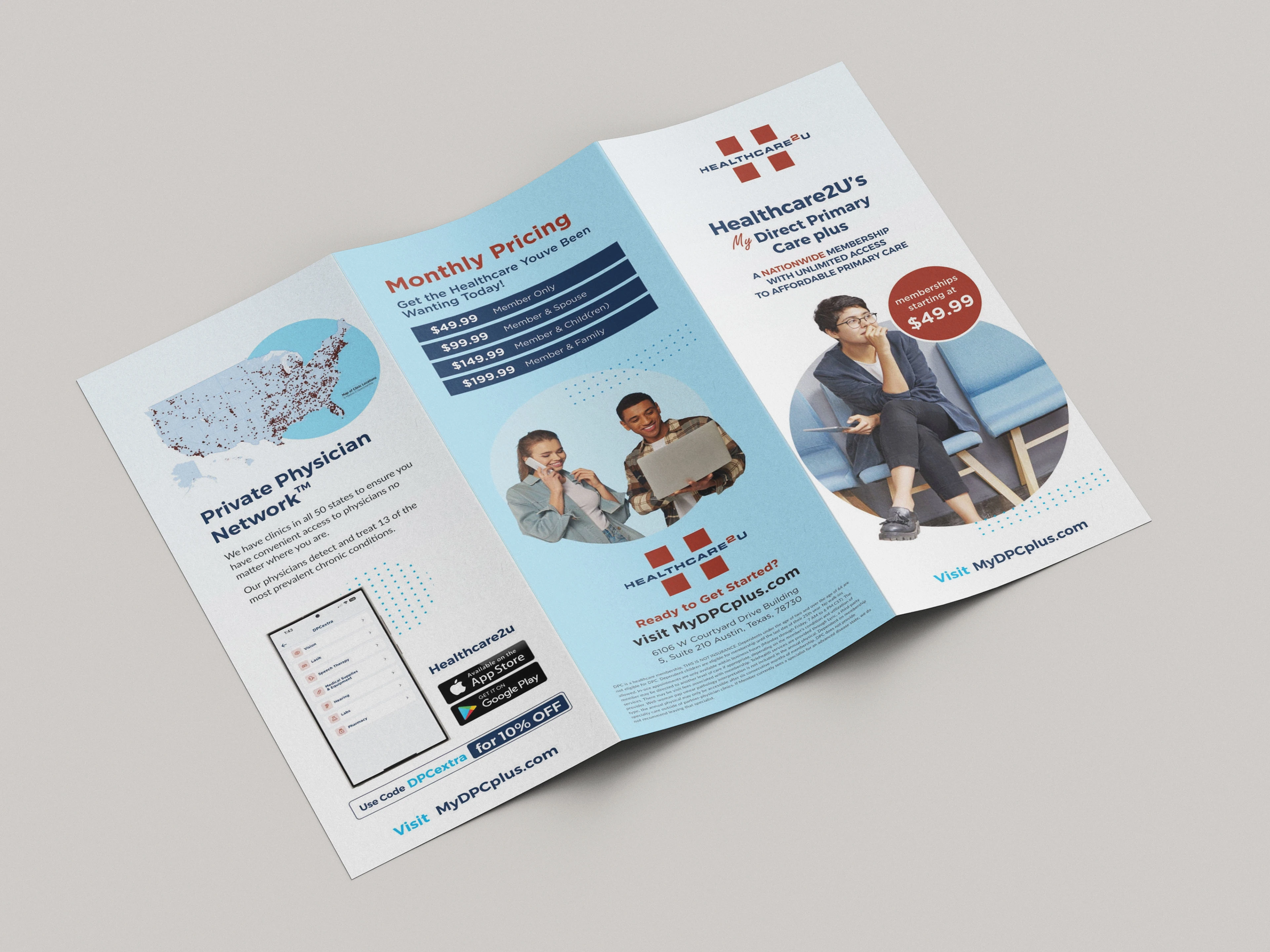
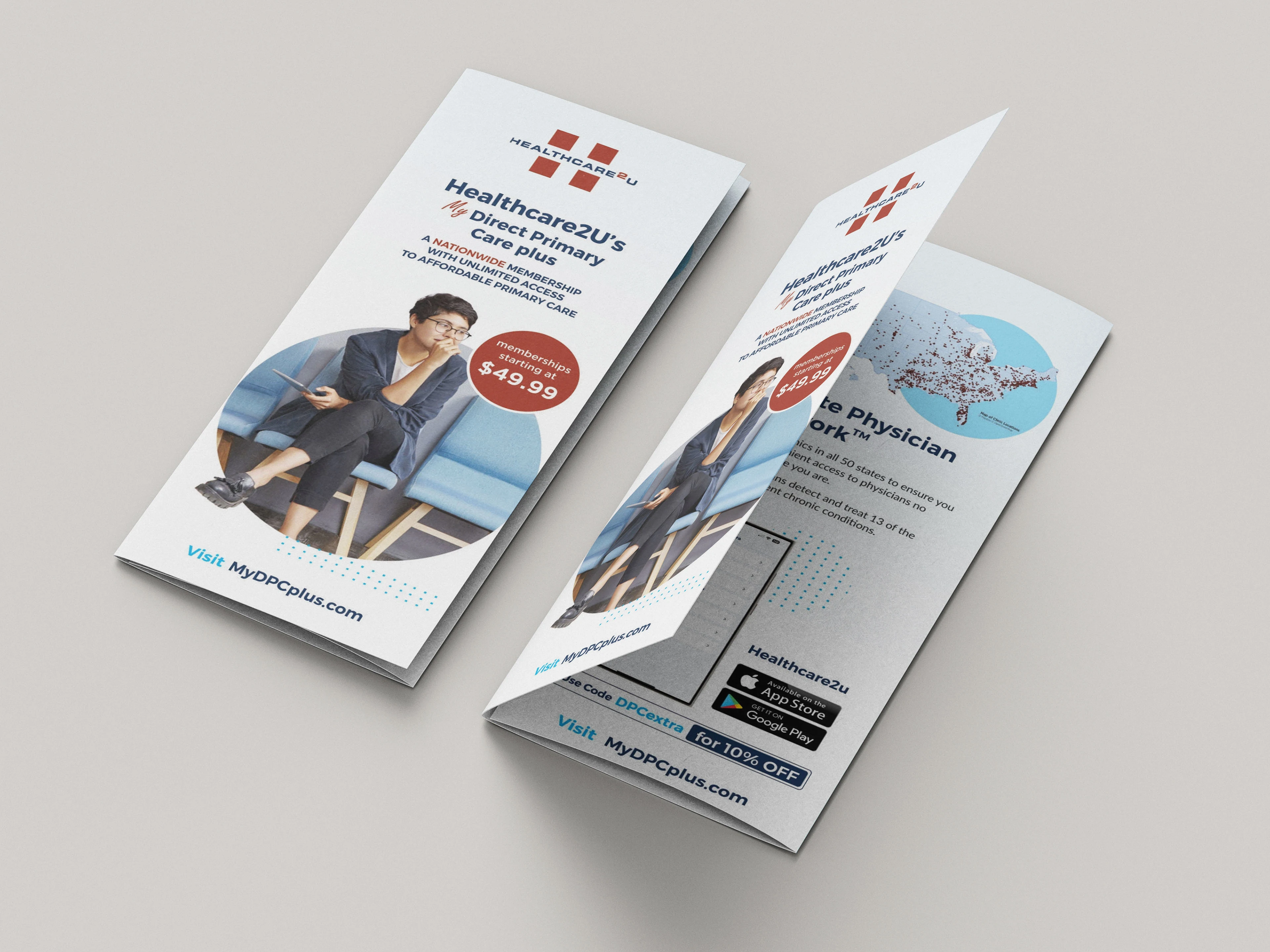
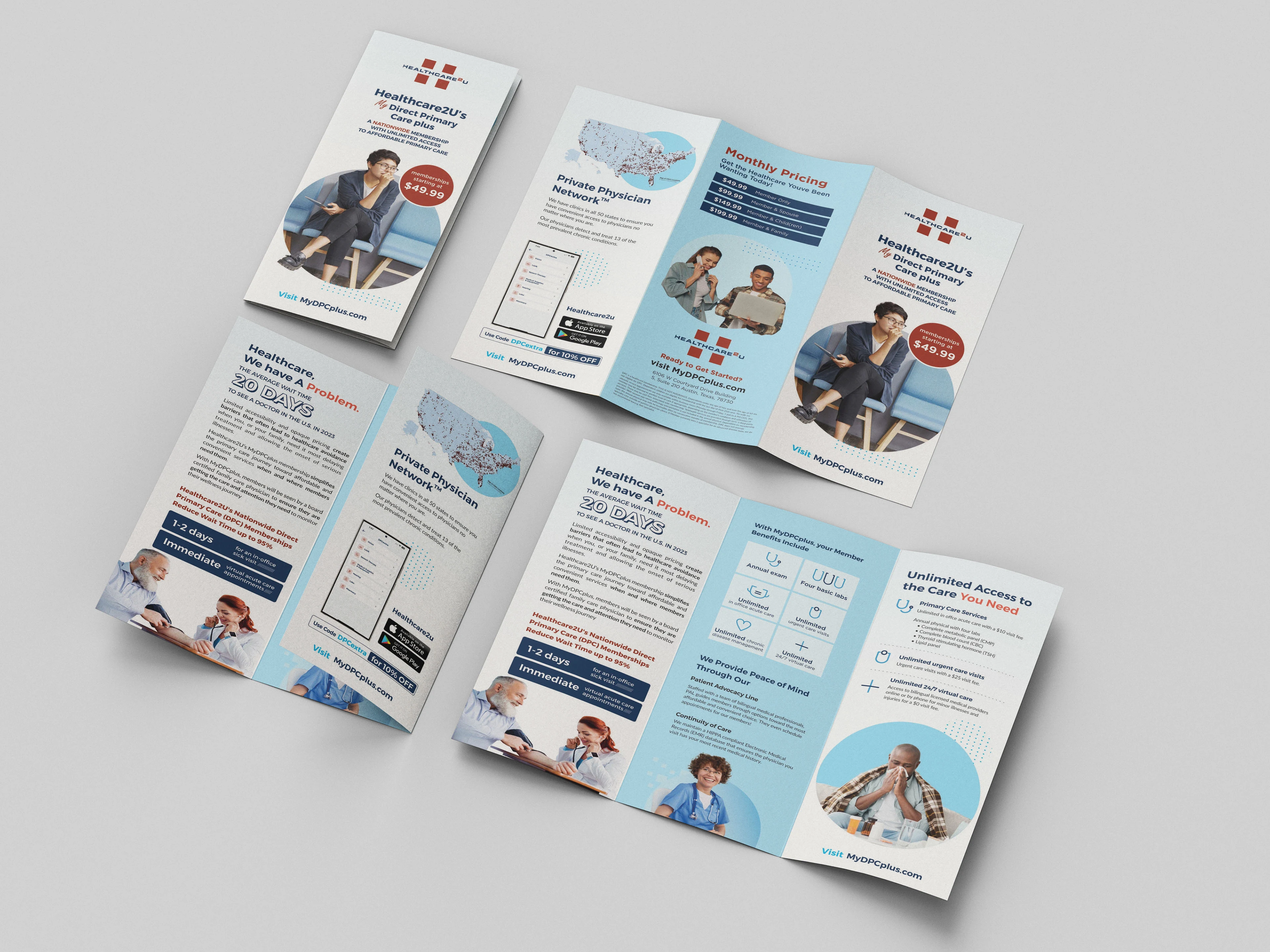
Healthcare2U needed a tri-fold brochure to promote their affordable nationwide healthcare membership program. The challenge was to communicate a complex healthcare model in a way that felt clear, trustworthy, and visually engaging— while staying within a corporate yet approachable tone.
The layout had to deliver:
Tiered pricing clearly for multiple audience segments (individuals, couples, families)
Benefits of the private physician network
App download CTA + membership signup funnel
Visual credibility for both digital and print formats
Design Challenges:
Presenting detailed information without overwhelming the reader
Aligning design with an existing brand while refreshing the visual feel
Structuring dense medical content in a brochure-size layout with good readability.
Creative Approach:
We used a clean, structured grid layout and color blocks to separate sections while guiding the user through key information visually. Brand red and healthcare blue tones were used strategically for emphasis, while icons and rounded photography created a more friendly, personal connection. Typography was chosen to balance professionalism with readability.
The end result was a print-ready, scalable brochure that now supports both sales reps and online inquiries for Healthcare2U’s membership plans across the US.
Like this project
Posted May 22, 2025
Tri-fold brochure design for a nationwide healthcare brand, balancing clarity, trust, and visual hierarchy for print and digital marketing use.