Slide UI Design System Made Accessible
Orezi Mena

🖥️ Welcome Screen
A simple, bold hero message that captures the purpose of the system — making design accessible. The welcome screen sets the tone for the UI library experience.
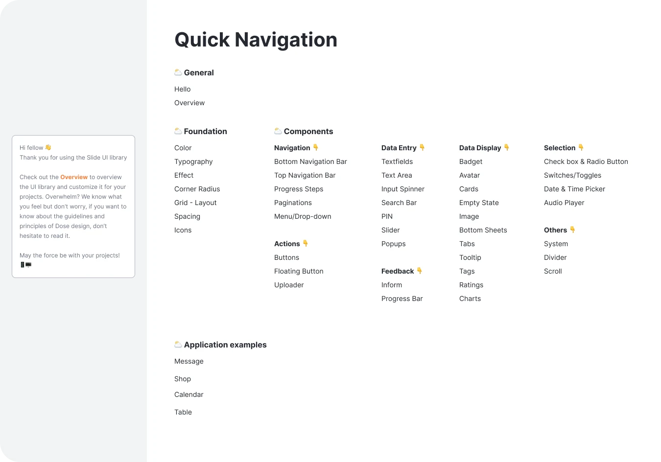
🧭 Quick Navigation
An organized index of all foundational and component categories in the library, designed for clarity and fast access. This navigation is the backbone of the system’s usability.
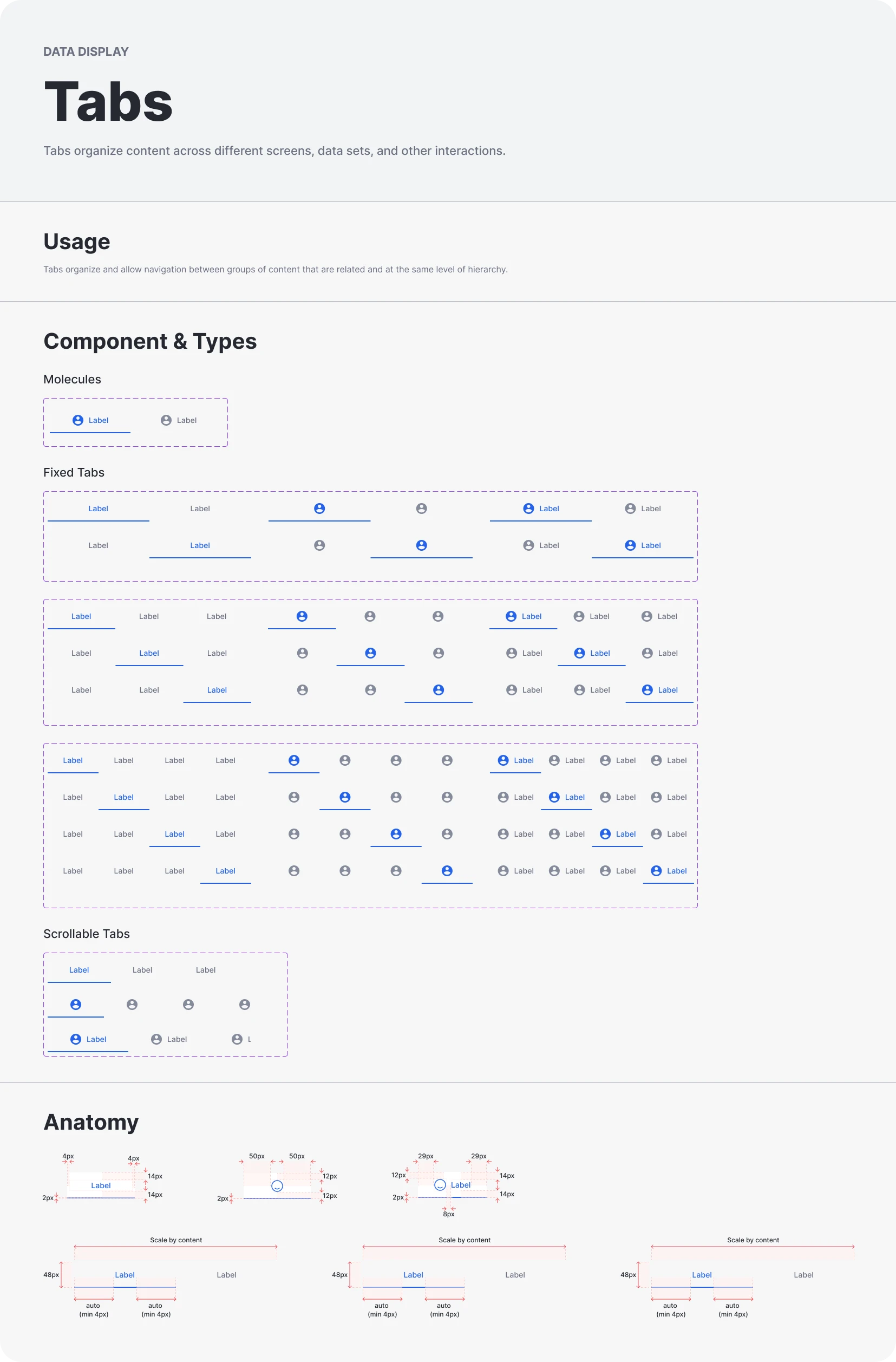
🗂️ Tabs Component
Comprehensive documentation for Tabs — fixed and scrollable variations — with labeled examples and spacing anatomy. Each layout variant is clearly presented for implementation ease.
📏 Spacing Guidelines
Responsive spacing rules across desktop, tablet, and mobile. This guide helps maintain vertical rhythm and content structure consistency throughout the design.
🧱 Corner Radius System
Standardized corner radius rules for semi-rounded, rounded, and sharp UI styles. Defined radius values promote visual consistency and easy implementation across cards, buttons, and input fields.
📌 Typography
We defined a clear, scalable typography system using the Inter typeface with consistent hierarchy and weights across titles, headers, body, and labels. This ensures visual harmony and legibility across devices.
Like this project
Posted Jun 4, 2025
Built a modern, accessible UI design system from the ground up—complete with typography, spacing, components, and visual guidelines.