Finance SaaS Dashboard
Cansaas Agency
Overview
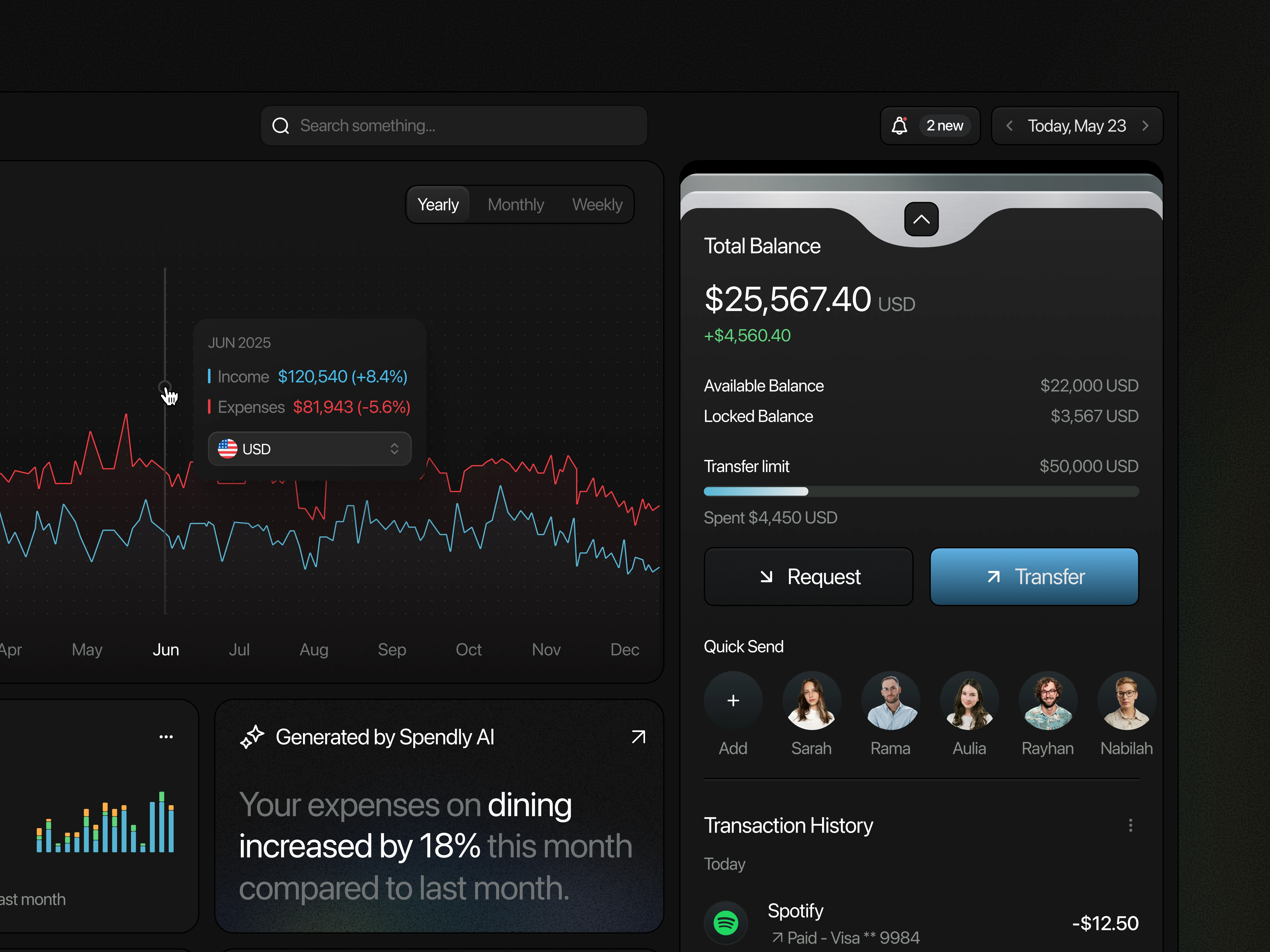
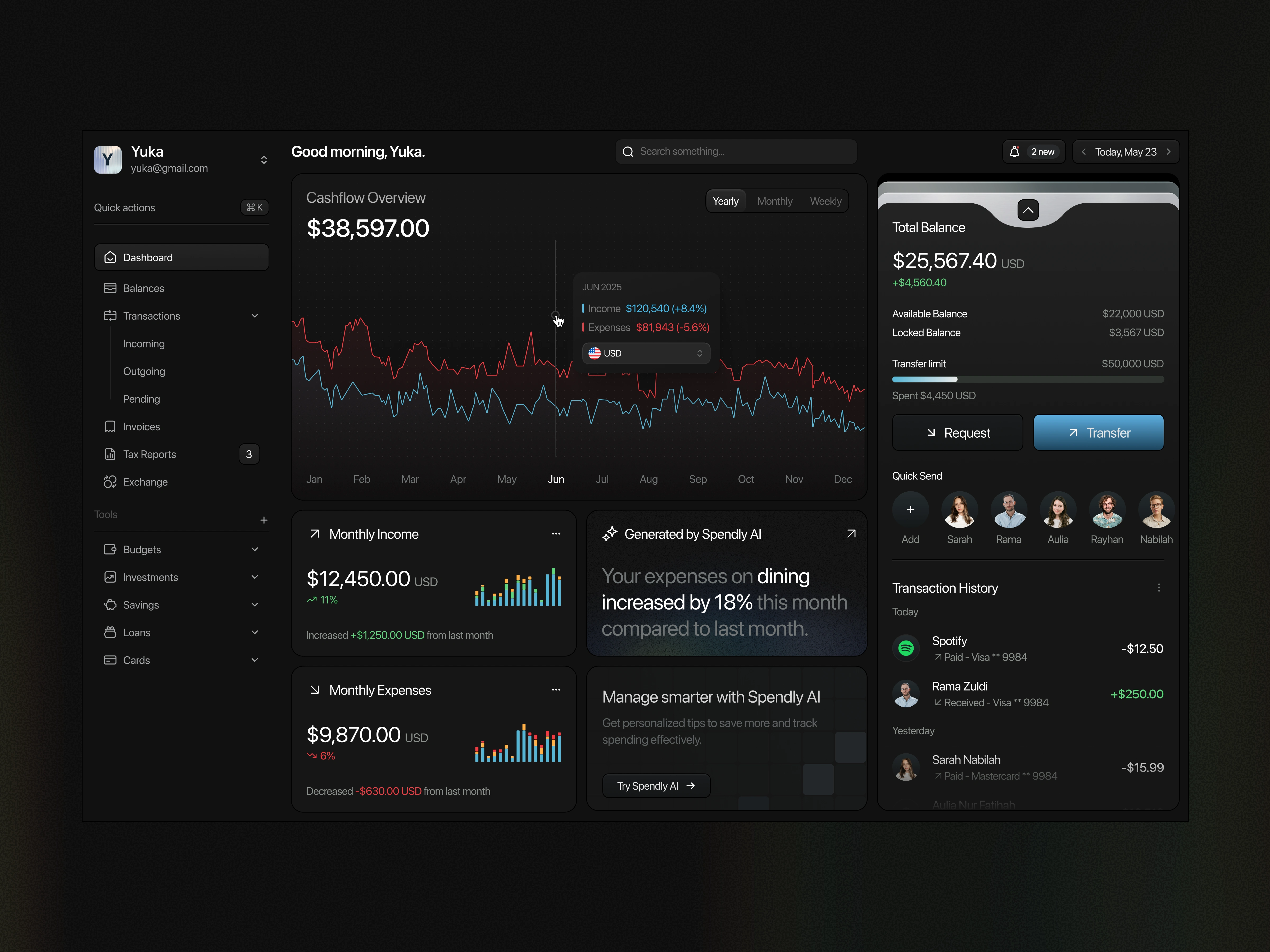
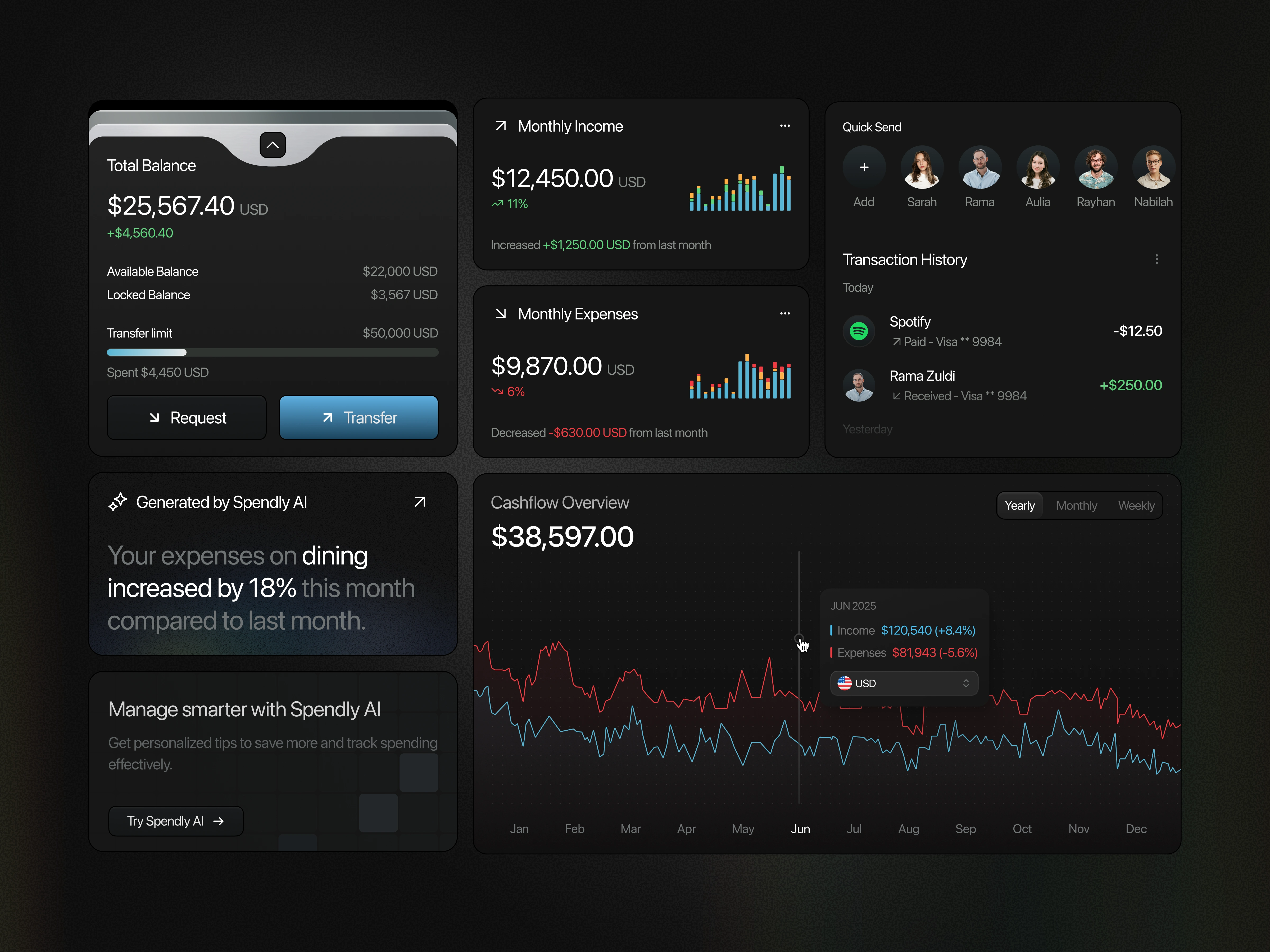
The Spendly Finance Dashboard is designed to empower users with real-time financial visibility. With its sleek dark-mode interface, it delivers clear insights into cash flow, balances, income, expenses, and AI-generated spending patterns all in one place. The layout is intentionally minimal yet data-rich, allowing users to manage their money without distraction while maintaining a modern, professional aesthetic.
The Problem
Traditional finance dashboards often overwhelm users with complex charts, scattered data, and hidden transactions. This lack of clarity forces individuals to manually track spending, compare balances across multiple accounts, and interpret raw numbers without context. As a result, users struggle to gain meaningful insights into their financial health.
The Solution
This dashboard introduces intuitive visualizations, categorized expenses, and AI-driven insights. For example, income and expenses are represented with clear trendlines and comparative metrics, while Spendly AI highlights unusual spending behavior, such as an 18% increase in dining expenses. Transaction history, balance overviews, and quick transfer actions are seamlessly integrated, ensuring visibility of financial status at all times. This aligns with Jakob Nielsen’s usability heuristic Visibility of System Status by keeping users constantly informed through clear, immediate feedback.
Key Takeaways
By blending clarity, automation, and AI assistance, Spendly’s dashboard makes financial management more actionable. It minimizes cognitive effort with visual cues, helps users quickly detect anomalies, and offers proactive suggestions for smarter decisions. This design case demonstrates how user-centered finance dashboards can move beyond simple tracking to become strategic tools for personal financial growth.
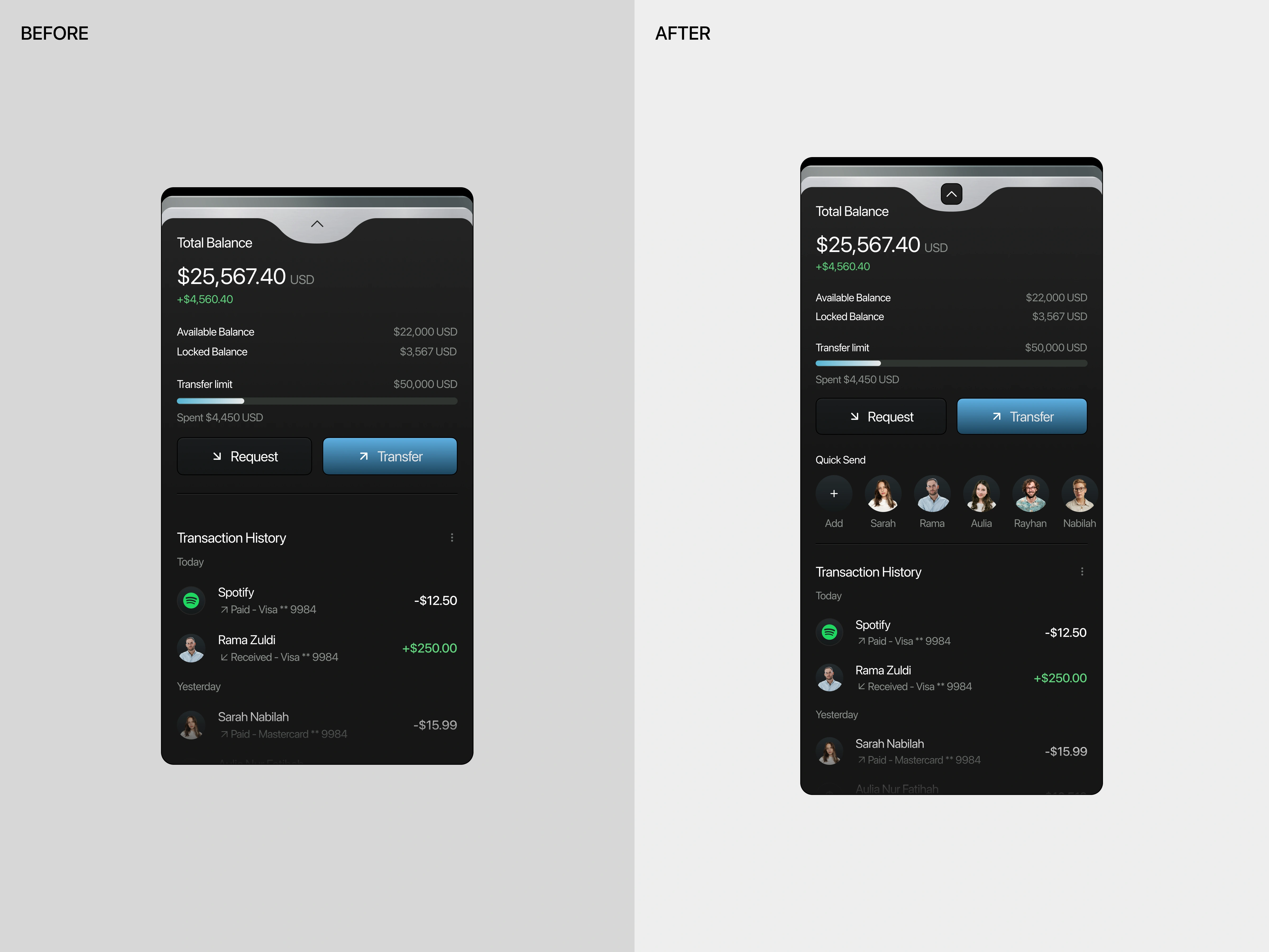
Flexibility & Efficiency of Use
Interfaces should cater to both novice and expert users, allowing frequent actions to be performed more quickly. Shortcuts or streamlined options increase efficiency without removing full functionality.
In the initial version, users had to go through the full transfer flow (choose recipient, enter details, confirm) every time they wanted to send money, which added friction even for frequent transactions. In the improved version, the Quick Send section provides direct access to recent or favorite recipients, allowing users to complete common transactions with fewer steps. This increases efficiency and convenience, especially for experienced users who regularly send money to the same people.
(src: Jakob Nielsen – 10 Usability Heuristics for User Interface Design)
Like this project
Posted Sep 9, 2025
Designed Spendly's finance dashboard for real-time financial insights and AI-driven spending patterns.
Likes
0
Views
13
Clients
Spendly