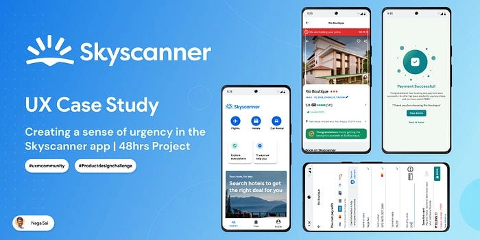
Creating a sense of urgency | Skyscanner app | Product Design
Imagine you’re planning a last-minute weekend getaway to a beautiful coastal town. You’ve been dreaming about this trip for weeks and are finally ready to book your hotel. But as you start browsing through the options, you realize that most of the good hotels are fully booked. You start to panic as you realize that you may have to settle for a subpar hotel or even worse, not go on the trip at all. This is a feeling that many of us have experienced at one point or another — the sense of urgency to book a hotel before it’s too late. In this case, study, how I tackled this problem during a product design hackathon and developed a solution that helps users book their desired hotels before they’re gone.
📹A glimpse of Final Solution
To showcase the effectiveness of the solution, I’ve included a prototype below. Before delving into the detailed case study, I wanted to provide an initial glimpse of the key features and functionalities that I’ve developed by the end to address the problem of creating a sense of urgency to book hotels. As you can see, my prototype includes a push notification system to alert users of upcoming hotel bookings and a streamlined booking process.
The Start⏱
Our mentor Anudeep kicked off the 48-hour product design challenge on Friday evening, with 180+ UX design students participating. Our team, consisting of 10 members, was tasked with focusing on the problems of hotel bookings within a larger app The Skyscanner. Each member was assigned their own specific problem to tackle within this application.
This format mimicked real-world product design team dynamics, where individuals work on their own tasks while also collaborating with their group.
Throughout the challenge, I was able to rely on my team members for support and guidance. I also lent my expertise to help them with their individual tasks. Together, I was able to create a cohesive solution that addressed the problem of creating a sense of urgency for hotel bookings.
Topic selection🤔
As a member of Team G-2050, we were assigned to work on the Skyscanner app for the 48-hour product design challenge. We were given a list of problems to choose from but were required to work individually while still utilizing the help of our group members. The goal was to select a problem statement that would not be chosen by other members of the group.
“A scene of confusion”
I was feeling a bit uncertain when I first began my project for the hackathon. My team had already started working on their tasks, but I found myself struggling to find a problem statement that aligned well with the Skyscanner app.
But I knew that I had a valuable resource in my mentor. I reached out to him for guidance, and he helped me understand more about the app and the various problems it could solve. Together, we broke down the app into its different components and analyzed the user experience.
It was a long and challenging process, but eventually, I was able to find a problem statement that felt like a perfect fit. With my mentor’s support and encouragement, I was able to turn my uncertainty into clarity and make meaningful progress on my project.
After careful consideration, I finally chose to focus on the problem of creating a sense of urgency for hotel bookings within the Skyscanner app. I believed that by addressing this problem, the app could improve the user experience and drive business growth through increased customer satisfaction and loyalty, ultimately leading to higher sales.
Throughout the 48-hour challenge, I worked on my individual task while also collaborating with my team members to create a cohesive solution that tackled the problem of creating a sense of urgency for hotel bookings.
Problem Statement🔏
Creating a sense of urgency for booking hotel rooms in the Skyscanner app.
Why this Problem?
I recognized a problem with hotel bookings — that customers tend to only book when they have an immediate need or planned trip. This observation made me interested in finding a solution that would encourage users to book hotels more urgently. To improve communication with customers and increase booking rates, I was chosen an urgency indicator from our list of problems.
This indicator would clearly communicate the importance of making a booking in a timely manner and inform customers of any time-sensitive offers or potential consequences for not booking quickly. By creating a sense of urgency, I aim to prompt customers to complete their bookings without hesitation and increase customer satisfaction and loyalty. This feature would enhance the overall user experience by making the booking process smoother and more efficient.
The core idea of the feature
To encourage users to make a booking decision, I want to create a sense of urgency around hotel availability, improve the user experience and drive business growth through increased customer satisfaction and loyalty, ultimately leading to higher sales.
Creating a Brief💼
What is my product?
My product is Skyscanner, a travel app that helps users find and compare prices for flights, hotels, and car rentals. The app allows users to search for the cheapest flights, hotels, and car rentals based on their preferences, including destinations, dates, and budgets. it also allows them to book their travel directly through the app. it’s available on both iOS and android platforms.
Who are the Users?
The users of the Skyscanner app are primarily individuals who are planning to travel, this includes people who are looking to book flights, hotels, and car rentals for their upcoming trips. The app caters to a wide range of travelers, including leisure travelers, business travelers, and backpackers.
The Skyscanner app is also used by travel agents, travel bloggers, and other travel-related professionals who use it to book flights, hotels, and car rentals for their clients or themselves. In addition, the app can also be used by individuals looking to plan a last-minute trip or those who are searching for the best deals on flights and hotels. Overall, the app targets anyone who is looking to plan their travel, whether it’s for leisure, business, or personal reasons.
How will this feature help the business?
Increased sales by encouraging users to book their desired hotels before they’re fully booked.
Enhanced user satisfaction and loyalty by ensuring users can book their desired hotels without having to settle for subpar options.
The improved user experience by making it easy for users to find and book available hotels in real time.
Reduced the number of abandoned bookings by alerting users of the availability of hotels before they start the booking process.
Increased average booking value by alerting users when a hotel they are interested in is about to become fully booked, they may be more likely to upgrade to a higher room category or book additional services.
❗What are my Assumptions?
It’s always important to consider assumptions before starting work on a new feature, as they can help guide your design and development process and ensure that you are building something that meets the needs of your users and your business. here I also came up with some assumptions.
Users are more likely to make a booking if they feel that the availability of rooms is limited.
Users will find the feature helpful and will use it to make booking decisions.
The feature will not negatively impact the user experience or usability.
The information about room availability will be accurate and up to date.
The feature will successfully increase the number of completed bookings and drive revenue for Skyscanner and its hotel partners.
Users are more likely to book a hotel stay if they perceive a sense of urgency or think they are getting a good deal, and this assumption will be validated by conducting user research.
Users will be more likely to book a hotel stay if the limited-time deals are prominently displayed and easy to access, and this assumption will be validated by testing the design and placement of the feature.
Users will be interested in the deals and will engage with them, and this assumption will be validated by conducting user research to understand users’ needs and preferences in terms of deals and discounts.
Users will not be overwhelmed by the feature, and this assumption will be validated by considering the balance between providing useful information and overwhelming the users with too much information.
The feature will be consistent with the overall user experience and the branding of the app, and this assumption will be validated by considering how the feature fits into the existing design and user flow of the app, and how it is presented to the users.
The data and the deals provided will be accurate and updated regularly, and this assumption will be validated by ensuring that the deals and discounts are accurate and up to date.
Users will perceive the sense of urgency as an incentive and not as a pressure, and this assumption will be validated by considering the language and tone used to communicate the sense of urgency to the users.
Research🔍
I had a tight deadline of 48 hours to complete the entire design process. In order to meet this deadline, I made the decision to prioritize Secondary Research over Primary Research. This allowed me to quickly gather and analyze existing data and user insights, rather than conducting my own research.
This approach enabled me to quickly understand the users’ needs, allowing me to make informed design decisions and meet tight deadlines.
Analyzed other apps for urgency integration.
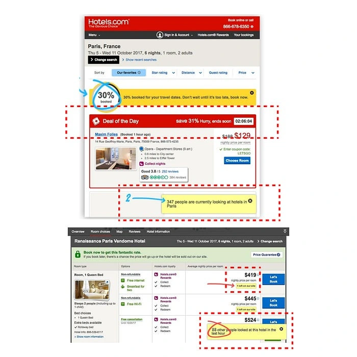
I conducted research on the integration of a sense of urgency in other competitor apps, such as Expedia, Kayak, Hotels.com, Booking.com, Travelocity, TripAdvisor, Agoda, and Hotwire. This research was conducted in order to understand how to effectively create a sense of urgency in my design. I also reviewed articles about human physiological behavior, FOMO (fear of missing out), how it relates to urgency, and tips on how other booking platforms use urgency to influence customer behavior. I’ve attached the research for your reference.
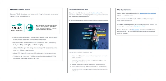
Competitor app’s
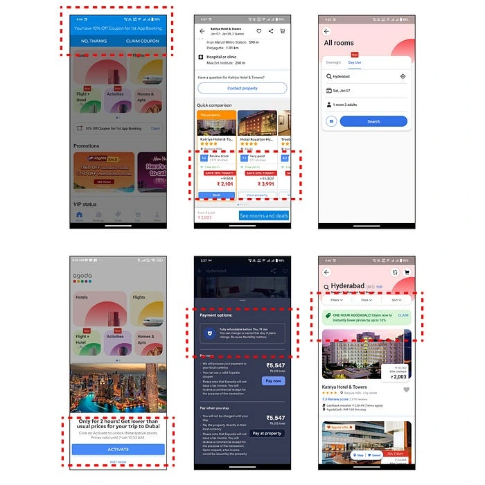
competitor apps
Articles
Strategies and Motivation Techniques to implement this feature.
👉 Information on the availability of rooms.
👉 How to make the booking process easier and more efficient.
👉 Making clear which hotels have a limited number of rooms left.
👉 Creating FOMO by showing many people utilized today’s booking offer from the user location.
👉 Show the percentage of booking taken on the day.
👉 Showing periodical coupes.
👉 Limited time welcome offer on 1st booking.
👉 Extra discount on your next booking (TODAY ONLY).
Ideas to implement.
Below is the list of ideas I made in the brainstorming stage.
💡1 Left on our sites (search result screen)
💡Deal of the day, Hurry Up ends now (Top of the Hotel card)
💡Save 50% today (Top of the Hotel card)
💡Limited time welcome offer on 1st booking (Home screen)
💡Extra discount on your next booking (TODAY ONLY)
💡One booking left on your site (Down of the hotel room card details)
💡Pop-up Notification after opening the app (Home screen).
Final Idea
I am facing time constraints, so I had to prioritize among the listed ideas. I have carefully evaluated all the ideas and selected the one that I believe to be the best and most positive and impactful solution to implement: Pop-up Notification after opening the app (Home screen), within the limited time frame. This approach ensures that I am able to deliver a high-quality solution that addresses the problem effectively and efficiently.
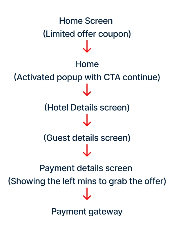
User Interface📱
✏Wireframes
In order to get a better understanding of how to present the details on the screen, I began sketching the wireframes on paper. This approach allows me to quickly experiment with different layouts and visual elements and better understand how the final product will look and function before committing to a digital wireframe. This is a common approach among product designers to get a clear picture of their design on paper before moving to digital wireframes.
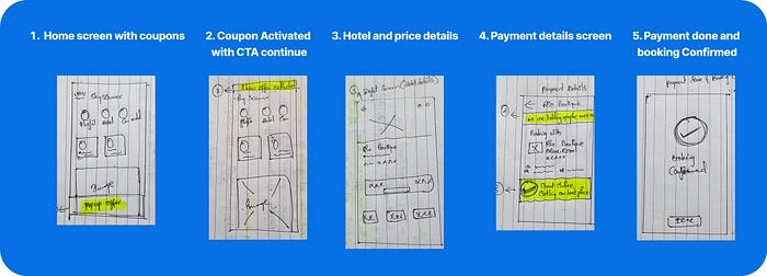
Wireframes
📲Building UI Screens
After creating wireframes for my solution, I turned my attention to designing the user interface (UI). To get inspiration and ensure that my solution was well-aligned with industry best practices, I gathered a collection of screenshots from other applications that had already addressed similar problems.
Using these screenshots as a starting point, I began to design the UI for my solution.
In total, I designed a total of 6 screens for my solution, which was in line with my original plan is 5 screens only on my problem statement and flow. I paid close attention this time to details such as layout, color scheme, and typography, and I worked closely with my team to ensure that everything was on track.
Screen 1️⃣
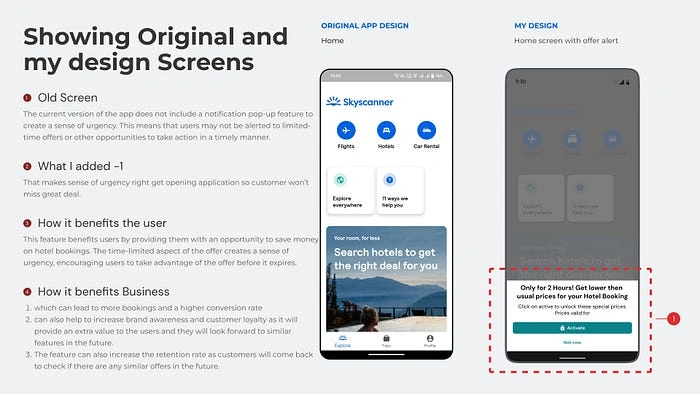
Home screen with offer alert.
Screen2️⃣
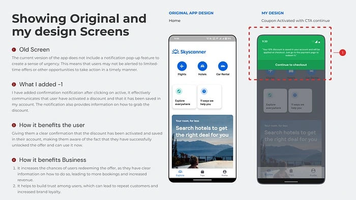
Coupon Activated with CTA to continue
Screen️3️⃣️⃣
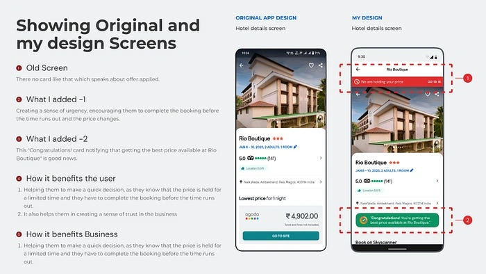
Hotel details screen
Screen4️⃣
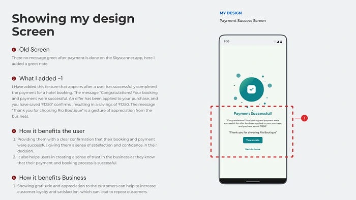
Payment Success Screen
🫣Real-world evaluations: Putting the prototype to the test.
I conducted user testing to evaluate the effectiveness of my solution by reaching out to individuals in the User Experience (UX) community and gathering feedback through testing my prototype with 3 users. I prepared a set of probing questions to gain insight into their behavior during the booking process. I shared a prototype link with them and asked them to complete the booking by applying the offer.
The feedback was positive, with users expressing that the idea applied on the home screen effectively grabs their attention and creates a sense of urgency to use the offer and book the hotel rooms. However, they also mentioned that they were distracted by other hotel details screens, but as it is not my priority screen as per the flow, I have not forced much on that too narrow down the flow.
Based on the user feedback, I identified pain points, frustrations, and areas of confusion from the solution screens that I built. I then compiled a list of the most common and highly impactful problems from the feedback to make improvements to the solution.
🪢A Story of Listening to Users and Revamping the UI
Some common and highly impactful problems
1. Confusion surrounding the “Continue Checkout” button and the lack of indication of the price difference with the coupon applied. These issues could lead to users abandoning the booking process or feeling frustrated with the app.
2. Difficulty finding the book option and confusion about the “view details” CTA. This could lead users to spend more time on the app and potentially become frustrated, which could impact their likelihood of using it again.
3. Lack of visibility for the coupon card and a lack of scannability for the original price and saved amount. This could lead to users missing out on discounts and not fully understanding the savings they are making, which could impact the effectiveness of the promotional offers.
📝Iterations from usability testing
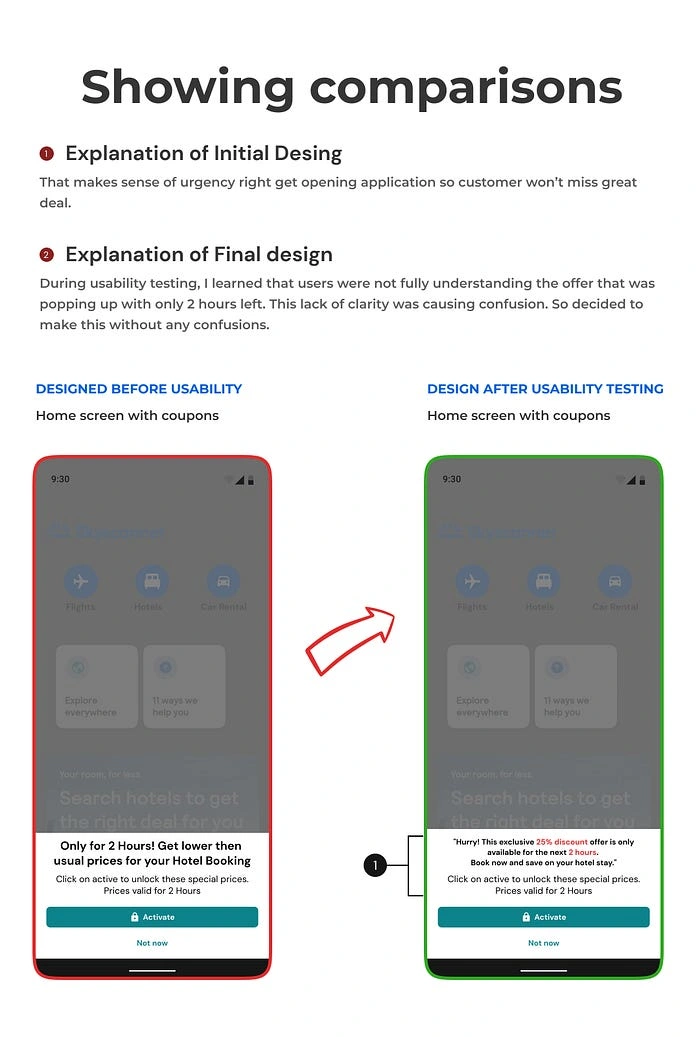
Comparison 1
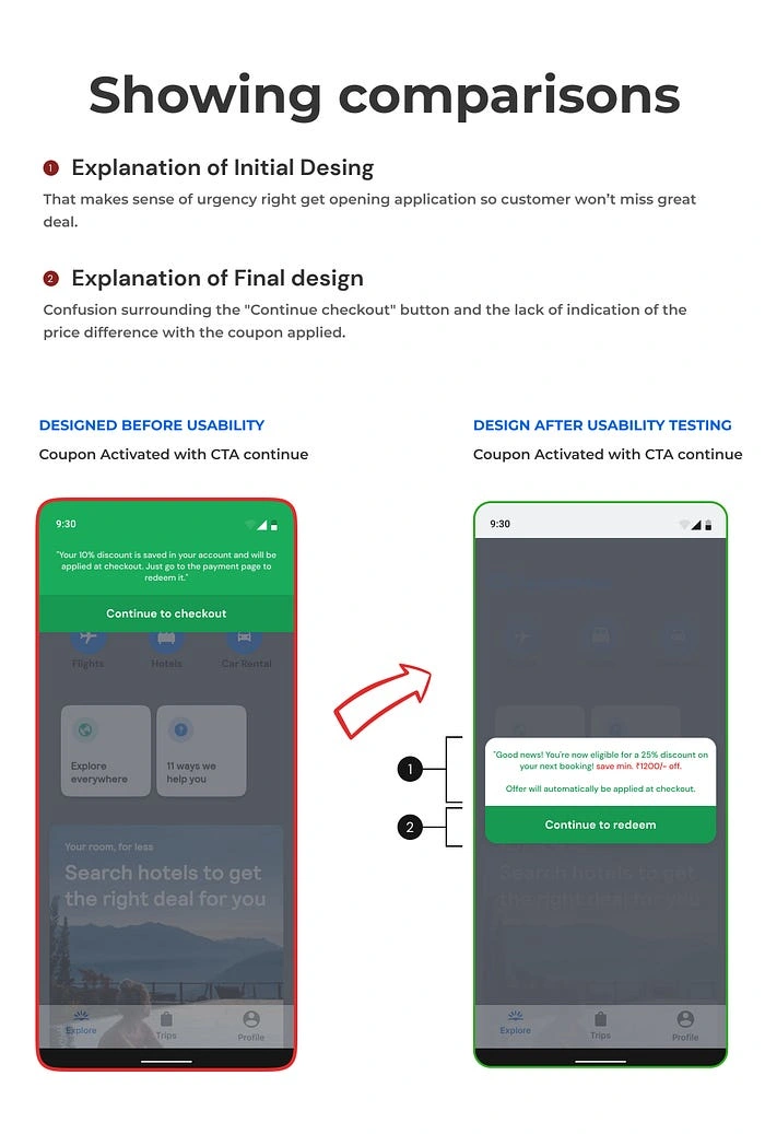
Comparison 2
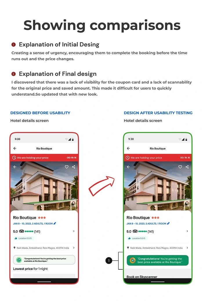
Comparison 3
Future prospects for enhancement
I would like to delve deeper into this project and conduct a more thorough exploration of different use cases and user groups associated with each case. This would allow me to create a more comprehensive and user-centric solution, taking into account the specific needs and preferences of different users. The goal would be to design a more tailored and personalized experience for the users.
Figma link
Prototype Link
Key Learning🗝️
Understanding how to gather user feedback and insights to inform the design process.
Understanding how to create fear of missing out drives users to take action.
Understanding how to identify and solve problems related to user experience and design.
Understanding how to be open to change and adapt to new ideas and feedback. Also, how to incorporate user feedback and apply it to improve the design.
Created UI primarily by using auto layouts and components (self-made mini design system)
🙏Thank you for taking the time to read through Skyscanner’s problem-solving journey. I hope you found it informative and enjoyable. I would greatly appreciate any feedback or comments you may have. If you would like to get in touch with me. 🖤
Like this project
Posted Aug 2, 2023
Increased average booking value by creating a sense of urgency for booking hotel rooms in the Skyscanner app.
Likes
0
Views
5


