UX case study | A Designathon Case Study on AJIO
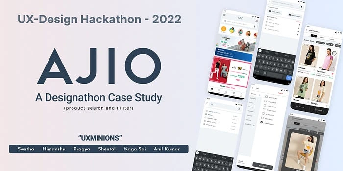
This case study explains our journey in the 48hr Designathon, and how we find straightforward solutions to enhance usability for working women on the AJIO application. This is my second case study on UX from my Bootcamp.
Overview
I have recently taken part in a Designathon in Bootcamp where we needed to work as a team (6 members) started by selecting the Evaluated problem statements from the specified list by providing an unfair advantage that our team had. After deciding on the problem statement, we have to empathize, define, ideate, prototype & test — to find a simple solution for the inconveniences of working women users.
UX Minions: Members

What I did here
I was engaged in most of the stages and processes throughout the process. In 1st half, we worked on defining problem statements working on assumptions & hypotheses, and Desk, competitive research, and Primary research.
The second half started with Affinity Mapping, User journey mapping, ideating, wireframes with the flow, testing, and final UI. These were all the stages that made my contributions. We made this together by sharing each step and we enjoyed it a lot. Working as a team had wonderful fun. All 6 members’ approach is involved in every single step of the episode. few strode up because they are skilled in those.
This event was performed and executed under the guidance of Anudeep Ayyagari (Mentor/UX Designer; Amazon), on a platform supported by Growthschool.
Problem Statement
Evaluate the product search and filtering flow of the AJIO app, which includes filter sorting and zeroing down on what they are looking for to be able to make quick and sound decisions and redesign the experience while identifying opportunities to make usability better for 👩 working women which will lead to decreasing bounce rate and increasing the frequency of use per month.
Why this problem statement?
We chose this problem statement because wanted to create a holistic solution for AJIO just by evaluating one small flow (from search to filter). We wanted to create a wide solution (write conversion, retention, lower bounce off) from just a small flow. Also, finding uses for usability testing was easy, given the timeline.
Business Matrix in focus
Conversion rate
Retention metrics
Bounce off rate
Focus on flow
Search
Product listing
Search/ product filters
Roles and plan of action
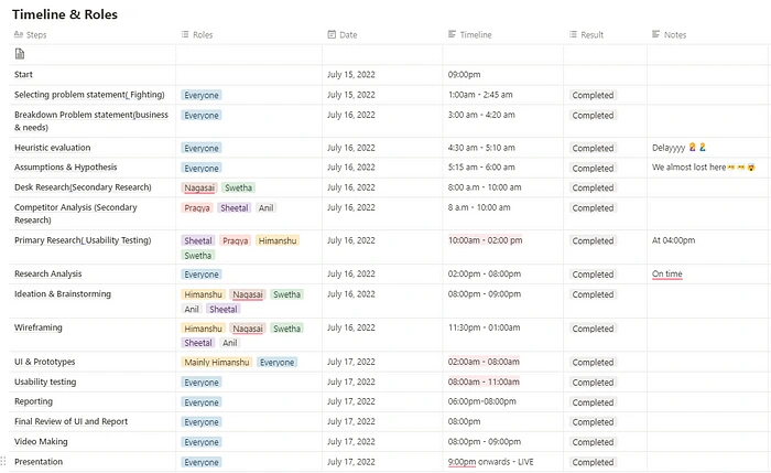
Our team has 6 people, so listed all the actions and timelines we segregated them among us to accomplish the task in a given time.
Understanding the problem
After, we finalized our problem statement, to thoroughly understand the problem first.
The problem is that women who go to the app (whether they know what to buy or are just browsing) do not end up finding something that makes them want to make a purchase. And this could be due to poor experience while searching for anything and while landing on (and browsing) the listing page. The increase in bounce rate is a result of this experience. And thereby, less conversion, retention, and overall footfall.
Understanding of the present flow as per Information Mapping
We decided to understand the current user flow that we are working on. The current flow that we are effectively focused on includes these steps:

Information mapping
Once we were clear about how the user would map their journey–within our flow–we took screenshots of each step of that journey in the AJIO App.
Self-Heuristic Evaluation & Hypothesis
After we understood our flow and the information mapping, we started our self-heuristic evaluations concerning every screen of that flow.
Please note that we have not yet referred to any other apps till now. We wanted our Self-Heuristics Evaluation to get completed before that.
We started by placing the entire flow up for evaluation.

Flow that is being evaluated
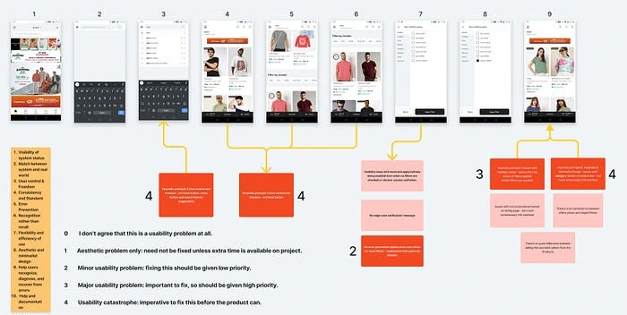
2. We then applied the top 3 Heuristic principles of all the screens and identified which screen did not comply with the principles. (we could ’t evaluate all 10 principles because of the lack of time for this hackathon, that’s why our hack was using only 5 principles which directly brought about the addressed problem).
SHE & Severity scale
3. We not only evaluated the screen as per the heuristics, but we also evaluated the screen as per our intuitions and judgments.
4. Heuristic-based evaluations are in RED Cards, and judgment-based evaluations are in PEACH Cards.
5. Once we were done with the Heuristics and non-heuristic evaluation, we rated our points based on their severity. Below is the scale of severity, and in the image, you can see the ratings we have given to each evaluative statement.
0 — I don’t agree that this is a usability problem at all***
1 — Aesthetic problem only: need not be fixed unless extra time is available on the project***
2 — Minor usability problem: fixing this should be given low priority***
3 — Major usability problem: important to fix, so should be given high priority***
4 — Usability catastrophe: imperative to fix this before the product can***
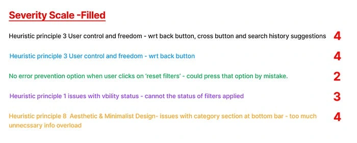
List other identified problems (non-heuristics based)
1. Problems concerning the back button, cross button and search history suggestions
2. Usability issue with preset and apply buttons being enabled even when no filters are checked or chosen, Causes confusion.
3. Problems concerning the back button
4. No edge case notification/ message
5. No error prevention option when user clicks on ‘reset filters’ — could press that option by mistake.
6. Visibility status issue where we cannot understand the status of filters applied.
7. issues with ICICI promotional banner on listing page — too much unnecessary info overload.
8. Issues regarding the category section at the bottom bar — too much unnecessary info overload.
9. There’s no appreciable difference between selling fast and best sellers from products.
10. There’s a lot of confusion between offer prices and original prices.
Brain-storming on DTFPO (based on our hypothesis)
Upon completion of our Self Heuristic Evaluation and Non-Self Heuristic Evaluation part, we moved to brainstorm on the DTFPO — Does, Think, Feel, Pain, Opportunities. This part was important to us to clearly understand our minds and hypothesis so that we could easily draw correlations or alternatives between our hypothesis and real user insights (for when we go ahead with our user testing).
For this, we had broken down the flow into three parts 👉 Search 👉 Listings 👉 filter
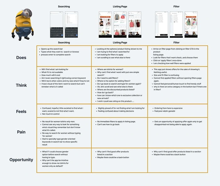
Journey Mapping
With this, our DTFPO brainstorming came to an end, and we now evaluate our hypothetical DTFPO so we can draw clearer hypothesis-based statements.
Hypothesis after Self-Heuristic Evaluation and DTFPO
We started our Hypothesis from the home page itself as it can affect the navigation to the search bar–from where our actual flow begins.
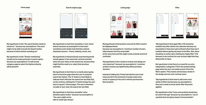
After narrowing down our hypothesis statements, we went ahead with our secondary research. The team divided itself into 2 parts and work on the two aspects of secondary research simultaneously.
Secondary Research
A. Desk research
Key Insights from desk research
Factual insights: Small missing details in descriptions are creating a lot of confusion in the User’s Shopping Journey.
Behavioral insights: The absence of review options for the products in the description results in increased bounce-off rates.
Factual insights: 42% of top e-commerce websites lack category-specific filter types.
Behavioral insights: Providing too many choices at a time can confuse and overwhelm your customers. It is always better to add the Filters option, which can help User Shop in the required Specific Category.
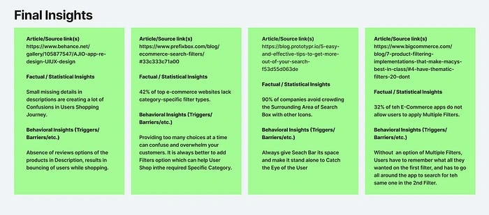
Final Insights- Secondary Research
B. Competitive Research & research and Benchmarking
Benchmarking: (Direct and Indirect competitors)
Direct competitors — Myntra, Nykaa Fashion and H&M
Indirect competitors — Instagram & Pinterest (for their search experience.
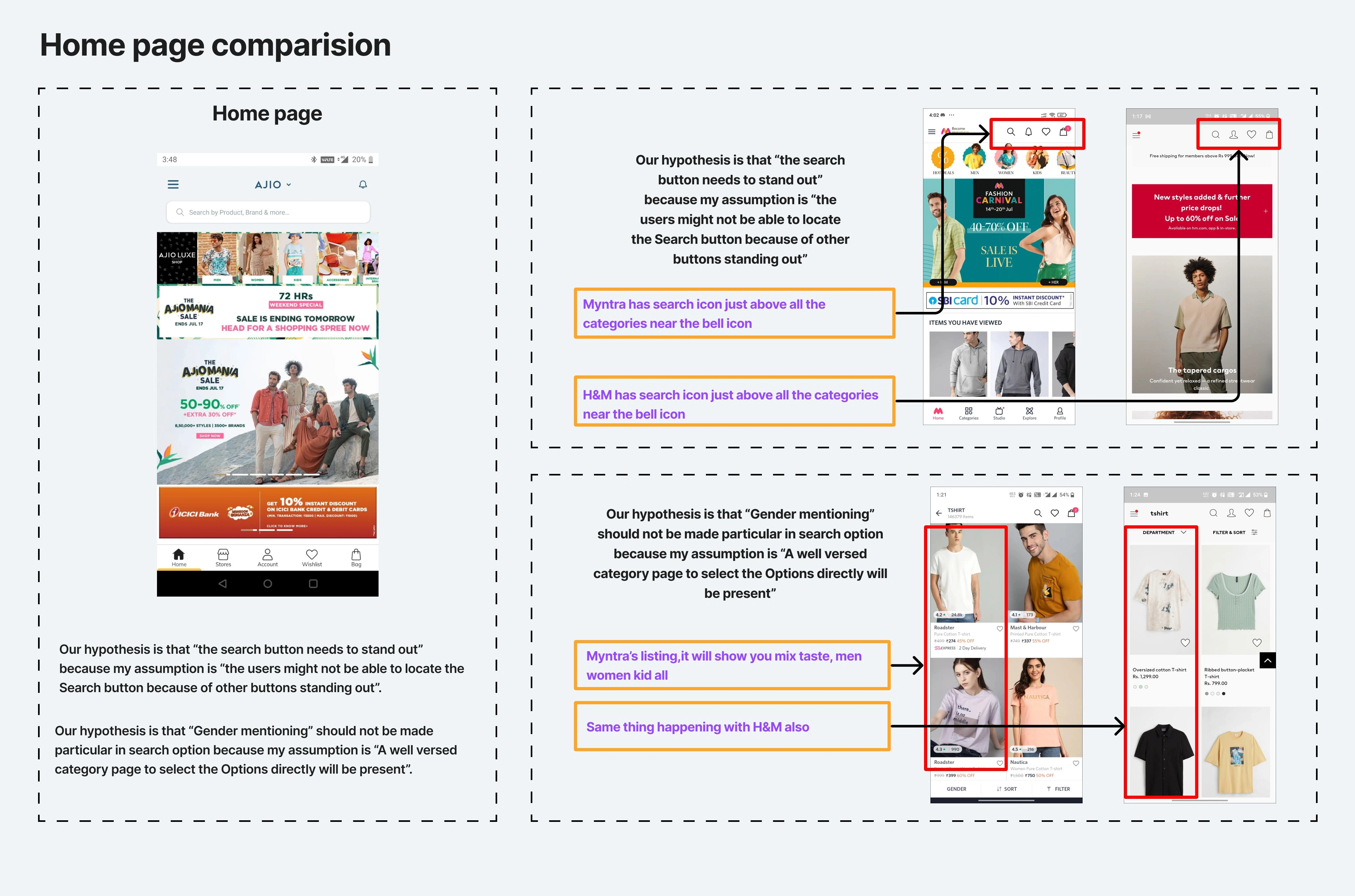
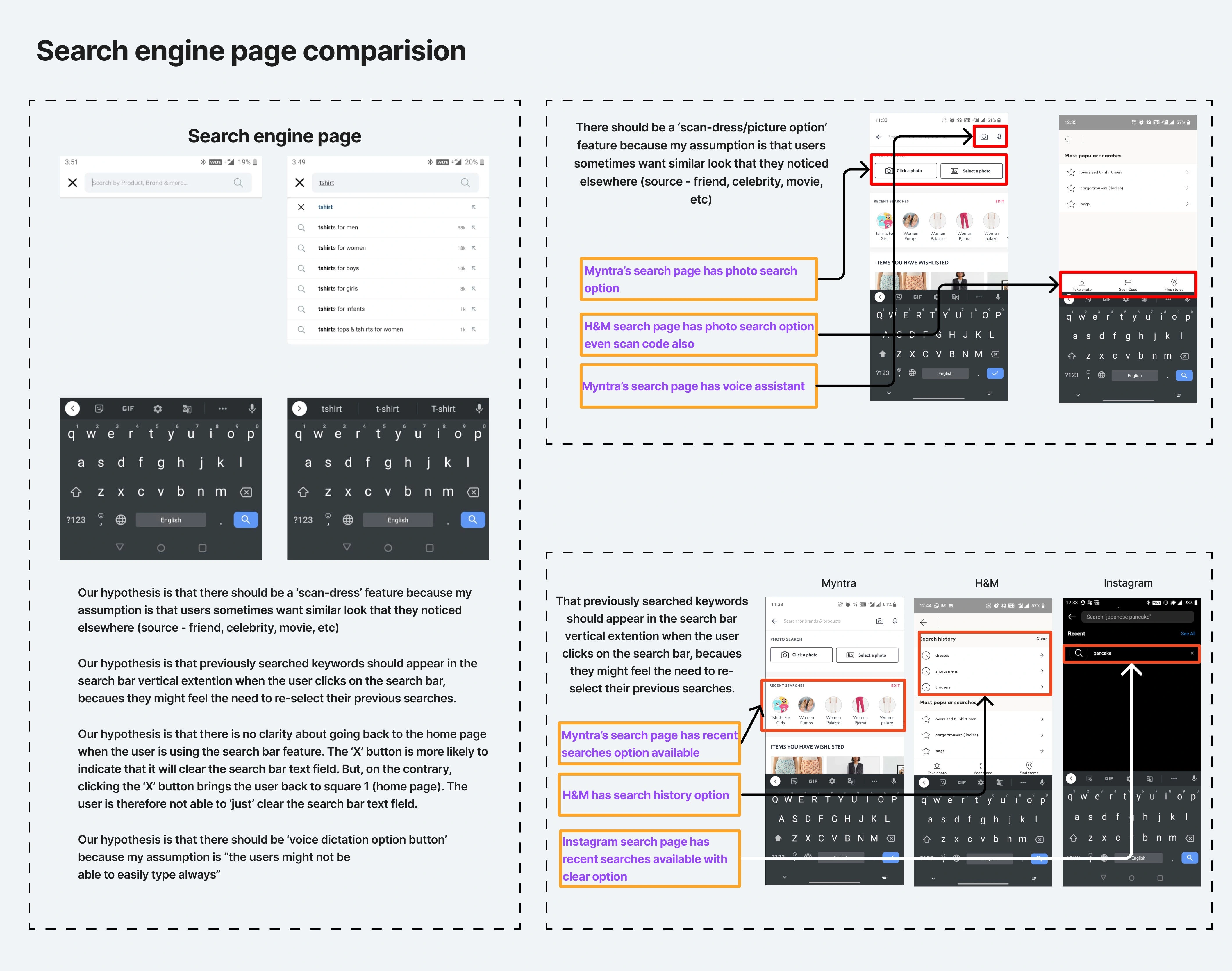
Home and search: Competitive Research
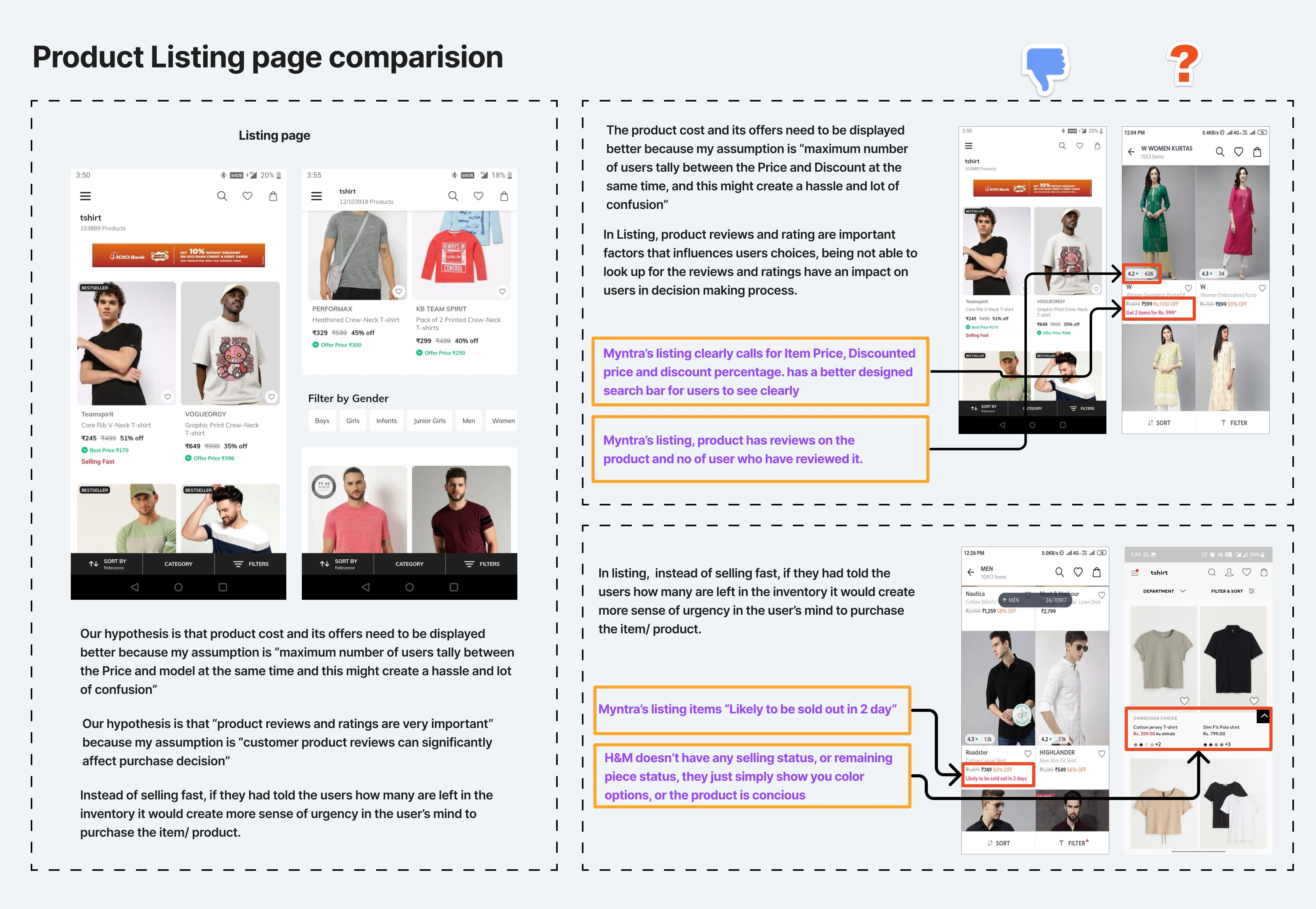
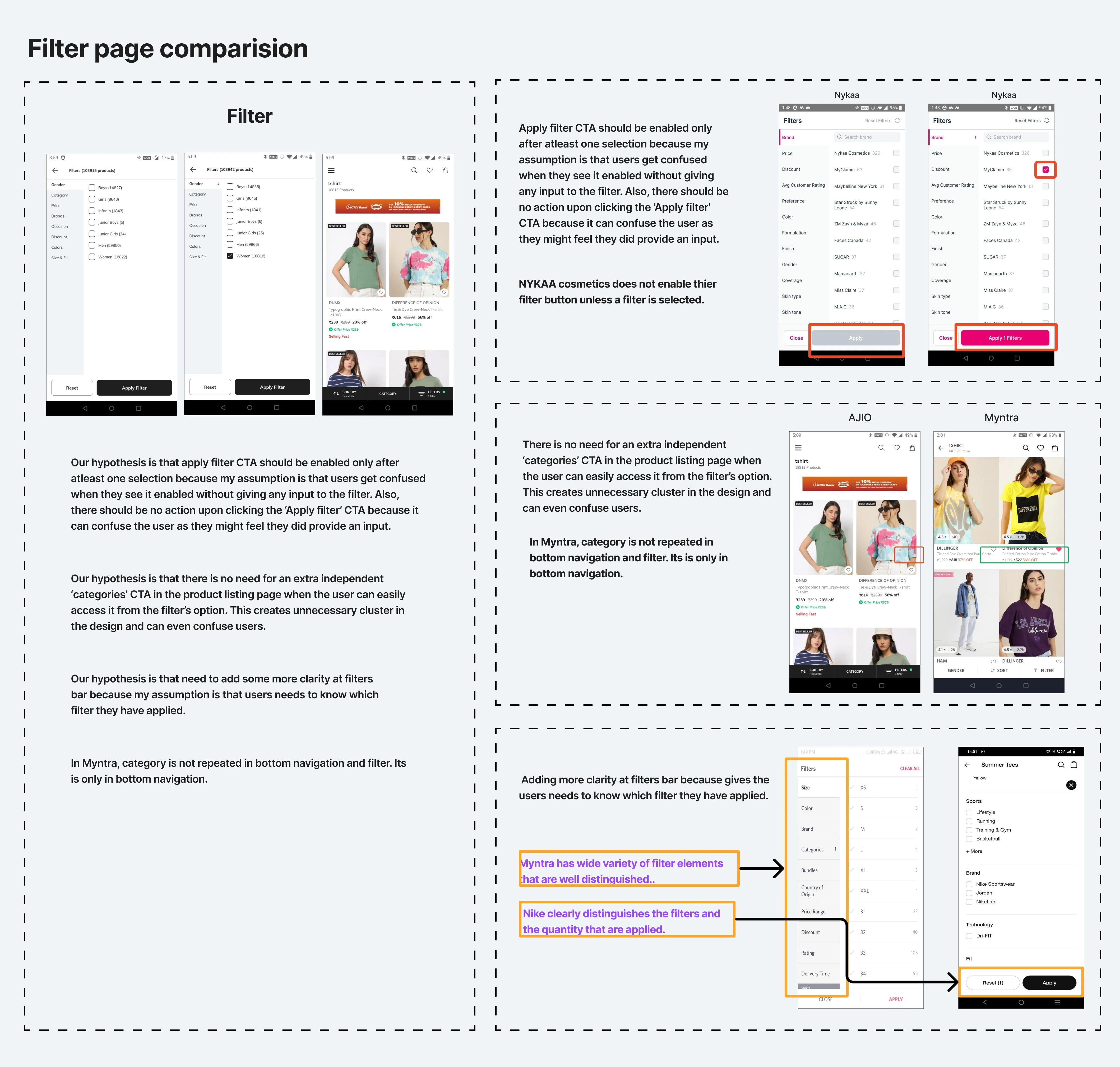
Product listing and Filter: Competitive Research
After backing our hypothesis from secondary research, it’s time for primary research.
Primary Research
As this is an evaluative project, we wanted to observe the behavior of the users while the users use the AJIO application. we found a few participants who agreed to talk to us about their shopping experience with the AJIO application (since we were in a time crunch, our team decided to contact our friends, and to reduce bias, we made clear that no individual interviewed their friend). So, asking them something the user should be able to take action in the user flow, without clues or describing the steps to be taken. The team prepared tasks that were used by every member to conduct the interviews.
Home Page
Search Screen
Searching for a product
Listing Screen
Filter Screen
Listing Screen after applying filters
We interviewed 4 users in total — all of them are working women. Below are the user insights we got from our primary research.
Points to observe for the initial comprehension of the user (without probing)
Observe what Part of the screen the User notice at First Glance.
Observe if the User was able to identify the Search Bar on the Home Screen.
Observe how users search for products.
Observe how long the user is spending on the Listing/Filter Screen.
Observe whether users can take cues from their recent research items(whether they can notice that this feature exists or not).
Observe what options/Details did she look for in Listing Screen.
Observe what kind of Filters/Sort is the User Applying?
Observe how the User is looking for Similar Options.
Observe how the User is going back to the Home Screen from the Listing screen.
Observe if the User can make Fast Decisions or not?
Observe how users are searching for a specific product that they already bought in the past?
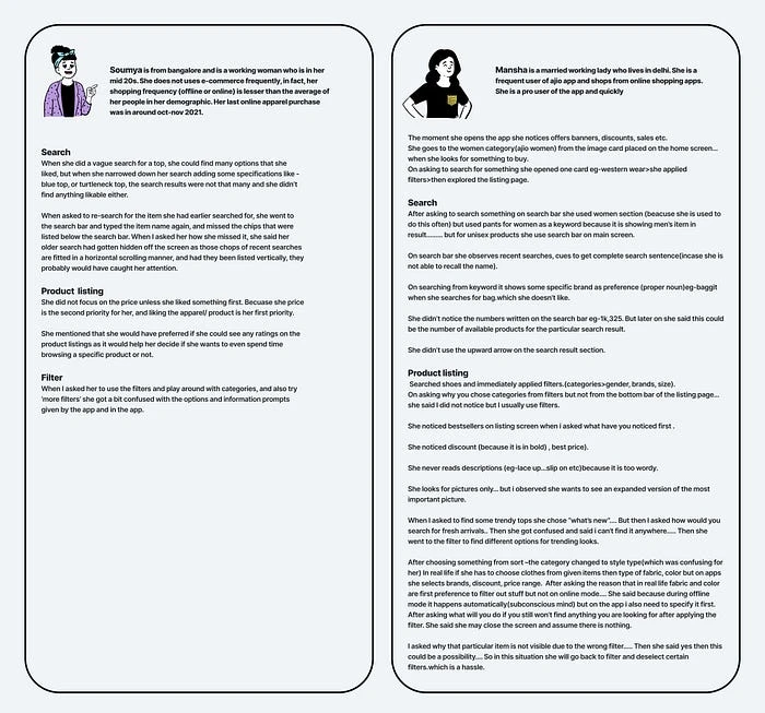
Soumya and Mansha Interview data
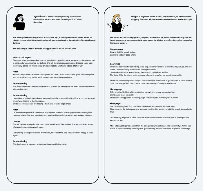
Ayushi and Mrigna Interview data
Post-primary research — we started with Affinity Mapping. However, given the strict timeline of the hackathon, we had to shelve it and jump to user journey mapping concerning the primary and secondary research.
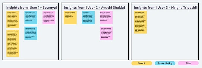
Affinity Mapping
Post-primary and Secondary Research we have made Journey Mapping
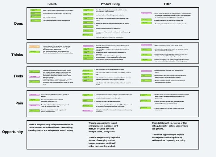
User Journey Validation Map based on Primary and secondary research
Ideation and Brainstorming
As we have very little time, we started framing How Might We question and validated the same statements; we spent less than 8 mins with each problem. We just tried to make top solutions that we hypothesized based on the research till we were done.
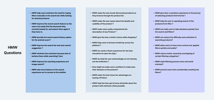
HMW
Finally, we got more than 40 solutions, so by brainstorming session in a group to refine the ideas which we came up with in the previous steps. We came up with the best solutions for the chosen problems and gave the reasoning for them; we listed those below.
Problems we decided to solve and WHY?
1. Home screen — Search Bar prominence:
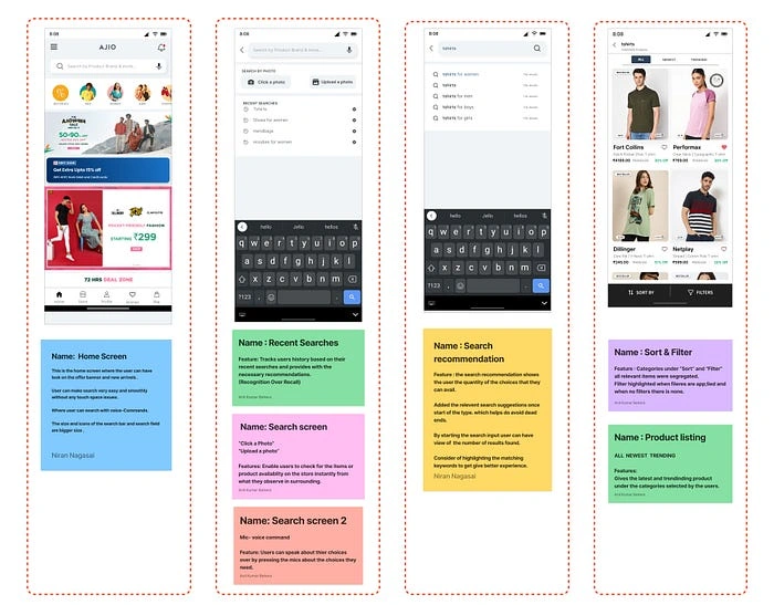
While our flow was only from search to filter, we decided to just make one change to the search bar by making it more prominent, because that is the start of our flow. We understand that we are evaluating only one flow, but our solutions could be of any flow (that affects the flow in focus)
2. Search Bar — Added new features (tapping opportunity) and improved the current design:
From the secondary research, we realized that it helps users to be able to search for a product by uploading an image or clicking a new image of apparel they liked and using AJIO search to find it or something similar. Therefore, we included the feature of clicking and uploading a photo.
3. Filter — Improved existing layout:
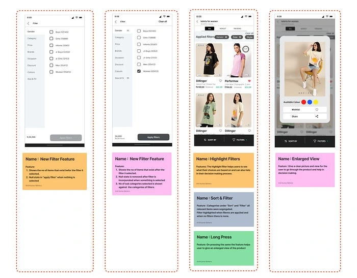
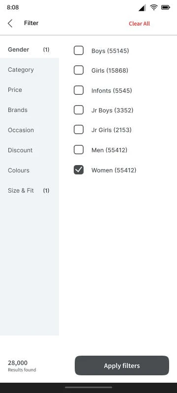
The filter seems to confuse a lot of users — an insight we got from our primary research and so we decided to work on that. The filter is an important feature for the user to find what they are looking for. Without an efficient filter, they will not find what they are looking for, resulting in bouncing off. We improved the overall layout of the filter; we added the applied filter chips to the product listing page so users can clearly see what filters they have applied.
4. Product listing — Improved the product display cards on the product listing page, and added a signifier for an important but ignored feature:
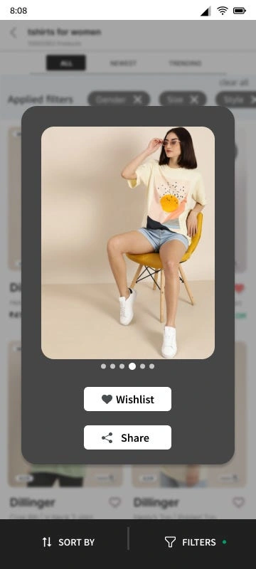
We feel that our users are not able to make first decisions by just looking at the product cards. Giving them more open space to make this decision by adding information like product rating, and sneak peek, and improving the readability of the brand of the product.
Wireframes
We created these wireframes and their iterations after choosing the problems we are solving.

Wireframes
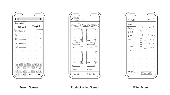
iterate wireframes
User Interface
Finally, we turned all our ideas into the user interface, while working on the UI screens, we realized a few things and added them, with the help of references from many applications. Also tried not to disturb the style of the existing app.
Usability testing
Now our screens are ready with the prototype. It’s time to test them with our users to check how effective your solutions are. Here, all our users match the real target user group of our problem statement.
Insights from usability testing
Overall FeedbackLiked the interface design, felt good using it. Overall ease of use and understanding. She felt she had a lot of freedom in many places.Very Good.
How did the solution work for the problems they faced?She felt that there were many easy features that solved the issues she faced. And she also felt that features were easy to find.
The Feasibility of all the icons. Loves the detailing for each product.
Earlier, she had to click on every product and go through all the details to filter out the minimal detail required. Now, she feels the minimal details necessary are already placed as descriptions on the Product-Listing page.
What are the changes that you would make based on the feedback?Make the clear all option more visible as our user missed it.
Make the ratings on the product listing page more prominent because our user missed that too.
Explain what they can do with the new feature of clicking and uploading photos to search for a product in fewer words, but right under the feature because our user was slightly confused about it, but liked the feature.
Add a prompt to tell the users that they can now use voice dictation too because our users missed that feature too.
The Feasibility of all the icons. Loves the detailing for each product.Earlier, she had to click on every product and go through all the details to filter out the minimal detail required. Now, she feels the minimal details necessary are already placed as descriptions on the Product-Listing page.
Color option positioning can be changed in the long-press.
Final UI screens after usability testing
Based on the feedback from the user testing, we made the final screens and gave the reasons for each development.
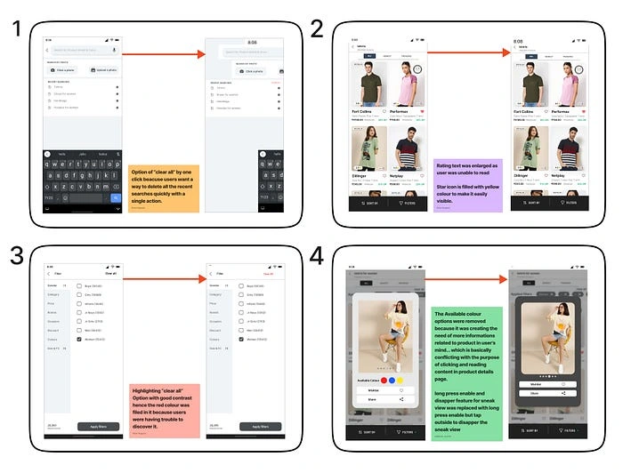
changes based on user testing
All final UI screens
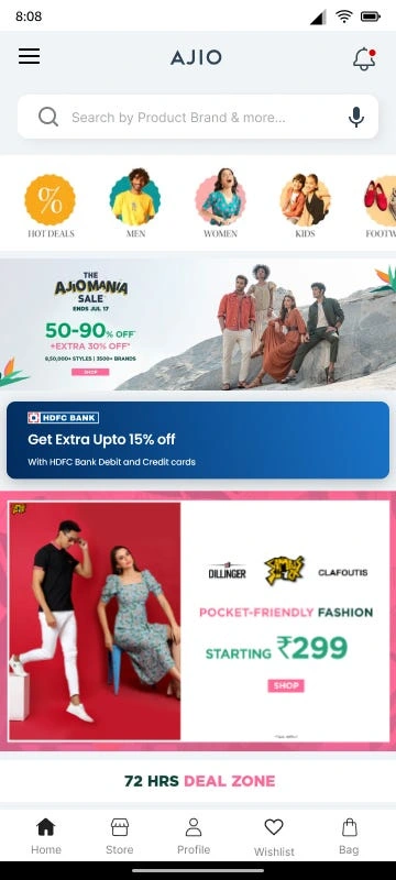
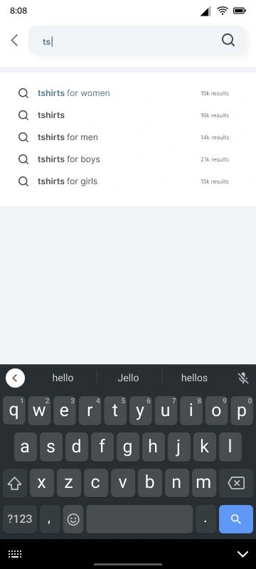
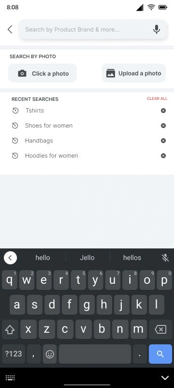
Iterative development of Home, search and search with suggestions screens UI
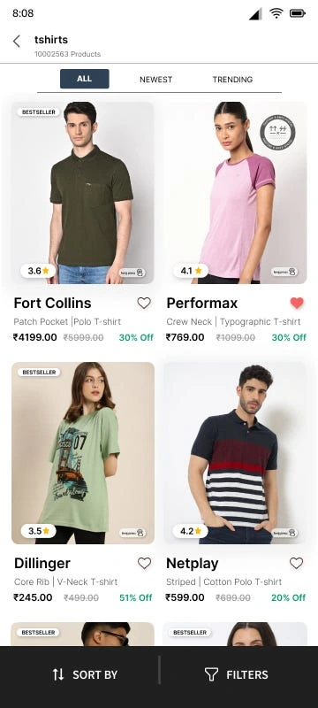
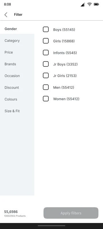
Product listing, Filter, and Filters apply screens
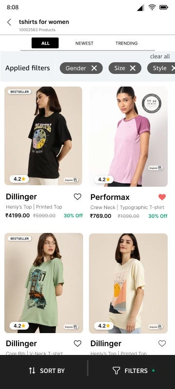
I am happy that we haven’t compromised at any point and given up. Our Designathon project was completed in the allowed time. It was a wonderful experience. We started as strangers, don’t even know each other names but worked as a team, had fewer hours of sleep, and worked continuously for 48hr. I’m so honored to associate with you people. Thank you so much team #UXMinions.
Takeaways
This project gave me the spirit of working on UX problems and gained knowledge about evaluated problems and patterns of working on them.
How the search option in applications plays a key role, its seriousness, and affects business.
The design doesn’t stop at a point; it iterates the process, and it needs to understand users. See how they evolve.
Thank you for spending your time reading this article, wish you liked it and got wonderful insights from this case study.
Please Let me know what you think, Feel free to leave feedback!
Like this project
Posted Aug 2, 2023
This case study explains our journey of how we find straightforward solutions to enhance usability for working women on the AJIO application.
Likes
0
Views
36


